Poster Guidelines - icnbme-2015
3nd INTERNATIONAL CONFERENCE
on Nanotechnologies and Biomedical Engineering
with related Workshops on
Novel Nanomaterials for Electronic, Photonic and Biomedical Applications
(German-Moldovan)
Biomedical Engineering Education
Nuclear and Radiation Safety and Security
Innovations and Technology Transfer
Research Poster Guidelines
General specifications
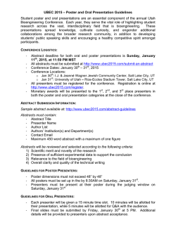
Size: An A1 sheet (equivalent to four A3 sheets). Orientation: Portrait preferred. Lamination:
It’s a good idea to get your poster laminated.
Font size: Large enough to be easily read from 1 to 1.5 meters away e.g., 24 point for main
text.
Suggested content
Research / Project Title: Approximately 25 mm tall (point 96).
Additional identifying information: Approximately 19 to 25 mm (e.g., point 80). May also be
on an additional label / strip above the main poster.
- Name of Organization(s) / Affiliation
- Researcher(s) Name
Problem Outline & Aims: Bulleted information describing the research issues and objectives.
Summary of Methods: Bulleted information describing how the research was conducted and
any challenges encountered.
Illustrations: Photographs, graphs, graphics, or other "art" that illustrate the research project.
Graphic information is easier to process quickly than text information. Look for imaginative ways to
graphically explain your project and its impact.
Results & Conclusions: Bulleted information describing your findings and discussing the
conclusions of the research project.
Acknowledgements & References: At the end of the poster.
Additional information: Any additional information that you think would enhance the
presentation.
Before, during and after the conference
When you arrive we will show you the area where you will be mounting your poster
presentation. You should plan to stand next to your poster and answer questions. For the benefit of
those who wish to contact you, or take a mini copy of your poster home, you may wish to place
business cards and/or A4 versions (black & white acceptable) next to your poster.
General Advice
A research poster is very different from a paper or a talk, and to produce one requires
different techniques. Simplicity is essential in a poster - it should tell a story. As in any research
presentation, the outline includes a statement of the problem, a description of the method, a
summary of the work, and then a presentation of results. But within that structure, there is much
scope for creativity. A question-and-answer (Q&A) format, for example, may be appropriate for part
of your poster. Brief conclusions should leave the reader with a clear message to take away.
A typical reader may spend only 5 minutes looking at your poster, so there should be less
clutter and more brief informative statements, with attractive and enlightening graphics. It should not
contain a lot of details – you can always explain the fine points to interested participants. Keep in
mind that your poster will be one among others in the exhibition area: it needs to capture and hold
the reader’s attention.
Transporting a poster may be awkward, but rolling the paper into a cylinder is one way around
this. As suggested above, you may wish to have A4 sized photocopies of the poster as a handout.
Alternatively, if the work presented in the poster has been described in more detail in a paper,
consider making the paper (or any associated presentation slides) available as a handout at the
poster session.
Further Information
If you have any questions about the guidelines, please email: [email protected]
We look forward to seeing you and your research poster!
© Copyright 2026
