
update - Climate4You
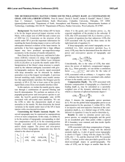
Contents:
1
Page 2:
Year 2014 and 2013 global surface air temperature overview
Page 4:
Comments to the Year 2014 global surface air temperature overview
Page 5:
Sea surface temperature anomaly at the end of the years 2014 and 2013
Page 7:
Lower troposphere temperature from satellites, updated to year 2014
Page 8:
Global surface air temperature, updated to year 2014
Page 9: Reflections on the significance of the 2014 global annual temperature
Page 12: Global satellite temperature trends calculated for different periods
Page 12: Global surface air temperature trends calculated for different periods
Page 13: PDO - Pacific Decadal Oscillation
Page 13: AMO (Atlantic Multidecadal Oscillation) Index
Page 14: Annual accumulated cyclone energy (ACE) Atlantic Basin
Page 15: Arctic and Antarctic sea ice extension, updated to December 2014
All diagrams in this newsletter as well as links to the original data are available on www.climate4you.com
Year 2014 and 2013 global surface air temperature overview
2
Year 2014 (upper panel) and 2013 (lower panel) surface air temperature compared to the average for 1998-2006. Green-yellow-red
colours indicate areas with higher temperature than the 1998-2006 average, while blue colours indicate lower than average
temperatures. Data source: Goddard Institute for Space Studies (GISS)
3
Year 2014 (upper panel) and 2013 (lower panel) Polar region surface air temperature compared to the average for 1998-2006. Greenyellow-red colours indicate areas with higher temperature than the 1998-2006 average, while blue colours indicate lower than average
temperatures. Data source: Goddard Institute for Space Studies (GISS)
Comments to the Year 2014 global surface air temperature overview
This newsletter contains graphs showing a
selection of key meteorological variables for the
year 2014. All temperatures are given in degrees
Celsius.
In the above maps showing the geographical
pattern of surface air temperatures, the period
1998-2006 is used as reference period. The reason
for comparing with this recent period instead of
the official WMO ‘normal’ period 1961-1990, is that
the latter period is affected by the relatively cold
period 1945-1980. Almost any comparison with
such a low average value will therefore appear as
high or warm, and it will be difficult to decide if
modern surface air temperatures are increasing or
decreasing. Comparing with a more recent period
overcomes this problem.
The average global surface air temperature for
2014.
4
On average, the year 2014 was not very different
from 2013. The corresponding sea surface
temperature changes 2013-2014 is shown by the
diagrams on pages 5-6.
The Northern Hemisphere was characterised by
regional temperature contrasts. Most of North
America had below annual average 1998-2006
temperature conditions, while easternmost Siberia
and Alaska had relatively warm conditions.
Temperature conditions near Equator were near or
below the 1998-2006 temperature average, even
though an El Niño situation has been developing
during the latter part of 2014 (see p.5).
In the Southern Hemisphere surface air
temperatures were near or below the 1998-2006
average, especially in the SE Pacific. However,
Australia had above average annual temperature.
In the Arctic the Canada-Greenland sector had
below average temperatures, while especially
eastern Siberia-Alaska has above average
temperatures. Compared to 2013, the region from
eastern Siberia to Alaska was warmer in 2014.
Most of the Antarctic continent had below average
temperature conditions, with only part of East
Antarctica being relatively warm. Compared to
2013, the Antarctic region was cooler than in 2014.
Sea surface temperature anomaly at the end of the years 2013 and 2012
5
Sea surface temperature anomaly in late December 2014 and 2013.
6
Arctic sea surface temperature anomaly late December 2014 and 2013.
Lower troposphere temperature from satellites, updated to year 2014
7
Mean annually lower troposphere temperature anomaly (thin line) since 1979 according to University of Alabama at
Huntsville, USA. The thick line is the simple running 3 year average. The average for 1979-1988 (10 yrs) has been set to
zero, to make comparison with other temperature data series easy.
Mean annual lower troposphere temperature anomaly (thin line) since 1979 according to according to Remote Sensing
Systems (RSS), USA. The thick line is the simple running 3 year average. The average for 1979-1988 (10 yrs) has been set to
zero, to make comparison with other temperature data series easy.
Global surface air temperature, updated to year 2014
8
Mean annual global surface air temperature (thin line) since 1850 according to according to the Hadley Centre for Climate
Prediction and Research and the University of East Anglia's Climatic Research Unit (CRU), UK. The thick line is the simple
running 3 year average. The average for 1979-1988 (10 yrs) has been set to zero.
Mean annual global surface air temperature since 1880 according to according to the National Climatic Data Center
(NCDC), USA. The thick line is the simple running 3 year average. The average for 1979-1988 (10 yrs) has been set to zero,
to make comparison with other temperature data series easy.
Mean annual global surface air temperature (thin line) since 1880 according to according to the Goddard Institute for
Space Studies (GISS), at Columbia University, New York City, USA. The thick line is the simple running 3 year average. The
average for 1979-1988 (10 yrs) has been set to zero, to make comparison with other temperature data series easy.
9
Reflections on the significance of the 2014 global annual temperature
According to the satellite temperature records (p.7)
2014 was not a record warm year. This is in
contrast to the surface air temperature records
(p.8-9), which suggest the possibility that 2014 was
one of the warmest years since 1880 or 1850.
All temperature records are affected by at least
three different sources of error, which may differ
between the individual station records used for
calculation the global average temperature. 1) The
accuracy is the degree of closeness of
measurements to the actual (true) value. 2) The
precision is the degree to which repeated
measurements under unchanged conditions show
an identical value, true or not. In addition we 3)
have the measurement resolution, which is the
smallest change in temperature that produces a
response in the instrument used for measurement.
When combined, this is typically what the
expression margin of error attempts to convey for
surface air temperature records.
The margin of error has been intensively discussed
in various new media during the last weeks, and is
probably at least ±0.1oC for surface air temperature
records, and possibly higher. This makes it
statistical impossible to classify 2014 as
representing the warmest year in the observational
record, as several other years are within the ±0.1oC
range of the 2014 value.
However, two additional issues relating to the
margin of error have not been widely discussed: 1)
First, it will not be possible to conclude much about
the actual value of the December (and November)
2014 global surface air temperature before MarchApril 2015, when data not yet reported (January
2015) eventually are incorporated in the surface air
temperature databases. 2) Secondly, these surface
air temperature records display administrative
changes over time, which makes it even more
difficult to conclude anything about the significance
of the recently reported 2014 surface air
temperature.
The second (administrative) issue is derived from
the apparently never ending changes of monthly
and annual temperature values carried out by
especially the GISS and NCDC databases, with the
consequence that what in one particular year was
reported as the average global temperature for
previous years (and months) are exposed to
ongoing administrative changes, that apparently
has little or nothing to do with delayed reporting of
missing data. This is strongly suggested by the fact
that especially the GISS and NCDC databases each
month are publishing new changes to monthly
temperatures even long before year 1900, where
the likelihood of delayed data reporting is very
small. Most likely, such administrative changes are
the result of alterations in the way the average
values are calculated by GISS and NCDC.
As an example of such administrative temperature
changes is shown below the effect on the GISS
mean annual air temperature (MAAT) anomaly
record since 2001, with the six different data
versions published since January 2010 plotted in
one diagram.
10
From this diagram (above) it is obvious that quite
substantial administrative changes have been
introduced over this short period of just six years.
The GISS 2007 MAAT anomaly value, for example,
was announced as 0.57 oC in January 2010, 0.58 in
January 2011, 0.58 in January 2012, 0.62 in January
2013, 0.63 in January 2014 and 0.62 oC in January
2015.
So the GISS 2014 MAAT anomaly value of 0.68 oC
published in January 2015 is presumably also going
to change for administrative reasons during the
coming years, which makes it even more difficult to
discuss meaningfully the significance of small
temperature differences between individual years.
Summing up, 2014 was indeed a warm year in the
still short instrumental period (since 1880/1850),
but it is not possible statistically to classify it as the
warmest year.
In addition, there is a noticeable and interesting
difference between the global satellite- and surface
air temperature records, detailed in the diagram
below, as well as in the two diagrams on page 12.
11
Plot showing the average of monthly global surface air temperature estimates (HadCRUT4, GISS and NCDC) and
satellite-based temperature estimates (RSS MSU and UAH MSU). The thin lines indicate the monthly value,
while the thick lines represent the simple running 37 month average, nearly corresponding to a running 3 yr
average. As the base period differs for the different temperature estimates, they have all been normalised by
comparing to the average value of their initial 120 months (10 years) from January 1979 to December 1988.
Global satellite temperature trends calculated for different periods before December 2014
Diagram showing the latest 5, 10, 20 and 30 yr linear annual global temperature trend, calculated as the slope
of the linear regression line through the data points, for two satellite-based temperature estimates (UAH MSU
and RSS MSU). Last month included in analysis: December 2014.
Global surface air temperature trends calculated for different periods before December 2014
12
Diagram showing the latest 5, 10, 15, 20, 30, 50, 70 and 100 yr linear annual global temperature trend, calculated as the
slope of the linear regression line through the data points, for three surface-based temperature estimates (GISS, NCDC and
HadCRUT3). Last month included in analysis: December 2014.
PDO - Pacific Decadal Oscillation
13
Annual values of the Pacific Decadal Oscillation (PDO) according to the Joint Institute for the Study of the
Atmosphere and Ocean (JISAO), a Cooperative Institute between the National Oceanic and Atmospheric
Administration and the University of Washington. The PDO is a long-lived El Niño-like pattern of Pacific climate
variability, and the data series goes back to January 1900. The thin line indicates annual PDO values, and the
thick line is the simple running 7 year average. Last year shown: 2014.
AMO (Atlantic Multidecadal Oscillation) Index
Annual Atlantic Multidecadal Oscillation (AMO) index values since 1856. The thin line indicates 3 month
average values, and the thick line is the simple running 11 year average. Further explanation in text above. Data
source: Earth System Research Laboratory at NOAA. Last year shown: 2014.
Annual accumulated cyclone energy (ACE) Atlantic Basin
14
Accumulated cyclonic engergy (ACE; Atlantic basin) per year since 1850 AD, according to data from the Atlantic
Oceanographic and Meteorological Laboratory, Hurricane research Division. Thin lines show annual ACE values,
and the thick line shows the running 7-yr average. Last year shown: 2013.
Arctic and Antarctic sea ice extension, updated to December 2014
15
12 month running average sea ice extension in both hemispheres since 1979, the satellite-era. The October
1979 value represents the monthly average of November 1978 - October 1979, the November 1979 value
represents the average of December 1978 - November 1979, etc. Last month included in the 12-month
calculations: December 2014. Data source: National Snow and Ice Data Center (NSIDC).
***************
All above diagrams with supplementary information (including links to data sources and previous issues of this
newsletter) are available on www.climate4you.com
Yours sincerely, Ole Humlum ([email protected])
January 27, 2015.

© Copyright 2026