Stefan Bräuniger
Stefan Bräuniger
Die Sinnlichkeit der Natur
GALERIE VON BRAUNBEHRENS
Axel Zimmermann
Ainmillerstraße 2 D-80801 München
Tel. 0049.(0)89.33 03 65 33 Fax 0049.(0)89.33 43 16
[email protected]
Dieses Buch erscheint anlässlich der Ausstellung
Stefan Bräuniger
Die Sinnlichkeit der Natur
in der Galerie von Braunbehrens, München
vom 12. September bis 17. Oktober 2003
Umschlagabbildung (Ausschnitt):
Kürbisse III (127), 2001, Öl auf Leinwand, 50 x 88 cm, Privatsammlung
Inhalt
5
Regina Böker
ZWISCHEN ABSTRAKTION UND WIRKLICHKEIT
ENTRE ABSTRACCIÓN Y REALIDAD
BETWEEN ABSTRACTION AND REALITY (page 19)
35
Dr. Eva-Maria Schumann-Bacia
„EIN ANGRIFF AUF DIE REALITÄT?“
“UN ATAQUE A LA REALIDAD?”
“AN ASSULT ON REALITY?” (page 53)
78
Künstlerfoto / Foto del artista / Photo of the artist
79
Biografie / Biografía / Biography
Ausstellungen / Exposiciones / Exhibitions
80
Impressum
Johannisbeeren II (137), 2002, Öl auf Leinwand, 80 x 76 cm
4
Regina Böker
Zwischen Abstraktion und Wirklichkeit
Zur Malerei von Stefan Bräuniger
Natürlich sind es zunächst die abgebildeten Dinge,
die Früchte und Blumen, die beim Betrachten von
Stefan Bräunigers Bildern ins Auge springen und
faszinieren. Sie strahlen eine verträumte Poesie aus
und sind doch gleichzeitig in ihrer Direktheit geradezu lebendige Wiedergaben der Realität. Staunend gewahrt der Betrachter die vollkommene
Schönheit der Rose, die zarte Anmut der Wicke,
die perfekte Form der Johannisbeere – und empfindet beinahe unweigerlich Ehrfurcht vor diesen
Wunderwerken der Natur.
Entre Abstracción y Realidad
sobre la pintura de Stefan Bräuniger
Por supuesto que son los elementos representados,
las frutas y las flores, lo primero que salta a la vista
y nos fascina cuando miramos los cuadros de Stefan
Bräuniger. Si bien emanan una poesía de ensueño, su
claridad las convierte también en una reproducción
acertadamente viva de la realidad. El espectador
contempla asombrado la belleza absoluta de la rosa,
la delicada gracia de la arveja, la forma perfecta de
la grosella – e inevitablemente siente casi un respeto
ante semejante obra maestra de la naturaleza.
Erst wenn man sich eingehender mit der Wirkung
der Bilder beschäftigt, wird deutlich, dass diese
nur vordergründig durch die Sujets hervorgerufen
wird. Viel mehr als die Früchte und Blumen selbst
sind es die Bildausschnitte, die Perspektiven, die
Farbigkeit, der Bildaufbau, also die Bildkompositionen, die den Bildern Spannung und Emotion
verleihen. Bräunigers Stillleben beweisen sein
sicheres Gefühl für Proportionen und formale
Zusammenhänge, zeigen jenseits aller Inhaltlichkeit den leidenschaftlichen Maler. Die Wahl seiner
Themen verweist weniger auf einen fanatischen
Blumenfreund und Obstliebhaber als auf einen
Künstler, der ideale Objekte gefunden hat, seine
wahre Meisterschaft zu zeigen.
Únicamente cuando nos preocupamos más detalladamente por la impresión que nos crean los
cuadros, entendemos que esa impresión ha sido
causada sólo en apariencia por los sujetos. Mucho
más que las frutas y las flores mismas, son los
detalles, la perspectiva, el colorido, así como la
construcción de la imagen en una palabra o la
composición de una imagen, los que confieren a los
cuadros tensión y emoción. Las naturalezas muertas
de Bräuniger demuestran su acertado sentido por la
proporción y las relaciones formales, y más allá de
todo contenido, muestran al pintor guiado por la
pasión. La elección de sus temas apunta menos
hacia un amante fanático de las flores y frutas y más
hacia un artista que ha encontrado los objetos
ideales para enseñar su maestría.
Das Quadrat als Bildformat, das Bräuniger häufig
wählt, zeichnet sich durch seine besondere Ausgewogenheit aus. Als Ausgangsbasis für Bräunigers
Kunst ist es damit prädestiniert. Virtuos verleiht er
dem Format eine eigene aufregende Dynamik. Sie
El cuadrado como formato de cuadro, elegido tan a
menudo por Bräuniger, se caracteriza por su
5
entsteht durch steigende und fallende Diagonalen,
Staffelungen, Komplementärkontraste, die Arbeit
mit Flächenaufteilungen, den gekonnten Einsatz
von Körpern und Linien.
equilibrio especial. Como punto de partida para el
arte de Bräuniger, está predestinado como tal. Con
virtuosidad, el artista le concede al formato una
dinámica propia, excitante. Esa dinámica está conseguida mediante diagonales ascendentes y descendentes, apilamientos, contrastes complementarios,
trabajo de división de la superficie, y el hábil
empleo de cuerpos y líneas.
Schaut man sich „Zitronen V“ als Beispiel daraufhin genau an, findet man dies bestätigt. Den drei
im Dreieck zueinander stehenden Hintergrundflächen entsprechen die drei Zitronen, die nachbzw. voreinander gestaffelt Tiefe und Volumen
ergeben und gleichzeitig eine Diagonale von Körpern bilden, während die Blätter von links unten
nach rechts oben als Gegengerade erscheinen.
Dem Hintergrunddreieck der Basis entspricht das
von den Blättern gebildete Dreieck am oberen
Rand, dem großen Blatt der linken unteren Ecke
die obere rechte Fläche. Neben dem eingewölbten
Dreieck am linken Bildrand bildet das Blatt in der
oberen linken Ecke ein ausgewölbtes Dreieck, dessen Form in der unteren rechten Ecke durch einen
Stängel wieder aufgenommen wird. Blattrispen,
Stiele und Schatten bilden ein Liniengerüst, das
mit den kugeligen Körpern der Zitronen kontrastiert. Diese Entsprechungen, Kontraste und Gewichtungen – das rechte untere Bilddreieck zeigt
die große, schwere vordere Zitrone, während das
linke obere Dreieck durch die kräftig grünen Blätter das Gegengewicht bildet – sind eine formale
Meisterleistung. Auch der Anschnitt der Zitrone
am rechten Rand dient dieser Komposition. Er verhindert die Rechtslastigkeit und verweist so auf die
Konstruktion des Bildes an sich, auf dessen fast
schon abstrakte Qualitäten. Wie man es auch dreht,
stehen Linien, Flächen, Volumen und Gewichtung
in einem spannungsreichen Verhältnis zueinander.
Si miramos ahora desde cerca el ejemplo de
“Zitronen V” (Limones V), esas observaciones se
confirman. A las tres superficies de fondo, situadas
en formación triangular una con la otra, les
corresponden los tres limones, que uno detrás del
otro, y uno delante del otro, crean volumen y profundidad en capas así como una diagonal de
cuerpos, mientras que las hojas del lado inferior
izquierdo forman una contra-recta al quedar
inclinadas hacia la derecha. El triángulo en el
borde de arriba, constituido por las hojas, corresponde al triángulo del fondo de la base. A la
superficie del lateral superior derecho le corresponde la hoja grande de la esquina del lateral
inferior izquierdo. Al lado del triángulo que queda
arqueado hacia dentro en el borde izquierdo del
cuadro, la hoja de la esquina superior izquierda
forma un triángulo arqueado hacia fuera, cuya
forma se repite en el tallo de la esquina inferior
derecha. Las nervaduras de las hojas, así como los
tallos y las sombras forman un andamio de líneas
que contrasta con el aspecto esférico de los limones.
Estas relaciones, contrastes y la división del peso –
el triángulo inferior izquierdo del cuadro muestra el
limón grande y pesado en primer plano, mientras el
triángulo derecho alto forma el contrapeso con sus
fuertes hojas verdes – son una obra maestra en el
aspecto formal. El corte del limón en el borde derecho también aporta a esa composición, impidiendo que la parte derecha parezca pesada, y
haciendo hincapié en la construcción del cuadro en
sí y en sus calidades ya casi abstractas. Independientemente del ángulo que tomemos, siempre
tendremos líneas, superficies, volúmenes y división
del peso relacionados entre sí de manera intrigante.
Die Farbgebung des Bildes unterstreicht diese formalen Komponenten. Es dominiert das Gelb der
Zitronen, die durch aufgesetzte weißliche Lichter
noch an Volumen gewinnen. Der helle rötlich graubraune Hintergrund, der als Mischung aus Gelb,
Rot und Blau die Blatt-, Stiel- und Zitronenfarben
und doch mit rötlichem Schimmer den Komplementärkontrast zu Grün enthält, lässt die Zitronen
6
Zitronen V (146), 2003, Öl auf Leinwand, 100 x 100 cm
7
Kirschen III (144), 2003, Öl auf Leinwand, 40 x 40 cm
8
und Blätter noch präsenter erscheinen. Feine ins
Rot gehende Farbspuren am Rand der Zitronen,
der Blätter, den Stielen und am Blattschatten zeigen als Komplementärkontraste die Raffinesse der
Malerei.
La coloración del cuadro reafirma sus componentes
formales. Domina el amarillo de los limones que,
gracias a las luces añadidas en tono blanco, ganan
en volumen. El fondo claro, rojizo, de un marrón
grisáceo, conseguido con una mezcla de amarillo,
rojo y azul, que contiene los colores de las hojas, el
tallo y el limón, así como el contraste complementario al verde, aunque con un brillo rojizo, hace
que los limones y las hojas estén más presentes aún.
Huellas delicadas de color se van desvaneciendo
hacia rojo en el borde de los limones. Las hojas, los
tallos y las sombras de las hojas muestran, como
contrastes complementarios, el refinamiento de la
pintura.
Die besondere Qualität von Stefan Bräunigers Bildern beruht darauf, dass diese rein malerischen und
formalen Themen voll ausgereizt werden, und sie
doch realistische Darstellungen sind. Sie sind quasi eine Synthese aus reiner Malerei und perfekter
Abbildung. Jede Pore der Zitrone ist akribisch
gemalt, ihr wächsernes Aussehen wiedergegeben,
die frische Glattheit der Blätter, die kleinen kräftigen Stiele in ihrer natürlichen Stofflichkeit genau
getroffen. Aber auch dies ist letztlich vor allem
eine malerische Aufgabe für den Künstler.
La calidad especial de los cuadros de Stefan
Bräuniger se basa en el hecho de que, a pesar de
que agotan temas puramente pictóricos y formales,
siguen siendo representaciones realistas. Los cuadros son casi una síntesis entre pintura pura e
ilustración perfecta. Cada poro de limón está pintado meticulosamente, reproduciendo su imagen
cerosa, el fresco liso de sus hojas, los tallos pequeñitos y fuertes acertados en su materialidad
natural. Pero esta síntesis es también, principalmente, un reto pictórico para el artista.
Es ist die Faszination des „Handwerks“, also der
Tätigkeit des Malens und des künstlerischen
Schaffens, die sich, ganz losgelöst vom zu Malenden, hier Ausdruck verschafft. Liebevoll legt Bräuniger eine farbige Untermalung an, um später den
für seine Bilder so typischen „Schmelz“ zu erhalten. Ohne Hintergedanken an mögliche inhaltliche
Konnotationen ist es dann sein Bestreben, das ausgewählte Sujet genau der fotografischen Vorlage
entsprechend wiederzugeben. Penibel wird jeder
Farbton einzeln angemischt, in tagelanger Arbeit
ausgehend von einer Ecke des Bildes nach- und
nebeneinander auf die Leinwand gebracht. Die
leichte Zartheit der Blütenblätter einer Wicke, die
Durchsichtigkeit der Johannisbeeren, die mattglänzende Oberfläche der Oliven, die prallen, glänzenden Kirschen oder die duftige, filigrane Rose –
schon seit dem 17. Jahrhundert war es ein Bestreben der Maler von Stillleben, mit ihrem malerischen Können die sinnlichen Eigenschaften der
Dinge zum Leben zu erwecken.
Es la fascinación del “oficio”, o mejor dicho el acto
de pintar y el de la creación artística, lo que,
totalmente liberado de lo pintado, encuentra aquí su
máxima expresión. Bräuniger aplica con cariño
una capa de fondo de color, para luego poder conseguir ese “derretido” tan característico en sus
cuadros. Sin entretener duda alguna sobre posibles
connotaciones del contenido, su aspiración es, por
un lado, representar el sujeto elegido de forma leal
a su modelo fotográfico, y por otro, convertirlo por
medio de la pintura en un retrato realista, que tiene
como punto de orientación el objeto mismo. Uno
por uno, Bräuniger añade meticulosamente los
matices de color, una labor que dura días enteros,
partiendo desde una esquina del cuadro y
aplicándolos uno detrás de otro y uno al lado del
otro sobre el lienzo. La ligera delicadeza de los
Trotz der unbestreitbar malerischen Qualitäten ist
Stefan Bräunigers Kunst ohne die Fotografie nicht
denkbar. Im ganz praktischen Sinne beruht dies
zunächst auf dem Entstehungsprozess der Bilder.
9
Wie schon erwähnt, dienen dem Künstler Fotografien als Bildvorlagen. Zu Haus, bei möglichst immer gleichen Lichtverhältnissen, fotografiert er,
was ihm an Früchten und Blumen unterkommt.
Nur ca. zehn Prozent dieser Aufnahmen erscheinen
ihm allerdings für seine Zwecke tauglich. Mit Hilfe eines verschiebbaren Rahmens sucht er aus den
farbigen Abzügen den Bildausschnitt, den er malerisch umsetzen will. Der wird auf die Leinwand
projiziert und als Skizze übertragen.
pétalos de la flor de una arveja, la transparencia de
las grosellas, la superficie brillo mate de las olivas,
las cerezas rellenas y brillantes o la rosa perfumada
y afiligranada – ya desde el siglo XVII los pintores
de naturaleza muerta tenían la ambición de
resucitar las cualidades sensuales de los objetos
con su sabiduría pictórica.
A pesar de las indudablemente pictóricas calidades
que lo caracterizan, el arte de Stefan Bräuniger no
puede existir sin la fotografía. En el sentido más
práctico, la fotografía es primordialmente la base
del proceso de nacimiento de los cuadros. Como ya
mencionamos anteriormente, el artista usa las
fotografías como modelo para sus cuadros. En
casa, buscando que la calidad de luz sea siempre la
misma, fotografía todas las flores y frutas que pueda.
Tan sólo aproximadamente un diez por ciento de sus
tomas le parecen adecuadas para sus fines. Con la
ayuda de un marco móvil busca entre las tomas de
color el detalle que va a reproducir pictóricamente.
Consecutivamente, ese detalle es proyectado sobre
el lienzo y traspasado como boceto.
Neben diesem konkreten Bezug zur Fotografie ist
es aber vor allem die durch die Fotografie ermöglichte Sehweise, die entscheidenden Einfluss auf
Bräunigers Kunst hat. Seit den Anfängen der Fotografie beeinflussen sich Fotografie und Malerei
wechselseitig. Die Fotorealisten haben in diesem
Zusammenhang die Abstraktheit des Mediums
deutlich gemacht. Fotografische Realität ist in
ihrem Sinne das Nebeneinander von abstrakten
Flächen, Linien und Punkten, die erst das menschliche Auge zu einem Abbild zusammensetzt. Auch
wenn Bräuniger sich selbst nicht als Fotorealist
bezeichnet, weil ihm Etikettierungen dieser Art
nicht geheuer erscheinen, so nutzt und kopiert er
doch diese Erkenntnisse. Er inszeniert seine
Objekte nicht, noch zeigt er sie als Ganzes. Das
Kameraobjektiv erforscht für ihn den Gegenstand
Stück für Stück, Ausschnitt für Ausschnitt. Es zerlegt die Realität in Versatzstücke, zoomt sich ganz
nah heran – eine Sehweise, die sich nicht am
Gegenstand selbst ausrichtet, indem sie z.B. nur
ein einzelnes Blatt „ausschneidet“, sondern die die
Realität in rechteckige Flächen aufteilt, auf denen
jeweils ein bestimmter Part des Gegenstandes zu
sehen ist. In diesem Rechteck das Wesen des
Gegenstandes zu erfassen, ist Bräunigers großer
Verdienst. Mühelos funktionieren seine Bilder als
eben diese abstrakt angelegten Rechtecke wie als
getreue Wiedergabe der Wirklichkeit.
No obstante, es esa forma de observar que le ha
facilitado la fotografía, además de su relación
concreta con ella, la que tiene la palabra decisiva
en el arte de Bräuniger. Fotografía y pintura se
influyen mutuamente desde los principios de la
primera. En ese contexto, los foto-realistas han
hecho evidente el carácter abstracto del medio.
Desde su punto de vista, la realidad fotográfica es
la yuxtaposición de superficies, líneas y puntos
abstractos que sólo cuando vistos por el ojo humano
se juntan creando una imagen. A pesar de no
autodefinirse como foto-realista, ya que no le gusta
ese tipo de etiquetado, Bräuniger utiliza y copia
esos conocimientos. Bräuniger no sitúa a sus objetos en una mise-en-scène, y tampoco los enseña en
su totalidad. Cumpliendo su deseo, el objetivo fotográfico investiga el objeto trozo por trozo, detalle
por detalle. La cámara descompone la realidad en
decorados móviles, se acerca hasta el límite – una
forma de ver que no se dirige hacía el objeto en sí,
Anders als die Maler der Vergangenheit hat Stefan
Bräuniger nicht das Bestreben, seine Objekte mit
einer metaphorischen oder symbolischen Bedeu-
10
tung zu belegen. Trotzdem weckt ihr Anblick unwillkürlich Emotionen. Seine Blumen und Früchte
scheinen nicht mehr und nicht weniger sagen zu
wollen als: „Ich bin was ich bin“, eine Rose, eine
Zitrone, ein Olivenzweig. Aber tragischerweise
bleibt ihr Wunsch unmöglich zu erfüllen, macht
doch gerade die Art ihrer Darstellung deutlich,
dass sie eben nur das Abbild der realen Rose,
Zitrone oder Olive sind. Vielleicht rührt daher ihre
tiefe Melancholie und poetische Kraft. Sie mag
dem unbarmherzig realistischen Blick geschuldet
sein, dem kein Detail entgeht, mehr noch aber
ihrem ausschnitthaften Dasein, gleichsam verloren
in ihrer lebendigen Präsenz im unbestimmten
Raum. Je klarer und deutlicher das Bild sagt: „Ich
bin ein Bild“, von einer Rose, einer Zitrone, einem
Olivenzweig, desto mehr wird die Vergänglichkeit
der realen Rose, Zitrone oder Olive bewusst. Ihre
Existenz ist eingefroren, festgehalten, aber nicht
mehr fassbar, schon vorbei. In diesem Sinne kann
Stefan Bräunigers Vorliebe für die Gegenstände
der Natur verstanden werden als Versuch, den Dingen wieder Leben „einzumalen“, ihre Vergänglichkeit damit aufzuheben, und doch genau die Widersprüche, die sich daraus ergeben, mitklingen zu
lassen und spürbar zu machen. Ein Unterfangen,
das ihm auf meisterhafte Weise glückt.
“resaltando” por ejemplo una sola hoja, sino que
divide la realidad en superficies rectangulares, en
las cuales se puede ver una por una, respectivamente, una parte determinada del objeto. Es
aquí que radica el gran mérito de Bräuniger, en el
hecho de poder captar la esencia del objeto. Sin
esfuerzo alguno, los cuadros de Bräuniger funcionan simultáneamente como rectángulos abstractamente agrupados y como reproducciones fieles de la
realidad.
A diferencia de los pintores del pasado, Bräuniger
no tiene la ambición de cargar sus objetos con un
significado metafórico o simbólico. No obstante, la
contemplación de sus cuadros despierta emociones
espontáneas. Sus frutas y flores parecen decir ni
más ni menos que: “Soy lo que soy”, una rosa, un
limón, un ramo de olivo. Pero desgraciadamente su
deseo nunca llega a hacerse realidad, puesto que su
manera de representar deja claro que su rosa, limón
o ramo de olivo no son más que la imagen de la
rosa, el limón o la oliva real. Puede que sea por eso
que nos conmueve tanto su profunda melancolía y
su poder poético. Quizás se deba en cierto modo a
la despiadada mirada realista, a la cual no se le
escapa ningún detalle. Pero más que a esa mirada,
nuestra conmoción se debe a la existencia fragmentada de estos objetos, como si dicha existencia
estuviera perdida en su presencia viva en un espacio
indefinido. Cuanto más claro y evidente dice el
cuadro: “Soy un cuadro” de una rosa, un limón, un
ramo de olivo, tanto más nos damos cuenta de la
perdurabilidad de la rosa, el limón o la oliva real.
Su existencia está congelada, conservada, pero ya
intangible y del pasado. En ese sentido, podemos
entender la predilección de Stefan Bräuniger por
los objetos de la naturaleza como un intento de “repintarles” la vida, guardando de esa manera su
perdurabilidad, mientras hace notables y les da voz
a las contradicciones que nacen de ese proceso. Un
reto que consigue de una forma maestra.
11
Wicken I (95), 2000, Öl auf Leinwand, 50 x 65 cm
Privatsammlung
12
Wicken II (139), 2003, Öl auf Leinwand, 40 x 40 cm
13
Rose XXXVI (150), 2003, Öl auf Leinwand, 90 x 140 cm
15
Tulpe III (154), 2003, Öl auf Leinwand, 90 x 140 cm
17
Rose XXIII, 2001, Öl auf Leinwand, 145 x 145 cm,
Privatsammlung
18
Regina Böker
Between Abstraction and Reality
Reflections on the art of Stefan Bräuniger
When you look at Stefan Bräuniger’s paintings,
naturally what first draws you to them is the fruit
and flowers they depict. They have an ethereal
quality yet at the same time they are such exact, inyour-face reproductions of nature as to seem
literally ‘alive’. Gazing at them, you are captivated
by the beauty of a rose, the delicate charm of a sweet
pea, the perfect roundness of a blackcurrant – and
you are almost overcome with awe as you stand
before these marvels of nature.
the background correspond to those of the three
lemons in the foreground and the way the lemons
are arranged, each closer (or further away) than the
next, gives an impression of depth and volume. Yet at
the same time, seen as just two-dimensional shapes
the lemons form a rough diagonal that is opposed by
the diagonal of leaves running from bottom left to
top right. The triangular-shaped area of background
colour is matched by the similarly-shaped area
formed by the leaves near the top edge of the frame,
as is the large leaf in the bottom corner by the shape
on the upper right. In juxtaposition with the concave
triangle on the left hand edge of the painting, the
leaf in the top left corner forms a convex triangle
whose shape is echoed by a stem on the lower right.
Meanwhile panicles, stalks and shadows weave a
mesh of lines that contrasts with the spherical forms
of the lemons. The way these corresponding,
contrasting and balancing elements are handled –
for instance, the way the bottom right triangle
contains the heavy shape of the front lemon while
the triangle on the upper left contains the
counterbalancing mass of the bright green leaves –
is quite masterly. Even the shamfer of the lemon at
the right-hand edge plays a part in this composition.
It prevents the right of the picture from becoming too
heavy and thus enhances the construction of the
painting as a whole, pointing up its almost abstract
qualities. Whichever way your eye turns there is
tension and movement between the different lines,
shapes, weights and volumes.
Only when you think a little harder about how the
paintings work do you realise there is more to them
than the subjects themselves. Much more than the
fruits and flowers it is the choice of what is placed
within the frame, the choice of perspective, the
combination of colours – i.e. the elements of their
composition – that give tension and feeling to the
works. Bräuniger’s still-lifes testify to his fine sense
of proportion and structure but beyond all their
formal qualities they show he is a painter with real
passion. The themes he chooses do not really
indicate that he is a fanatic for flowers and fruit but
that he is an artist who has found the ideal subjects
for displaying his genius.
The chief characteristic of the square, the format
that Bräuniger often uses for his pictures, is its
equilibrium, and that makes it the natural
foundation for his creativity. With great virtuosity he
turns this basic shape into something with its own
special dynamism, conjuring it into being with left
and right-sloping diagonals, receding formations,
the employment of opposing colours, the creation of
patterns and the clever use of shape and line.
The manner in which colour is used helps to
emphasise these geometric elements of the painting.
The dominant hue is the yellow of the lemons whose
three-dimensional quality is further brought out by
white-ish highlights. The warm, earthy-brown background contains a mixture of yellow, red and blue
If you examine Citron V, for example, you can see all
these elements in play. The three separate fields of
19
that chimes with the colours of the leaves, stems and
fruit but it also has a reddish tinge that is
complementary to green and therefore makes the
lemons and the leaves stand out more boldly.
Another sign of the refinement of the painting
technique are the fine streaks of colour, tending
towards red, on the outer rim of the lemons,
leaves and stalks and edging the shaded parts of the
leaves.
Despite all its obvious painterly qualities, Stefan
Bräuniger’s work is inconceivable without photography. Quite literally, his art is the sum of his
working methods. As already mentioned, photographs serve as the basis for his paintings. In his
own home, and as far us possible under identical
lighting conditions, he takes photographs of
whatever fruits and flowers come to hand, though he
judges only about ten percent of the shots to be
adequate for his purposes. With the aid of an
adjustable frame he selects the area of the colour
print that he wants to convert into paint, then it is
projected onto the canvas and he sketches it in.
The distinctive feature of Stefan Bräuniger’s
pictures lies in the fact that they explore all these
aspects of the painter’s art yet remain true-to-life
representations. They are, so to speak, a synthesis of
pure painting and straight reproduction. Every pore
of the lemon is depicted with painstaking care,
its waxiness conveyed to the life, the radiant
smoothness of the leaves and the natural thrust
of tough little stalks captured so so precisely.
But this too, when it comes down to it, is seen
by the artist as essentially part of the creative
process.
But it is not so much the mechanics of photography
that are the deciding influence on Bräuniger’s art. It
is more the photographic way of seeing things. From
the very beginnings of photography, painting and
photography have influenced each other. In this
context the photorealists have revealed just how
abstract the medium is. From their standpoint,
photography is essentially an assemblage of
abstract planes, lines and dots that only the human
eye can resolve into a recognisable image. Even if
Bräuniger does not call himself a photorealist,
because labels of this sort appear meaningless to
him, he still borrows and applies their discoveries.
He does not arrange his subjects artificially, nor
does he show them in their entirity. The camera lens
explores them for him bit by bit, one chosen section
after another. It breaks the material world up into
fragments, zooms right up close – a way of looking
at things that is not concerned with the object itself
but which in picking out a single leaf, for example,
divides the world up into rectangles in which only a
fraction of the object can be seen. The great value of
Bräuniger’s work is that within the limits of this
space he is able to capture the essence of the object.
Seemingly without effort, his paintings function not
only as exact reproductions of nature but also as
these carefully constructed rectangular abstracts.
What predominates here is the fascination of an
artist with the painter’s ‘craft’, with the act of
painting as something quite detached from the thing
that is being painted. Bräuniger is loving in the way
he lays on the coloured ground of his pictures so
that later they will have that typical ‘glow’. After
that, without stopping to think about any deeper
connotations, he concentrates on creating a good
match with his working photograph of the chosen
subject, using all his painting skills to produce a
realistic image that corresponds to the object itself.
The different shades of paint are then mixed with the
utmost care and applied to the canvas in succession,
working outwards from one corner of the frame. The
delicacy of the sweet pea’s leaves, the glossiness of
the blackcurrants, the silken sheen of the olives, the
radient fullness of the cherries or the lacy softness of
the fragrant rose – ever since the 17th Century the
painters of still-lifes have striven to capture the
inherent sensuality of objects using all the arts at
their command.
Unlike the painters of the past, Stefan Bräuniger is
not forever striving to infuse his subjects with
20
metaphoric or symbolic meaning. Nevertheless you
cannot help reacting emotionally when you look at
them. His fruits and flowers seem to want to say no
more and no less than: “I am what I am”, a rose, a
lemon or a branch of olives. But sadly their wish is
impossible to fulfil. The manner in which they are
portrayed makes it abundantly clear that they are
only the image of a rose, lemon or olive, not the
thing itself. Perhaps this is the origin of their
profound melancholy and strong poeticism. These
may be put down to the artist’s unforgiving gaze that
does not miss a single detail, but even more to the
fact that they are isolated fragments – with a living
presence, yes, but lacking any surrounding context.
The more clearly the image declares: “I am a
picture” of a rose, a lemon or an olive branch, the
more the transience of the real rose, lemon or olive
becomes apparent. Their essence is preserved but
their reality is gone and no longer tangible. In this
sense, Stefan Bräuniger’s penchant for things of
nature can be seen as an attempt to paint life
back into them and thus to inactivate their
transience – yet in doing so, to activate and make
tangible precisely the contradictions that this
involves. An attempt in which he succeeds quite
brilliantly.
21
Trauben VI (136), 2002, Öl auf Leinwand, 90 x 140 cm
Privatsammlung
22
Trauben IX (142)
2003, Öl auf Leinwand, 40 x 40 cm
Trauben VIII (141)
2003, Öl auf Leinwand, 40 x 40 cm
23
Heidelbeeren IV (129), 2002, Öl auf Aluminium, 80 x 120 cm
by courtesy of HAL/VFD Interiors, Utrecht-Holland
24
Kumquats V (132), 2002, Öl auf Aluminium, 80 x 150 cm
by courtesy of HAL/VFD Interiors, Utrecht-Holland
25
Zitronen III (130), 2002, Öl auf Aluminium, 80 x 120 cm
by courtesy of HAL/VFD Interiors, Utrecht-Holland
26
Kirschen II (131), 2002, Öl auf Aluminium, 80 x 120 cm
by courtesy of HAL/VFD Interiors, Utrecht-Holland
27
Oliven II (151), 2003, Öl auf Leinwand, 90 x 140 cm
29
Orange II (147)
2003, Öl auf Leinwand, 40 x 40 cm
30
Trauben X (152)
2003, Öl auf Leinwand, 40 x 40 cm
31
Kürbisse I (126), 2001, Öl auf Leinwand, 50 x 78 cm
Privatsammlung
32
Kürbisse II (128), 2001, Öl auf Leinwand, 50 x 88 cm
Privatsammlung
33
Tulpe II (149), 2003, Öl auf Leinwand, 100 x 100 cm
34
Eva-Maria Schumann-Bacia
„Ein Angriff auf die Realität?"
Die Blumenbilder von Stefan Bräuniger
I. Warum lieben Menschen Blumen? Eine Einzelblüte oder eine als Einheit wirkende Anhäufung
von Blüten?
Weil sie etwas in uns zum Klingen bringen! Unser
Gefühl für Schönheit und Anmut zum Beispiel.
Weil sie uns mit ihrer Farbenpracht, Perfektion der
Form und ihrem Duft verführen und betören. Und
weil sie zu uns sprechen in einer bestimmten Symbolik. Und damit unser Herz gewinnen.
Blumen verkörpern offenbar etwas ganz Elementares:
„Seit alters her spielen Blumen als Schmuck bei
kultischen und weltlichen Festen sowie im Alltag,
in Brauchtum und Symbolik bei allen Völkern eine
große Rolle“, so steht’s im Brockhaus. Ob altägyptische Grabkammer oder Tempel der Azteken, sie
waren mit Blumen geschmückt. In der antiken
Dichtung werden Blumen besungen, im kaiserlichen Rom wurden Olivenanpflanzungen und Weizenfelder durch Rosenfelder ersetzt und seit der
zweiten Hälfte des 15. Jahrhunderts erfreuen die
Blumen in Vasen als Zimmerschmuck den Menschen.
Mit der Blüte signalisiert die Pflanze das Eintreten
und Durchlaufen der Phase der geschlechtlichen
Fortpflanzung, die begrenzte Zeitspanne, wenn die
Samen und Pollenkörner in den Staubbeuteln reifen, die Narben empfangsfähig und die Pollenkörner zur Bestäubung aus den Pollensäcken entlassen
werden.
Die Natur schmückt sich, um zu überleben. Um
eine Frucht hervorzubringen. Die Blume ist deshalb Feier des Lebens schlechthin. Sie strahlt
“¿Un ataque a la realidad?”
Los cuadros florales de Stefan Bräuniger
I. ¿Por qué las personas aman las flores?
¿Preferimos una flor sola o un cúmulo de flores?
¡Porque despiertan algo en nosotros! Por ejemplo,
nuestro sentimiento por lo hermoso y la belleza.
Porque nos seducen y fascinan con la riqueza de su
color y con la perfección de su forma y perfume. Y
porque nos hablan con un simbolismo predeterminado. Y de esta manera conquistan nuestro corazón.
Las flores representan evidentemente algo totalmente elemental:
“Desde los viejos tiempos, las flores juegan un
importante papel ornamental, tanto en las celebraciones profanas y de culto como en el día a día,
en los usos y costumbres y en el simbolismo de todos
los pueblos”, según la enciclopedia Brockhaus. Ya
las antiguas tumbas egipcias o templos aztecas,
estaban adornados con flores. En la poesía antigua
se elogiaban las flores, en la Roma imperial se
sustituyeron plantaciones de aceituna y campos de
trigo por campos de rosas, y desde la segunda mitad
del siglo XV, las flores en jarrones alegran al ser
humano decorando su espacio habitable.
Con la flor, la planta indica el comienzo y trascurso
de la fase de reproducción sexual, el periodo
limitado de tiempo durante el cual las semillas y los
granos de polen maduran dentro de las anteras, los
receptáculos se vuelven receptivos y las anteras
sueltan los granos de polen para la polinización.
La naturaleza se adorna para sobrevivir, para crear
un fruto. Por eso, la flor es, por excelencia, la
35
etwas Optimistisches aus, das die Menschen beglückt. Und ist nicht eines ihrer Geheimnisse die
Erinnerung? Weil sie auch immer eine an den
Sommer ist? An blauen Himmel, vor allem an Sonne? Blumen und Sonne gehören zusammen!
Menschen lieben Blumen. Sie bedeuten für sie das
kleine Surplus im Leben, den Gewinn an Lebensfreude, den Überschuss an Luxus, das Sahnehäubchen im Alltag, das einfach das Herz erfreut. Und
sie symbolisieren die Liebe wie die Rose...
celebración de la vida. Transmite algo optimista, que
hace felices a las personas. ¿Y no es la memoria uno
de sus secretos? ¿Por qué también nos recuerdan
siempre al verano? ¿Al cielo azul, sobre todo al sol?
¡Flores y sol andan siempre de la mano!
Las personas aman las flores. Para ellas las flores
representan los pequeños excesos de la vida, conseguir alegría de vivir, el excedente de lujo, la guinda
del pastel en el día a día, que simplemente alegra el
corazón. Y simbolizan el amor, como las rosas...
II. Warum malt jemand Blumen?
Eine Rose, eine Wicke, ein Stiefmütterchen, den
gelborangefarbenen Sonnenhut? Warum verleiht er
ihnen Gestalt in einem Bildnis mit einmaligen,
individuellen Zügen und dennoch von unverwechselbarer Form? Vergrößert sie, der Artenvielfalt
entnommen, zu einem Porträt mit einer eigenständigen Persönlichkeit? Warum wird hier so detailund naturgetreu wie nur möglich die Perfektion
ihrer Form festgehalten?
Stefan Bräuniger spielt mit Emotionen und gleichzeitig ist doch alles kühl konstruiert.
Bei ihm sehen die Blumengemälde aus wie Fotografien. Besser gesagt: Eine Vergrößerung eines
Ausschnitts einer Fotografie, wie sie uns mitunter
als Appetizer in Hochglanzbroschüren begegnet.
Man erkennt keine Pinselspur oder Handschrift des
Malers – ist hier nicht eher die Hand eines Designers am Werk?
Mit diesem Eindruck operiert Stefan Bräuniger.
Das ist seine Absicht: Eine kalkulierte Atmosphäre
der Unsicherheit zu schaffen, etwas, was gleichzeitig klar und rätselhaft erscheint.
Wir erfahren eine Totalität von Anmutungen und
vielfältigsten Botschaften. Vor allem, wenn wir die
Homepage von Stefan Bräuniger im Internet
anklicken und die naturgetreuen Blumenbilder
über den Bildschirm des PC sausen sehen, die
augentäuschend echt wirken, eben wie Buntfotos!
Die tradierte Form des Blumenstilllebens in Öl ist
gleichzeitig Oberfläche, ist Sampler, den man
anklicken kann. Wenn man dann noch den
gewünschten „noise“ dazu wählt: „romantic
II. ¿Por qué alguien pinta flores?
¿Una rosa, una arveja, un pensamiento, un girasol
amarillo-anaranjado? ¿Por qué les da forma en un
retrato, con unos rasgos únicos, individuales, pero
de forma inconfundible? ¿Las aumenta, alejadas de
la variedad de la especie, a un retrato con
personalidad autónoma? ¿Por qué registra la perfección de su forma con tanta atención por el detalle
y tan fiel a la realidad?
Stefan Bräuniger juega con emociones pero al
mismo tiempo todo está construido de forma
calculada.
Sus pinturas de flores parecen fotografías. Mejor
dicho, detalles ampliados de fotografías, como las
que de vez en cuando encontramos ilustrando los
entrantes en folletos couché. ¿No se nota ni una
pincelada o letra del pintor – no será la mano de un
diseñador la que trabaja?
Stefan Bräuniger trabaja con esta sensación. Esta es
su intención: crear una atmósfera calculada de
inseguridad, algo, que parezca claro y enigmático al
mismo tiempo.
Percibimos una totalidad de suposiciones y
mensajes diversos. ¡Sobre todo, cuando visitamos
la pagina Web de Stefan Bräuniger y vemos las
imágenes tan reales de flores volando sobre la
pantalla del ordenador, engañando al ojo, reales,
como fotografías en color! La forma proveniente
de la naturaleza muerta al óleo es al mismo
tiempo superficie, es una muestra que se puede
seleccionar con el ratón. Cuando además se
selecciona el sonido deseado para acompañarla:
“romantic noise”, “break beat”, “space ambient”
36
Oliven I (148), 2003, Öl auf Leinwand, 40 x 40 cm
37
Johannisbeeren III (143), 2003, Öl auf Leinwand, 40 x 40 cm
38
noise“, „break beat“, „space ambient“ oder „jazzy
drive“ und die Musik das Stimmungsvolle verstärkt, dann fragen wir uns, vor allem bei dieser
Kunst im Netz, was damit alles in uns angeklickt
wird. In welche Stimmung werden wir versetzt?
Der Realismus der Blüten wird fast körperlich und
das Überdeutliche wirkt fast surreal. Wird hier die
Wirklichkeit transzendiert? Vielleicht liegt in der
Übertreibung auch Ironie? Spitzweg à la carte... ?
o “jazzy drive” y la música refuerza el ambiente,
es cuando nos preguntamos, sobre todo con este
arte en la red, qué es lo que se despierta en
nuestro interior. ¿De qué humor nos pone? El
realismo de la flor se convierte en casi corporal y lo mas-que-obvio tiene un efecto casi
surrealista. ¿Se transciende la realidad? ¿Habrá
también ironía en la exageración? ¿Spitzweg a la
carta ...?
Warum macht Stefan Bräuniger das?
Weil er mutig ist. Weil er sich an dieses verminte
Terrain der Ästhetik heranwagt. Weil ihn das
besonders interessiert! Weil er damit einen Raum
öffnet, der ein vielschichtiges Beziehungsgeflecht
verschiedener Denkkonstrukte möglich macht.
Weil er uns eine Möglichkeitsform anbietet, Wirklichkeit zu sehen. Durch leichte Verschiebung mit
der übrigen Realität. Weil er einen Angriff fährt.
Auf die Realität!
Um seine Kunst besser zu verstehen, um sozusagen näher an ihn heranzukommen, wollen wir Stefan Bräuniger einkreisen. Wir wählen dazu als Einstieg eine Betrachtung, die die Gattung des Stilllebens in der Kunstgeschichte in Augenschein
nimmt. Um Ähnlichkeiten, aber auch Unterschiede
festzustellen. Und um das teilweise ganz andere
seiner Kunst zu würdigen.
¿Por qué hace esto Stefan Bräuniger?
Porque es valiente. Porque se atreve con este terreno
minado de la estética. ¡Porque es lo que más le
interesa! Porque con ello abre un espacio que hace
posible una compleja red de relaciones entre
diversos estructuras de pensamiento.
Porque nos ofrece otra posibilidad de ver la
realidad, vía un suave desplazamiento con la otra
realidad. Porque inicia un ataque. ¡Contra la realidad!
Para mejor entender su arte, por así decirlo para
acercarnos un poco mas a él, enmarcaremos a
Stefan Bräuniger en un círculo. Para ello elegimos
como planteamiento un punto de vista, que sitúa el
genero de la naturaleza muerta en la mirada de la
historia de arte. Para establecer comparaciones,
pero también diferencias. Y para valorar lo en parte,
totalmente diferente de su arte.
III. Im Von-der-Heydt-Museum in Wuppertal finden wir nicht weit vom Atelier des Künstlers Blumen- und Früchtestillleben in großer Vielfalt und
von herausragender Schönheit. Bilder, die Bräuniger mit Sicherheit studiert hat.
Treten wir in den Raum mit den niederländischen
Stillleben, so finden wir prächtige Arrangements
opulenter Schönmalerei. Wir sehen hier die Schätze der Natur wie Schauspieler mit genau zugewiesenen Rollen über eine Bühne verteilt. Die Bühne
ist fast immer der Tisch und auf ihm ist angerichtet: Der Silberteller mit den Zitronen in leuchtendem Gelb, eine halb geschälte Frucht lässt die Spirale ihrer Schale über den Tischrand mäandern.
Geöffnete Austern verführen mit dem schimmern-
III. En el museo Von-der-Heydt, en Wuppertal,
encontramos, no lejos del taller del artista, una gran
variedad de naturaleza muerta de flores y fruta de
deslumbrante belleza. Cuadros que Bräuniger
seguramente ha estudiado.
Entrando en la sala de la naturaleza muerta
holandesa, nos encontramos con espléndidas composiciones de pintura puramente bella. En ella
vemos los tesoros de la naturaleza como actores, con
sus respectivos roles estrictamente asignados,
repartidos sobre el escenario. El escenario es casi
siempre la mesa y sobre ella se encuentran: El plato
de plata con los limones de un amarillo fluorescente,
una fruta pelada por la mitad deja la espiral de su
piel crear un meandro sobre el borde de la mesa.
39
den Perlmuttglanz ihres Inneren. Die Weintrauben
sind so glasklar gemalt, dass sich das Licht in
ihnen reflektiert. Die Aprikosen im samtenen Gelb
sind handschmeichlerische Naturnachahmung, das
Federkleid der toten Rebhühner so weich, dass
man meint, es anfühlen zu können! Das alles ist
Verherrlichung, ist Lob der Schöpfung und Lob der
Könnerschaft des Malers gleichermaßen, der für
diesen augentäuschend echt wirkenden Augenschmaus die Draperie, den Vorhang hebt!
Frans Snyders „Stilleben mit Wildschweinkopf“
aus der ersten Hälfte des 17. Hahrhunderts, ist
eines der repräsentativsten Stücke der reichen
Sammlung des Museums. Hier haben die „toten
Dinge“ einen regelrecht opernhaften Auftritt, fast
kommt etwas Dramatisches durch die lebendige,
fauchende Katze hinzu. Die Wildheit des toten
Eberkopfs mit dem braunen Zottelfell und aus dem
Maul ragenden Hauern bildet einen choreografiert
extremen Gegensatz zu der hochzivilisierten
Kunstfertigkeit der Malerei, dem exquisiten Geschmack gebündelter Spargel etwa. Die sonst üblichen Blumen in Vasen sind hier durch einen üppigen Früchtekorb ersetzt. Eine der blauen Pflaumen
scheint aufgeplatzt zu sein, was soviel heißt wie:
Sieh, all die Fülle und Schönheit der Natur, aber
die Fäulnis, Fliege, Raupe, letztlich der Tod sind
auch nicht fern! Das heißt, in dieser Art der Stilllebenmalerei haben wir es auch immer mit einem
Symbolgehalt, im weitesten Sinne mit einem
„memento mori“ zu tun.
Ostras abiertas seducen con el brillante resplandor
del nácar de su interior. Las uvas están pintadas tan
cristalinas, que la luz se refleja en ellas. Los
albaricoques de un amarillo aterciopelado son
acariciadores imitaciones de la naturaleza, el
plumaje de las perdices es tan suave, que uno piensa
que lo podría tocar. ¡Todo esto es glorificación,
elogio de la creación y asimismo elogio de la
maestría del pintor, que levanta la cortina, el telón,
para este festín de trompe l’oeil con efecto real!
“Naturaleza muerta con cabeza de jabalí” de Frans
Snyder, de la primera mitad del siglo XVII, es una de
las obras más representativas de la rica colección
del museo. En él las “cosas muertas” tienen una
entrada en escena realmente teatral, el gato vivo
gruñendo tiene algo cuasi -dramático. El carácter
salvaje de la cabeza de cerdo muerto con la piel
marrón velluda y los colmillos colgando de la boca
está en extremo contraste, cuidadosamente coreografiado, con el civilizado arte de la pintura,
parecido al exquisito sabor de un manojo de espárragos atados. Las, en otras ocasiones, cotidianas flores
en jarrones se sustituyen aquí por una generosa
cesta de frutas. Una de las ciruelas azules parece
haberse reventado, lo que simplemente significa:
¡mira, toda la plenitud y belleza de la naturaleza,
pero la putrefacción, la mosca, la oruga y finalmente
la muerte tampoco están muy lejos! Ello significa que
se trata, como siempre en este tipo de pintura de
naturaleza muerta, de un contenido simbólico, en
sentido más amplio de un “memento mori”.
IV. Nun, Vergänglichkeit ist mit Sicherheit kein
Thema für Stefan Bräuniger! Im Gegenteil. Damit
die Blüten und Blumen, „die schon nach Stunden
anders aussehen“, seinem Pinsel den unveränderbaren Vorwand liefern können, arbeitet er nur nach
Fotos. Kaum jemand in der gegenständlichen
Malerei kommt heute ohne Fotos aus. Sie sind die
Grundlage, die für die Zeitgenossenschaft bürgen.
Und keiner geht heutzutage in die Landschaft und
malt ein Bild von einer Blume; das kommt selbstverständlich von einem Medium her. War bei den
Niederländern Zeit durch Vergänglichkeit, durch
IV. ¡Bien, la perdurabilidad seguramente no es un
tema para Stefan Bräuniger! Al revés. Para que los
pétalos y las flores ofrezcan a su pincel el pretexto
inmutable “ya que tras unas horas tienen otro
aspecto”, trabaja solamente a partir de fotografías.
Casi nadie en la pintura objetual existe sin la
fotografía. Ella es la base, que garantiza la actualidad. Y nadie va hoy en día al campo y pinta un
cuadro partiendo de una flor, sino que parte
naturalmente de una herramienta. Si para los
Holandeses el tiempo se tematizaba por la
perdurabilidad, la descomposición del motivo, la
40
Rose XXXIII (111), 2001, Öl auf Leinwand, 100 x 100 cm
41
Pfingstrose (84), 1999, Öl auf Leinwand, 100 x 100 cm
42
Verfall des Motivs thematisiert, so garantiert die
Konservierung durch das Foto Zeitlosigkeit ohne
Verfallsdatum. Damit wird der Symbolgehalt auf
ein Minimum reduziert!
Das Fotografieren ist also Teil der künstlerischen
Arbeit von Stefan Bräuniger. Die Wahl des Motivs,
der Ausschnitt, das Licht. Die Fotos sind im Zimmer gemacht. Höchstens tritt er auf den Balkon für
das Orangenbäumchen, die Kumquats... Das heißt,
auch bei Bräuniger ist es die zivilisierte Natur, wie
sie uns als Zimmerschmuck ins Haus kommt. Der
Blumenstrauß, die Blattpflanze.
Aber Bräuniger richtet heute seine Protagonisten
nicht mehr auf einer Bühne eines Tischs an. Er inszeniert nicht. Es ist ein eher beiläufiger Blick, dem
Gestalt verliehen wird.
Bei den Altvorderen war der Raum der kleinen
Tischbühne nicht sehr tief. Aber er war immerhin
ein Raum mit einer gewissen Tiefenschärfe. Ein
Raum, der den realen Raum des Betrachters in der
virtuellen Tiefe des Bildraums fortsetzte.
Bei Bräuniger ist das ganz anders. In Nahaufnahme zoomt er die Details heran, richtet seinen Fokus
auf eine einzige Blüte, eine Zitrone, eine Olive im
Geäst der Pflanze. Er wählt einen Ausschnitt. Denn
unser Blick erfasst heutzutage nur Fragmente der
Wirklichkeit! Aber die untersucht Bräuniger genau
und eingehend.
Er überträgt die Fotografie mit der Malerei ins
Großformat. Waren in der alten Stilllebenmalerei
die Proportionen des Umraums des Betrachters
auch im Bild gewahrt, so staunen wir bei Stefan
Bräuniger über ihre maßstäbliche Entgrenzung.
Über die einen Quadratmeter große Rosenblüte
beispielsweise. Die Zitrone ist ein riesiger Ballon,
die blauen Oliven haben Basketballgröße. Dieser
Bruch mit der Realität verfremdet den vertrauten
Gegenstand und gleichzeitig kommt uns das alles
sehr bekannt vor! Und zwar von der fotografischen
Technik her, die hier mit Malerei nachvollzogen
wird. Der Fokus liegt im Vordergrund, auf der Blüte, der Frucht. Nahaufnahmen haben keine Tiefenschärfe, ihr Hintergrund ist naturgemäß immer
unscharf. Und weil die Gemälde exakt nach der
conservación por medio de la fotografía garantiza
imperdurabilidad sin fecha de caducidad. ¡De este
modo se reduce el contenido simbólico a un mínimo!
Fotografiar es, por tanto, parte del trabajo artístico
de Stefan Bräuniger. La elección del motivo, la
sección, la luz. Las fotos están hechas en el interior.
Como mucho sale al balcón, para el arbolito de
naranjo, los kumquats... lo que significa, que para
Bräuniger también la naturaleza está civilizada, tal
y como llega a casa en forma de decoración del
espacio habitable. El ramo de flores, la planta verde.
Pero hoy Bräuniger ya no prepara a sus
protagonistas en el escenario de una mesa. No los
pone en escena. Se trata más de una mirada fugaz, a
la que se otorga forma.
Para nuestros antecesores, el espacio del pequeño
escenario de una mesa, no era muy profundo. Pero
no obstante era un espacio con una cierta
profundidad de campo. Un espacio que continúa el
espacio real del espectador en la profundidad virtual
del espacio pictórico.
Con Bräuniger las cosas son diferentes. En tomas de
cerca amplía los detalles, enfoca su atención hacia
una sola flor, un limón, una aceituna entre las ramas
de la planta. Elige un fragmento. ¡Porque nuestra
mirada capta hoy en día solo fragmentos de la
realidad! Pero Bräuniger investiga estos fragmentos
con precisión y detenimiento.
Mediante la pintura, Bräuniger transfiere la fotografía a gran formato. Mientras en la antigua pintura de naturaleza muerta, las proporciones del
entorno real del espectador también eran preservadas en el cuadro, las pinturas de Stefan Bräuniger
nos dejan sorprendidos por el aumento de su escala.
Por ejemplo, la rosa de un metro cuadrado de
grande. El limón es un enorme globo, las aceitunas
azules son del tamaño de una pelota de baloncesto.
¡Esta ruptura con la realidad distancia al objeto que
nos era familiar pero, al mismo tiempo, todo nos
resulta muy conocido! Concretamente desde el punto
de vista de la técnica fotográfica, que aquí esta
completada por la pintura. El enfoque se centra en el
primer plano, en la flor, en el fruto. Las tomas de
cerca no tienen profundidad de campo, su fondo
43
fotografischen Vorlage gearbeitet sind, haben auch
sie keine Tiefenschärfe. Die Astgabel wird zu braunen Streifen, die sich kreuzen, die Blätter des
Geästs gehen verschwommen in das diffuse Grau
der Zimmerwand über. Und das ist eben der uns
vertraute Anblick, wie ihn die Fotografie bietet.
Und doch ist das hier Malerei! Die erschließt sich
beim Nähertreten ans Bild.
Die Zeitgenossenschaft der Malerei von Stefan
Bräuniger beruht auf dem malerischen Prinzip.
Denn es geht heute auch und vor allem beim Trend
der gegenständlichen Malerei immer wieder um
die Frage, wie verhält sich die Malerei zur Bildfläche? Wie kommt der evozierte plastische
Gegenstand auf die zweidimensionale Leinwand
zu stehen? Und wie stark tritt ihre Zweidimensionalität als eigenständiges Element in Erscheinung?
Geht man an Bräunigers Bilder ganz nahe heran,
dann löst sich das mimetische Prinzip auf in reine
Malerei! Die zum Anlangen realistische Zitrone
hat, wenn auch überproportional groß aufgebläht,
von weitem die Präsenz realer Gegenständlichkeit.
Aber die verwandelt sich von nahem, wird reiner
Farbauftrag von hellgelben über orange zu bräunlich verschatteten Pigmenten. Man kann in diesen
Tonabstufungen schwelgen; unmerklich, ohne die
Spur eines Pinselstrichs, eines persönlichen Farbgestus verschwimmen die Konturen, die Farben
werden sinnlich, der Eindruck malerisch. Wir empfinden die reine Farbe mit ihren Farbwerten, die
Oberfläche der Leinwand. Der Bildträger wird
ganz real. Die „gute belgische Leinwand“, die
weiße Baumwolle lebt, belebt das Erscheinungsbild.
Das ist eine große Kunst dieser Malerei, geradezu
ihr Geheimnis!
Wie gelingt Stefan Bräuniger das? Plastizität hervorzurufen und sie gleichzeitig zu negieren, d.h.
alles in die Fläche aufzulösen: Von nahem ist
plötzlich alles ganz flach! Hier geht es nur noch
ums Malen, um die Farbe! Das ist besonders auffällig bei der Zimmerwand: Hier ist der Hintergrund nur noch für die Farbe da. Aber trotzdem
keine Pinselspur! Nur von der Seite betrachtet ver-
está, como en la realidad, desenfocado siempre. Y
como las pinturas están elaboradas siguiendo
exactamente sus modelos fotográficos, tampoco
tienen profundidad de campo. La bifurcación del
ramo se convierte en rayas marrones que se cruzan,
las hojas del ramaje pasan borrosas al gris difuso de
la pared de la habitación. Y ello es simplemente la
imagen familiar que nos ofrece la fotografía.
¡Y a pesar de todo, lo que tenemos aquí es pintura!
Que se nos descubre al acercarnos al cuadro.
La actualidad de la pintura de Stefan Bräuniger se
basa en el principio pictórico. Porque en el presente,
también y sobre todo en la tendencia de la pintura
objetual se plantea cada vez de nuevo la pregunta
sobre la relación de la pintura con la superficie
pictórica. ¿Cómo llega el objeto plástico evocado a
estar sobre el lienzo? ¿Y cuan fuertemente se hace
visible su bidimensionalidad como elemento
autónomo?
¡Si nos acercamos mucho a los cuadros de
Bräuniger, entonces el principio mimético se
deshace en pura pintura! El limón, que tiene
dimensiones realistas como para desearlo, aunque
está exagerado fuera de proporción, tiene desde lejos
la presencia de una objetividad real. Pero desde
cerca, esta se transforma, se convierte en una pura
aplicación de color, desde los pigmentos amarillos
claros pasando por los naranjas y llegando a los
marrones sombreados. Podemos deleitarnos en estas
escalas de matices; sin notarlo, sin ninguna huella
de pincelada, de un gesto personal de color, los
contornos se difuminan, los colores se convierten en
sensuales, la impresión se convierte en pictórica.
Sentimos el color puro con sus valores colorísticos,
en la superficie del lienzo. El soporte de la imagen se
convierte en muy real. El “buen lienzo belga”, el
algodón blanco, vive, le da vida a la imagen. ¡Es un
gran merito de esta pintura, realmente su secreto!
¿Cómo consigue esto Stefan Bräuniger? Crear
plasticidad y al mismo tiempo negarla, es decir,
deshacer todo en la superficie: ¡Desde cerca, de
repente, todo es muy plano! ¡Solamente se trata de
pintar, de color! Ello es especialmente llamativo en
la pared de la habitación: el fondo existe únicamente
44
raten die Oliven, die blauen Wolken, die atmosphärischen Kugeln, das dunstige Helldunkel, einige glänzende Tupfer in der ansonsten matten Oberfläche. Die Erklärung ist: Je dunkler die Pigmente,
umso glänzender wirkt die Ölfarbe. Aber das Verwischen, das Schmirgeln der Oberfläche ebnet
alles wieder ein. Perfekt.
Der Versuch, dem Geheimnis auf die Spur zu kommen, bleibt unweigerlich in der Entdeckung technischer Details stecken.
„Alles kommt auf die Grundierung an.“ Dadurch
entstehe die matte, die glatte Oberfläche.
Wir rekapitulieren die Vorgehensweise, ohne damit
der Kunst auch nur eine Spur näher zu kommen:
Erst ist das Foto da. Dann wird das Format der
Leinwand gewählt. Dann dieselbe orangefarben
grundiert. Dann kommt der Projektor zum Einsatz
und die Konturen des Fotos werden auf die Bildfläche übertragen. Und dann wird der Tonwert des
Bildes durch den Hintergrund festgelegt.
Stefan Bräuniger liebt die Ölfarbe. Für ihn ist sie
ein „schöner Gegenstand“ wie der Malstock, den
er benutzt, wenn die Malerei es erfordert, genauer
zu werden. Dann kann er damit seine Hand abstützen. Wie in alten Zeiten. Auf einem Notenständer
direkt neben der Leinwand lehnt das Foto, das er in
Malerei übersetzt.
Es sieht ein bisschen aus wie in einem Labor. Oder
wie beim Augenarzt. Denn es geht ums Sehen. Überall herrscht Ordnung, keine Farbtropfen finden sich
auf dem reinlichen Atelierboden. „Die wilde Malerei, das Schlimmste!“ Stefan Bräuniger kommt von
der Zeichnung her. Auch er habe „zwischendurch
rumgematscht“, aber das ist jetzt „erledigt“.
Die sofakissengroßen Bilder, 40 x 40 cm, sind
Bräunigers Lieblingsformat. Seit vier Jahren malt
er nun die Früchte- und Blumenbilder, an die 1700
Fotografien liegen der malerischen Umsetzung
zugrunde.
para aportar color. ¡Y continúa sin huellas de
pinceladas! Solo al mirarlas de lado delatan las
aceitunas, las nubes azules, las bolas atmosféricas,
el claro-oscuro húmedo, unas pinceladas brillantes
en la superficie de otra forma mate. La explicación:
cuanto más oscuro el pigmento, más brillante parece
la pintura al óleo. Pero difuminar, frotar la superficie
lo nivela todo de nuevo. Perfecto. El intento de
averiguar el secreto queda inevitablemente
escondido mientras que no descubras los detalles
técnicos.
“Todo se reduce a la aplicación de la base”. De
esa forma se consigue la superficie mate, lisa.
Recapitulemos el procedimiento, aunque ello no nos
facilite acercarnos ni un milímetro más al arte:
Primero es la fotografía. Después se elige el formato
del lienzo. A este último se le aplica una capa de
fondo naranja. Tras ello entra en juego el proyector
y los contornos de la fotografía se traspasan a la
superficie pictórica. Después se establece el valor
del tono de color del cuadro a través del fondo.
Stefan Bräuniger ama la superficie. Para él es un
“objeto bello”, como el palo de pintar que utiliza
para apoyar la mano, como en los viejos tiempos,
cuando la pintura le pide ser mas preciso. Sobre un
atril, justo al lado del lienzo, se encuentra la
fotografía que el pintor traslada a pintura.
Parece casi como el ambiente de un laboratorio. O
el de una consulta oftalmólogo. Porque se trata de
ver. Por todos lados reina el orden, ni una gota de
pintura en el suelo limpio del taller. “¡La pintura
salvaje es lo peor!” Stefan Bräuniger parte del
dibujo. Él también ha “pintarrajeado por ahí”, pero
eso ya se “acabó”.
El formato preferido de Bräuniger son los cuadros
del tamaño de un cojín de sofá, 40 x 40 cm. Desde
hace ya cuatro años pinta las pinturas de flores y
frutas, aproximadamente 1.700 fotografías como
base de la permutación pictórica.
V. Warum lieben wir diese Malerei? Warum lieben
wir überhaupt Malerei?
Uns interessiert wohl an der Malerei ein bestimmter Grad an Lesbarkeit, der einem Zeit lässt, anders
V. ¿Por qué amamos esta pintura? ¿Por qué amamos
la pintura en general?
En la pintura nos interesa un cierto grado de
legibilidad, que nos proporcione el tiempo, a
45
als bei Film oder Video, neue Anschauungsmöglichkeiten zuzulassen. Da gibt es viele Spielarten,
wie Dinge auf der Bildfläche materialisiert werden, Gestalt annehmen, sich tote Materie „verlebendigt“. Der Prozess der Umsetzung ist das Spannende, die Bildwerdung, die die Frage auch des
Materials betrifft. Wie schlussendlich die Materie
verkörpert wird – zum Beispiel ein Kürbis, eine
Traubendolde.
Bei den zeitlosen Früchte- und Blumenstillleben
Stefan Bräunigers funktioniert da etwas offenbar
sehr gut: Die Farbmaterie tritt dezent in den Hintergrund, um der Gestaltwerdung Raum zu verschaffen. Diese Malerei akzentuiert zwar auch den
Scheincharakter, z.B. durch das unwirkliche Aufblähen einer Rose ins Großformat. Aber sie aktiviert vor allem ein kollektives Bildgedächtnis, das
auch die Ebene des Erzählerischen, vielleicht sogar
des Symbolischen berührt. Durch die Aktivierung
des Erinnerungsspeichers Blume / Fotografie
bekommt das Medium Malerei hier einen Vertrautheitsbonus, den es braucht, um diesen Punkt zu
treffen, der einen berührt.
So ist die „box of roses“ und die „box of citrusfruits“ gleichsam ein magischer Behälter erinnerter, positiv besetzter Bilder, der Zeitlosigkeit mit
Schönheit kombiniert. Die riesige weiße Johannisbeere ist zwar durch die Größe verfremdet – der
„Inhalt“ ist jedoch so vertraut, dass man nicht
umhin kann, das Bild zu lieben und besitzen zu
wollen.
Und wie ist das nun mit der Ironie? Sind die Bilder
nicht so schön gemalt, die Kamelie, das Stiefmütterchen, die unzähligen Rosenporträts, dass es
heutzutage kaum mehr ernst gemeint sein kann?
Wenn jemand Rob Scholte gut findet, dann kann
das eigentlich nur in die Richtung eines Bruchs,
eines ironischen Untertons gehen. Bräuniger
meint, er liebe alles, „was so ein bisschen in die
Ironie geht“ und fügt hinzu: „Schade, dass ich das
nicht so unterbringen kann!“
Kann er nicht? Was ist mit den Rosenbildern von
hinten, die er eine Zeitlang malte? Dem Butterstück, der Becel-Margarine, dem Buco-Frischkäse,
diferencia de las películas o del video, para
desarrollar nuevas posibilidades de contemplación.
En ella hay muchas posibilidades de juego, cómo se
materializan las cosas sobre la superficie pictórica,
cómo cogen forma, cómo la materia muerta “vuelve
a la vida”. El proceso de la permutación es lo
excitante, la creación de la imagen, que se refiere
también a la pregunta sobre el material. Cómo
finalmente se representa la materia – por ejemplo
una calabaza, un racimo de uvas.
Obviamente algo funciona muy bien en los cuadros
de flores y frutas de Stefan Bräuniger: El color se
retira humildemente al fondo, para dejar espacio a
la creatividad. Su pintura también acentúa el
carácter de apariencia, por ejemplo mediante el
aumento sobrecogedor de una rosa a gran formato.
Pero sobre todo activa la memoria pictórica
colectiva, que alcanza también el nivel de la
narrativa y posiblemente también el simbólico.
Mediante la activación de la reserva de memoria flor
/ fotografía la pintura recibe el bono de confianza
que necesita para alcanzar ese punto que nos
conmueve.
De ese modo, “box of roses” y “box of citrusfruit”
son al mismo tiempo un recipiente mágico de
imágenes recordadas, cargadas positivamente, que
combinan atemporalidad con belleza. La enorme
grosella blanca, aunque poco familiar, debido a su
tamaño, tiene un “contenido” tan familiar que no
nos queda otra opción que amar el cuadro y querer
poseerlo.
¿Y qué pasa con la ironía? ¿No son los cuadros
pintados tan bellos, la camelia, el pensamiento, los
numerosos retratos de rosas, que hoy en día casi ya
no se podrían tomar en serio? Si a alguien le gusta
Rob Scholte, entonces tiene que ser realmente en un
subsentido irónico. Bräuniger opina que le gusta
todo “lo que tiene algo de ironía” y añade: “¡Qué
pena que no pueda transmitir eso!”
¿No puede? ¿Y que pasa con las imágenes de rosas
desde atrás, que estuvo pintando durante un tiempo?
¿La barra de mantequilla, de margarina Becel, el
queso fresco Buco, todos los que han sido sus
motivos antes de las flores y frutas? ¿A cuales
46
die allesamt vor den Blumen und Früchten seine
Motive waren? Die er in realistischer Form von
oben betrachtet aufs Bild setzte? Der grüne
Wackelpudding mit Waldbeergeschmack, die Rotweinschaumcreme von Dr. Oetker?
Bezieht man das in die Betrachtung mit ein, so findet man auch heute noch bei seinem geschärften
Blick auf die Dingwelt diesen Punkt, der irritiert
und spannend bleibt – auch, und gerade bei einem
im Grunde so abgegriffenen Motiv wie den Blumen. Stefan Bräuniger macht etwas Neues daraus.
Er findet eine Form dafür mit seiner Malerei, die
auf der Kippe balanciert, die eine Gratwanderung
ist zwischen monumentaler Überhöhung, Wirklichkeitsnähe und Distanzierung. Diese Malerei
umschreibt oder besser beschreibt die Wirklichkeit und schrappt doch bewusst haarscharf an ihr
vorbei. Und das ist so aufregend!
situaba en el cuadro, de forma realista, vistos desde
arriba? ¿La gelatina con sabor a arándanos, la
crema espumosa de vino tinto del Dr. Oetker?
Si tenemos en cuenta todo esto, encontramos hoy
también ese punto en su aguda mirada sobre el
mundo objetual, que se mantiene irritada y excitante
– incluso con un motivo tan anticuado como las
flores. Stefan Bräuniger hace con ello algo nuevo. Le
encuentra una forma con su pintura, esa pintura que
se balancea sobre el acantilado, que anda por la
cuerda floja entre un aumento excesivo, el
acercamiento a la realidad y el distanciamiento. Su
pintura circunscribe o, mejor dicho, describe la
realidad pero aun así pasa conscientemente casi
rozando, por un pelo, de lado. ¡Y eso es tan
excitante!
47
Rose XXXVIII (140)
2003, Öl auf Leinwand, 40 x 40 cm
Kamelie III (118)
2001, Öl auf Leinwand, 40 x 40 cm
48
Kirschblüten I (145)
2003, Öl auf Leinwand, 40 x 40 cm
49
Rose XIX (91), 2000, Öl auf Leinwand, 55 x 55 cm
Privatsammlung
50
Rose XX (92), 2000, Öl auf Leinwand, 55 x 55 cm
Privatsammlung
51
Rose XXXVII (153), 2003, Öl auf Leinwand, 90 x 140 cm
52
Eva-Maria Schumann-Bacia
“An assault on reality”?
The Flower Paintings of Stefan Bräuniger
I. Why do human beings love flowers?... whether a
single blossom or a whole mass of blossoms combining as one?
Because there is something in our make-up that they
cause to resonate! For instance, our sense of grace
and beauty. Because they intoxicate us with their
richness of colour, their perfection of form and the
headiness of their perfume. And because there is a
special symbolism through which they speak to us –
and win our hearts.
Clearly, flowers are the embodiment of something
quite elemental.
The encyclopedia tells us that “from time
immemorial flowers have played an important role
in every civilisation; as ornament, in religious
festivals and in daily life; in both gesture and
metaphor.” From the burial chambers of the
pharaohs to the temples of the Azteks, flowers were
the chosen adornment. They were lauded in the
writings of ancient Greece; in imperial Rome groves
of olives and plantations of wheat were supplanted
by fields of roses; and in modern times vases of
flowers have been used to brighten up people’s
homes since the mid-15th Century.
Blossoms are the plant’s way of signalling the start
and continuance of its reproductive period, the short
phase when its pollen and seeds ripen in the anther,
the stigma are receptive and the pollinating dust is
ready for release. Nature dresses not to kill but to
bear fruit and bring forth life. So flowers are the
supreme expression of life itself. They radiate a
message that fills human beings with hope. And
perhaps part of their secret is association, because
they always remind us of summer, of blue skies and
above all of sunshine? Where there are flowers there
is always sunlight and optimism.
Yes, people really do love flowers. They give us that
something extra in our daily lives, that plus of
pleasure, that little bit of luxury, that icing on the
cake. Quite simply, they warm our hearts. And love
itself is symbolised by a rose...
II. Why does a person paint flowers?
A rose, a sweet pea, a pansy, the gold-and-bronze
variety of echinacea... why does he manifest them in
an image whose line and shape are fresh and new but
whose form is nevertheless unmistakeable? Why
does he pluck them from the ranks of their species
and enlarge them into portraits with a personality of
their own? And why, in what we see, is the perfection
of their form captured with such extreme attention to
detail and likeness to nature?
Stefan Bräuniger plays with the emotions yet at the
same time everything remains coolly controlled and
structured.
The flower paintings he does look like photographs.
Or rather, like blown-up sections of a photograph,
similar to the softening-up ones we encounter in
glossy sales brochures. There is no trace of any
brushstrokes or other sign of the artist’s hand - in
fact, isn’t the hand here that of a designer rather than
that of a painter?
This impression is one that Stefan Bräuniger makes
deliberate use of. His intention is to create an air of
uncertainty, something that appears at the same time
both open and mysterious.
We are presented with a whole gamut of signals and
demands on our senses. Particularly if we visit Stefan
Bräuniger’s homepage on the internet and see all his
true-to-life flower paintings flicker across the screen
of the PC, looking incredibly real – exactly like
colour photos! Originally a still life in oils, each
flower image on the screen also functions as a
sampler, a button that you can click on. Then if you
select one of the “noise’ options - “romantic noise”,
“break beat”, “space ambient”, “jazzy drive” - the
53
music will emphasise a particular mood and you
begin to wonder, especially in relation to this internet
art, what exactly this is all doing to yourself. How
many things inside us are being clicked on, and what
moods are we being switched into? The flowers
become so realistic as to be almost tangible and the
accentuation of detail has an almost surreal effect. Is
this a case of reality being transcended? Perhaps
there is also an element of irony in the exaggeration?
Spitzweg à la carte... ?
sheen and the luscious glint of their inner parts:
bunches of grapes painted with such limpid clarity
that the light is reflected in their skins: velvety golden
apricots so true to nature that they seem to caress
your hand: and a brace of partridges with capes of
feathers so soft that you feel you want to stroke them.
And all of this is an act of worship, a hymn to
creation and at the same time and in equal measure
a glorification of the skill of the painter who is able
to lift the drapery, the stage’s curtain, to reveal such
a trompe l’oeil, real-looking feast!
Frans Snyder’s Still-life with Boar’s Head from the
first half of the 17th Century is one of the most
imposing items in the Museum’s sumptuous
collection. The way it presents its “dead things” is
nothing short of operatic and the presence of a live,
snarling cat almost lends it a touch of drama. The
wildness of the severed boar’s head with its bristling
hide and the crunching teeth projecting from its
mouth seems choreographed to function as a
complete foil to the highly civilised schooling of the
painting technique – the exquisite taste, shall we say,
of bundled asparagus. Instead of the usual flowers in
vases, this painting has a glorious basket of fruit.
One of the dark blue plums seems to have split open,
which is as much as to say: “Behold, all the fullness
and beauty of nature - yet decay, flies and maggots,
and ultimately death, are waiting in the wings.” In
other words, in this type of still-life painting we are
always dealing with a symbolic content and in the
broadest sense with a memento mori.
Why does Stefan Bräuniger do all this?
Because he has the courage. Because he dares to
enter this aesthetic minefield. Because he finds it
fascinating! Because in this way he can create
enough space for a multiplicity of interwoven layers
of different thought constructs.
Because he wants to present us with a window for
observing the real world. By placing it slightly out of
register with the rest of reality. Because he is
mounting an assault. On reality itself!
In order to understand his work better, to get closer
to him so to speak, let us try to build up a picture of
Stefan Bräuniger. We can start by looking at the
position of still-life painting in the history of art. With
the idea of finding differences as well as similarities.
And to distinguish what sets his own work apart.
III. Not far from his studio is the Von-der-Heydt
Museum of Art in Wuppertal where we find a large
collection of unusually fine still-life paintings of fruit
and flowers – paintings that Bräuniger is sure to
have studied.
Stepping into the room devoted to Dutch still-lifes,
we are surrounded by examples of opulent
decorative art, impressive tableaux setting out the
rich ingredients of nature, looking like actors with
strictly defined roles who have been carefully
disposed about a stage. In this case the stage is
almost invariably a table and on it are arranged: a
silver salver with lemons in radiant yellow, plus a
half-peeled item of fruit with its spiral of skin trailing
down over the edge of the table; ready-opened
oysters tempting you with their mother-of-pearl
IV. However, transience is certainly not what Stefan
Bräuniger is about! On the contrary. In order that
flowers and blossoms “which look different after
only a few hours” should assume the pretence of
being everlasting while he is painting them, he works
only from photographs. In fact there is hardly anyone
in painting today who can do without photos
altogether. They underpin the whole of contemporary
art. No one simply goes out into the field and paints
a picture of a flower: it is all done, as a matter of
course, with the help of some technical procedure.
Whereas with the Dutch painters the passing of time
54
Weiße Rose (101), 2001, Öl auf Leinwand, 145 x 145 cm
55
Tulpen I (100), 2000, Öl auf Leinwand, 145 x 145 cm
Privatsammlung
56
was constantly inferred through the perishability and
decay of the subject, preservation via the photograph
now guarantees complete timelessness with no
expiry date. As a result the symbolic content is
reduced to a minimum!
So photography is an integral part of Stefan
Bräuniger’s working method. The choice of subject,
the decision about what to home in on, the light. The
photographs themselves are taken indoors. Or
occasionally he may venture onto the balcony when
he is working on the dwarf orange tree or the
kumquats... Which shows that even Bräuniger’s
milieu is only the civilised side of nature, the one that
is allowed into the drawing room. Bouquets or house
plants.
But Bräuniger, now in our time, no longer uses a
table as the stage on which to position his
protagonists. He is no theatre director. His art is
more about the embodiment of a momentary glance.
With the old masters the table-top stage had a very
limited depth, front to back. But it was still an area
with a certain depth of focus. A realm where the real
space of the observer’s world was extended into the
virtual space of the painted image.
The situation is completely different with Bräuniger.
His close-ups zoom in on details and he will focus on
a single blossom, a single lemon, a single olive
among the leaves and branches. He takes the
decision on what area to select. For our field of
vision nowadays only ever encompasses fragments
of the true picture. Though Bräuniger examines
every inch of these with great intensity.
In the process of painting he transforms the
photograph into a large scale image. Whereas in the
old still-lifes the dimensions of the observer’s
surroundings were smoothly carried over into the
picture, in Stefan Bräuniger’s case we are stunned by
the sudden abandonment of these normal
proportions. For instance, by a rosebud that is three
feet across. A lemon that is a giant balloon, purple
grapes the size of a basketball. This sudden break
with reality makes common objects seem different,
though at the same time everything remains familiar.
For the very reason that we are used to the
photographic technique which is here being applied
to painting. The focus is set on the foreground, on the
blossom or fruit. But photographic close-ups have no
depth of focus, their backgrounds are inevitably
fuzzy, and because the paintings are modelled
exactly on the photographic originals, they too lack
depth of focus. A forked branch becomes just brown
stripes feathering into each other, the leaves of a
bush merge into the diffuse grey of the house wall.
And this is exactly what we are accustomed to seeing
from photography.
Nevertheless, what we are looking at is definitely
painting! That becomes obvious if we move closer to
the image.
What places Stefan Bräuniger’s work in the
mainstream of contemporary painting are the
principles behind it. Because nowadays, particularly
with regard to trends in representational art, the
question being constantly asked is about the
relationship between painting and painted surface.
How does the evocation of an originally threedimensional object actually work on a twodimensional canvas? And how strong is the material
influence of the fact that it really is two-dimensional?
When you look at it from a distance, even though it
has been blown up to many times its original size, the
lemon has the presence of an object in the round and
is real enough to touch. But if you go right up to
Bräuniger’s paintings, the representational element
dissolves into the purely painterly! From close up the
lemon become nothing but a coating of paint shaded
with pigments ranging from yellow to orange and
then to brown. You can gorge on all the graduations
of colour: imperceptibly, with no trace of brushwork
or personal flourish of paint, the contours gradually
fade over into each other, the colours become
sensual, the impression picture-esque. We experience
nothing but paint with its different shades of
pigmentation: and the surface of the canvas. The
medium becomes an entity. The “fine Belgian
canvas”, the white cotton, begins to live, breathes life
into the visual image.
That is one of the great qualities, indeed the hidden
secret of these paintings.
57
How does Stefan Bräuniger manage to suggest an
object’s sculptural form and simultaneously to negate
it, i.e. to resolve everything into a single plane? From
close to, everything is suddenly flat! Nothing remains
but the painter’s art and the paint itself! This is
particularly apparent in the wall of the room, where
the background expresses nothing other than paint.
Not even a hint of a brush having been applied! Only
if you squint at them from the side do the olives – now
only bluish clouds, aery swirls, misty gleams – betray
the occasional highlight in the otherwise totally matt
surface. But the way the colour is washed and
tempered smoothes everything out again. Perfect.
Further attempts to prise out the secret never get
beyond discoveries about technical details.
“It’s the priming that is all-important.” The matt,
even finish is ascribed to that.
So we go back over the working process, still without
managing to pinpoint what makes the whole thing
tick:
First there is the photo. Then the format of the canvas
is chosen. Then this is given an orange-coloured
wash. Then with the help of a projector the general
outlines of the photograph are transferred to the
working surface. And then the background is used to
establish the overall tonal values.
Despite this, Stefan Bräuniger still loves them. To
him they are “a wonderful invention”, like the
painting rest he employs when the work demands
that the paint should be applied more precisely. He
can support his hand with it. Like in the olden days.
Meanwhile the photo he is translating into paint is
propped up on a music stand right next to the canvas.
It all looks a bit like in a laboratory. Or like at the
opticians. Since it is all about seeing. Everything is
neat and tidy and there are no splashes of paint on
the pristine studio floor. “Painting impetuously,
there’s nothing worse!” Stefan Bräuniger’s beginnings were in drawing. Even he had “flung it about
a bit” for a time but that was “off my chest’ now”.
Bräuniger’s favourite format is 16 inches square, the
size of a chair cushion. He has been doing paintings
of fruit and flowers for about four years now and has
amassed about 1,700 supporting photographs.
V. Why do we love these paintings? Why do we love
paintings altogether?
It appears that what we find good about paintings is
a certain quality of readability, a quality that is
absent from film and video allows us time in which to
absorb new ways of looking at things. And there are
many different strategies for making artefacts seem
plastic on the flat surface of a painting, for giving
them a presence, for “breathing life into” dead matter.
The process of conversion, the concretisation process, which hangs together with the question of the
medium, is the thing that fascinates us. How, when it
comes down to it, the subject-matter – such as a
pumpkin or a bunch of grapes – is made manifest.
In Stefan Bräuniger’s timeless still-lifes of fruit and
flowers, all these things clearly work extremely well:
the paint medium itself retires discreetly into the
background so as to allow ample space for the
manifestation process. His paintings also, incidentally, accentuate the virtual nature of the image
by, for example, blowing up a rose to such a large
size. But above all they activate a collective visual
memory almost to the same extent as storytelling or
even of symbolic communication. By triggering the
memory stores for flower/photograph the medium of
painting gains, in this instance, the bonus of
familiarity which it requires in order to reach the
point at which it touches the observer emotionally.
Thus the Box of Roses and the Box of Citrus Fruits
are each a fabulous casket full of recollected images
laden with positive thoughts, combining beauty and
timelessness. The giant whitecurrant may look
strange because of its size but the “content” is so
familiar that you cannot help loving the painting and
wanting to own it.
But what about irony? Aren’t the pictures – the
camelia, the pansy, the innumerable portraits of
roses – so beautifully painted that they can no longer
be taken seriously nowadays? If somebody says Rob
Scholte is good, frankly you suspect some kind of
joke or ironic undertone. Bräuniger himself says he
loves “everything that has a touch of irony” and
adds: “It’s a pity I can’t quite get that into my own
work!”
58
But can’t he? What about the pictures of roses seen
from behind which he used to paint for a time? The
slab of butter, the Becel margarine, the Buco cream
cheese that were all his regular subjects before the
flowers and fruit? Which he showed realistically and
from above. The green wild-berry-flavour jelly and
Dr. Oetker’s Black Grape Whip?
If you take this into consideration too, you still find
in his work, with its heightened perception of the
material world, this certain element that remains
irritable and edgy – even, and especially, with a
motif that is as basically commonplace as flowers.
Stefan Bräuniger turns it into something new. He
finds a form of expression for it in his painting that is
always a balancing act, always on a knife edge
between monumentally overdoing everything, getting
to the core of things and observing them from a
distance. His art interprets, or rather depicts, the
real world yet by a hair’s breadth deliberately avoids
doing only that. And that is what is so thrilling!
59
Türkischer Mohn I (110), 2001, Öl auf Leinwand, 120 x 165 cm
Privatsammlung
60
Türkischer Mohn II (121), 2001, Öl auf Leinwand, 60 x 50 cm
61
Narzisse II, 1998, Öl auf Leinwand, 40 x 40 cm
Privatsammlung
62
Narzissen III (134), 2002, Öl auf Leinwand, 70 x 125 cm
Privatsammlung
63
Früchte V (113)
2001, Öl auf Leinwand, 40 x 40 cm
Privatsammlung
Früchte VI (114)
2001, Öl auf Leinwand, 40 x 40 cm
Privatsammlung
64
Trauben VII (138), 2003, Öl auf Leinwand, 100 x 100 cm
65
Schlehen II (12)
1999, Öl auf Leinwand, 40 x 40 cm
Privatsammlung
Äpfel III
1999, Öl auf Leinwand, 40 x 40 cm
Privatsammlung
66
Aprikosen I (17)
1998, Öl auf Leinwand, 40 x 40 cm
Privatsammlung
Pflaumen I (16)
1998, Öl auf Leinwand, 40 x 40 cm
Privatsammlung
67
Rose XXXIV (124), 2001, Öl auf Leinwand, 100 x 100 cm
Privatsammlung
68
Rose III (21), 1998, Öl auf Leinwand,100 x 100 cm
69
Rose XXX (117)
2001, Öl auf Leinwand, 40 x 40 cm
Privatsammlung
Rose XXXI (119)
2001, Öl auf Leinwand, 40 x 40 cm
Privatsammlung
70
Stiefmütterchen (120)
2001, Öl auf Leinwand, 40 x 40 cm
Sonnenhut (10)
1997, Öl auf Leinwand, 40 x 40 cm
71
Trauben III (123)
2001, Öl auf Leinwand, 70 x 70 cm
Privatsammlung
72
Trauben II (122)
2001, Öl auf Leinwand, 70 x 70 cm
Privatsammlung
73
Heidelbeeren II (104), 2001, Öl auf Leinwand, 40 x 40 cm
Privatsammlung
74
Kumquats IV (116)
2001, Öl auf Leinwand, 40 x 40 cm
Privatsammlung
Stachelbeeren I (62)
1999, Öl auf Leinwand, 40 x 40 cm
Privatsammlung
75
Kleine Blumen (96), 2000, Öl auf Leinwand, 45 x 58 cm
Privatsammlung
76
78
Biografie / Biografía / Biography
1957
geboren in Wuppertal
1979-82 Studium Grafikdesign in Berlin
Lebt und arbeitet in Wuppertal
Ausstellungen / Exposiciones / Exhibitions
(Auswahl / Selección / Selection)
1983
1985
1992
1996
1997
1998
1999
2000
2001
Fotografiewerkstatt Wuppertal
Galerie am blauen Wunder, Dresden
Galerie 68elf, Köln. Unorte 2; Von Bett
zu Bett in Köln, Bonn und Berlin
50. Bergische Kunstausstellung,
Solingen
Große Kunstausstellung NRW,
Düsseldorf
Galerie 9, Wuppertal
Galerie Andreas Grimm, Palma de
Mallorca
Rathaus Stadt Attendorn
Westfälisches Landesmuseum Münster,
Prisma Art Collection
Galerie Andreas Grimm, Palma de
Mallorca, Colectiva
Art Frankfurt, Galerie Andreas Grimm
ARCO Madrid, Galerie von Braunbehrens
ART COLOGNE, Galerie von Braunbehrens
ARCO Madrid, Galerie von Braunbehrens
2002
2003
79
Art Frankfurt, Galerie von Braunbehrens
Galerie Leuchter und Peltzer,
Düsseldorf
Große Kunstausstellung NRW,
Düsseldorf
ARCO Madrid, Galerie von Braunbehrens
Kunstmesse Dresden, Galerie von
Braunbehrens
Art Frankfurt, Galerie von Braunbehrens
ART COLOGNE, Galerie von Braunbehrens
Arte Fiera, Bologna, Galerie von
Braunbehrens
ARCO Madrid, Galerie von Braunbehrens
Art Frankfurt, Galerie von Braunbehrens
Galerie von Braunbehrens
Impressum
© Galerie von Braunbehrens
München 2003
Alle Rechte vorbehalten
Herausgeber:
Axel Zimmermann
Planung und Gestaltung:
Axel Zimmermann
Frauke Deutsch
Text:
Regina Böker
Dr. Eva-Maria Schumann-Bacia
Übersetzung:
englisch: Gordon Fielden
spanisch: Teodora Zamfirescu
Fotografie:
Jeannette Müller, München
Jens Schultze, Wuppertal
Ralf Silberkuhl, Wuppertal
Redaktionelle Bearbeitung:
Christa Hubert-Penzes
Susanne Zimmermann
Lithos, Satz:
phg GmbH, München
Druck und Bindung:
FOTOLITO LONGO AG, Bozen
Auflage:
1.500 Exemplare
ISBN 3-922268-32-3
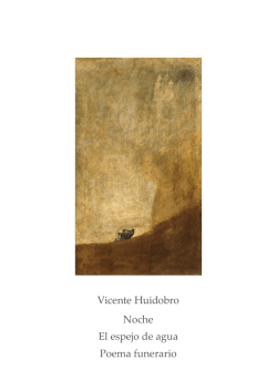


© Copyright 2026