
Chinati Foundation newsletter vol20
Chinati Foundation newsletter vol20
1
COVE R, INSID E FRONT COVE R, P G 3: LARRY BEL L, 6X6 AN IM P ROVIS ATIO N, (INSTAL LAT ION V IEWS ), P HO TOG RAP HS BY ALEX M ARK S.
Contents
Contenido
2
2
LETTER FROM THE DIRECTOR
C a r ta d e l a d i r e C t o r a
Jenny Moore
larry Bell
4
Robin Clark: Glass Labyrinth: A Context for Larry Bell’s Standing Wall Sculptures
14
Larry Bell in Conversation with Marianne Stockebrand
21
6x6 an improvisation: photographs by Alex Marks
Sharon JohnSton and Mark lee
38
Karen Stein: All Roads Lead to Marfa
40
Johnston MarkLee, Architects: An Overview
roBert irwin
52
Adrian Kohn: A Way to Look at Things by Not Forgetting Their Names
donald Judd
64
Erin Shirreff: Judd with Camera
S PA N I S H T R A N S L AT I O N S
t r a d u C C i o n e S a l e S Pa Ñ o l
68
70
74
80
80
robin Clark: Laberinto de vidrio: Un contexto para las esculturas de muros de pie de Larr y Bell
larry Bell en una conversación con Marianne Stockebrand
adrian kohn: Una manera de mirar las cosas no olvidándose de sus nombres
karen Stein: Todos los caminos llevan a Marfa
Johnston Marklee arquitectura: un resumen
C H I N AT I E X H I B I T I O N
e x P o S i C i ó n d e C h i n at i
86
Charlotte Posenenske and Peter Roehr
Charlotte Posenenske y Peter roehr
C H I N AT I B E N E F I T E D I T I O N S :
e d i C i o n e S B e n é F i C a S d e C h i n at i :
88
Jeff Elrod, Sterling Ruby
ARTISTS IN RESIDENCE
a r t i S ta S e n r e S i d e n C i a
90
104
Daniel Turner, Thomas Eggerer, Monika Sosnowska, Jeremy DePrez,
John Newman, Jennifer Paige Cohen
Staff News
noticias de nuestro personal
105
Internship Program
Programa de becarios
106
Funding, Membership
Financiación, afiliación
112
Visitor Information
información para visitantes
Staff/Board; Credits/Colophon
Personal/Consejo ; reconocimiento/Colofón
1
of Irwin’s signature shaping of light
and space was announced two years
ago when Chinati began the capital
campaign to fund the project. Robert Irwin has remained committed to
Chinati and to this project over many
years. We are in the final phase of
fundraising for the project and and
would like to thank Chinati’s trustees and all the individuals, families,
foundations, and philanthropies that
are contributing to this endeavor. We
look forward to celebrating the opening of Irwin’s installation in summer
2016.
Last year another magnificent piece
was created at Chinati, Larry Bell’s
6x6 an improvisation. Donald Judd
admired and collected Bell’s work
and installed it permanently in his
¡es emocionante ver que por fin la visión de irwin para el emplazamiento
se convierte en una realidad! Con más
de quince años de planificación, la instalación en Chinati será la única obra
permanente de su género de irwin,
uno de los artistas americanos más
influyentes. esta manifestación, con un
emplazamiento específico, que destaca
la distintiva formación de la luz y el espacio que crea irwin con tejido sintético,
se anunció hace dos años cuando Chinati
comenzó la campaña para financiar el
proyecto. el progreso que hemos hecho
y la cristalización de la instalación sólo
han sido posibles gracias a la verdadera dedicación de robert irwin, que ha
mantenido su compromiso para con
Chinati y con este proyecto a lo largo de
tantos años, y debido al gran apoyo de
consejeros y financiadores de Chinati,
los cuales se enumeran en este boletín
informativo. estamos en la fase final de
la recaudación de fondos para el proyecto y estamos muy agradecidos a los
muchos individuos, familias, fundaciones y entidades filantrópicas que están
contribuyendo a realizar esta iniciativa.
lo que está tomando forma en el desierto
en Marfa –en los terrenos de este museo,
donde otros muchos artistas han creado
obras que se encuentran entre lo mejor
del arte de nuestro tiempo– seguramente
será extraordinario. estamos deseando
celebrar la apertura de la instalación de
irwin durante el verano de 2016.
el año pasado, otra magnífica obra tomó
forma en Chinati: 6x6 an improvisation
de larry Bell. donald Judd admiraba y coleccionaba la obra de Bell y la instaló de
forma permanente en su estudio del tercer
piso de la calle 101 Spring. allí, el cubo de
vidrio de Bell era la única escultura que
Judd incluyó entre su propia obra. Bell
llegó a Marfa el verano pasado con una
There are construction workers at
the site of the old hospital for Fort
D. A. Russell, pouring the concrete
slabs and laying the foundation for
the masonry blocks that will become
Robert Irwin’s permanent installation
for Chinati. We broke ground on the
project in the first week of June.
How thrilling to see Irwin’s vision for
the site finally becoming a reality!
Over fifteen years in the planning,
this artwork in the form of a building
will be the only work of its kind for
Irwin. This site-specific manifestation
third floor studio at 101 Spring
Street. There, Bell’s glass cube stood
as the only sculpture Judd included
amongst his own work. Bell arrived
in Marfa last summer with an array of six-foot-square glass panels,
many originally fabricated in the
late 1960s and early 1970s when he
began using the material on a large
scale. Bell “improvised” the installation by working off the irregularities
in the floor, the reflective properties
of the windows, and the dynamic
quality of light flooding the space.
We dedicate much of this newsletter to the spectacular experience of
Bell’s work at Chinati.
During October Weekend 2015 we
will open a yearlong special exhibition featuring work by Charlotte
Posenenske (1930 –1985) and Peter
Roehr (1944 –1968). Working in
Germany in the mid to late 1960s,
hay trabajadores de la construcción en
el emplazamiento del antiguo hospital
del Fuerte d. a. russell vertiendo las losas de cemento y colocando los bloques
de mampostería que se convertirán en la
instalación permanente de robert irwin
para la Fundación Chinati. inauguramos
la construcción del proyecto la primera
semana de junio.
2
serie de paneles de vidrio de seis pies,
muchos fabricados originalmente a finales de 1960 y principios de 1970 cuando
comenzó a trabajar con ese material a
gran escala. Bell “improvisó” la instalación basándose en las irregularidades en
el suelo, las propiedades reflectantes de
las ventanas y la calidad dinámica de la
luz que inundaba el espacio. dedicamos
gran parte de este boletín informativo a
la espectacular experiencia de la obra de
Bell en Chinati.
durante el fin de semana de octubre de
2015 inauguraremos una exposición
especial de un año de duración, en
la que destacará la obra de Charlotte
Posenenske (1930 –1985) y Peter roehr
(1944 –1968). trabajando en alemania a
mediados y finales de 1960, Posenenske
y roehr desarrollaron prácticas artísticas radicales usando técnicas y
procesos que abrieron nuevas vías
para la producción artística. esta será
Posenenske and Roehr developed
radical artistic practices utilizing mediums and processes that opened up
new avenues for creative production.
This will be the first museum presentation in America devoted to these
two artists.
Two core components of Chinati’s
mission, the artist-in-residence and
education programs, continue to
prosper. Seven artists are participating in the residency this year. They
are a vibrant part of Chinati, bringing fresh perspectives and diverse
work to the museum and the town
of Marfa. The education department implemented the pilot program
“Seeing Poetry,” the first of its kind
with area schools. With a focus on
Carl Andre’s Words installation,
la primera presentación museística de
the program explored the power of
the printed word, formal arrangements, and the richness of language
as young artists created their own
poems, artworks, and means of linguistic expression. Students from the
West Texas region and from as far
away as Austin took part. In the coming year, Chinati educators will be
working with college students from
Sul Ross University, many of whom
are our future area educators, to develop pedagogical tools to integrate
contemporary art into broader educational curricula.
I’d like to take this opportunity to extend our thanks to Bill Jordan, who
has served as a trustee on Chinati’s
board for over fourteen years, and
will be retiring. Bill has championed the museum from the opening of the Dan Flavin Project to the
groundbreaking of the Robert Irwin
tas crean sus propios poemas, obras de
importancia dedicada a estos artistas en
norteamérica.
dos componentes centrales de la misión
de Chinati –el programa de artista-enresidencia y el programa de educación–
siguen prosperando. Siete ar tistas
están participando en la residencia de
este año. Son una parte vibrante de
Chinati, aportando nuevas perspectivas
y obras diversas al museo y a la ciudad
de Marfa. el departamento de educación
implementó el programa piloto “Viendo
Poesía,” el primero de este tipo en colaboración con las escuelas del área. Con
un enfoque en la instalación Words de
Carl andre en el museo, el programa
explora el poder de la palabra impresa,
los arreglos formales y la riqueza de la
lengua a medida que los jóvenes artis-
arte y medios de expresión lingüística.
Participaron estudiantes de la región
oeste de texas y de lugares tan lejanos
como austin. durante el próximo año,
los educadores de Chinati trabajarán
con estudiantes universitarios de la
universidad de Sul ross, muchos de los
cuales son nuestros futuros educadores
de la zona, para desarrollar herramientas pedagógicas para integrar el
arte contemporáneo en programas de
estudio más amplios. y estamos particularmente orgullosos de ser anfitriones
en el museo de una reunión de todos los
directores escolares de la región 18, que
representan a más de cuarenta distritos
escolares del distrito educativo más
Project, and acted as board chair in
between. We are deeply grateful for
his many years of devotion, support,
scholarly perspective, and good advice.
I end this letter in remembrance of
Chinati trustee Vernon Faulconer,
who passed away on August 7. Vernon was a person of extraordinary
kindness and magnanimity, unfailing
in his encouragement and curiosity.
Chinati, where Vernon served on
the board for more than ten years,
is one of the many institutions and
charities that he and Amy, his wife
of fifty-four years, generously supported. In addition to the arts and
cultural organizations with which
Vernon was involved, his philanthropy supporting education was equal-
construcción del Proyecto robert irwin,
ly as great. With joy he once mentioned to me a scholarship program
he had begun for students in Tyler,
Texas, specifically kids who were not
at the top of their class but striving
to attend college. As was often the
case, Vernon was pretty unassuming
about it. It wasn’t until his passing
that I learned that the Faulconer Academic Incentive Award for Minority
Students had awarded scholarships
to more than 750 students from Tyler to attend up to five years of college. Vernon was truly a great man
and Chinati was able to accomplish
so much because of his involvement
and generosity. He will be profoundly missed.
me mencionó con alegría un programa
Warm regards from Marfa,
Jenny
un cordial saludo desde Marfa,
y entre medio presidió la junta. estamos
profundamente agradecidos por sus muchos años de dedicación, apoyo, perspectiva académica y buenos consejos.
termino esta carta en memoria del consejero de Chinati Vernon Faulconer, que
falleció el pasado 7 de agosto. Vernon
era una persona de extraordinaria
bondad y magnanimidad, inagotable
en su apoyo y curiosidad. Chinati, de
cuya junta Vernon formó parte durante
más de diez años, es una de las muchas
instituciones y organizaciones benéficas
que él y amy, su esposa de cincuenta y
cuatro años, apoyaron generosamente.
además de las organizaciones artísticas
y culturales con los que Vernon estaba
involucrado, su filantropía apoyando la
educación era igual de grande. una vez
de becas que había comenzado para los
estudiantes en tyler, texas, específicamente para los jóvenes que no se encontraban entre los mejores de su clase
pero que se esforzaban por asistir a la
universidad. Como solía ocurrir, Vernon
era bastante modesto al respecto. no fue
hasta su muerte que me enteré de que el
Premio Faulconer al incentivo académico
para estudiantes Minoritarios había
otorgado becas a más de 750 estudiantes de tyler para que asistiesen hasta
a cinco años de universidad. Vernon
fue verdaderamente un gran hombre y
Chinati fue capaz de lograr tanto gracias
a su participación y generosidad. Se le
echará profundamente de menos.
grande de texas.
Bill Jordan, que ha sido consejero durante
más de catorce años, se jubilará. Bill ha
apoyado a Chinati desde la apertura del
Proyecto dan Flavin hasta el inicio de la
3
Jenny
LARRY BE LL, 6X6 AN IM PR OVISATION, IN STAL LATIO N VIE W. THE CHINATI FOU ND ATIO N, M ARFA, TEX AS.
ALL ARTWO RKS ILL USTRATED IN T HIS ES SAY ARE BY LARRY BE LL.
ROBIN CLARK
Glass Labyrinth:
A Context for
Larry Bell’s
Standing Wall
Sculptures
4
F IG. 2 : LI TTLe B LA NK RI dI NG hOOd, 19 6 2 , A C RY LI C ON SHA P ED C A NVA S, 6 5 X 6 5 X 2 ¼ IN.
C OLLEC TI ON M USEUM OF C ONTEM P ORA RY A RT SA N DI EGO.
The following is an edited
transcript of a talk given at the
Crowley Theater on October 11,
2014 as part of a program
devoted to Larry Bell’s work
during Chinati Weekend. It
was followed by a conversation
between Larry Bell and
Marianne Stockebrand.
suggests a journey, which may reflect Bell’s trajectory
as an artist (over the years he has expressed a
determination to refine, explore, and maybe even to
frolic a little in his practice). A labyrinth might also
reflect the trek that many of us made to Marfa to see
this piece, and can describe the passage of visitors
in and around the sculpture itself on-site. In Greek
mythology, of course, Dedalus built a labyrinth to
imprison a monster. Labyrinth patterns are sometimes
found in cathedral floors to afford those who are
not able to undertake an epic pilgrimage to make
a small symbolic one instead. This might be a lot
to project onto a glass sculpture, so let’s just hold
onto these ideas loosely along with others that
may emerge. When thinking about this body of
work it also seems important to touch on the topic
of stewardship, the responsibility for its care, and
ultimately perhaps also a poetics of ruin. But let’s
start with architecture.
Like nearly all the artists in his generation, Bell
began as a painter. His early canvases featured
geometric shapes rendered in gestural strokes,
such as L. Bell’s house from 1959 (fig. 1). The
nesting squares in the painting, when considered
together with its title, may suggest a room seen
either in plan view or in elevation. From here Bell
started to eliminate the texture of his brushstrokes,
applying opaque color to the unprimed canvas,
and masking off shapes to create parallelograms.
Take, for example, Little Blank Riding hood from
1962 (fig. 2). The bottom right and the top left
corners of the canvas have been literally clipped
off, suggesting an isometric projection of a threedimensional form while also emphasizing the
FIG. 1: L. Be LL’ S hOUS e, 1959, O IL O N CANVAS, 48 X 60 IN. P RIVAT E CO LLE CT ION.
With this talk I’m hoping to offer some context
for Larry Bell’s remarkable installation, 6x6 an
improvisation (which opened this morning at the
Chinati Foundation), and the “standing wall”
series of which it is a part. I’ll begin with a brief
discussion of Bell’s early work, and address some
of the themes that the standing walls call out (for
me at least), including ephemerality, temporality,
subjectivity, alchemy, and contingency. Bell
describes this new installation and others in the
series as “improvisational,” which alludes to
other themes, namely improbability, surprise, and
risk. Along the way it might also be interesting to
consider the work’s relationship to architecture.
Certainly the standing walls can be seen to function
as mirrors, windows, and doors; perhaps also as
portals. Bell’s “standing wall” title for the series is
much more laconic than the “glass labyrinth” idea
I am trying out today. Why a labyrinth? A labyrinth
5
GLASS LABY RINTH
F I G. 4 : P heNOM e NA L: C A LI F ORNI A L I GhT, SPA C e, SURFA C e , INSTA LLATION
VI EW SHOW I NG L A RRY B ELL’S W ORK , THE M USEUM OF C ONTEM P ORA RY A RT
SA N D I EGO, 2 0 11.
F I G. 3 : A W I SP OF T he GI RL She US ed TO B e, 19 6 3 , A C RY LIC ON C A NVA S
W I TH GLA SS A ND M I RROR, 4 8 ½ X 4 8 ½ X 3 I N. NORTON S IM ON M USEUM ,
PA SA DENA .
by Bell’s work, I think implicitly until the early 1980s
and then explicitly when he started to have direct
references to the work of H.G. Wells in his titles.
We’ll return to that.
Next, as with the paintings, the cubes underwent
a process of simplification, losing the elliptical
embellishments and the metal framing devices
around their edges. An installation view from a
2011 exhibition called Phenomenal: California
Light, Space, Surface, illustrates this trajectory.
Phenomenal, which I curated at the Museum of
Contemporary Art San Diego as part of the Pacific
Time series of exhibitions, featured work by thirteen
artists based in Los Angeles for whom light was
a primary medium. Bell’s work filled two large
galleries, presenting a survey of his development
from 1960 to 1980. One gallery charted the
evolution of the cubes from the hybrid forms up
to the more austere cubes; the installation was
conceived as a kind of garden of cubes (fig. 4). The
other gallery featured a standing wall sculpture from
1970.
I am showing this studio portrait of Larry from
1966 (see p. 17), because who could resist? It’s also
a nod toward what I would call the technological
sublime in Bell’s work. In the mid-‘60s Bell began
working with his own high vacuum thermal
evaporation tank to treat glass elements of his
sculptures. The first tank was relatively small; later
a larger tank allowed him to work on a larger
scale, engaging the visitor’s peripheral vision not
only up close, as he described it with the elliptical
cube, but also from a much greater distance. The
first works that Bell tested with this method were
painting’s status as an object by calling attention
to its edges. Many of Bell’s paintings from this time
explore variations on this motif, and from this twodimensional shape his three-dimensional sculptures
in glass would literally emerge. Bell has explained
that the inspiration for this particular painting came
from a specific architectural element, the skylight
of his Marine Street studio in Venice, although he
has also said that recognizing the similarity of this
approach to Ellsworth Kelly’s paintings is part of
what encouraged him to make a change and to
begin incorporating glass into his paintings in ways
that related to the cube. Soon he began embedding
mirrors describing cube forms into paintings such
as A Wisp of the Girl She Used to Be, 1963 (fig. 3).
A hybrid object, this work straddles both painting
and sculpture by incorporating mirrored glass into a
canvas support. Fabricated cubes embellished with
reflective ellipses that produced spatial confusion,
or spatial reversal, soon followed. Bell has said
that with the ellipse-embossed cubes, “a jungle of
beautiful things happen when you look into the
piece. The more intimate you are with bringing your
peripheral vision into the scope of the limitations of
the piece, the more engaging the patterns become.”
Bell’s description of this “jungle of beautiful things”
reminds me of a moment in J.G. Ballard’s novel A
Crystal World, when a contaminated meteorite lands
in a jungle turning all the surrounding vegetation
to crystals, which then endlessly reflect and refract
one another. When thinking of geometry, jungle and
plant metaphors don’t immediately come to mind,
but when you explore these works visually it does
resonate. Science fiction is another theme suggested
ROBIN CL ARK
6
7
GLASS LABY RINTH
UNT ITLE D, 1969. VACUUM -PL ATE D G LASS BOX WITH CHRO ME BIN DING O N P LEX I SE LF-BASE. CUBE : 18 ¼ X 18 ¼ X 18 ¼ IN. SMITH C O LLEG E M US EUM O F ART, NO RTHA MPTO N, MA S S A CHUS ETTS . PURCHA S ED .
ROBIN CL ARK
8
FI G. 7: UNTITL ED, 1969. 14 SCULP TO RS E XH IBITION VIEW, P LAT E GLASS , 8 UNITS,
EACH 8 FT X 6 FT X 3/8 IN. WAL KE R ART CE NT ER, MINNE AP O LIS.
FIG 6: INSTAL LATIO N IM AGE OF LARRY BE LL, UNTIT LE D, C. 1970 (PASADE NA), IN Phe NO Me NAL:
CALIFOR NIA L IGhT, SPACe, SU RFACe AT TH E MUSE UM OF CON TEM P ORARY ART SAN DIE GO , 2011.
FIG . 5: SPe CTRUM R O O M, 1982, INS TA LLATIO N V IEW, HUD S O N RIV ER M US EUM, YO NKERS , NEW Y ORK .
F I GS. 8 A ND 9 : TW O SK ETC HES F OR G I USEP P E PA Nz A , 19 7 4 ,
WATERC OLOR, B LA C K I NK ON PA P ER, 8 5 /8 X 11 5 /16 IN.
THE G ETTY R ESEA RC H I NSTI TUTE, LOS A NGELES.
installation view of ten standing panels from 1969 is
from the group exhibition Fourteen Sculptors, which
was held at the Walker Art Center (fig. 7). Although
they seem quite blue in the image, these panels
were described as a combination of clear and gray
glass, which may have had a cool tint. Bell similarly
used panels of clear, gray, and coated glass, some
with a greenish tint, for his current exhibition here at
Chinati. Not to be overlooked when considering these
sculptures is the labor and skill required to properly
install them. Views of Bell installing a standing wall
sculpture in the late 1960s show him first placing
panels and then squaring the corners after applying
adhesive to hold them together (fig. 10). Another
image from this photo session is a double portrait of
Bell reflected darkly in his sculpture (fig. 11).
The standing wall format as an opportunity for
improvisation was realized on a large scale with
a work from 1974, The Iceberg and its Shadow.
The piece included panels of numerous sizes and
departed from the regular rectangles in previous
works by introducing some sharply angled panels.
It traveled across the country during the mid-1970s,
including a stop at the South Texas Art Museum in
Corpus Christi in 1976 (fig. 12). Regarding the title,
Bell has said, “I called that sculpture The Iceberg and
its Shadow because of its numerous permutations.
Any given installation would only reveal the tip of
the piece. The Iceberg consists of fifty-six panels
that could be put together with a factorial number of
possibilities—theoretically infinite possibilities.” The
work was acquired by the List Visual Arts Center at
MIT, where Bell did have the opportunity to play with
various configurations of it over time, and also to
narrow strips that he referred to as “shelves.” Here
are two sketches for a room, the perimeter of which
was meant to be traced by treated glass shelves
(figs. 8 and 9). This Spectrum Room was proposed
to the Italian collector Giuseppe Panza in 1974.
The sketches demonstrate some of the ways that
Bell was thinking about both architecture and color
in relation to his glass sculpture of that time. One
sketch is annotated “color will cover all four walls.”
Unlike the cube sculptures and standing walls, both
of which are meant to be lit indirectly by washing the
surrounding space with light but avoid spotlighting
the works or allowing them to cast shadows, the
glass shelves require framing projectors to capture
them directly to create their spectrum effects. An
installation view of a Spectrum Room that was
realized in 1980 and installed at the Hudson River
Museum as part of Bell’s show there in 1982 gives
the sense either that the cube is dispersed or that you
are somehow inside of it (fig. 5).
When he obtained a larger vacuum chamber,
Bell was able to treat large glass panels to make
the standing wall sculptures. A work consisting of
five large panels was first shown in his solo show
at the Pasadena Art Museum in 1972, and not
again until the Phenomenal exhibition in 2011
(fig. 6). With the standing wall sculptures, Bell both
enlarged and fragmented the cube. Each panel is
treated with different thin metallic films, which vary
the transparency and reflectivity of the glass. From
different perspectives, viewers can see themselves
reflected once or many times or simply look through
the panel. This work becomes environmental by
capturing all ambient reflection and activity. An
9
GLASS LABY RINTH
F IG. 11: LA RRY B ELL I NSTA LLI NG A STA NDI NG WA LL SC ULP TURE I N W ORK S F OR Ne W SPA C eS , 19 71.
WA LK ER A RT C ENTER.
F IG. 10 : LA RRY B ELL I NSTA LLI NG A STA NDI NG WA LL SC ULP TURE I N W ORK S F OR Ne W SPA C eS , 19 71.
WA LK ER A RT C ENTER.
to create Solar Fountain, a public artwork for
the city of Denver. They designed a bowl form
from a number of glass panels that were ten feet
tall and treated with a golden metallic film. The
properties of gold were of particular interest to
Eric Orr, who studied the alchemical aspects of
materials including lead, glass, and gold. In this
collaboration Eric Orr was involved with exploring
ancient traditions while Bell’s approach was
perhaps more formal and more environmental,
but their interests came together in a happy union
for this piece. A pumping system caused mist and
fog to rise from the bowl, and I understand that
wind and inversion layers also played a role in its
effect. Although a press release announced that
an endowment was established for the care of this
piece, it was not ultimately well-maintained, and
a little over a decade after it was unveiled it was
decommissioned.
In the same year that he completed Solar
Fountain, Bell created Pink Compass (fig. 15).
Itself a large work, nearly ten feet square and six
ROBIN CL ARK
FIG. 12: The ICe BeRG ANd ITS Sh Ad OW , 1976,
SOUT H TEX AS ART MUSE UM , CO RP US CHR ISTI.
consult with several scientists at MIT who influenced
some of his future projects. Unfortunately, though,
the work was eventually damaged beyond repair,
a recurring problem for Bell’s monumental works in
glass.
In interviews and on his website, Bell has talked
about several “ill-fated fountain sculptures” related
to the standing walls, in which he attempted to
merge water and glass. One such work was Wind
Wedge (1982), which comprised fourteen coated
glass panels and was installed in the zoological
Gardens in Abilene, Texas (fig. 13). A photograph
of the nesting corners reveals the uncanny slicing
of space that the sculpture enacted. Here it seems
that the park and the automobiles surrounding the
sculpture have been gathered up and accordionfolded. (These compressed corners call to mind
another science fiction reference, Madeleine
L’Engle’s novel A Wrinkle in Time, which explores
the idea that time can be folded and one can travel
through it by moving from edge to edge rather
than in a linear trajectory.) An image of the same
sculpture at dusk shows the extreme responsiveness
to ambient light and season that the work can
have (fig. 14). Bell described the way the sculpture
functioned as a fountain by saying, “as the wind
caused the water in the pond to ripple, and the
shape of the pond caused the ripples to encircle
the sculpture, the water climbed up the hypotenuse
edge of the glass on the prism.” (I warned you
that this story does not have a happy ending,
and structural difficulties eventually caused this
piece to fail and be taken down.) The following
year Bell collaborated with his friend Eric Orr
10
F IG . 13: W INd W ed Ge, 1982, WATER F O UNTA IN,
zO O LO G ICA L G A RD ENS , A B ILENE, TEXA S .
looking back from the other side of the panel, there
may be a coating toward the top of the glass that is
more reflective (so you see yourself) and less coating
toward the bottom so that it becomes transparent (so
you see someone else), creating an exquisite corpse
effect. Doubling and suturing of the figure is a
common, although still mysterious, occurrence with
these sculptures. The curator Marie de Brugerolle,
who organized Bell’s recent survey exhibition in
Nîmes, has written, “Larry Bell’s work is informed by
the appearance and disappearance of the human
FI G. 14: WIN d We dG e, 1982, NIGHT V IEW O F WATE R FOU NTAIN,
zO OLO GICAL GARD ENS , ABILE NE, T EX AS.
feet tall, Pink Compass echoes some of the more
acute angles found in The Iceberg and its Shadow.
Pink Compass was originally intended to be a
cast concrete sculpture placed in Albuquerque,
noting directions to El Paso, Denver, Los Angeles,
and Oklahoma City. In the event, however, it was
realized in laminated peach-colored glass and
exhibited at ARCO Center for the Visual Arts in
Los Angeles—a bit further west than originally
conceived, but still functioning as a place marker
and also a potential catalyst for a future journey.
Skipping forward from the mid-‘80s to the
mid-‘90s, here are two installation photographs
of standing wall sculptures from 1997 as installed
in the Reykjavik Museum in Iceland (figs. 16 and
17). The crispness and delicacy of these works
relates closely to some of the panels in the current
installation here at Chinati. The disappearance
of the figure in this image is likely a result of long
camera exposure, but disappearance, and also
doubling of the figure, is something you may notice
when visiting the installation here in person. When
you view a standing wall sculpture with someone
11
GLASS LABY RINTH
F IG. 17 : STA NDI NG WA LL SC ULP TURES, 19 9 7 , C OATED GLA SS PA NELS, REY K JAVIK A RT M USEUM .
F IG. 16 : STA NDI NG WA LL SC ULP TURES, 19 9 7 , C OATED GLA SS PA NELS, REY K JAVIK A RT M USEUM .
Now I’d like to show you a short video clip of
Bell’s 1970 standing wall sculpture as it was installed
in the Phenomenal exhibition. It is photographed
from multiple viewpoints, including from above, and
gives a sense of some of the ways these works both
absorb and reflect their surroundings.
figure. This is the link that animates the surfaces,
shines through the shadows, and perturbs the
visitor.” (In this essay de Brugerolle also explored
the influence of science fiction on Bell’s work,
including his interest in H.G. Wells, and her own
serendipitous discovery of H.G. Wells’s The Time
Machine in a bookshop while visiting Larry in Taos.
There is something about a pilgrimage to a remote
and beautiful place to learn something new that
seems to facilitate discovery.) The figure disappears
in a second image of the Reykjavik installation.
FIG. 15: P INK COMPAS S, 1983, ½ IN. LAMINATED P INK ROS A GL AS S, 72 X 216 X 216 IN. AR CO CE NTE R FO R VIS UAL ART, LO S ANG ELES .
[from Larry Bell’s video narration]
I think the only other installation of these five panels
was at the Pasadena museum when I did a show
that was curated by Barbara haskell, and it’s been
ROBIN CL ARK
12
F IG. 18 : I NSTA LLATI ON I M A GE F ROM P heNOM e NA L: C A LI F ORNI A L IGhT, SPA C e, SURFA C e
AT THE M USEUM OF C ONTEM P ORA RY A RT S A N D I EGO, DOW NTOW N LOC ATION, 2 0 11.
Larry’s exhibition this morning I was startled and
alarmed to hear the sound of breaking glass, and
for a moment I feared the worst before realizing
that the scale was off. It was a little tinkling sound,
the shattering of a champagne flute, and not the
colossal smash and thunder of a falling six-by-six-foot
glass panel. It reminded me that the sculptures and
visitors alike exist in a state of contingency and risk.
Handled with care, these works can last for quite
some time, but many of them have been lost and it
is incumbent upon institutions to do their very best
to support the preservation of the work. I’m hoping
that the installation we’ve all had the opportunity
to experience this weekend at Chinati will find a
permanent home here. It is a majestic location for
the work. We saw that the related work in San
Diego very much reflected its urban surround (San
Diego’s not terribly urban, but that particular location
has trains, trolleys, cars, bikes, and pedestrians
all passing by). Here at Chinati it’s an extremely
different context: it’s contemplative, the light is
diffuse in the gallery, and I am delighted to imagine
what the work will be like at different times of day
and different times of year. I applaud Chinati’s
commitment to present this ambitious installation and
appreciate the chance to see it here in dialogue with
the work of Larry Bell’s longtime colleagues John
Chamberlain, Robert Irwin, and of course Donald
Judd.
in the crate since then. It looks real good for being
in the slammer for so many years. I’ve always been
interested in the surfaces of glass, and they are
quite varied. Although we tend to think of glass as
a window, it is a solid liquid that has at once three
distinctive qualities: it reflects light, it absorbs light,
and it transmits light all at the same time. I like to
play around with those things [and] alter some of
them slightly (which changes the rest of them). By
taking this window out of context of being in a wall
to separate things and putting it in the center of a
room as a sculpture, another kind of credible tension
exists in the piece. It’s an improbable tension, and
my work’s always been about that kind of stuff. The
fact that the ceiling is so high allows the piece to
stand in a kind of magical, mystical presence. It
gives the piece a chance to have light coming at it
from different kinds of sources, from two different
main directions, and the white walls incorporate
themselves into the reflection of the piece.
One final image: this is Bell’s standing wall piece in
San Diego (fig. 18). I chose it for the various types of
reflections you can see. From one angle the figure
is crisply realized in reflection, from another angle
he’s blurry, and from still another he’s vanishing. The
movement of the trains outside is captured, as is the
reflection of the architecture above and below the
sculpture. In the image, it seems as though the piece
is swallowing everything up—while at the same time
reflecting everything back out.
Concluding, I’d like to say that when we
talk about stewardship of this work, we need to
consider the condition of loss. When I was in
Robin Clark is Director of the Artist Initiative
at the San Francisco Museum of Modern Art.
13
GLASS LABY RINTH
Larry Bell
in conversation with
Marianne Stockebrand
Crowley Theater, Marfa, Texas,
October 11, 2014.
14
by the Getty Conservation Institute last
year explaining many of the details of the
procedure and the material. We’d like
to show it to you, because then it will be
much easier to pick up on the specifics of
the material and the coating process.
M a r i a n n e S t o C k e B r a n d : Thank
you, Larry, for being here, and to Robin
for her wonderful introduction to Larry’s
work. I think it gave all of us a very
good entrée and a framework within
which we can now consider Larry’s work
here in a conversation, and I hope that
some of you will have the curiosity to
go further and look into what Larry has
done in the past. Today, of course, we
want to mostly concentrate on what has
happened here over the past two weeks:
the installation of Larry’s exhibition
6x6 an improvisation. I wanted to pick
up on what Robin indicated earlier,
namely that glass is a material that Larry
has used for many years: since the early
‘60s, with the first standing walls dating
from the late ’60s. Glass is a material
that has difficulties in handling in spite of
the fact that it looks so clear and matterof-fact in the exhibition space. It has
characteristics that we want to go into
a bit more momentarily, by explaining
one of the treatments that Larry uses on
the glass panels. All of you who have
seen the exhibition today have noted that
Larry has used clear glass—very slightly
green, almost clear glass—and then dark
gray glass and a third category, glass
that is coated. It’s a very special coating
procedure that he has applied since the
late ‘60s, when he first began using these
materials. There is a wonderful film, very
new and up-to-date, that was produced
[Excerpts of Larry Bell’s narration from
Larry Bell: Seeing through Glass]
My work is about the various properties
of light and the way it interacts with
surfaces. I use glass because it’s an
available material. It’s not terribly
expensive, but it also has three interesting
characteristics in that it reflects, absorbs,
and transmits light at the same time. The
surface techniques that I use include the
deposition of very thin layers of various
materials onto either one side of the glass
panel or both sides. It’s done in a process
called thermal evaporation in a vacuum.
It deposits an exquisitely thin and
controllable film of materials that adheres
well to the glass and changes the nature
of the way the light is either reflected,
transmitted, or absorbed.
The first constructions that I did that
incorporated glass were just when I got
out of art school in 1959. Then I went into
incorporating mirrors and glass surfaces
into both the paintings and some small
constructions, and it led to the focus on
glass exclusively for what I was trying to
do. I found it very interesting.
Somebody told me about a process that
was used in the film business for making
efficient reflectors and lenses. I went to
the L.A. phone book and looked up the
process and contacted somebody that
did it and I hired that company to do my
original work. For my first one-person
show in New York, several of the pieces
were damaged in shipping, and the man
I hired to repair the sculptures suggested
that I get into it myself, because I
could do a lot more work for a lot less
money if I had the equipment. I was not
mechanically inclined, but it did seem like
a reasonable thought, and so that’s what
I ended up doing, buying the equipment
and staying in New York for a couple
years.
I worked with that equipment and then
decided I wanted to do some larger
things, and I ended up with a company
that would build a larger coating system
15
for me. It was made near Niagara Falls
and shipped to Venice Beach. That piece
of equipment arrived at my studio in
1969, and it started a whole different
kind of concept for the use of it.
When I decide on doing a series of
cubes, the first decision is how big
are they going to be and what kind of
glass am I going to work with. We find
the material that is free from as many
scratches as possible—glass may look
perfect, but it has a lot of scratches. So
we have to find good material, and it
has to be cut to the size that I want and
beveled so that the parts go together at
exactly ninety degrees. You have to clean
the surface of the glass well enough that
the coating will stick to it, so after an
ultrasonic cleaning of the surface of the
glass, it goes into a vacuum chamber
where the air is removed. The chamber,
in a sense, gets like a big light bulb, in
that a light bulb has tungsten filaments in
it that get bright. The tank has those also,
and on those filaments are the materials
that will heat until they evaporate, and
there’s no air between the source of
the evaporation and the surface to be
coated, so the evaporated metals adhere
to the clean surface and have the same
natural crystalline structure as a thin film
that they did as a solid, so the optical
qualities are the same.
In the last few years I’ve been
concentrating on the use of a nickelchrome alloy called Inconel as the
material that raises the reflectivity of the
surfaces. The silicon monoxide interferes
with the light. For my purposes it works
exactly the same as a little bit of gasoline
does on a puddle of water: it interferes
with the light that’s reflected off the water
at wavelengths equivalent to the thickness
of the coating. I have the ability to control
the wavelengths that I want by their
thickness. My criterion is pretty simple:
I want it to be something new. I want
to feel that the piece is different from
anything I’ve done before, even though
the format is the same.
If [the works] are cared for, they’re going
to be around for a long time. If you drop
them, they’ll break. There’s a fragility in
everything. There’s a patina that comes
to everything with age, and I don’t try
to fight that patina. I like it. I like to see
LA RRY B ELL IN CO NV ERS ATIO N WITH M ARIANNE STOCK EBRAND
the pieces have a lifetime. But I don’t
want to interact with the art world as a
conservator. When my time is up, the stuff
goes into some other hands. I don’t know
how to think about what my responsibility
is to those things. I wouldn’t mind hearing
creative options from the bigger world
about how to deal with these things, but I
don’t want to spend a lot of time thinking
about that. everything has its lifetime,
and I’m not the timekeeper, I’m just the
artist.
[end film]
l a r r y B e l l : Just remember, I’m not the
timekeeper. [Laughter]
M a r i a n n e S t o C k e B r a n d : Let’s talk
about this a bit more. After seeing the
film and understanding the process a
bit better—particularly after seeing the
big machine, the tank—a fascination
remains, having to do with questions such
as, how can you control the size of the
area that you want to be coated darker?
How do you control the phasing of the
darker color into the clear glass?
B e l l : With sleight of hand and great
skill.
S t o C k e B r a n d : And that great skill
came with experience, I suspect.
B e l l : I try to make a stab at a certain
kind of discipline each time I work, and
if you do enough stuff, that discipline
eventually adds up to the point where
you have tools that you can play with.
Originally I attempted to do very even
coatings on pieces, because that’s what
I first bought the equipment for, and then
I found that making the coatings variable
in their densities was more interesting
to look at. So then I focused on learning
how to do a gradient so that it had that
kind of fading reflectivity and rising
transmission and a sort of captured
absorption at a certain point in the
thickness of the coating.
S t o C k e B r a n d : Can you do that by
programming your machine?
B e l l : You can, but I don’t do any
programming like that. It’s all by
watching through windows and setting
up the vapor sources where I know
they’ll do a certain thing. Then I place
the material to be coated in the known
vapor stream so the angle that the glass
might be placed at will affect how the
LA R RY BELL IN CONVE RSAT IO N WIT H MARIAN N E S T O C K E B R A ND
coatings are more reflective where it’s
closer to the source, less reflective when
placed further, and so on—simple spatial
relationships between the vapor source
and the part itself.
S t o C k e B r a n d : And what about color?
What we’ve seen in the exhibition is
largely one scheme of color—a darkish
gray tone—but I know from your smaller
pieces, such as the cubes, that you’ve
also coated color to make iridescent
surfaces. How do those pieces work in
comparison to the work in this exhibition?
B e l l : Well, I like colors. I like blues
and yellows a lot. So a lot of that is
transported to the work by something
called “interference color”—the layers
interfere with the light that strikes
the surface at the wavelength that’s
equivalent to the thickness of the film
that’s been applied. If the film is metal,
it will have a somewhat bright reflection
off the surface, depending on how thick
the metal is. If the metal is extremely thin,
you may not even see it, but when it’s
overcoated with a quartz-like material,
the interference color—the interference of
the light at the wavelengths determined
by its thickness—is enhanced. In other
words, it’s brighter with a little metal
under the quartz. It depends on how
I stack these films up. If I’m using two
materials I tend to coat the parts three
or four times in the process and watch
through the little window to see what the
colors are.
It’s a very simple thing. I have a
fluorescent tube inside the tank that’s
just above the window I’m looking
through, and on the other side of the
tank is another fluorescent light that I
can see through the glass (the glass is
between the two light sources). They’re
long tubes. The reflection of the one in
front of the window I’m looking through
appears in reflection on the glass. Below
it, in transmission, is the one that’s on
the other side of the tank. The color will
shift through the spectrum in reflection
on the glass and I will see that color
by the reflected light off the one that’s
closest to me, and I’ll see the transmitted
characteristics by looking at the light tube
that’s on the other side of the glass.
You teach your eyes how to see things,
and it takes a while. Each time I do a run
16
of things, I have to get my chops back.
It’s a little like playing the piano or the
twelve-string guitar. The more you do
it, the easier it all gets. Usually all the
mistakes are made in the first month or
two of doing a run. You get all of the
clumsiness out of the process and then go
on to just do the things.
S t o C k e B r a n d : How long does it take
to coat one large panel? What’s the
process time?
B e l l : A couple hours in the tank, but
the preparation, cleaning them properly,
takes a very long time. We used to
clean them all by hand until we got that
ultrasonic that you saw in the film.
S t o C k e B r a n d : But that’s only for the
smaller sizes.
B e l l : Well, it will cover up to a meter
square. The big glasses were all handcleaned with squeegees and face masks
and rubber gloves.
S t o C k e B r a n d : And to be clear, the
panels are coated on both sides?
B e l l : On both sides.
S t o C k e B r a n d : I think that’s really
important. And are there mistakes? If a
panel doesn’t work out the way you want,
can you still use it? Or do you toss it out?
B e l l : It depends on how bad the error is.
S t o C k e B r a n d : That’s what I want to
know: where is the borderline?
B e l l : When the part looks good, it’s
acceptable. When it looks like shit, I
throw it out. [Laughter]
S t o C k e B r a n d : I think that’s totally
clear. [Laughter]
B e l l : It’s not too complicated, really.
[Laughter]
S t o C k e B r a n d : Okay. And are there
any surprises? When you send a glass
panel into the machine, do you know
what you want to achieve? Can you
anticipate it clearly, or not at all? Is it a
surprise?
B e l l : No, I know pretty much what
I’m going for. Whether I can do it or
not is another story. I’m not really an
engineer or a physicist or anything else.
This is kind of a high-tech procedure
which is basically very simple. You heat
a material up until it reaches a vapor
pressure in an environment that has no
air. When it reaches a vapor pressure,
it will evaporate. What’s evaporating
has a certain crystalline structure as a
days, when these things were totally
charming and new to me and making
them was so much fun—when I had the
feeling of doing something nobody else
was doing and ending up with something
I’d never seen before and I didn’t think
anybody else had seen before—that was
all very invigorating. But in those days I
was 35, I was 40, I was 45… Now I’m
almost 75. That shit is really hard to lift.
[Laughter] And whereas it was possible
to get somebody else to come in and
do it, the sensuousness of the work was
what I was after. I liked lifting the stuff,
LARRY B ELL IN HIS NEW YO RK S TUD IO , 1965.
solid. When it evaporates and grows
on another surface—the film—it goes
back together with the same crystalline
structure that it had as a solid. So it has
the same optical qualities as the thin
film. Now on a larger surface it’s rather
arduous to maintain an absolute blue or
yellow, so I work with something that’s
not so absolute. It’s almost blue or it’s
almost yellow, and that’s okay with me.
S t o C k e B r a n d : Having seen now how
heavy the panels are, and how difficult
it is to handle and position and put them
together, I think it’s remarkable that
you’ve treated all the panels yourself
in your machine. Are there no other
mechanical systems? For instances, are
there factories—?
B e l l : There are new techniques. I’m a
dinosaur, and so is my equipment. The
process itself is absurdly expensive and
uses vast amounts of energy and water
to run. There are new techniques that
have the same end result in terms of a
thin film. I deliver my coatings to the
surface of a piece of glass by electrons
that cause heat in a tungsten filament and
cause the the material to evaporate. The
newer techniques deliver the material
to the surface via ions. This uses much
less energy and is much more efficient to
control and does not require anywhere
near the pressures that are required
in my process. But I learned how to
do it the old way, and I’ve just always
done it that way. I’m not that big on the
technique—I like what I do. I’ve thought
about upgrading the system, but it’s so
absurdly expensive. These techniques
were really developed for businesses
that required millions of square meters
of almost identical material. I just make
a few things and do what I can with it.
I can’t really afford to make a big step
in another high-tech area, even if it’s a
much more elegant and less cumbersome
way of doing it.
S t o C k e B r a n d : We talked about this
the other day, when I was asking pretty
much the same question. You were saying
that if you went to a factory where they
coat glass panels such as these, they do it
in very large quantities, and it’s not really
available for your needs.
B e l l : I tried to find somebody who could
do this stuff for me for years. In the early
I liked looking at it, I liked all that kind
of sensuous stuff. It gave me a feeling
of satisfaction—that I was really doing
something with real stuff. It was hands-on.
S t o C k e B r a n d : I think that’s a very
important point, and as I learned
yesterday from your conversation on our
local radio station, you were initially
rather reluctant to do a show of the glass
panels when I first approached you. You
feared having to handle these large glass
pieces.
B e l l : The first time you suggested doing
it, I got a backache. [Laughter]
S t o C k e B r a n d : You didn’t show it. You
didn’t get your Advils out. [Laughter]
B e l l : There’s all kinds of equipment that
can handle this stuff really effortlessly—
but I don’t have any of it. [Laughter] It’s
17
all hands-on, you know? It’s all heavy
lifting. Terry Allen said he was gonna
write a song for me called “The GlassGrunting Yodel.” [Laughter]
S t o C k e B r a n d : But then you agreed
to do the show, or at least look into your
inventory…
B e l l : There’s not a lot of that stuff that’s
at my disposal anymore. There are pieces
in collections—institutional collections
and a few private ones—but those people
would be crazy to lend that work. We
brought a piece from London. I harvested
together as much of the material that I
had that was six feet square, because
that was the key to this improvisation,
that all the parts were exactly the same in
size and weight. One broke in transit.
S t o C k e B r a n d : It seemed clear from
the beginning that we didn’t want to
borrow anything from other institutions or
private collections, but that that this was
something that needed to be assembled
here. I’d like to ask you a little bit more
about how you approached this. Once
you knew what was available in your
inventory, you realized there weren’t
enough panels to make a whole show, so
additional panels in clear glass and dark
glass were cut and brought here. But then
you had to deal with how to assemble
them and how to place them in the show.
B e l l : I liked the idea of mixing up the
parts. Some of them were coated and
some were not; some were old and some
were brand new. There was a really
clear glass that I had access to and a
normal clear glass, which is actually
kind of green. The difference between
the low-iron glass that’s very clear and
the normal glass that’s sort of green, the
space of that color differential—it’s those
subtleties that I really like. I like playing
with your eyes, making your eyes study
the differences. It had been a long time
since I’d done an improvisation.
What I had to work with were leftovers
from different experiments, and I made
up some clear ones and some gray ones
to kind of act as a filler for whatever
was going to happen with this. The
key for me to getting an improvisation
done is the speed that it’s executed
with. I have to work fast or else I can’t
be improvisational. If I have to study
something for very long, then it all goes
LA RRY B ELL IN CO NV ERS ATIO N WITH M ARIANNE STOCK EBRAND
flat. There’s a charm that’s imparted to an
environment by the speed with which it’s
done. So when I realized that we couldn’t
do what I had originally planned to do
with these things… not that I knew what it
was going to look like, but I had an idea
where to begin. The installation is made
up of a series of right angles that, when
we discovered we couldn’t do it because
of unevenness in the floor, I just started
putting stuff up and letting the floor
determine where I could go with it.
S t o C k e B r a n d : I thought there was
one extremely interesting moment. You
came in the morning and had this idea
of working with and responding to the
walls, and you realized that the floor,
in spite of the carpet that we installed,
was in certain areas so uneven that it
was impossible to place these long glass
panels of six-foot lengths and quite a bit
of weight there and make them stable
and at precise right angles—and bang,
just shortly afterward, you placed the first
corner, and then another. It was stunning
how it developed from that earlier,
perhaps not precisely formulated concept
to the second idea. Was it an idea? Or
was it happening—
B e l l : No, the imperative was speed—to
not worry about any condition that we
had other than stability of the parts,
and so let the piece grow out of what
we could do. I knew how to glue these
things together, it was just, how do we
glue them together so that they look like
right angles? You’ll notice that all these
parts are exactly the same size, and
when you look at the installation, you’ll
see that some of them appear one-fourth
of an inch taller than the others. Well,
it’s not the part, it’s the floor—that’s what
we had. I want not only ninety degrees
for the parts, but I want ninety degrees
where the piece meets the floor. The
parts want to be at rest, balancing on
the weight of their own vertical thrust,
with a simple bead of silicone rubber
bonding them together and the glass
nesting down into the carpeting, which
worked beautifully to act as a kind of
shim on the floor, rounding out a lot of
stuff that would be intolerable for the
parts. And it just kept going. I tend to
like symmetrical relationships, so that
means I would prefer to have had, in
LA R RY BELL IN CONVE RSAT IO N WIT H MARIAN N E S T O C K E B R A ND
each relationship with the panels, a thirtysix-inch space between each of the right
angles—half the base widths of the parts.
When you line things up like that, there’s
a very strange world that’s created by
the reflected light in relationship. There’s
no ambiguous space to the thing, where
your eye wants to believe that there’s
ambiguous space there. These are the
subtle tactile qualities that I like about
these things. Well, we couldn’t get three
feet apart because of floor problems, so
it ended up being three-and-a-half feet,
four feet, something like that. But there’s
a line-up; I tried to line the center bevel,
where they’re held together, in one line.
We managed to do that pretty well.
S t o C k e B r a n d : The pieces in the
connecting wing are three feet apart,
but the other have more space between
them. What’s fascinating is the interplay
between these various panels and
surfaces and reflections and transmissions
of light. When I look at them, I think of
a different form of painting, particularly
when the coated glass merges into
something different and so on. It was
interesting that Robin referred earlier to
Josef Albers and his superimposition of
planes of different color. I wonder if any
of that has played a role for you—do you
think of these kinds of paintings?
B e l l : Not in the case of this improvisation. We had thirty-nine parts to work
with, and it cost a lot of money and a lot
of calories to move that stuff here, and I
wanted to use as much of it as we could
and see what happens. I think of shows
like this really as an extension of my
studio—it’s something that I can do that
I can’t do in my studio, because I don’t
have the room. This is such an interestingly shaped space. There’s no electric
light in there, it’s just windows, and the
one wing that doesn’t have windows has
light coming in from the side, which is
changing its intensity from one side to the
other all the time. I didn’t have to do very
much to activate those things. I just knew
if I could get these things up, it would do
something very interesting.
S t o C k e B r a n d : If I’m remembering
correctly, so far you have always done
individual sculptures in different configurations. Is this the first exhibition where so
many units make one entire piece?
18
B e l l : It’s the biggest by one panel.
The Iceberg piece that there were some
pictures of earlier was fifty-six panels of
glass, but I never got the whole thing up.
The most that I could put up was thirtyone.
S t o C k e B r a n d : Was that because of
space limitations?
B e l l : Time. There was never time for an
entire installation. If I signed up to do a
show, the show before ended at a certain
date, and there was only a certain
amount of time for the installation before
the opening, so I had to crowd everything
into that time slot. So I ended up with the
Iceberg being thirty-one pieces, which
was the most I ever got out of it.
S t o C k e B r a n d : And that was one
contiguous line of glass panels, so the
floor and other conditions needed to
be absolutely precise—much more than
here.
B e l l : Well, being here was a very
special thing, and it really had as much
to do with my affection for you, and for
Donald and our longtime friendship,
and for what you’ve tried to do here. But
otherwise I would never have done a
show on a floor like this. [Laughter] When
I was doing my pieces before, I would
never do that to myself. What’s really
interesting is that the flattest floor I ever
came across was a wooden parquet floor
at the Santa Barbara Museum of Art. You
could stretch a string across that floor
with no gaps anywhere. It was amazing.
S t o C k e B r a n d : Parquet has a pattern.
How do you see the carpet that’s in the
exhibition space now, which is relatively
even and gray, versus a very straight but
very patterned wooden floor? How did
you make that pattern work for you?
B e l l : Everything that you do teaches
you something. I’m always tripping over
things in my studio activities that can take
me in a different route with the next thing
or give me an idea for something else. I
did a show at the Detroit Institute of Arts
years ago of some glass panels. But at
the same time I was making furniture,
and playing around with light projected
onto glass and so on, so I made this sixfoot-by-eight-foot box with a chair sitting
in the center of it. The chair appeared to
dissolve because of the coatings on the
glass, which were highly reflective where
the glass met the floor and faded to a
thinner coating rising up until the glass
was perfectly clear at about center-point
on the vertical axis. I used the pattern on
the parquet floor as a guide for where the
piece was to go, then put some patches
of light on the floor. You saw a photo
earlier of a similar piece, where I put
a cube inside a big box and then put
patches of light around the box exactly
the same distance from the outside
surface of the glass as the cube was from
the inside surface, so the cube appeared
to dissolve in the center of the box. The
chairs did the same thing.
Then I decided I would try making some
really small things. I started making some
small maquettes of what I had had just
done in Detroit, and it became a game,
a playable game. I called it Chairs
and Space. The glass sculptures sat on
a forty-two-inch-square checkerboard
table. The chairs were two inches square
and sat inside the sculpture, like my
installation in Detroit, and several of
different colors sat on the squares outside
the sculpture. Four people could play
the game, each one having a colored
chair, and two dice were rolled. An odd
total determined the number of squares
and direction that the chairs could move
on the checkerboard. The idea was to
try to put your chair in a position so
that its reflection in the little sculpture
overlapped the actual little chair that
was sitting inside the sculpture, so that
they appeared to be the same thing. The
center sculpture was actually shaped like
the outside one; it was a block of solid
acrylic, shaped the same way, that filled
with light, so it was a kind of ghostly
white thing floating in the center. If you
rolled a six or something, it meant you
could move your chair six spaces side
to side on the checkerboard. Certain
other combinations determined if you
could rotate your chair or not. Part of the
objective was to get your chair in that
reflected space of the target chair, but
also, if one of your opponents were to
roll a combination that allowed them to
occlude your reflection in the sculpture,
then you were out of the game. So you
wanted to watch where everyone was.
It was a game of perception happening
on the table. It was a thundering flop.
[Laughter] I thought it was gonna be
hotcakes. [Laughter]
S t o C k e B r a n d : That reminds me of
a few rooms that you’ve built. Robin
showed one in her talk earlier, where
you installed some narrower glass pieces
along the three sides of the room, and the
reflections then create illuminations and
colorations on the wall.
B e l l : I thought it was a wonderful idea,
so I made it and it didn’t work. I made
it without any fine-tuning in my studio. I
took it to the site and it looked like hell.
S t o C k e B r a n d : Oh, so you never made
it?
B e l l : In fact we made it at the Hudson
River Museum, but it looked so bad I
decided to close.
S t o C k e B r a n d : The photos looked
terrific.
B e l l : Yeah, well… [Laughter]
S t o C k e B r a n d : Okay, let’s change the
subject. [Laughter]
B e l l : You win some, you lose some.
[Laughter] Robert Irwin and I were in a
show once in London with Doug Wheeler.
Those guys got there way before me and
chose the places where they wanted to
do their presentations, and when I got
there what was left was a rotunda room
that didn’t really suit what I thought I was
going to do in there, which had to do
with the reflection of a glass rod hanging
from the ceiling. What I was doing didn’t
work at all until I saw the reflection of the
glass rod in the granite floor. I thought
the glass rod would appear as if it were
floating in the space, but it didn’t. But it
was visible on the floor. You couldn’t see
the glass rod—but on the floor you could
see it. That was just a revelation to me.
I went from feeling like a complete jerk,
with these two other characters doing
their great stuff, and then it just worked,
you know? I was looking in the wrong
direction. [Laughter] So I found the work,
and I was so gratified by that. There was
some great press which said, “Artist turns
light off at the Tate’’—because it was a
dark room, a dark space.
S t o C k e B r a n d : I wanted to ask you
how you met Donald Judd. Here we are
in Marfa, and Don owned some of your
work—there is a beautiful painting from
1962 here in the mezzanine of the Bank
Building, together with an Albers painting
19
and one by Antonio Calderara and
some old Russian furniture, which is an
incredible combination.
B e l l : It’s great. It’s a fantastic room.
S t o C k e B r a n d : And at Spring Street in
New York there is one of your cubes, and
we know that there is more work in the
inventory by you, so you had this lifelong
friendship. When did you first meet him?
B e l l : I met Don in ’65 when I did my first
one-person show in New York City. It was
at a party that Frank Stella and Barbara
Rose, who were married at the time, had
for me. I actually didn’t know Frank at
the time. I knew his wife, because she
had interviewed me for an article she
was going to do. So they had this party,
and Don was there, and so was Barney
Newman and John Chamberlain. I had
met Chamberlain in Los Angeles in ’62,
and I hit it off with that guy really fast.
Don and I became real close. Every time
I went to New York I made a point of
seeing him, seeing Chamberlain, and
seeing Frank. Sadly, Frank is the only one
left. Anyway, that’s how I met him.
S t o C k e B r a n d : But then he came to Los
Angeles almost on an annual basis. He
started traveling to the southwest in the
late ‘60s, even to Baja California a few
times, because by then he was already
looking for an alternative, a place in
addition to New York. We’re in Marfa
now, so we know what his decision
ultimately was, but there were a few steps
in between, and I think you witnessed
those.
B e l l : I remember one trip when Don,
Julie, and the two children were coming
back from Baja California. He was so
excited about a place that he had found
there called El Rosario. I remember the
name just because of how enthusiastic
Donald was about the place. I didn’t
fully understand that he was thinking of
making his own country. [Laughter] He
wanted Juddville. [Laughter] I thought it
was an incredibly ambitious and fantastic
plan, and I knew this guy could pull the
thing together—he was not a guy who
said he was gonna do something and
then slink away. But I didn’t think it was
such a good idea to go to Mexico to
do it, because in those days foreigners
couldn’t really own any property down
there. You could use it until they decided
LA RRY B ELL IN CO NV ERS ATIO N WITH M ARIANNE STOCK EBRAND
they wanted it back, and that wasn’t
going to suit Don—putting a lifetime
of work into something that could be
taken away from him. So I really tried to
dissuade him from doing it in Mexico.
But it was very beautiful, this place in
Baja. He showed me pictures—it looked
just like Marfa. But I was doing my own
thing, not thinking too much about what
Don was doing. Whenever I would come
to New York he would welcome me and
tell me about whatever was going on. It
was a very warm relationship. I found the
guy exceedingly droll.
S t o C k e B r a n d : I read a quote from you
about that the other day—that you found
him “amusingly odd,” and since you had
an inclination for odd people, you hit it
off.
B e l l : Well, I think that’s what “droll”
means. [Laughter]
S t o C k e B r a n d : You yourself lived in
New York after your first exhibition there
in ’65.
B e l l : Well, I had never sold anything,
and I went to New York and before the
show opened I had sold everything, so
I was thinking, “Well, why in the hell
haven’t I come here sooner?” [Laughter]
So I decided to stay, I found a place,
I found that equipment that I bought.
You saw the picture of the great East
9th Street studio that I had. But I don’t
actually like cold weather, and so the
winter of ’66… I didn’t want to do that
again. I also missed my buddies out on
the coast. I sort of went off to do a show,
and then had a bunch of action, and then
sort of lost touch with people that I saw
and spoke to every day. I didn’t see them
for months, and I missed them. I missed
the beach too. I liked living in Venice.
It was a very cool place at the time. It
was cheap and funky and a lot of artists
moved down there because there wasn’t
a single commercial business. It was
dead. It was probably like Marfa before
Donald showed up. There wasn’t a single
business—it was too dangerous. But you
could get a 3,000-square-foot studio on
the beach for sixty bucks a month, and
the landlord would even fix the plumbing.
So as happens, as soon as an artist
moves in, another artist moves in, and
then there’s a bunch of artists moved
in, and pretty soon the neighborhood
LA R RY BELL IN CONVE RSAT IO N WIT H MARIAN N E S T O C K E B R A ND
starts coming back. It’s probably what’s
happening here too.
S t o C k e B r a n d : Right.
B e l l : Property values soon preclude
an artist being able to use those spaces
anymore.
S t o C k e B r a n d : Let’s open the forum to
the audience, if there are any questions.
Q u e S t i o n F r o M a u d i e n C e : We
heard a little about materials and the
crystalline structure of the metal—how the
crystals attach themselves to the surface
of the glass—and I was wondering if the
idea of this crystalline structure appeals
to you on a poetic or a metaphorical
level.
B e l l : No, it doesn’t. The materials I use
all have certain optical qualities that are
a characteristic of the crystalline structure
of the material, and when the material
is put into a vapor state by heat and
collects someplace else, it collects with
the same crystalline structure that it had
before because of the vacuum, because
there’s no air to change the stuff. If I add
a little bit of gas to the chamber during
an evaporation, I can actually change
the crystalline structure of the stuff. But I
don’t do that very often. So I use the term
“crystalline structure” not poetically but
simply as a technical description.
Q u e S t i o n F r o M a u d i e n C e : I have a
question about the instructions you give
to collections either public or private.
The reason I ask is, I was in Seattle when
Rem Koolhaas built his library—which I
don’t think was a great library internally,
but was a phenomenal sculpture for
the city—but with the passage of time,
the glass just got dirty and became an
eyesore. So how do you deal with that
with your clients?
B e l l : Well, let me start by saying that
everything on the face of the earth has the
right to a patina. [Laughter] If something
collects dust, that’s its right. If you want
to not have dust on the surface, you must
remove it, which is a whole other thing
from an architectural issue of using the
glass for construction. You’d have to
clean the city, clean the air, get rid of
the cars and everything else—that’s not
practical. A whole kind of conservative
performance has to be applied which has
nothing to do with the architecture. I’m
not so sure that any artist is responsible
20
for the maintenance of stuff once it’s out
of the studio and goes someplace. What
happens to it after that… I don’t know
what to say about that. The instructions
that I give to people when they acquire
something are basically three words:
“Don’t drop it.” [Laughter]
Q u e S t i o n F r o M a u d i e n C e : You’ve
been working with paper for several
years. Did this exhibition stimulate you
to want to go back to working with glass
again?
B e l l : Well, I didn’t have any backing on
these big sculptures. It cost a lot of money
to do that stuff. A lot of calories went
into the maintenance of the equipment
and actually making the things—and by
calories I mean a lot of water, electricity,
all that kind of stuff, plus physical
calories. I reached a point where I just
couldn’t underwrite my stuff anymore
without a support base. We might sell
something somewhere along the line,
but it just went into trying to make more
things that nobody really wanted. A lot of
people wanted to see them, but nobody
wanted to own them. So there wasn’t a
collector base for these pieces, although
there was a lot of enthusiasm about how
they looked. Everybody was afraid of
them, for good reason. I just didn’t want
to carry on doing that; I couldn’t afford it
anymore. So I started working on paper.
I recycle the techniques that I’ve learned
for different kinds of surfaces, and paper
was a wonderful choice. There were so
many variations of surface in different
papers, and what the coatings did on soft
surfaces was quite amazing.
S t o C k e B r a n d : And on mylar in your
newer pieces.
B e l l : Mylar too. I started combining
papers and mylar through lamination,
and even the films that hold stuff together
became materials that I coated. So it was
a whole new media that kind of emerged
out of this frustration that I couldn’t do the
glass anymore.
S t o C k e B r a n d : I think we are
tremendously fortunate to have the glass
pieces here.
B e l l : You’re right. [Laughter]
S t o C k e B r a n d : And we’ll leave it at
that. Thanks, Larry, for doing it.
6x6 an improvisation
by
l arr y
be ll
32 glass panels (clear, gray, and coated), each 6 x 6 feet and 1/2 inch thick
photographs by
alex
mar k s
21
22
23
24
25
26
27
28
29
30
31
32
33
34
35
36
37
Johnston Marklee,
architects:
an overview
All Roads Lead to Marfa
Karen Stein
Many architects today cite Donald Judd as a
formative influence and many more will flaunt
that badge of honor for years to come. After a
visit to the Chinati Foundation, this comes as no
surprise. Here, art, building, and landscape are
simultaneously in perfect union and complete
contrast, bringing a heightened awareness to
the essentials of architecture—space, light, color,
volume, proportion, and material. The impact of
Judd’s work can be, like all forms of influence,
heady but brief or more subtle and enduring. In
the case of Los Angeles-based Sharon Johnston
and Mark Lee, its significance to their careers is
both elusive and specific.
While Johnston and Lee were introduced
to Judd’s art criticism as students at Harvard
University’s Graduate School of Design, it was
later, when they had formed their own firm
and were hired to remodel some bungalows
owned by the Lannan Foundation in Marfa,
that they were truly confronted with his work.
And it made an impression. Some architects
see Chinati as an argument for a singular, if not
On November 28, 2014, the
architects Sharon Johnston and
Mark Lee gave a presentation
about their work at the Crowley
Theater in Marfa. The following
pages present a condensed and
edited transcript of their talk, with
an introduction by architecture
historian Karen Stein.
JOHN STON MARKLEE, ARC H IT E C T S
38
TERRY/ A MIRYA NI S TUD IO .
architects’ work, including projects like the Hill
House and the View House and, most notably,
the Menil Drawing Institute in Houston, currently under construction, the latest addition to
the Menil Collection’s small village of exhibition
spaces. There, as at Chinati, the sum of distinctly
individual parts makes a greater whole.
Occasionally the architects find themselves
back in Marfa. As for many of us who
repeatedly make the long trip to the far corner
of West Texas for reasons of art, architecture,
or something entirely different, the friendships
formed there feel deeply rooted, if not fated,
and more durable than many, perhaps as a
result of the mixed sense of triumph and relief
that comes from discovering such camaraderie
in such a remote place. For Johnston and Lee,
Marfa-made friends have later become informal
advisors, artistic collaborators on projects in
Los Angeles and elsewhere, champions, or even
clients—ensuring them both a way out of the
small town where their careers began and a way
that will always lead back.
autocratic, vision. Johnston and Lee understand
it differently, describing the ethos of the place
using a word not often associated with Judd,
“humility.” The buildings he renovated for his
art and the art of others are, to them, a master
class in “do as much as you need to do but no
more,” according to Johnston. For her and Lee,
the seductive plainness of Judd’s own architecture is not a formal language to be imitated.
Instead, they rely on the same basic truth as
Judd: there is a special beauty inherent in the
practical.
In the nearly twenty years since their first
visit to Marfa, the anti-heroic model of Chinati
itself has become a recurring theme in Johnston
and Lee’s work. Conceived in many ways as
a rebuttal to the traditional museum, Chinati
presents its collection among a dispersed group
of remade and repurposed buildings, creating
an art-viewing experience that is informal but
highly choreographed, episodic but permanent.
It is this reconciliation between the modest and
the monumental that is also characteristic of the
39
AN OVERVIEW
BeginningS
JOHN STON MARKLEE, ARC H IT E C T S
HA LP ERN HOUSE.
house was built here for the Halperns. So I think the relationship of art
to architecture here has continued
to inform our practice, and is really
what inspires our approach to looking at each project in a fresh way.
M a r k l e e : Speaking of beginnings,
we read somewhere that François
Truffaut said that the entire career of
a director is already present in the
first 150 feet of his or her first film.
After reading that, we tried to look
back at our earlier projects, and we
found that one of the things we’ve
always been interested in is the notion of the horizon line, and how that
works with the shape of the aperture,
and subsequently the spatial tension
beyond that aperture. The very first
project that we did was for a studio
in Michigan that was never realized. On one side it faces a view of
a creek, which is very horizontal,
and then on the opposite side it
faces a view of a valley, which is
quite vertical. So what we did was,
we used two windows of the same
size. We placed one horizontally
and one vertically on the opposite
side; we basically combined them
and then created the room itself. It’s
very straightforward: we use one
curve that fluctuates from convex
to concave. It was a very simple
gesture. I think, when we look back,
it became a project that presaged
our approach to our later projects,
where we take one element that is repeated, sometimes quite differently. It
also shows a certain predilection for
edges more than surfaces.
40
hill houSe
Mark lee:
The Hill House, which was
finished more than ten years ago,
is situated very close to the Charles
and Ray Eames House by the Pacific
Coast Highway. The site was very
uneven and steep and also quite
small. Twenty years ago, the city of
Los Angeles instituted a series of ordnances in order to preserve the profile of a hill that makes it very difficult
to build on a hillside. So when we
started designing, rather than fighting against them, we thought that
maybe we could use the restrictions
as a design opportunity—conceptually, not unlike what Hugh Ferriss
did in the 1920s, with all the setback
code implemented in New York, and
the way he used the code to reimagine the city as a crystalline city. So
step by step we began to spatialize
the restrictions, trying to develop the
maximum buildable volume, but at
the same time the minimum footprint.
A lot of the construction cost of building on a hillside is in the footprint
and the foundation—the pillars of
the house are as tall as the building itself—so by having a smaller
footprint we have less foundation.
HIL L HO USE.
We’re delighted to be
here in Marfa. We basically started
here, so coming back and sharing
with you what we’ve done for the
past fifteen or sixteen years is almost like coming back to where we
began. I remember one of my first
times in Marfa, Sharon and I and
Rob Weiner were driving on Highway 90, and from a long distance
we saw a pillar of smoke coming up,
and Rob said, “Oh, that could be at
the foundation.” We got closer and
closer and indeed, it was a wildfire
coming toward the museum. So we
got out of our car and met Marianne
Stockebrand, who was carrying a
pile of Dan Flavin drawings. (There
was a Flavin show up at the time.)
We shook hands and she handed me
this pile of Dan Flavin drawings to be
stored in the station wagon. So for
the first line of my resume I put “Art
Handler for the Chinati Foundation.”
[Laughter]
S h a r o n J o h n S t o n : This really
is a kind of homecoming for us.
We feel so fortunate that our first
projects were here in Marfa, and
many friends have been important
to us here for almost twenty years.
As we were putting together this
talk, we were thinking about beginnings and how much Chinati and
our experience here in Marfa—the
artists we’ve met, the history of the
place—have informed our thinking
as architects as we began to expand
our practice beyond Texas. We
started with some simple projects for
the Lannan Foundation. They bought
a number of small bungalows in
town and we helped do very simple
modifications of them. We also had
the chance to meet some young artists who were moving here, including
Nick Terry and Maryam Amiryani.
We made a small studio for them,
which continues to be quite productive today. Our first single-family
M I C HI GA N STUDI O, UNREA LIz ED.
Mark lee:
a r t i S t C o l l a B o r at i o n S
Today we do
many projects in the arts, including
a lot of galleries in Los Angeles, similar to the work we did here, always
taking on the history of the building
as a prompt to begin considering
the concepts of architecture and the
role of the city and the way that it informs the development of our work.
We often try to really engage the idiosyncracies of these existing buildings for art spaces, and our interventions try to celebrate that contrast
between the history of the building
and the new building. We’ve begun
to work with creative enterprises in
L.A. such as Lapis Press and Arcana:
Books on the Arts, where we work
in bigger industrial buildings. This
idea of village planning—almost
an urban approach to the way that
these spaces are shaped within
these shells—is a theme that runs
throughout the work.
HILL HOU SE.
Sharon JohnSton:
HILL HOUSE. P HOTOGRA P H B Y LUI SA LA M B RY.
HI LL HOUSE.
After the house was built, we
had artist friends who began to use
it as subject matter in their work.
The Swiss photographer Marianne
Meuller took a snapshot of the house
and combined it with other shots she
took on her trip to Los Angeles and
formed a kind of triptych. The Italian
artist Luisa Lambri was fascinated by
the texture in the corner of the house
and did a series of photographs with
different types of light conditions and
exposures. For us, it’s very important
to learn back from these artists and
how they see the work, and that begins to inform other projects of ours.
HILL HOU SE.
So it’s a very site-specific house, in a
way. It also has the contrast of being
extra-large but with an extra-small
footprint. We took this type of polar
opposition between large and small
and also deployed it for the windows
and the openings, so we have larger
openings that are flat up against
the volume that faces the view, and
then smaller-scale openings that face
the neighbor. So the house is quite
monolithic; it looks like a one-and-ahalf-story house on the street side, but
once you enter, it’s very open and
loft-like. Because we built all the way
up to the maximum buildable envelope, we couldn’t have decks that
extend, as in the ‘50s Case Study
houses, so instead we had huge
eight-foot-wide glass panels that
slide open, turning the interior into
an exterior. It’s a concrete and steel
house, and because of earthquakes,
we have a lot of cross-bracing with
steel members that are very big and
deep. Because the house is not far
away from the Charles and Ray
Eames House, built in 1950 and very
delicate, we decided not to expose
the steel, because otherwise it would
look like the steel house on steroids.
So the only sense you have that it’s a
steel house is because of the lack of
intermediary support in the middle.
41
AN OVERVIEW
JOHN STON MARKLEE, ARC H IT E C T S
hibited Walead’s work and created
a series of objects—sculptural bases
for artifacts in the show, something
that we designed together as a
system of modular furniture elements.
For the Peabody Essex Museum, we
designed a monument with Marianne
Mueller—an armature to exhibit her
images as well as pieces from the
collection that she curated.
This has all led to working with
artists on studio environments. With
our friend Millie Wilson, we’re developing a series of modular studios for
artists—large cooperative spaces for
different creative practices in L.A.
So this, in a way, is the DNA for
how we present the set of interests
that we have in the work that you’ll
see now.
view—we create something spatial
that is embracing at the same time,
but extends beyond. The geometry
allows us to create a point where
the reflecting pool meets. We were
thinking a lot about Louis Kahn’s
Salk Institute: it’s embracing, but also
spatially it expands beyond. The client later commissioned Daniel Buren
to design a site-specific piece in the
middle of the pool; Buren envisioned
a striped, tartan-grid pool with totem
poles of different colors. There is a
curved, mirrored wall, so you see the
opposite color.
View houSe
Mark lee:
Poggio golo winery
Mark lee:
We’re designing a winery
in Montepulciano in Tuscany. We’re
working with existing buildings and
adding a new gallery. You approach
from the top, where you have a
panoramic view of the Tuscan landscape, and then you walk down into
a semi-enclosed courtyard. Geometrically, it’s very simple—we want the
building to be something between
a bar that is opened up and a solid
that’s been carved out. It’s a curve
that is part of a sphere, and then
we extruded the courtyard out. In
the middle there will be a reflecting
pool that’s recycled from the winemaking water. When you’re up top,
you have this panoramic view, but
down below we don’t replicate the
P OGG IO G OLO WINE RY.
We’ve also had the chance to
begin to work with artists and art
institutions. We’ve been working for
the last couple years with the Hammer Museum in L.A.; we did a show
with the artist James Welling. I think
what’s important to us about this
work, which is possible when we’re
working with living artists, is that
we’ve known James for a long time
and we know the work really well.
This was the first exhibition of a large
body of his work, and being able to
work between the content and themes
of the work and the architecture is
something that we really enjoy.
We also worked on a Robert Heinecken show at the Hammer—again,
another chance to think deeply
about the content of the work and
how it can inform a language for the
exhibition architecture. Several years
ago we had the chance to work with
Takashi Murakami on a show at
MOCA in L.A.. Our part of the show
was to design the Kaikai Kiki Merchandise Room, so we were creating
an environment for the most commercial elements of his practice. He
was interested in creating a contrast
between the loud, formal, volumetric
sculptures that were in the show and
this zen-like environment of the store.
We designed a very inexpensive
system of display that, with just a
shelving system and lighting, could
create a flexible, serene environment
that was adaptable to a number of
exhibition spaces.
A project that we’re working on
right now—it’s a competition that
we’re shortlisted for—is for a new
museum in Basel. It’s a natural history museum, and we’re working with
the artist Sam Durant on the façade
design, so in this case we’re bringing the artist literally into the building
design. Working with Walead Beshty
at the Italian Cultural Institute in L.A.,
we had the chance to create a kind
of total environment where we ex-
42
This is a house that was
finished a few years ago in the
town of Rosario in Argentina, which
is about three hours northwest of
Buenos Aires. When we inherited
the project, there weren’t many
houses around the site, but we knew
that in the future two of the four
sides would have houses, so when
we began to design the house we
thought preemptively about where
these futures houses would be, and
that influenced how we positioned
the windows. This was the first time
we built something outside the U.S.
Being not that familiar with the
building culture in Argentina, we
tried to employ a very simple method of thinking about the geometry.
The primitive of the building is really
a marriage between an ellipse and
a rectangle, and then we had four
cuts—two of them that are straight
cuts on curved surfaces and two that
are fragments of a sphere. You circulate around the house like a spiral,
and every time you turn there’s a
picture window, so you look out into
the landscape differently, and when
you get to the top of the house, you
see the whole panorama again. So
unlike the Farnsworth House of Mies
or the Glass House of Philip Johnson, the landscape view is not so
VIEW HOUSE.
VIEW HOUSE.
the positions of the windows, but
their depth as well, so sometimes
the windows are right up against
the wall; sometimes they’re set back
and create a canopy that provides
shading for the window. You come
out into the exterior room that is
semi-enclosed, so you momentarily
don’t see the view, and then you get
up onto the deck and you see the
flatness of the pampas again.
The best compliment we received
for the house was from a blogger
who said it looked like a love-child
between a septic tank and Mario
VIE W HOU SE.
much a wallpaper, but reveals itself
in fragments until you see the whole
thing again. Also, the apertures
are closely related to where the
cuts happen. (It’s a concrete house;
there are two pours.) We also used
the cuts as a means to bring natural
light into the rooms—subsidized
light that comes from the openings.
You spiral up to a semi-enclosed exterior room and then up to the roof
garden. In contrast to the solidness
and heaviness of the exterior, the
interior is actually quite loft-like and
open. We thought not only about
43
Botta. (For those who don’t know
Mario Botta, he does these rotundatype buildings.) We thought it was a
pretty nice compliment.
round houSe
and PorCh houSe
Mark lee:
Some of these ideas were
taken to other projects. A project
we’re working on right now is in
Mattaranya in Spain, between Valencia and Barcelona. It’s a huge lot,
with no other houses around, and it’s
situated in the middle of an almondtree grove. Almond trees blossom
once a year; they have a very beautiful white flower, and the trees are
only about two meters tall. We designed a house that is floating above
the almond grove, so that once a
year you feel that you’re really surfing on top of these white flowers. It’s
called the Round House. It’s similar
to the View House in Argentina—this
one is not as episodic, but you really
get this panoramic view all around.
We thought a lot about the geometric
tension between the curvature of the
interior walls versus the curvature of
the glass in relationship to the profile
of the view, similar in approach to
another project in Brentwood called
the Porch House, which is situated
at the top of a valley, with a very
AN OVERVIEW
ROUND HOUSE.
P ORC H HOUSE.
slight curve that already exists, and
we basically echoed the curvature of
the valley in the façade, so there’s a
tension between this curvature and
the glass walls beyond. The glass
walls slide completely open, and it
becomes like an outdoor gazebo.
We always think a lot about ways
of bringing reflected light into the
space.
James Welling, who designed the
show for the Hammer, made a series
of photographs in the house after it
was finished, called Light Series—
he photographed the skylights and
such.
Sale houSe
mathematics of the house: it’s always
1, 2, 4, 6, and 8, a sequence that
comes from the Morphosis house
next door. So in her narrative, she
either had 1, 2, 4, 6, or 8 people in
the photographs, and obviously it’s
all color-coordinated. After the building was finished, Jeff Elrod and Jack
Pierson came and did an installation,
and we had a huge event there.
Va u l t h o u S e
Mark lee:
This is the Vault House,
just finished last year, in Oxnard
between L.A. and Santa Barbara.
It’s situated right on the beach. Many
houses along the beachfront tend
to be very narrow and very long,
Mark lee:
JOHN STON MARKLEE, ARC H IT E C T S
SALE HO USE.
An earlier project that
was important to us was the Sale
House in Venice. We invited Jeff
Elrod, who we met here in Marfa,
to come and help us with the color
of the house. He picked the photographic gray, as well as the cyanmagenta-yellow, in response to the
pure color of the Morphosis house
that our house was attached to. After
the house was finished, we invited a
photographer, Livia Corona, who’s
interested in growth and gerontology, to photograph the house. She
created a series of thirteen photos
that narrates the life of a couple in
the house. She was interested in the
packed together like sardines, and
typically people tend to put their
living room and the master bedroom
facing the beach—which is great
for those rooms, but unfortunately
the rest of the rooms are very dark
and no one wants to linger in them,
and furthermore you usually have
to enter quite unceremoniously from
an alley in back into the dark part of
the house. So when we had this lot
to design, the first thing we wanted
was a big courtyard in the middle
to bring as much natural light as
possible into the darkest place in the
house. The second thing we wanted
to do was to bring the view and the
air as deep into the house as possible. Our lot has an empty lot next
to it right now, but we knew that in
the future there will be a house there,
so we designed our house keeping
in mind that there will be a neighbor.
The concept is really to give every
44
think, by this kind of abstractness,
and he took this series of images that
capture fragments of the house.
houSe houSe
S h a r o n J o h n S t o n : If the first
half of the lecture was more about
singular-object projects, in the
second half we’ll look at how the
singular object starts to multiply and
address a city or a more collective
kind of urban environment. This
next project was important to us; in
the end it was never built, but it was
part of a collective project called
the Ordos 100. It was conceived of
by Ai Weiwei working with Herzog
& de Mueron. The idea was, there
was a large artist collective that
was already in development, with
a museum and an artist compound,
and one hundred architects were
invited from around the world to
design a house for the residential
VAULT HO USE.
from the master bedroom looks out
through the double-high space to the
beach; the opposite side looks out to
the courtyard.
I think we learned a lot from this
very dumb way of stacking these
vaults—from the way that the upsidedown vaults bring natural light into
the room, and how that actually
changes the spatial configuration
as well as the feeling of the vaults
themselves.
We used a film still from Jean-Luc
Godard’s Contempt of the famous
Casa Malaparte in our collage for
the house. Sometimes we use these
types of images, film stills, for our
collages, and we’ll try to capture
our building in one collage. The
problem with this is, the original is
always better than what you try to
do. [Laughter] After the house was
finished, Jack Pierson came and took
photographs. He was captivated, I
VA ULT HOUSE.
VA ULT HOUSE.
room a shape, in this case a barrel
vault, and all the vaults are packed
into a box, which is the maximum
buildable envelope. All the vaults
are open on both ends and directed
toward the view. It’s our version of a
shotgun-type typology, where rooms
have their own character but they’re
all facing in one direction. So if you
cut a series of cross-sections, you
could see that sometimes you have
a double-high room and sometimes
single-high rooms, but even when
you are three-quarters deep into the
house, you feel this connectivity to
the ocean—sometimes it’s a fragment
of a view, or air that will be flowing
in. There is not always direct access,
but there’s a certain directionality,
because the collection of vaults faces
this one direction.
Because the site is in the tsunami
zone, we had to raise the house
so that, if a tsunami comes, the
water can go under the house and
the group of houses does not form
a dam. We used the same type
of structure to hold up the house.
Viewed from the beach, you see a
double-high room, and beyond that
the master bedroom, the kitchen/
dining room, and then the courtyard
beyond. In contrast to the beachfront
side of the house, the side facing the
street is actually much more subtle;
it fits quite nicely within the Spanish Colonial-style neighborhood.
You enter from the street, then walk
to the middle of the house and up
these stairs into the courtyard. On
the right-hand side, you’ll see this
library space, and on the opposite
side of the courtyard you’ll see the
open dining room/kitchen, and then
the living room beyond. The master
bedroom is above, which opens up
into a double-high space. We turned
the vault upside down, because it
opens the vault a lot more as opposed to right-side up. It results in a
groin vault, like a basilica. The view
45
AN OVERVIEW
VA ULT HOUSE. P HOTO B Y JA C K P IERSON.
VA ULT HOUSE, C OLLA GE A F TER GODA RD.
really worked within the typical
coordinates of orientation within
the development. The idea was that
from every view of the house, that
doubleness was always present, but
the view was never the same.
Our approach was to think about,
on the one hand, addressing the
mass by creating a kind of double
reading, where in some cases
it felt like a very solid and deep
form—through the way we treated
apertures, for example—but then,
in the way that the openings would
align within the line of structure of
the façade, we would offset typical
lines of structure. So it really has this
feeling of being both very planar
and sort of flat, and also heavy and
volumetric, depending on the orientation of the house. Because it’s such
a deep and tall building, apertures
were important both for light and for
circulation of air. Connecting all of
the floors is a light-core that brings
light from a skylight that allows air to
ventilate all the way down to a reflec-
TH ESE TH REE IMAG ES: HO USE HOUS E.
part of the development. Ordos is
in western China, pretty much in the
middle of a desert; it was trying to
become a new center in that part of
the country. As we anticipated, the
whole project was basically a smorgasbord of every young architect
trying out any idea they had within
this relatively large (by Chinese
standards) 10,000-square-foot
building. The only parameter that
Ai Weiwei established for all the architects was that the houses would
all be built out of cast-in-place
concrete and clad in brick. (It’s a
very severe climate—it gets very hot
and very cold.) Our approach was
to really think about the most primitive idea of what a house might be,
and in addition, think about what
it might mean if the house started
to multiply and began to think of
itself as part of a city as opposed
to just a single-family home. The
project is called House House, so
it’s really a double house. In addition to doubling the figure or the
primitive of the house, we also
worked to site the building so it sits
on an oblique within the site so that
it extended both views from within
the house, but also so that it never
JOHN STON MARKLEE, ARC H IT E C T S
46
tive pool at the bottom of the house.
We thought of the house almost as a
kind of little city inside, because it’s
huge—10,000 square feet. There
are very few houses like that in the
country. It has both very over-scale
public spaces, and then, as you
move up, the more private programs
of the house are in the top part of the
building, including the master suite,
which really fills out the megaron
shape of the rooftop and creates a
kind of intimate house-within-a-house
for the master suite.
M a r k l e e : I think that in hindsight,
we realized that Ai Weiwei was
never interested in having the project built, but maybe more interested
in having one hundred architects
trapped in a Holiday Inn in Mongolia. [Laughter]
S h a r o n J o h n S t o n : Mark, fortunately, missed both trips. I had to go.
[Laughter]
M a r k l e e : I had to go to Tuscany.
[Laughter]
S h a r o n J o h n S t o n : But it really
was an important benchmark in our
career, because we became very
close with a number of architects
from all around the world, and many
of those architects have become
collaborators. It’s produced a kind of
international exchange that’s been
really vital to our work as our office
has grown.
Chile houSe
C HI LE HOUSE.
elliptical forms are identical in shape
and enclosed by a perimeter wall,
such that when you approach the
building it has an almost bunker-like
quality; it really didn’t reveal itself
except through the simple aperture
that you would enter through the
courtyard—for a moment, you have
a view all the way through it into the
community hall and then back out to
the bay.
In a way, there’s no materiality; the building is built out of castin-place concrete, with almost no
detail, and really what animates
the space is the way that light and
shadow play on the curved walls.
We had to remove three or four pine
trees to site the building, so we took
the form of the tree trunk and made a
cast of it that will become part of the
formwork. The scallop shape somehow echoes the forest that surrounds
the building and becomes a kind
of sculpted element that frames the
open-air space. Within the community center itself, we were interested
in drawing the curve of the bay as
deeply as we could into the room,
letting it inspire the figure of the
building. So what we did was simply
propose to polish the walls of con-
crete on that interior space, so that
it will just really quietly reflect, and
create a sweeping sense of horizon
that will surround you when you’re in
the room.
The happy ending to this story is
that of course there are a lot of political changes that happen in Chile,
but now a dance troupe has taken
over the building. We’ve made some
nice adjustments and expanded it a
bit. The building will start construction next year. It will be a kind of
dance hall, with a couple of additional dance studios below. We’re
really happy with how the project
finally resolved itself in terms of who
will be using it.
PaV i l i o n o F S i x V i e w S
Sharon JohnSton:
Another collective project was part of the West
Bund Architecture and Contemporary Art Biennial in Shanghai in
2013. I believe twelve architects
CHILE HOU SE.
This project is
in Penco, Chile, between Santiago
and Concepción. It’s an interesting
premise, because after the earthquake in Chile in 2010, there was
an impetus on the part of the government and certain cultural leaders to
take some of the money that would
be used for reconstruction and direct
it toward cultural projects—which is
pretty unheard of; typically what you
do first is rebuild housing, and then
you see what’s left for other projects.
So ten architects from around the
world were chosen to develop small
buildings along the coast—in our
case, in Penco. It’s in a pine forest, a
couple hundred feet above a beautiful bay. Our project was to be a sort
of cultural center, but given the level
of destruction from the earthquake,
there was also a commemorative
aspect to the project in our minds.
We were given a relatively square
footage of about 3,000 square feet
as the original brief. Of course, like
any good architect, we immediately
doubled the size of the program,
to see if we could get away with it,
which we were ultimately able to
do—
M a r k l e e : But we didn’t double the
budget.
S h a r o n J o h n S t o n : The sign of a
really good architect! But anyway,
what we did was take the area of
the indoor portion and double it
for the outdoor enclosed room. The
approach was that you would enter
into a space emerging from the forest, and then into a courtyard, and
then into the community center. The
experiential effect would be that
you’d enter into a room that was oriented toward the sky, and then pass
through a point where two elliptical
forms were tangent toward one another, and then enter into the interior
space, which is oriented with a horizontal view toward the bay. The two
C HI LE HOUSE.
Sharon JohnSton:
47
AN OVERVIEW
a very small pavilion-type building
and an industrial-scale building. The
idea was that the three outwardly
oriented pavilions could have galleries or media projections, things like
that, but it would be very public. The
life of the street immediately became
part of the space of the gallery, and
by introducing different sources of
light, it became a very animated
space throughout the day and night.
Alternatively, the inwardly oriented
spaces could be programmed as
one kind of collective space, or the
entire building could be used as one
space, as it was when the exhibition
opened.
M a r k l e e : The day before the opening, we went there, and there were
hundreds of people working on the
project, with scaffolding everywhere.
There was obviously no way it was
going to be finished; it would take
another month. And then I went to
sleep and the next day I came back
and it was finished. [Laughter] So
that was my first introduction to
China speed.
g r o t ta F e r r ata
We’re doing
an ongoing project for an organization called the DEPART Foundation, based in Rome and now in Los
Angeles. They acquired a pretty
big parcel of land in Grottaferrata,
which is twenty minutes outside of
Rome. It’s quite famous—it includes
a monastery where the Da Vinci
Codex was restored; Cy Twombly
spent time here. This parcel has been
abandoned for a long time, but it’s
central to the main center of Grottaferrata. Our clients put together
a joint venture with the city with the
idea that they would redevelop the
site and then deed back this whole
portion as an art park for the town
of Grottaferrata. It’s made up of an
eclectic group of historic buildings
of different vintages—a nineteenthcentury villa and then a number of
buildings of different eras that were
either never finished or abandoned
early on. Our approach was both
to restore the buildings with the local architect and give them various
kinds of public-private programs, but
also come up with an architectural
language that could accommodate a
series of programs that the developer
wanted to introduce, which included
housing, creative office space, exhibition galleries, and artist studios.
We developed a very simple language of building blocks that gave
us the flexibility to assemble them
into scales of buildings—from simply
PAVILIO N OF SIX VIE WS.
Sharon JohnSton:
PAVILIO N OF SIX VIE WS.
were invited to participate. It’s an
interesting project, and similar to
the Penco project in that this whole
area probably has several hundred
thousand units of housing, so it’s a
rapidly developing area in Shanghai
south of the city center. Each one of
the pavilions designed by the invited
architects was intended to be a kind
of cultural center that would feature
the future development of the area
and then be able to accommodate
different kinds of programs in the
future.
We called our project Pavilion of
Six Views because we knew it had
to accommodate a larger collective
space initially and then be occupied
by different vendors or galleries in
the future. Three of the volumes are
oriented outward toward the city
and three are oriented inward to an
open-air courtyard. The footprint of
the building is relatively compact;
it’s on a strange, irregular, triangular
lot. From certain points of view it
feels like a quite packed, monolithic
building, with entries at the interstitial points where two volumes come
together. We wanted it to reflect the
industrial legacy of the site, which
is rapidly changing, but fragments
of the buildings will remain and get
reprogrammed. So it works between
JOHN STON MARKLEE, ARC H IT E C T S
48
UC LA GRA DUATE A RTS STUDIO B UILDING.
GROTTA F ERRATA .
hinging or stacking to creating a
kind of ring of volumes that could
stack and accommodate different
program elements.
For the housing portion, it’s a really tight parcel, and we had to get in
thirty-two units and a couple of artist
studios. So in this case, we created
what are almost like mini-towers.
Given that almost all the ground was
going to be deeded to the city as a
public arts park, the strategy was to
forgo the ground floor, which typically in Italy is a kind of private garden, and instead have people enter
the building through the roof. There
would be a roof terrace with views
back to Rome, and then as you move
down into the building, the more
private living spaces and bedrooms
would appear, so it allowed for that
co-existence of the public and private
within a pretty tight proximity.
the legacy, of that warehouse. The
warehouse is raised three feet above
grade for deliveries; we expanded
the plinth, wrapping the façade
around the warehouse to enclose the
entire block, and then took the roof
structure and expanded it to enclose
or put under roof 55,000 square feet
of building.
We spent a lot of time working
with the UCLA faculty and student
body, and what emerged out of the
dialogue was an attempt to establish a language for the architecture
that was part of the history of this
industrial part of Los Angeles. But
at the same time we try to use the
language to define a publicness, or
a kind of porosity, for more interaction between the space of the school
and the space of the city. So all of
the architecture engages the infrastructure of the building structure
itself and creates a more porous
and lively—but still rather underdefined—architecture that allows for
the work of the students to come to
life. It’s really almost thinking of the
campus as a mini-city, with a number of public spaces: what’s called
Center Bay, the main pin-up space, a
number of open-air streets, a garden,
the workshop labs. It all creates a
continuous and connected series of
public spaces that unify the more
intense private studio spaces. We
work a lot in collage, and we had
this idea of looking at the legacy of
Mies, thinking about how to unpack
the typology of the warehouse building and really scrutinize it, reframing
it as a language of architecture that
could both be definitive and define
specific functions, but also be open
enough that it would allow students
to transform the building over time.
M a r k l e e : It’s our immodest hope
that the building is so banal that Ed
Ruscha will paint it one day.
M e n i l d r aw i n g i n S t i t u t e
Sharon JohnSton:
This is one of
the biggest projects we’re working
on right now, which is the competition we won a couple of years ago
for the Menil Drawing Institute. David
Chipperfield did a master plan, and
from that the first building to be built
u C l a g r a d u at e a r t S
Studio Building
This is a
project that we won about two years
ago for the UCLA Graduate Arts
Studio building. It’s one of the few
campus buildings that’s not in the
Westwood campus; it’s in Culver
City. The campus has been sited
here since the mid-1980s, so it’s a
weird mishmash: one beautiful old
warehouse (a wallpaper factory) and
a number of other small, not-so-wellfunctioning buildings. Our approach
was to strip away all the extraneous
elements and then try to capitalize
on what was really the strength,
UCLA G RAD UATE ARTS STUD IO BUILD ING .
Sharon JohnSton:
49
AN OVERVIEW
C OLLA GE A F TER M IES.
LUDW I G M I ES VA N DER ROHE, C ONC e RT hA LL P ROJe C T: INTe RIOR P e RSP e C TIVe , 19 4 2
will be the Drawing Institute. A large
residential apartment building will
be torn down to create a site for our
building. Most of you are probably
familiar with the layout of the Menil:
the anchor of the Menil Collection
building and then these satellite
buildings which together form this
beautiful tapestry of buildings within
a residential neighborhood. What
probably defines the museum, for
all of us who have been there, is the
importance of natural light in the
buildings, all of which, in varying degrees, are defined by top-lit galleries.
For us, that was not going to be an
option, because we’re designing a
building for drawings, so we needed
to look very carefully at the fabric of
the campus and start to understand
the different layers and begin to
define them in a new way for the
Drawing Institute. Not in a way unlike Marfa, the necklace of bungalow
buildings forms this unique residential scale. Equally important is the
scale afforded by the great oak trees
which have been preserved throughout the years. What will happen first
is, part of the residential building will
be removed, extending West Main
Street and the pedestrian pass that
links from north to south. The Drawing Institute will be quite closely sited
against the existing bungalows that
form the necklace around the Menil.
We’re also designing a new energy
house.
The building is about 30,000
square feet, relatively small by museum standards, and the first impulse
we had was to figure out a way to
define a space that nested within the
existing canopy of trees. We wanted
JOHN STON MARKLEE, ARC H IT E C T S
to use the trees to create shade and
shadow; that was important for the
language and atmosphere of the
building. We visualized the concept
as taking a thin sheet of paper and
folding it over the proposed building,
and we are working with our structural engineer Guy Nordensen on this.
Planning-wise, it’s very simple: there
is a kind of study center and conservation lab, administrative offices,
and exhibition galleries. These are
organized around three courtyards.
What unifies all these elements is
the thin roof, which sits up against a
larger, more simple box building, the
conservation lab and study center.
You’re all probably familiar with
the informal way you move around
the Menil campus—that was really
important to how we conceived of
the openness of the building. You’re
always entering the building through
gardens, so the idea of creating
a kind of intermediate-scaled outdoors room was an important part
of creating the appropriate scale
and atmosphere. We worked a lot
with out lighting team to understand
the light of the Texas sun. Outdoors,
you’re looking at about 10,000-foot
candles, and then within the gallery,
you step down to five-foot candles.
Without any artificial means, through
extending the roof of the building
and using the tree canopy, we’ve
stepped down all of those levels just
through the way we’ve organized
and sequenced the elements.
From the south, the building
seems quite quiet; it simply extends
like a porch looking toward the
south park. From the north, what
really marks the building as an
50
entry is something as simple as a
nearly enclosed garden, almost like
a hortus conclusus. As I mentioned,
you always enter through a garden,
so if you’re coming from the south,
you would enter into a courtyard on
a twelve-foot-wide walk that circles
that planting palette. What’s important for us is that while the primary
art rooms are quite monolithic and
hermetic, there’s also a really strong
degree of transparency, a sense
of diagonal views from the east
courtyard through to the scholar
courtyard. You enter the building
into a room we call the living room,
which is a program element we
invented that is both the entry—a
sort of lobby, in more traditional
terms; it’s immediately adjacent to
the galleries—but is also, by eliminating all the other circulation in the
building, a sort of a mixing place
where scholars can congregate and
people can have informal meetings.
It’s organized in such a way that you
could have seventy people here for
a talk or for a dinner. So it has a real
intimacy, but it can accommodate
many different programs.
M ENI L DRAW I NG I NSTI TUTE.
us what was important about this
building, and it’s something that
courses through all of our work, is
this idea of a twilight condition.
We have an interest in a kind of
in-betweenness: between building
and garden, inside and outside, day
and night, light and dark, dark and
light. That sort of ambiguity through
contrast is something that we’re really interested in.
M a r k l e e : I think that many of the
things we’ve used with this project
were things we first learned here.
Really thinking about the specificity
of the art environment, understanding the intimacy of scale, dealing
with the existing pre-war houses,
are things that we first learned from
Marfa, working on these West Texas
houses. And for us this project marks
a return to Texas. We started in Texas
and we end in Texas. So after this
project, we should retire. [Laughter]
S h a r o n J o h n S t o n : That will be
in 2017, when the Drawing Institute
should open. So we hope to see you
all there in a couple years.
M ENIL DRAWIN G INS TITUT E.
The sculpting of the roof, which
extends the language of the courtyards, is such that it really baffles the
natural light, and so during the day
there will be no visible artificial light
in the room. Only in the evening will
there be artificial light from small
concealed fixtures at the top of the
wall.
The third courtyard, the scholar
courtyard, is on the north side of the
building. It’s a more private space,
with smaller-scale plantings, so
there’s always an atmospheric sense
of dappled light. We’re working with
a landscape architect, Michael Van
Valkenburgh. The trees will be Texas
persimmons; given their scale, they’ll
help us modulate light throughout the
day.
In contrast to the south view,
where it feels rather long and
opaque, viewed from the west the
building feels quite transparent and,
in a way, almost at the scale of the
surrounding houses. That kind of
contrasting quality was something
that we were interested in, given
that the building is housing such
intimate works on paper. I think for
51
AN OVERVIEW
robert irwin
A Way to Look At Things by Not Forgetting Their Names
Adrian Kohn
… regarder, c’est-à-dire oublier les noms des choses que l’on voit
[… to look, that is to say, to forget the names of the things that
one sees]
—Paul Valéry, 19361
We know the sky’s blueness even before we know it as
“blue,” let alone as “sky.”
—Robert Irwin, 19772
shadows, schlieren,
and __________
could be that you have got to adjust how you use
language such that it plays a more noticeable role
than ever before.
Take shadow, the name for something Irwin
often mentions in his talks and writings.4 It is a
common-enough noun assigned to everyday occurrences which we see fit to group together,
and accordingly it ignores a lot about any single
shadow—just as a word is intended to. When we
choose this term to name a patch of darkness cast
on the grounds of the old Fort D. A. Russell hospital building that appears true to type, we might
next try to learn which details are thereby lost
(fig. 1). After all, the name indicates nothing of the
size of this shadow before us, nothing of its shape,
its angle, its hue (does it sit atop the greens and
yellows of the grass underfoot or does it stretch
over the beige stucco and gray concrete of the walls
alongside?), nothing of its value (dark at the center but toward the edges suddenly, not steadily, less
so), its saturation (does the lack of light leach away
most of the color or only a tad?), and its gloss (here
a lustrous darkness on moist turf, there a flat darkness on dry dirt). In searching out the many qualities of a given shadow that the customary name
omits, we may come to register a few which we
would not have otherwise.
As one might have guessed, this word shadow has
been part of English almost from the beginning.5
Actually I am not so sure that to look hard at a thing
is to forget its name—Valéry’s hasty quip which
says as much seems to duck the troublesome and
ever-present tangle of sights and words.3 For, try
as I might, I never quite break free from language
when I take in a work of art by Irwin; studying it
involves in some basic way either recognizing by
name that which already has one, or else discovering that what is there does not yet have a name.
Perhaps Valéry got it wrong on purpose, though.
He may have wished to disrupt at any cost our
habit of glancing at something in front of us only
for the sake of identifying and classifying it with a
term. To truly see such a thing, so the claim goes, is
altogether different. For this we have to pick up on
aspects of it that are unforeseeable beforehand, in
spite of our familiarity with the category of things
like it that its name names. But even if this is so,
the word we have for the particular sort of a thing
which is under examination proves helpful. As you
set about viewing one of Irwin’s works, you can
hazard names or descriptions or metaphors, and,
having done this, thereupon attempt to figure out
all that still remains unsaid. Seeing his art does not
entail forgetting names, then, so much as verifying
the limits of what they report. And writing about it
amounts to settling on the best words you can find
in anticipation of knowingly overburdening them.
When you want to really focus in on Irwin’s art, it
A WAY T O L O O K AT T H IN G S BY N O T F O R G E T T I NG T H E I R NA M E S
52
FIG . 2: E XAM P LES OF S CH LIER EN ARO UND M ARFA, TEX AS.
F IG . 1: O LD HOSP ITA L B UILDING OF F O RT D. A . RUSSELL, C HI NATI F OUNDATI ON, M A RFA , TEXA S.
And over the centuries it has been duly larded with
meanings, several of which show up in hackneyed
phrases like shadow of war, shadow of a doubt, more
shadow than substance, shadow of his former self, on
and on. These idioms leave off naming a dark patch
on the ground that we can see, and instead turn
to the nonvisual operations of metaphor—in each
case making an implicit comparison between shadows and something else on the basis of an abstract
quality (above, respectively: foreboding, slightness,
unreality, and inferiority) that we are supposed to
understand as being characteristic of both. Such
leanings toward the figurative muddy and enrich
the term while also conveying how muddy and rich
it already is. We should keep all of this in mind
when we use shadow to name one lying before us
in Marfa, Texas. The word will overshoot the thing,
revealing only a little about its visual properties and
as much or more about the nonvisual connotations
it purportedly shares with other things. But at least
somewhat plainly so. That is the possible advantage
of a noun which is very old, ordinary, and given to
abstraction: we know from the start not to depend
on it for a thorough account of the actual sight it
names. And this wariness of the word, once we
write or speak it, can serve as a prompt to seek out
more than it tells us.
Now consider the far rarer name of another
perfectly normal phenomenon that Irwin had an
interest in, schlieren.6 Evidently this is the term
for striations in a transparent substance which are
visible because their composition or temperature
or pressure, and therefore density, and therefore
refraction of light, differ from that of the rest of
the substance. Those wavy streaks swirling around
the nozzle as you fill up at the gas pump, streaming above a candle flame, and drifting off the hood
of a recently parked or idling car: all schlieren.
Here in Marfa it’s those ripples hanging in the air
over the sun-warmed land and roads (fig. 2). (On
a side note, Irwin’s acrylic columns from around
1970 make something similar happen. They bend
light, and from several positions appear more as
a wobble in your visual field than as a solid object
with defined edges (fig. 3)). At any rate, schlieren
is fairly new to English, in use since the 1880s or
so.7 And once we learn of it, we may find ourselves
inclined to assume that with its scientific origins
and lean technical precision, the name alone communicates all we need to know. Which is to say, we
will glance only in order to identify and classify the
53
ADRIAN K OHN
F IG . 4: O L D HOSP ITA L B UILDING OF F O RT D. A . RUSSELL, C HI NATI F OUNDATI ON, M A RFA , TEXA S.
F IG . 3: ROB ERT I RW IN, UNTITLED, 19 6 9 –19 7 0 , C A ST A C RY LI C C OLUM N, 14 4 X 8 ½ X 3 ½ I N.
C O LLECTIO N M USEUM OF C ONTEM P ORA RY A RT S A N D I EGO.
A WAY T O L O O K AT T H IN G S BY N O T F O R G E T T I NG T H E I R NA M E S
FIG. 5 RO BERT IRWIN, UNTIT LED (FOUR WALLS), 2006. V OILE TE RG AL
(SY NTHE TIC S CRIM ), WOO D, M ETAL, TAP E , W IND OW T INTING FILM ,
LIG HT CO NSTRU CT ION AND FRAM ING MAT ERIALS . THE CHINAT I
FOU NDATIO N, M ARFA, T EX AS.
phenomenon in question as schlieren, and that’s
that—exactly the type of looking which would
have worried Valéry. Yet in spite of its seeming accuracy, schlieren expresses no more about schlieren
than shadows does about shadows: the changeable particularities of the roiling motion go unaddressed, how quickly the waves waver, how many or
few waves you see, how high and wide they reach.
Rather, the distinction to be drawn here concerns
our handling of the two words. We might be less
skeptical of schlieren than shadow, and less likely
to look beyond the specialized noun which very
conveniently fills a lack in the language without
bringing metaphorical connotations in tow. Or the
opposite: shadow has worked well enough for so
long that we do not bother wondering about its
effectiveness, whereas the unfamiliarity of schlieren
gives it a tentative and provisional feel that keeps
us watching the phenomena themselves instead of
stopping at the word. A strange new term can cut
short your viewing, or serve to prolong it.
Then there are the commonplace things we notice that do not have a name in English. What is the
word for the illuminated forms cast onto the concrete when the sun shines through the doorways
and window openings of the former hospital (fig.
4)? They are akin to the rectangles and rhombuses
in Irwin’s 2006–7 installation at the Chinati Foundation, and in his permanent work titled 1º 2º 3º 4º
54
F IG . 6: RO B ERT I RW IN, 1 ° 2 ° 3 ° 4 °, 19 9 7 . A P ERTURES C UT I NTO EXI STI NG W I NDOW S; A P ERTURES: LEF T, 2 4 X 3 0 IN., C ENTER 2 4 X 2 6 IN.,
RIG HT 24 X 3 0 IN.; OVERA LL ROOM DIM ENSI ONS, 115 X 3 2 0 X 2 21 I N. C OLLEC TI ON M USEUM OF C ONTEM P ORA RY A RT SA N D IEGO.
in La Jolla, and also all over on clear days as sunrays
angle into bedrooms and offices lighting up shapes
on the floors, walls, and ceilings (figs. 5, 6).8 According to the dictionary, a sunspot is something else—a
dark feature on the surface of the sun, or a mark
on your skin caused by exposure to sunlight, and
not an area of bright sunlight itself.9 How about a
spangle or a speckle? Both are smallish and roundish
forms, with a difference being that spangles sparkle
and speckles are matte. Either word could fit the
patches of light you see on the ground when the sun
passes through the gaps between tree leaves, however they strike me as a mismatch with the bigger
and angular shapes under discussion here (figs. 7,
8).10 A dapple? The term does exist as a noun naming a thing, although the verb and the participial
adjective are more frequent (the dapples of sun on the
FIG . 8: RO BERT I RWIN, ST RING -dRAWING— FILTe Re d L IGhT.
S ITE -DE TE RMINE D INSTAL LATIO N COURTYARD OF TH E U S PAVILIO N,
VE NICE BIENNALE , 1976.
FIG. 7: STRING dR AWING—FILTe Red LIGh T. SIT E-D ET ERM INED
INSTALLAT ION CO URTYAR D OF T HE US PAVILIO N, VE NICE BIE NNALE ,
1976.
forest floor, as compared with the sun dapples the forest floor and the sun-dappled forest floor).11 But again,
too small and too irregular. If it is indeed true that
the language has no good word for this sunlit shape
and those which resemble it, then inspecting one
gives rise to a third kind of encounter with a visual
phenomenon at the old hospital. Rather than trying to see our way through the multiple meanings
of a centuries-old workaday name like shadow, and
rather than attempting to look past the specious
precision of a newer technical name like schlieren,
we may have to begin by just picking out a word.
Several options come to mind. One is to delicately stretch or downright strain the definition of
a known word. Through repeated use we might better establish sunspot, let’s say, as the name for these
shapes. Or we can borrow from another language.
55
ADRIAN K OHN
F IG . 9: OLD HOSP ITA L B UILDING OF F O RT D. A . RUSSELL, C HI NATI F OUNDATI ON, M A RFA , TEXA S.
Maybe we opt for one of those accretive German
constructions such as Sonnenscheinformen, “sunshine-shapes”; or the Chinese 窗影, chuang ying,
,
“window shadow”; or the poetic Farsi
transliterated as saayeye noor and pronounced
something like saw-yeah-yeah-nor, “shadow of
light.” The thing is, native speakers tell me that
these three are not widespread in the original languages, and that really no good term exists.12 Then
what if we settle on a sensible compound word in
English, perhaps sunshape, or moonshape since the
bright West Texas moon casts these forms too (fig.
9), or what about lightshape to account for the orange and white glow thrown into rooms at night
by the municipal street lamps in Marfa?13 As we
think through the names of this and that at Irwin’s
site, we ought to monitor our growing accumulation of stopgaps and stand-ins. Doing so is one way
of observing things carefully: first you assign the
most apt words you can come up with, and next
examine how what you see differs from what those
words report. It will be in large part because of the
language we are used to if, in the end, we manage to sense in Irwin’s art something beyond this
language. In which case, to look is decidedly not
to forget the names of things we see, but rather to
pay a great deal more attention to those names and
their limitations than we usually do.
after much verbalizing,
some hard-won conclusions
A WAY T O L O O K AT T H IN G S BY N O T F O R G E T T I NG T H E I R NA M E S
FIG. 10: ANECHO IC CHAMBE R IN THE BASE ME NT O F FR ANz HALL,
UCL A, 1969. “P HOTO GRAP HS OF RO BERT IRWIN,” SP ECIAL
COLLE CTIONS , G E TTY RE SEARCH IN STITU TE, L OS ANGE LE S.
“What we actually see is exactly what we’re oriented to see. We’ve set up and developed a very
elaborate, abstract system of logic—which has
worked—but at the same time it has really isolated
us away from any kind of really firsthand sensate
involvement.”14 This was Irwin around 1971 explaining how when we view the world we find it already
structured by words, and so tend to recognize solely
what conforms to our nouns and verbs and statements. A year or two before, he spoke of recent art
as opposing this. “It is my contention that modern
art has been principally involved for twenty years
in a disengagement from literate thinking [so as]
to place an emphasis on sensate awareness.”15 That
sounds like the standard read of his own artworks
as well: they are nonverbal and strictly sensory. Yet
despite this general avoidance of language, Irwin
and artist James Turrell and psychophysiologist
Edward Wortz conducted several experiments
56
that the word is denoting portions of your
thought-idea continuum or portions of your
mental space, rather than connecting itself
literally to other words. Thus making the
word an image-conjuring, spatial-feeling,
sentient-feeling device.22
on perception during which they reengaged with
words, if only in hopes of hastening along the shift
from literate to sensate participation mentioned
by Irwin. Beginning in March 1969, they tested
themselves and others inside a pitch-dark anechoic
(echoless) chamber in the basement of Franz Hall at
ucla—just one of their activities for the Los Angeles County Museum of Art’s Art and Technology
initiative—and fixed on the question of how perception could finally be freed up from language (fig.
10).16 “What I’m interested in is the artist’s ability to
treat non-verbal concepts,” said Wortz.17 “With the
project we’re working on now,” Turrell remarked
early on, “we’re going to try very hard to make an
experience that is nowhere near anyone’s capacity
to verbalize it.”18 They wanted to discover a way of
“working with non-verbal experience” by creating
situations “unmediated by [an art] object, objective
thought or structure, or verbal-literal description.”19
However, the verbal kept creeping into the
team’s search for the nonverbal. A test they called
“Experiment xii,” for instance, aimed to assess the
suggestiveness of language and its ability to alter
what your senses take in. This study would “investigate ‘word spaces’ and whether any programming
(loading or priming) prior to the experience of an
anechoic space will enhance, heighten, or hinder
the experience of that space.”20 Here are some of the
plans for carrying out such verbal “conditioning”21:
I for one find it pretty tough to crack the meaning
of these lines; everything seems to come straight
out of that wearisome version of stateside Zen
mysticism, new-agey Californian through and
through.23 Yet there is also a serious effort here to
change how language works. A word can indeed be
coaxed into staying more sensory than literate. Its
sound when pronounced very slowly or uttered over
and over like a mantra (“presented audibly …”), its
color and its shape when projected on the wall or
printed on the page (“… or visually”)—these are
other varieties of information in a word that might
dislodge its function of naming things. Or you can
put forth a term for something but then fend off
any further abstraction in language, such as the
correlation with other things proposed by metaphor. (Recall shadow of war.) This may get at what
the team intended by their puzzling notion of a
word that has been “remove[d] from any literary
connotations” and which therefore takes part in an
unconventional kind of “thought-idea continuum”
with “no literate context.” You see or hear a word
that names a sensation; an idea develops about how
the sensation feels; this initial idea then leads to
others within the same register of meaning that
is primarily sensory. This, as opposed to our accustomed mode of interpretation and association:
usually a word goes on “connecting itself literally
to other words,” and what it names gets lost amid
everything it evokes in the register of literal/literate/literary meaning.
The team believed that a dictionary and a thesaurus would remain helpful for selecting objectwords, action-words, state-of-being-words, and so
on. They needed to piece together a curious sort
of vocabulary which could somehow non-literately
“correspond to” and non-literately “describe” the
sights, sounds, and space you might meet with once
inside the anechoic chamber. Confined dull grainy
buzzing dense blue-black oppressive … peaceful (figs.
11, 12).24 You would undergo verbal conditioning
before stepping in, and upon coming back out you
would receive a checklist of words to tick or cross
off. Soon this approach was refined in order to get
Start with realm built with selected vocabulary, non-literal… . We can program people
there using words to produce a thought-idea
continuum which would have no literate
context. The words can either be presented
audibly or visually or combined somehow.
Find words through dictionary and thesaurus, and form groups of words as we like
them. Categorize them as to: object-words,
sound-words, action-words, state-of-beingwords, place-words, sensual-words, etc.
We must choose words to correspond to the
experience the people are going to have, i.e.:
pick words that describe the space of the anechoic chamber.
Try to deal with the space the words make,
as if each word had the power of a mantra.
Remove it from any literary connotations, so
57
ADRIAN K OHN
them a questionnaire to describe their experiences. then we decided all we were measuring was their ability to describe their experiences, not the experience. also destroyed the
effect of what hsppened.27
lengthier responses from the participants. “After
the time is up, the door is opened, the light turned
on, and the person is casually asked: ‘How did it
feel?’ to obtain an initial verbal reaction.”25 That
question and others also appeared on a typed form
given to each test subject:
Yes, a description of something is not the thing
itself. But there must be more to it than that. As
Turrell said, the experiment offered a chance to see
how ably one managed to bring forth names for
new, outlandish, and perhaps ultimately nonverbal
phenomena. What the team may have missed, or
more likely considered and then decided against,
is that this is useful information. The idea appears
reasonable enough, though. The language you settle on when speaking and writing about an experience attests to the ease or the difficulty of doing so,
and that in turn bears out (rather than destroys) the
effects it has had on you.
For example, details such as angled faces of
Christs and blondes preserve some sense of the
harrowing peculiarity of hallucinations, a term and
a theme which today one might otherwise shrug
off after so many breezy references out there to the
’60s acid subculture. And yet any success we have
in imagining the imagery recounted by the subjects
in their questionnaires also means that it is strange
only up to a point. The red and green eye requires
no more than a substitution of an ordinary brown
iris, black pupil, and white sclera with more chromatic colors. The swelling brightness in your periphery; the shiny object which is not actually there
but lingers just the same until it abruptly vanishes;
the gray before you when it ought to be the blackest black in a room with no light—these sights are
odd indeed, but they seem more or less successfully
articulated in the language we know.28
Other things mentioned here do not come
through as readily when put into words. The “designs” consisting of “fractionated” (I had to go to
the dictionary: fragmented, segmented) “planes”
are impossible for me to picture since I do not quite
understand what is being said.29 The same goes for
the “blue-gray after-images on a darker-grey field”
and the “gray on dark gray [along with] rod-shaped
blue things.” I cannot really envision in my mind’s
eye what either statement reports; and furthermore
I wonder whether these are two tries at capturing
the same visual phenomenon, which, if true, would
imply a curious discrepancy between them: what
starts out as only one kind of thing on dark gray
How did the room feel?
Subject: Hard to put a shape to it. Flat in front
of me. Hallucinations had shallow depth. On
looking straight ahead, I felt light converging
on the sides as if from behind, but when I
turned it was even darker.
Describe the overall field after the light went out.
S: Shooting backwards through a tunnel.
Blue-gray after-images on a darker-grey
field. A shiny object to my left stayed with
me then vanished.
What did you see?
S: Gray on dark gray. Rod-shaped blue things
and lights swelling in from sides. Hallucinations (e.g., faces from weird angles—mainly
looking up at them—focus on eyes and noses—mainly ‘Christ-like’ and ‘blond-female’
types) and designs (e.g., fractionated planes)
and colored objects (e.g., a red and green eye).
Describe the visual space you were involved in.
S: Dream-like. In fact, it was so hard not to
close my eyes that much of what I did ‘see’
was partial dreams. Up and flat at 5 feet or so.
What did you think while you were in the room?
S: Of falling asleep (felt guilty about this); of
trying to think about these questions which
I knew I would have to answer (i.e., concentrating on seeing and hearing mainly).26
With the conditioning and the checklists and then
this, a questionnaire of all things, it begins to seem
as if the team had been pursuing the very opposite
of their stated intentions. Every stage of their experiment wound up redoubling the “literate context” and “verbal-literal description” at work. Even
they had doubts, according to dashed-off notes
from a conversation with Turrell in April 1969:
now using ucla anachoid chamber to test
ourselves and 26 students. at 1st we gave
A WAY T O L O O K AT T H IN G S BY N O T F O R G E T T I NG T H E I R NA M E S
58
F IG . 11 : LIST OF “ W ORDS C HEC K ED” A ND “ W ORDS C ROSSED OF F,” 19 6 9 , A RT A Nd TeC h NOLOGY EXHIB ITION REC ORDS,
B A LC H A RT A ND R ESEA RC H L IB RA RY, LOS A NGELES C OUNTY M USEUM OF A RT.
in the first response (“blue-gray after-images,”
mixed-color nebulous forms) appears to become
two separate kinds of things on dark gray in the
second response (a completely formless lighter
gray on the one hand, and discrete blue rods on
the other). Then notice the degree to which the
participant felt it necessary to hedge her answers
when she wrote that much of what she did ‘see’ was
partial dreams. She and we remain unsure of even
the most basic facts, like precisely what she saw
and, moreover, whether what she saw was in reality
seen, or dreamed, or both, or something else.30
Following his own sessions in the anechoic
chamber, Irwin too recalled phenomena that break
down the distinctions between memory, sensation,
hallucination, and other such terms:
F IG. 12: “P OS SIBLE CHE CK LIS T, ” 1969, ART ANd Te ChN OLO GY EXHIB ITIO N RECO RD S , B A LCH A RT A ND RES EA RCH L IB RA RY,
LO S ANGE LE S COU NT Y M US EUM OF ART.
You get a certain amount of retinal playback. In your ears you feel as if you’re totally
underwater because the room is absolutely
packed with soundlessness—it is not empty
at all, you can cut it with a knife. In listening
to that soundlessness, you also begin to pick
up reads of your own body. You hear your
heartbeat and so on and so forth. And you
actually hear, I think, the electrical energy of
your brain.31
Irwin arrived at the conclusion that “it’s not a verbal
experience” largely by trying to verbalize the experience, as here.32 Newly coined or unusual sciency
phrases (retinal playback), similes (as if underwater),
idioms (cut with a knife), and colloquialisms (pick
up reads of) are among the various constructions he
tried in an effort to offer some kind of account of
the strange sights and sounds he had encountered.
Besides naming and describing and alluding, Irwin’s words also communicate which of his sensations fit most uneasily into language. “We would
do these things together,” he explained, “and then
begin to talk about them. [But] when you spend
this long playing with non-verbal forms, it gets
hard to talk. You don’t have a desire to talk about
it. It doesn’t work, and it doesn’t feel right.”33 The
team’s research always addressed verbal expression
as much as nonverbal experience, and had to, given
that where one ends the other begins. No surprise
then that throughout the tests, Irwin, Turrell, and
Wortz stayed knee-deep in language. By doing so,
they came to find out how and why their words
kept falling short of the things they felt firsthand.
59
ADRIAN K OHN
win drew attention to how the speakers stumbled
over another term, humanism (fig. 13):
the suchness and rightness
of an outer-space oven
I was struck by the fact that as each one got
up to the point of humanism, they found
words somewhat inadequate and they began
in one case to laugh a little bit, Mr. Izumi
became reluctant to hold himself to any one
verbal phrase, and as Dr. Pande put it he felt
the necessity to make 40 statements at one
time all of them coming out together somehow.37
One reason Irwin gave for why words didn’t work
and didn’t feel right is that they are physical. Possibly he was insisting how once spoken or written
they themselves become audible or visible phenomena as in Experiment xii, and also how when
arranged one after the next into a sentence whose
meaning unfolds step by step, nouns and adjectives
and verbs take on those other physical dimensions
of time and space.34 These properties of their own
will always get in the way of conveying information about some other thing in the world and its
physical properties. Now as for this information
about an object or a phenomenon that one might
wish to make known, it could be called nonphysical in a certain manner of thinking. It exists as a
feeling more than anything else and has little to
do with what Irwin saw as the particular physical
form of words. Here he is, saying a bit more on
the notion:
The conclusion Irwin drew from this was that “verbal communication—putting forth ideas abstractly—is somehow the seat of the problem in making
progress in habitability.”38 Maybe. But when gazing at the blue of the sky, running experiments with
an anechoic chamber, and defining hazy concepts
like habitability and humanism, Irwin’s focus on
language suggests that he might have been closing
in on a way to make use of its shortcomings, even if
unknowingly. The finding that words cannot get at
a thing counts as a discovery of some sort about it,
in short, that whatever it is is not well enough understood for one to choose words with ease. And so
the thing has to be talked about differently. Rather
than trusting or foregoing or forgetting the name
of it, we might view that word as a physical form
whose most important role is to mark out where
some amount of nonphysical information must be
missing. It seems to be a question of looking at,
then through, and then past a name: by staring at
a word we will come to notice it actually sitting
there on the page; from this, we may gain a clearer
sense of the limitations of identifying something in
the world according to the bunched-up little black
marks which form its name; and with that, we can
The areas of extended perceptual research
we got into have to do with the ability to
handle information in a non-physical form
[as opposed to handling it in a physical form
like a word]. Anything that has a (symbolic)
dimension [as words do]—even our own description of matter and energy—the[se kinds
of ] physical descriptions defy the form [of
the matter or energy or other phenomenon
under consideration]. You can’t talk about a
non-physical being with a physical symbol.35
A WAY T O L O O K AT T H IN G S BY N O T F O R G E T T I NG T H E I R NA M E S
FIG. 13: IRWIN (BEARDE D) AT T HE FIRST NATIO NAL SYM PO SIUM
ON HABITABILITY, M AY 11–14, 1970, VEN ICE , CAL IFO RNIA.
Although of course without words you can’t talk
at all. On occasion Irwin turned this dilemma to
his advantage by approaching a subject through the
physical/verbal form of its name and that word’s
defiance of the nonphysical/nonverbal information
it was supposed to impart. In August 1969 Irwin
and Turrell sat in on a meeting that Wortz had set
up with scientists and other colleagues. The contribution of the two artists consisted of taking issue
with what those in the room meant when using
the name for the topic of discussion, habitability.
“We corrupted the meeting,” Irwin remembered,
“because our definition of habitability completely
altered the premise they were assuming. We broadened the term.”36 In May 1970, at the First National
Symposium on Habitability in Venice Beach, Ir60
*
*
*
Irwin did not explain exactly how he and Turrell
broadened the definition of the term habitability
in that earlier meeting, but perhaps several of those
around the table thought of it as addressing only
the most basic factors in keeping humans alive
and able to accomplish their missions in extreme
conditions: how much air, food, water, sleep, space,
and what temperatures are necessary.39 Irwin’s ideas
tended elsewhere as Wortz knew:
Right now we’re establishing some criteria for a spacecraft. One of the things that
Bob has done is to help us. We’ve looked at
the problem of providing a very enriched
environment…. He was thinking that portions of the spacecraft should be designed
or painted to have an appropriate suchness
for their function. He’s designed us a little
oven…. So we have the first tentative art input into a spacecraft.40
What Wortz labeled suchness refers in part to the
“visual richness” of the dichroic paint on the oven,
that is to say, the “apparent changes in the color of
the object as the observer’s perspective changes,”
in this case from warm tan when standing over
the oven to cool green when sitting down beside
it (figs. 14, 15).41 “Forms are enhanced by this technique; the edges appear bold against one background and then become soft as the color shifts to
61
ADRIAN K OHN
THE SEATED OR OP ERATI NG P OSI TI ON, 19 7 0 .
F I G. 15 : ROB ERT I RW I N, M I C ROWAVE OVEN M OC K UP VIEW ED F ROM
F I G. 14 : ROB ERT I RW I N, M I C ROWAVE OVEN M OC K UP
VI EW ED F ROM A B OVE, 19 7 0 .
match the major area.”42 It sounds like training for
the eyes, a workout to ensure that they stay limber
and adaptable for the critical task of sighting things
from a space capsule.43 The enriching suchness
would come about in other ways too. For example,
the oven might raise larger philosophical issues for
one to consider. The stark color-switching characteristic of dichroic paint may be unusual, yet the
hue and saturation and value of any object in the
galley would alter as you moved in relation to it and
the light source. It could be interesting to mull over
whether variations of this type are truly “apparent”:
does color exist as a stable and intrinsic property
of the oven’s paintjob—perceived changes to which
are no more than apparent—or do the tan and the
green exist only as perceived, only as appearance,
which would imply that there cannot be anything
other than so-called apparent changes when it
comes to color? And then also figuring out causality. According to planning documents, a timer in the
appliance would make an indicator light flick on
and a buzzer beep; maybe as with most microwave
ovens, a component known as a magnetron would
emit radiation and rapidly spin molecules in the
food thereby heating it; and as you moved around,
the paint would respond as if it too were somehow
electrical, binary, on/off, tan/green.44 Although in
fact the two colors would have nothing whatever to
do with those other operations, you might have had
to think through and test the misleading impression of a correspondence before being able to confidently reject it as false—all of which amounts to
a complicated, rich encounter for one to have with
an oven over the duration of a prolonged mission.
But really suchness was Wortz’s term for a quality that fit with a larger principle of Irwin’s. For
him “everything has to feel just right,” as Wortz
start over by looking at the thing through its name
primarily in order to catch sight of what the word
does not manage to make clear—what we see of a
thing in front of us that is beyond the reach of its
name.
put it, an idea Irwin probably came up with in
the course of his own practice and which Wortz
recalled the artist comparing to the aesthetics of
customized cars—“guys massaging portions of the
machine that no one will ever see, just because it
feels right to have it all just right.”45 Except what
does that mean, to feel right? Irwin knew how in
seeking to answer this question one may get cornered into tossing out still more words in order to
“try to explain what it feels [like] to feel right.”46
He gave it a go regardless: “When I say, ‘It feels
right,’ what I’ve done is weigh it on some scale,
some reasoning scale.”47 Naturally we next have
to ask what this concept of a reasoning scale is all
about. Things have gotten vague. The added words
offer few gains in clarity and instead compound
incomprehension. Here at the limits of language
we have to see if we can grasp what suchness and
feeling right and weighing on a reasoning scale might
be intended to express, while also staying aware
that these are abstractions filling in for information that goes beyond them. This point of discovery
is reached in every respect by way of language, by
attempting to find names for what it is that we see
and feel, and not by forgetting those names.
Degas, danse, dessin (note 1), 161. The quote from
Pascal’s 1669 Pensées that Valéry has in mind
goes, “What vanity is painting, which attracts
admiration for the resemblance to things
whose originals we do not admire!” [Quelle
vanité que la peinture qui attire l’admiration par
la ressemblance des choses, dont on n’admire point
les originaux!]. Blaise Pascal, Œuvres complètes,
ed. Louis Lafuma (Paris: Éditions du Seuil,
1963), 504, §40-134.
Lawrence Weschler borrowed Valéry’s
words for the title and postscript of his celebrated biography of Robert Irwin, and wrote
that the “aphorism … had once served as an
apt characterization of Irwin’s entire course up
to a certain point”:
I adapted a line of Paul Valéry’s (‘seeing is
forgetting the name of the thing one sees’)
as the book’s title, in part because that kind
of struck-dumb attentiveness was precisely
the sort of experience to which Irwin’s
works were increasingly aspiring, but also
because my text constituted a record of all
the usual components of artmaking—image, line, focus, frame, signature, naming,
the requirement of making itself—that
Irwin had had sequentially to jettison, to
bracket out, to forget, before he himself
was able to see. Being here now is what
Irwin is all about—getting here now, and
not talking about it. And yet ‘getting here’
breeds talk—his, ours—and there is in
Irwin’s work all sorts of stuff to talk about.
As I say, the entire enterprise basks in
contradiction.
Lawrence Weschler, “In a Desert of Pure Feeling,” The New Yorker, June 7, 1993, 81, 88, emphasis in the original; Lawrence Weschler, “Playing It as It Lays & Keeping It in Play: A Visit
with Robert Irwin,” Robert Irwin, ed. Russell
Ferguson (Los Angeles: The Museum of
Contemporary Art, Los Angeles, 1993), 153, 178;
and Lawrence Weschler, Seeing Is Forgetting the
Name of the Thing One Sees: A Life of Contemporary Artist Robert Irwin (Berkeley: University
of California Press, 1982), 203. The phrase pops
up reliably enough whenever Weschler writes
and talks about Irwin. See also his “Taking Art
to Point Zero—II,” The New Yorker, March
15, 1982, 59; “Discriminations,” Doubletake 6,
no. 3 (Summer 2000), 87; “Robert Irwin and
Lawrence Weschler in Conversation,” Chinati
Foundation Newsletter 12 (October 2007),
39; “Embeddedness: Robert Irwin in His
Seventies,” Virginia Quarterly Review 84, no.
2 (Spring 2008), 210; “How I Got That Story,”
Art in America 99, no. 9 (October 2011), 148; and
an audio recording of a lecture at the Whitney
Museum of American Art, New York, July 11,
2013, at 48:41 (whitney.org/WatchAndListen/
Artists?context=Artist&play_id=883).
The nested problem here is that Pascal
might be misconstruing painting, and Valéry
misreading Pascal, and Weschler misusing
Valéry. To start with, Pascal detects a basic
irony in searching for likenesses as you view
a painting (which he seems to believe is the
proper thing to do when standing before
one): painted images are admirable to us on
account of their resembling the appearance of
real objects although those real objects may
be mundane and unworthy of admiration in
themselves. Therefore painting is a “vanity.”
Valéry finds in this statement of Pascal a
“reduc[tion]” of painting as opposed to an arch
observation that indicates (and even appreciates) something intriguingly contradictory and
constructed about the art form. Conveniently
for Valéry, the charge cries out for a defense—
well if Pascal thinks this, he does not know
how to look at the things one sees in a painting. Weschler then “adapt[s]” Valéry’s rebuke of
Adrian Kohn is Associate Professor in
the Department of Art History at the
Massachusetts College of Art and Design.
For their help with this essay, I thank
Hugh Davies, Kristie French, Jessica
Gambling, Harriet Hutton, Eva
Hyvarinen, Jane Livingston, Jon Mason,
Sally McKay, Jet Prendeville, David
Tompkins, Rob Weiner, Emma Whelan,
and Pauline Wolstencroft.
notes
Shortened citations in the notes below include
a reference in parentheses to the note with the
first and full citation.
1 Paul Valéry, Degas, danse, dessin (Paris:
Ambroise Vollard, 1936), 161.
2 Robert Irwin, “The Process of Compounded Abstraction—Notes Toward a Model,”
Robert Irwin (New York: Whitney Museum of
American Art, 1977), 25.
3 The context of Valéry’s phrase is somewhat
complicated. Bringing to a close his book on
Edgar Degas (and dance, and drawing, and
politics, and Stéphane Mallarmé …), Valéry
faults Blaise Pascal for “reduc[ing] [painting] to the ‘vanity’ of laboriously pursuing
the resemblance of things whose [actual,
unpainted] appearance is, in and of itself,
without interest” [le réduisait à la «vanité» de
poursuivre laborieusement la ressemblance de
choses dont la vue d’elles-mêmes est sans intérêt].
“Which proves,” Valéry continues, that Pascal
“did not know how to look, that is to say, to
forget the names of the things that one sees” [ce
qui prouve qu’il ne savait pas regarder, c’est-à-dire
oublier les noms des choses que l’on voit]. Valéry,
A WAY T O L O O K AT T H IN G S BY N O T F O R G E T T I NG T H E I R NA M E S
62
Pascal into a kind of “aphorism” having to do
with Irwin’s interest in paying attention not to
things in a painting but instead to things in the
world. Through a series of interpretations that
more than anything else seem to repurpose
what was to be commented on, we have come
full circle, back to Pascal’s initial distinction
between viewing real objects and viewing
painted images. In this essay, then, I consider
the phrase that emerges from Weschler’s
fundamental alteration of Valéry’s prickly
counter to Pascal’s questionable understanding of painting, largely because, as Weschler
wrote, the line is sometimes taken to be an apt
characterization of Irwin’s art and practice.
4 See “Robert Irwin (Part I). In Conversation with Donald Carroll,” [1975], audio
recording no. 38523, Center for Cassette
Studies, North Hollywood, California, side 2,
at 14:52; On Art and Artists: Robert Irwin, dir.
Lyn Blumenthal and Kate Horsfield, Video
Data Bank, School of the Art Institute of
Chicago, 1978, at 32:25; Robert Irwin, Being
and Circumstance: Notes Toward a Conditional
Art (Larkspur Landing, Cal.: The Lapis Press,
1985), 21; Robert Irwin: The Beauty of Questions,
dir. Leonard Feinstein, 1997, at 36:42; and an
audio recording of Robert Irwin, lecture at the
Chinati Foundation, Marfa, Texas, October 7,
2006 [disc marked “October 6, 2006”], Chinati
Foundation archives, disc 1, at 51:07.
Irwin included “shadows images” (perhaps
photographs of shadows?) as a topic of interest
in his list for Don Christiansen of Lockheed
Aircraft Corporation’s public affairs office during the early stages of the Los Angeles County
Museum of Art’s Art and Technology project.
See a document titled “Space craft cabin /
support environment,” folder 4, box 3, Art and
Technology exhibition records, Balch Art Research Library, Los Angeles County Museum
of Art, second page; and Jane Livingston,
“Robert Irwin / James Turrell,” in A Report
on the Art and Technology Program of the Los
Angeles County Museum of Art, 1967–1971, ed.
Maurice Tuchman (Los Angeles: Los Angeles
County Museum of Art, 1971), 128.
5 Apparently shadow occurs in a bestiary
from the year 1220, but goes back to Old
English sceaduwe, then to Germanic cognates
(Old Saxon scado, Middle Dutch schaduwe,
Old High German scatewes), and still further
to Greek σκότος. Oxford English Dictionary, 2nd
ed., 20 vols. (Oxford: Clarendon Press, 1989),
15:127.
6 Irwin listed “schlieren images” as another
topic of interest in the “Space craft cabin /
support environment” document (note 4),
second page; and Livingston, “Robert Irwin
/ James Turrell” (note 4), 128. With regard to
the word’s rarity, Mark Davies’ online “Corpus
of Contemporary American English” returns
over thirty thousand uses of shadow in various
forms over the covered date range from 1990 to
2012, and only eight uses of schlieren (and none
at all of the singular schliere listed in the Oxford
English Dictionary (note 5), 14:625). For a more
historical result, the “1,000,000 Books” corpus
from Google Books indicates, on the one
hand, about five and a half million instances
of shadow in sampled texts since the year 1500
(the earliest date included in the dataset), and,
on the other hand, about seven thousand instances of schlieren in sampled texts since 1880
(the decade of its first appearance in English).
So, schlieren occurs roughly seven-hundredfifty times less frequently than shadow in this
sampling of English usage. See corpus.byu.
edu/coca and googlebooks.byu.edu.
7 The dictionary has it that schlieren entered
English from German around 1885 in the field
of geology—streaks or striations in rock—and
by 1895 was to be found in chemistry texts
concerning the streaky and striated appearance
of one solution flowing through another of a
different density. Other citations come from
optics, aeronautics, and oceanography. Oxford
English Dictionary (note 5), 14:625. Every so
often the term turns up in the popular press,
as in Denise Grady, “The Mysterious Cough,
Caught on Film,” New York Times, October 28,
2008, D3.
8 “[Depending on] the orientation of the
sun[,] there are three white squares most of
the day. Three white squares move through the
room,” Irwin stated of 1º 2º 3º 4º. The 1997 piece
consists of three rectangular openings cut out
of the ocean-facing windows of a gallery in
the Museum of Contemporary Art San Diego
in La Jolla, California. “President’s Lecture:
Robert Irwin on Abstraction,” Rice University,
Houston, March 23, 2000, video recording, at
59:54 (edtech.rice.edu/www/?option=com_iweb
cast&action=details&event=301).
Irwin had to explain that the title 1º 2º 3º 4º
indicates the four dimensions of height, width,
depth, and time, a meaning which is not very
obvious from the (cardinal? ordinal?) numerals
alone. Furthermore, it is difficult to figure out
how you actually say 1º 2º 3º 4º aloud (“I call
it ‘one-, two-, three-, four-dimension,’ ” he
confirmed in an interview). A title that cannot
instantly be interpreted attracts attention to
itself, and to the gap between it and one’s sensory experience of the artwork it names. Robert
Irwin, interview with Tyler Green, New York,
May 3, 2012, in episode no. 26 of “Modern Art
Notes,” at 9:22 (soundcloud.com/manpodcast/
ep26); and Robert Irwin, telephone conversations, November 20–21, 2013.
9 Oxford English Dictionary (note 5),
17:201–202.
10 Oxford English Dictionary (note 5), 16:104;
Oxford English Dictionary (note 5), 16:162–163.
For the 37th Venice Biennale in 1976, Irwin
made a string square on the ground that drew
one’s eyes to the dapples of sun falling inside
and outside of it.
11 Oxford English Dictionary (note 5),
4:245–46.
in the
12 If you enter 窗影 and
keyword search field of the image-hosting
website www.flickr.com, however, it displays
digital photographs of the lit forms under
discussion, scattered here and there among
images of many other things and phenomena.
Searching Sonnenscheinformen did not return
any matches.
13 The Oxford English Dictionary does not
list sunshape, moonshape, or lightshape as either
open, hyphenated, or closed compounds (sun
shape, sun-shape, sunshape); likewise, the Corpus
of Contemporary American English does not
show instances of these words naming the illuminated forms (see notes 5 and 6). While www.
flickr.com returns no matches for moonshape, it
does display relevant images if you search for
sunshape and lightshape (see note 12).
14 Robert Irwin, in Drugs and Beyond, dir.
Lynne Littman, Extension Media Center,
University of California at Los Angeles, 1971, at
3:57.
15 Robert Irwin, in Douglas Davis, Art and
the Future: A History/Prophecy of the Collaboration Between Science, Technology and Art (New
York: Praeger Publishers, 1973), 163. Davis refers
to planning for the then-forthcoming First
National Symposium on Habitability in May
1970, so his interview with Irwin seems to have
occurred in late 1969 or early 1970 (162).
16 Art and Technology was based on “a fundamental belief in the necessity of giving artists
access to industry,” wrote lacma senior curator Maurice Tuchman, and it allowed twenty-
interactive manner, the technologist and the
‘S’s’ acquired a ‘meditational’ vocabulary, words
like ‘tantric,’ ‘koan,’ ‘om.’” See William Wilson,
“Two California Artists Are Busy Exploring
Inner Space,” Los Angeles Times, May 11, 1969,
D2; and David Antin, “Art and the Corporations,” Art News 70, no. 5 (September 1971), 52.
24 From the “words checked” and “words
crossed off ” columns of a handwritten sheet
that seems to summarize one participant’s
selections from a typed form titled “Possible
Checklist,” folder 4, box 3, Art and Technology
records (note 4). See also the “Possible Checklist” and “Words Descriptive of the Anechoic
Chamber Experience,” folders 4 and 5, box 3,
Art and Technology records (note 4).
25 Livingston, “Robert Irwin / James Turrell”
(note 4), 134, 136.
26 Livingston, “Robert Irwin / James Turrell”
(note 4), 136.
27 Jane Livingston, typewritten notes from a
conversation with James Turrell, folder 4, box
3, Art and Technology records (note 4), second
page.
28 Clinical terms exist as well. The Christs,
blondes, and multicolored eyes could be complex hypnagogic hallucinations, those arising as
one descends into sleep. The brightness in the
subject’s periphery might indicate an excessive
sensitivity brought on by the darkness known
as hyperaesthesia of the retina; the vanishing
object is perhaps an instance of palinopsia; and
the idioretinal (caused by intrinsic rather than
external stimulus) sensation of gray or light
in what is actually total darkness could be an
example of Eigengrau (“self-gray”) and Eigenlicht (“self-light”). Jan Dirk Blom, A Dictionary
of Hallucinations (New York: Springer, 2010),
170–171, 248, 251–52, 382–83; D. H. ffytche and
R. J. Howard, “The Perceptual Consequences
of Visual Loss: ‘Positive’ Pathologies of Vision,”
Brain 122, no. 7 ( July 1999), 1247–60; Jan Dirk
Blom, email correspondence, July 3–4, 2015; and
D. H. ffytche, email correspondence, July 3–6,
2015.
29 The response suggests tessellopsia, mosaic
vision, and hypnagogic geometrical hallucinations. See Blom, A Dictionary of Hallucinations (note 28), 207–208, 337–39, 507; ffytche
and Howard, “The Perceptual Consequences
of Visual Loss” (note 28); Blom, email correspondence (note 28); and ffytche, email
correspondence (note 28).
30 Notes from the planning of the anechoic
experiments mention “stimuli … on the order
of sub-threshold light flashes and sound
flashes” that “will increase gradually to the
point which seems to be between hallucination
and reality.” “Project with Garrett / 1–15–69”
(note 20), second page; and Livingston, “Robert Irwin / James Turrell” (note 4), 130.
31 Robert Irwin, interview with Clare Spark
Loeb for the “Sour Apple Tree” radio program,
February 1, 1971, Pacifica Radio Archives,
audio recording no. BB4458.01 [program title:
“Art and Technology”], track 3, at 5:25. See
also Robert Irwin, interview with Frederick S.
Wight, Los Angeles, 1975–76, transcript, “Los
Angeles Art Community: Group Portrait,”
Center for Oral History Research, University
of California, Los Angeles, 159.
32 Jane Livingston, notes from a conversation with Robert Irwin, folder 5, box 3, Art and
Technology records (note 4), second page; and
Livingston, “Robert Irwin / James Turrell”
(note 4), 139.
33 Livingston, notes from a conversation with
Irwin (note 32), second page, emphasis in the
original; and Livingston, “Robert Irwin / James
Turrell” (note 4), 139.
34 “I’m limited here by the fact that one word
has to follow another. Just in explanation [of
three of them to work “‘in residence’ … within
leading technological and industrial corporations” for varying lengths of time between 1967
and 1971. Maurice Tuchman, introduction to A
Report on the Art and Technology Program (note
4), 11, 21, 26; and a brochure in folder 1, box 1,
Art and Technology records (note 4), first page.
For the date of the anechoic chamber experiments, see the “Tentative Key to Documents,”
folder 4, box 3, Art and Technology records (note
4), first page. Jay Dowling, then a psychology
professor at ucla, worked with the team
and remembered that they used the anechoic
chamber in Edward C. Carterette’s laboratory
in the Franz Hall basement. Comparing
photographs of Irwin and Turrell in the small
rectangular space against architectural plans
of the Franz Hall room appear to confirm that
this was the place. The room was completely
remodeled in 2013. Jay Dowling, email correspondence, April 26, 2014; Malcolm Lubliner,
photographs of Robert Irwin, 1969, Special
Collections, Getty Research Institute, Los Angeles; Harriet Hutton, email correspondence,
April 20–28, 2014; and Welton Becket & Associates, Sheet A4 “Sub Basement Floor Plan”
and Sheet A34 “Anechoic Chamber Details,
Alternate Number 7” of the “Franz Hall Addition for Psychology” project, November 17, 1958,
Capital Programs, Design and Construction
department archives, University of California,
Los Angeles.
17 Edward Wortz, in Robert Buhrman,
“Portrait of the Artist as a Mad Scientist,” Los
Angeles Magazine 14, no. 11 (November 1969),
72.
18 James Turrell, in Victoria Nakagawa,
“Technology in Art,” Genre: An International
Journal of Literature and the Arts, nos. 2–3
(1968–69), +7.
19 “Project with Garrett / 1–21–69,” folder 4,
box 3, Art and Technology records (note 4), first
page; and a handwritten statement beginning
with “Objective thought is unaware of the
subject of perception,” folder 5, box 3, Art and
Technology records (note 4), second page. See
also Livingston, “Robert Irwin / James Turrell”
(note 4), 131.
20 “Experiment Schedule,” folder 5, box 3,
Art and Technology records (note 4), third page;
and Livingston, “Robert Irwin / James Turrell”
(note 4), 134, here listed as “Experiment xi.”
There is also a passing mention of “subliminal
word ‘spacing’” in “Project with Garrett /
1–15–69,” folder 5, box 3, Art and Technology
records (note 4), fourth page; and Livingston,
“Robert Irwin / James Turrell” (note 4), 131.
21 “Project Notes / 2–10–69,” folder 4, box 3,
Art and Technology records (note 4), first page;
and Livingston, “Robert Irwin / James Turrell”
(note 4), 132.
22 “Project Notes / 2–10–69” (note 21), first,
second, and third pages; and Livingston, “Robert Irwin / James Turrell” (note 4), 132–133. See
also Jane Livingston’s notes in the document
titled “2–3 [February 3, 1969] meeting with Irwin,” folder 4, box 3, Art and Technology records
(note 4), second page: “Dictionary thing—going thru word by word, selecting words that will
be provocative” (emphasis in the original).
23 Los Angeles Times art critic William Wilson
wrote that “much of the trio’s jargon was a mixture of current catchwords: revolution, evolution, vibrations. For a while it sounded like the
paisley mental muddle of the new astrological
and meditative mystics.” And Art News critic
David Antin: “As for its view of technology, it
is clear that here technology is conceived as a
capacity to gain vocabulary… . While the artists
acquired a vocabulary of ‘S’s’ [‘subjects’, that
is, of an experiment] and ‘alpha,’ ‘beta,’ ‘delta’
and ‘progressions’ and ‘digressions’ in a truly
63
various kinds of artistic activity] I lay them
out in sequence, but I don’t intend them as
a sequential thing.” Robert Irwin, “Myth &
Terms,” Cullinan Lectures, Rice University,
Houston, March 7, 1988, audio recording, ms
495, box 4.3, Woodson Research Center, Rice
University, disc 2, track 2, at 10:04.
35 Livingston, notes from a conversation
with Irwin (note 32), fourth page, bracketed
words added for clarity but parentheses
around “symbolic” in the original; and Livingston, “Robert Irwin / James Turrell” (note
4), 140.
36 Livingston, notes from a conversation
with Irwin (note 32), fifth page; and Livingston, “Robert Irwin / James Turrell” (note 4),
141.
37 Robert Irwin, statement in “First National
Symposium on Habitability,” 4 vols. (Los
Angeles, Garrett Airesearch Manufacturing
Company, [1971]), 4:63. See also the preceding
statements by Kiyoshi Izumi and Shashi K.
Pande.
38 Irwin, statement in “First National Symposium on Habitability” (note 37), 4:63.
39 “It became obvious, as mission duration
increased from a few weeks to a few months
and then to a few years, that a spacecraft
would have to become more and more selfsufficient until it contained everything necessary for survival and well being. The question
now became: what is everything? This is
where habitability became very interesting to
us. What is everything that a person needs?”
Edward Wortz, “Habitable Environments,”
Choke 1, no. 1 (Fall 1976), 20.
40 Jane Livingston, notes from a conversation
with Edward Wortz, folder 5, box 3, Art and
Technology records (note 4), eighth and ninth
pages; and Livingston, “Robert Irwin / James
Turrell” (note 4), 143.
41 C. E. Righter, D. P. Nowlis, V. B. Dunn,
N. J. Belton, and E. C. Wortz, “Habitability:
Guidelines and Criteria” (Los Angeles: The
Garrett Corporation / Airesearch Manufacturing Company, 1971), pages 5-1, 5-3 (fig. 5-1),
5-5 (fig. 5-2). The authors thank Irwin in the
foreword on page iii for his “consultation in
aesthetics and the infrared [elsewhere, ‘microwave’] oven mockup.”
42 Righter, et al. (note 41), page 5-1.
43 Irwin included “visual stimulus for attention, orientation, space, siting,” and “sighting
of specific objects on the earth” in his early
list of topics. “Space craft cabin / support
environment” (note 4), first page. (The Art and
Technology catalogue replaced “siting” with
“sitting” when it probably should have been
“sighting.” Livingston, “Robert Irwin / James
Turrell” (note 4), 127.)
44 Righter, et al. (note 41), page 9-86 (fig.
9-39).
45 Livingston, notes from a conversation
with Wortz (note 40), eighth and ninth pages;
and Livingston, “Robert Irwin / James Turrell”
(note 4), 143. “Bob’s aesthetic has to do with
space, light, line, form, shadow and a spirit of
inquiry. It provides him with a unique thrill
in the recognition of existing combinations of
these elements that is right. Right is my word
not his. In some sense right is equivalent to
beautiful. However beautiful is too limiting a
word. Correct is not a synonym for right either.
What is perceptually right is known to be so.”
Ed Wortz, undated statement, folder 10, box
115, Giuseppe Panza Papers, Special Collections, Getty Research Institute, Los Angeles, 1.
46 Irwin, “Myth & Terms” (note 34), disc 2,
track 1, at 20:35.
47 Irwin, interview with Wight (note 31), 94.
ADRIAN K OHN
DO NA LD J UD D , STO Ne RUINS , B A J A , MeXICO , 1969–70, CHRO MO G ENIC PRINT, 3 ½ X 3 ½ IN. THE M ETROP OLITA N M USEUM OF A RT.
donald Judd
Judd with
Camera
Judd con
la cámara
ERIN SHIRREFF
los 70, cuando donald Judd estaba pen-
the way, including the four reproduced here that come from a suite of
fifteen in the collection of the Metropolitan Museum of Art in New York,
acquired posthumously in 2001.
Last year I spent time looking into
Judd’s relationship to the camera,
and to photography in general, for a
talk I gave at Dia as part of its Artist
on Artist lecture series. I was curious
about Judd’s attitude toward documenting his work, how involved he
was, his perspective on photography
as an “art.” In my own work as an
artist I think a lot about images of objects; how the body interprets an encounter that is flat, still, and framed.
a finales de los años 60 y principios de
sando en trasladar su estudio de la ciudad de nueva york, viajó extensamente a
través de la Península Baja y el oeste de
texas evaluando emplazamientos poten-
In the late ’60s and early ’70s, when
Donald Judd was thinking about moving his studio out of New York City,
he traveled extensively through the
Baja peninsula and West Texas sizing up potential sites. Little known
are the photographs he took along
ciales. Poco conocidas son las fotografías
que tomó en el camino, incluyendo las
cuatro reproducidas aquí que provienen
de un conjunto de quince de la colección
del Museo Metropolitano de arte de nueva york, adquirido a título póstumo en
2001.
64
el año pasado pasé tiempo investigando
la relación de Judd con la cámara, y con
la fotografía en general, para una charla
que di en dia como parte de su ciclo de
conferencias artist on artist. tenía curiosidad acerca de la actitud de Judd hacia
la documentación de su obra, cuán implicado estaba, su perspectiva sobre la
fotografía como un “arte.” en mi propia
obra como artista pienso mucho en las
imágenes de los objetos; cómo el cuerpo
interpreta un encuentro que está plano,
quieto y enmarcado. la búsqueda de
Judd de la “instalación permanente” en
Chinati conlleva según mi opinión rastros
de lo fotográfico -no sólo en el sentido
de un objeto inmóvil, fijo, sino también
DO NA LD J UD D , STO Ne WA LL RUIN, B A JA , MeX ICO , 1969–70, CHRO MO G ENIC PRINT, 3 ½ X 3 ½ IN. THE M ETROP OLITA N M USEUM OF A RT.
Judd’s pursuit of the “permanent installation” at Chinati for me carries
traces of the photographic—not just
in the sense of an object stilled, fixed,
but also in that, like a photograph,
our experience of these installations
is carried forward with us in time.
That duality—that in and out of time
quality—to me is very profound and
is the basis of much of my own work
in my studio.
At some point in my research Rob
Weiner, associate director of Chinati and longtime assistant of Judd’s,
pointed me toward these pictures,
which at the time were for us both just
low-resolution JPEGs partially visible
in a Google image search online
(the Met hadn’t yet posted images
on their site). Through the pixelated
noise you could tell immediately they
were snapshots, almost like a visual
notebook—evidence of Judd logging
what caught his eye as he moved
from place to place.
Many people weren’t familiar with
these pictures, but Marianne Stockebrand relayed that Larry Bell had
given Judd a Hasselblad in the ’60s,
which could be what he used here
(the actual prints are quite small, only
4 by 3.5 inches, which is a mediumformat ratio). Richard Shiff quickly located these within Judd’s chronology
en que, al igual que con una fotografía,
nuestra experiencia de estas instalaciones nos acompaña con el tiempo-. esa
dualidad -esa calidad del tiempo que
entra y sale- es para mí muy profunda
y es la base de gran parte de mi obra
en mi estudio.
en algún momento de mi investigación,
rob weiner, director asociado de Chinati y ayudante durante muchos años de
Judd, me guió hacia estas imágenes,
que en ese momento eran simplemente
para nosotros dos archivos JPeg de baja
resolución parcialmente visibles en una
búsqueda de imágenes de google en línea (el Met aún no había publicado las
imágenes en su página web). a través
65
del ruido pixelazo se notaba de inmediato que eran instantáneas, casi como un
cuaderno visual –evidencia de que Judd
registraba lo que le llamaba la atención
mientras se movía de un lugar a otro.
Muchas personas no estaban familiarizadas con estas fotografías, pero Marianne
Stockebrand dijo que larry Bell había
dado una hasselblad a Judd en los años
60, que podría ser la que él utilizó aquí
(las impresiones reales son bastante pequeñas, sólo 4 por 3,5 pulgadas, que es
una relación de formato medio). richard
Shiff las encontró rápidamente para mí
dentro de la cronología de Judd y señaló características dentro de las imágenes que muestran el interés temprano y
DO NA LD J UD D , TePPed CIRCLe IN eA RTh, B A J A , MeXICO , 1969–70, CHRO MO G ENIC PRIN T, 3 ½ X 3 ½ IN. THE M ETROP OLITA N M USEUM OF A RT.
for me and pointed out features within the images that show Judd’s early
and abiding interest in vernacular
architecture and land preservation.
Practical structures built with modest,
locally sited materials recur in these
pictures—an ethos that Judd had followed in his Spring Street project,
and would again with his many renovated structures at Chinati and elsewhere in Marfa and southwest Texas.
The photos of course also make very
basic formal correspondences with
his sculptural work: stacking, repetition, creating mass through smaller
units, delineating space with simple
geometry, and in one sequence
of images, thinking through an approach to a singular form within a
larger field. After my talk several
people noted similarities between
the picture of the circular depression
in the landscape and Judd’s sitespecific installation in New Canaan
at Philip Johnson’s Glass House from
1971, and his Münster project from
1977.
Judd seems to have abandoned the
camera as a tool when he moved
to Marfa full-time. And his relationship to documenting his work and
exhibitions continued to be for the
most part exceedingly offhand, even
for the era. Many of his contempo-
permanente de Judd por la arquitectura
vernácula y la preservación de la tierra.
las estructuras prácticas construidas con
materiales modestos y obtenidos en el
ámbito local se repiten en estas imágenes –unos valores que siguió Judd para
su proyecto de la calle Spring, y que volvería a seguir con sus muchas estructuras
renovadas en Chinati y en otros lugares
en Marfa y en el suroeste de texas.
las fotos, por supuesto, también establecen correspondencias formales muy básicas con su obra escultural: el amontonamiento, la repetición, la creación de masa
a través de unidades más pequeñas, la
delineación del espacio con la geometría
simple y, en una secuencia de imágenes,
66
el análisis de una aproximación a una
forma singular dentro de un campo mayor. después de mi charla, varias personas se percataron de las similitudes entre
la imagen de la depresión circular en el
paisaje y la instalación de emplazamiento específico en new Canaan, en la Casa
de Vidrio de Philip Johnson que data de
1971, y en su proyecto de Munster que
data de 1977.
Judd parece haber abandonado la cámara como herramienta cuando se mudó a
Marfa a tiempo completo y su relación
con la documentación de su obra y sus
exposiciones siguió siendo por lo general sumamente informal, incluso para
esa época. Muchos de sus contemporá-
DO NA LD J UD D , STA CKed LO G S , eN RO UTe B Y T RA IN F RO M NeW YO RK TO MA RFA , 1970 –7 3 , C HROM OGENIC P RINT, 3 ½ X 3 ½ I N. THE M ETROP OLI TA N M USEUM OF A RT.
raries were active participants in the
documentation (and dissemination)
of their three-dimensional work. They
stage-managed shoots and looked to
accentuate drama within the frame.
Judd instead issued only the most
general directives to photographers
he employed, if he was even present
at all. Todd Eberle recalls Judd simply instructing him: “Show the space,
show the work”; objects were never
moved to “make” the shot.
So these early pictures that have Judd
squarely behind the camera are the
rare examples of him thinking in this
mode. To me they feel open and informal, very much a product of walking
and looking, and then walking some
more. You get a sense of him being
alone and surrounded by this arid
landscape, seeing things in the distance and wanting to get closer, but
not too close. They have a spirit of curiosity, and reverence, and restlessness. The desert is what Judd would
eventually call home. These pictures
capture the time before this kind of
landscape becomes familiar, when
things are still new and not known.
parte producto de caminar y de mirar,
colocan a Judd directamente detrás de la
Erin Shirreff is an artist based in Brooklyn. She
erin Shirreff es una artista que vive en Brooklyn.
cámara son ejemplos raros de él pensan-
was an artist in residence at Chinati in 2011.
Fue artista en residencia en Chinati en el 2011.
neos eran participantes activos en la
documentación y la diseminación de sus
obras tridimensionales. Montaban las
sesiones fotográficas y buscaban acentuar el dramatismo dentro del marco.
Judd, en cambio, emitía sólo las directrices más generales a los fotógrafos que
empleó, si es que estaba presente. todd
eberle recuerda que Judd simplemente
le indicó: “Muestre el espacio, muestre
la obra”; jamás se movieron los objetos
para “crear” la foto.
y de volver a caminar más. uno percibe
que estaba solo y rodeado de este paisaje árido, viendo cosas en la distancia y
queriendo acercarse, pero no demasiado. Poseen un espíritu de curiosidad, y de
reverencia, y de inquietud. Con el tiempo,
el desierto es lo que Judd llamaría hogar.
estas imágenes captan el tiempo antes de
que esta clase de paisaje se vuelva familiar, cuando las cosas aún son nuevas y
desconocidas.
Por tanto, estas primeras imágenes que
do de esta manera. Para mí las imágenes
parecen abiertas e informales, en gran
67
S PA NI S H T RA NS LATIO NS / t r a d u C C i o n e S a l e S P a Ñ o l
laberinto de vidrio:
un contexto para las esculturas
de muros de pie de larr y Bell
roBin Clark
teorito contaminado aterriza en una selva y
permitiendo que proyecten sombras, las es-
convierte a toda la vegetación circundante
tanterías de vidrio requieren proyectores de
en cristales, que se reflejan y refractan in-
enmarcado para capturarlas directamente
terminablemente entre sí. al pensar en la
para crear sus efectos espectro. una vista
geometría, las metáforas de la selva y de
de la instalación de Spectrum Room, que se
plantas no nos vienen inmediatamente a la
realizó en 1980 y se instaló en el Museo del
mente, pero cuando se exploran estas obras
río hudson como parte de la exhibición de
visualmente sí que resuenan. la ciencia fic-
Bell en 1982, da la sensación o bien que el
ción es otro tema sugerido por la obra de
cubo se dispersa o que de alguna manera
Bell, creo que implícitamente hasta inicios
uno se encuentra dentro de él (fig. 5).
de los 1980 y luego de forma explícita cuan-
Cuando obtuvo una cámara de vacío más
do él comenzó a tener referencias directas a
grande, Bell fue capaz de tratar grandes
la obra de h.g. wells en sus títulos. Volve-
paneles de vidrio para hacer las esculturas
La siguiente es una transcripción editada de
quizás también en una poética de la ruina.
remos sobre eso.
de muros de pie. una obra que constaba
una ponencia hecha en el Teatro Crowley,
Pero empecemos por la arquitectura.
a continuación, al igual que con los cuadros,
de cinco grandes paneles fue mostrada por
el 11 de octubre de 2014, como parte de
Como casi todos los artistas de su genera-
los cubos se sometieron a un proceso de sim-
primera vez en su exposición individual en
un programa dedicado a la obra de Larry
ción, Bell comenzó como pintor. Sus prime-
plificación, perdiendo los adornos elípticos
el Museo de arte de Pasadena en 1972, y
Bell durante el Fin de Semana de Puertas
ros lienzos destacaron formas geométricas
y los dispositivos de encuadre de metal alre-
no otra vez hasta la exposición Phenome-
Abiertas de Chinati. Después tuvo lugar una
representadas en trazos gestuales, como L.
dedor de sus bordes. dos visiones de insta-
nal en 2011 (fig. 6). Con las esculturas de
conversación entre Larry Bell y Marianne
Bell´s House de 1959 (fig. 1). los cuadra-
lación de una exposición en 2011 llamada
muros de pie, Bell amplió y fragmentó el
Stockeband.
dos incorporados en la pintura, cuando son
Phenomenal: California Light, Space, Surfa-
cubo. Cada panel es tratado con diferentes
considerados junto con su título, pueden su-
ce, ilustran esta trayectoria. Phenomenal, de
películas metálicas delgadas, que varían la
Con esta charla espero ofrecer un contexto
gerir una habitación visualizada o en vista
la que fui comisariado en el Museo de arte
transparencia y la reflectividad del vidrio.
para la notable instalación de larry Bell, 6
de planta o en elevación. a partir de aquí
Contemporáneo de San diego como parte
desde diferentes perspectivas, los especta-
x 6 una improvisación (que se inauguró esta
Bell comenzó a eliminar la textura de sus
de la serie de exposiciones Pacific time,
dores pueden verse reflejados una o muchas
mañana en la Fundación Chinati), y la serie
pinceladas, aplicando un color opaco al
destacaba obras de trece artistas con sede
veces o simplemente mirar a través del pa-
“muros de pie” de la que forma parte. Voy
lienzo sin imprimación y cubriendo las for-
en los Ángeles para quienes la luz era un
nel. esta obra se convierte en ambiental me-
a comenzar con un breve análisis de las pri-
mas para crear paralelogramos. tomemos,
medio primario. la obra de Bell llenó dos
diante la captura de todo reflejo y actividad
meras obras de Bell y abordaré algunos de
por ejemplo, Little Blank Riding Hood de
grandes galerías, presentando un estudio
ambiental. una imagen de la instalación de
los temas que los muros de pie significan (al
1962 (fig. 2). la esquina inferior derecha y
de su desarrollo desde 1960 hasta 1980.
diez paneles de pie que datan de 1969 y
menos para mí), incluyendo lo efímero, la
la esquina superior izquierda del lienzo han
una galería trazó la evolución de los cubos a
que formaban parte de la exposición colec-
temporalidad, la subjetividad, la alquimia
sido literalmente recortadas, lo que sugie-
partir de las formas híbridas hasta los cubos
tiva Fourteen Sculptors que tuvo lugar en
y la contingencia. Bell describe esta nueva
re una proyección isométrica de una forma
más austeros; la instalación fue concebida
el walker art Center (fig. 7). Bell utilizó de
instalación y otras de la serie como “de im-
tridimensional a la vez que hace hincapié
como una especie de jardín de cubos (fig. 4).
manera similar paneles de vidrio transpa-
provisación,” lo cual alude a otros temas,
en el estado del cuadro como un objeto al
la otra galería contó con una escultura de
rente, gris y recubierto, algunos con un tinte
a saber, la improbabilidad, la sorpresa, y
llamar la atención en sus bordes. Muchas
muro de pie de 1970.
verdoso, para su actual exposición aquí en
el riesgo. en el camino también podría ser
de las pinturas de Bell de este tiempo explo-
estoy mostrando este retrato de estudio de
Chinati. lo que no debe pasarse por alto al
interesante tener en cuenta la relación de
ran variaciones sobre este tema, y de esta
larry de 1966 porque ¿quién podría resis-
considerar estas esculturas es el trabajo y la
la obra con la arquitectura. Ciertamente, se
forma bidimensional emergen literalmente
tirse? es también un guiño hacia lo que yo
habilidad necesarios para instalarlas ade-
pueden ver los muros de pie en su función de
sus esculturas tridimensionales en vidrio.
llamaría lo sublime tecnológico en la obra
cuadamente. imágenes de Bell instalando
espejos, ventanas y puertas; quizá también
Bell ha explicado que la inspiración para
de Bell. a mediados de los años 60, Bell co-
una escultura de muro de pie a finales de
como portales. el título “muro de pie” de Bell
este cuadro en particular vino de un ele-
menzó a trabajar con su propio tanque de
1960 lo muestran primero colocando pane-
para la serie es mucho más lacónico que la
mento arquitectónico específico, el tragaluz
evaporación térmica de alto vacío para el
les y luego cuadrando las esquinas después
idea del “laberinto de vidrio” que estoy in-
de su estudio de la calle Marine en Venice,
tratamiento de elementos de vidrio en sus
de aplicar el adhesivo para mantenerlos
tentando usar hoy. ¿Por qué un laberinto?
aunque también ha dicho que reconocer la
esculturas. el primer tanque era relativa-
juntos (fig. 10). otra imagen de esta sesión
un laberinto sugiere un viaje, lo que puede
similitud de este enfoque con los cuadros de
mente pequeño; después, un tanque más
de fotos es un doble retrato de Bell reflejado
reflejar la trayectoria de Bell como artista (a
ellsworth kelly es en parte lo que le animó
grande le permitió trabajar a una escala
oscuramente en su escultura (fig. 11).
lo largo de los años ha expresado una volun-
a hacer un cambio y empezar a incorporar
mayor, con la participación de la visión pe-
el formato del muro de pie como una opor-
tad de refinar, explorar y tal vez incluso di-
el vidrio en sus cuadros de maneras que se
riférica del visitante no sólo de cerca, como
tunidad para la improvisación se realizó
vertirse un poco en su práctica). un laberinto
relacionaran con el cubo. Pronto comenzó a
describió con el cubo elíptico, sino también
a gran escala con una obra de 1974, The
también podría reflejar el camino que mu-
incrustar espejos que describían formas de
desde una distancia mucho mayor. las pri-
Iceberg and its Shadow. la pieza incluyó pa-
chos de nosotros hicimos a Marfa para ver
cubo en cuadros como A Wisp of the Girl She
meras obras que Bell probó con este método
neles de varios tamaños y se apartó de los
esta pieza, y puede describir el paso de los
Used to Be, 1963 (fig. 3). un objeto híbrido,
fueron tiras estrechas a las que se refirió
rectángulos regulares de obras anteriores
visitantes en y alrededor de la escultura en el
esta obra abarca la pintura y la escultura al
como “estanterías.” he aquí un boceto para
mediante la introducción de algunos pane-
lugar. en la mitología griega, por supuesto,
incorporar el vidrio con cubierta de espejo
una habitación, cuyo perímetro debía ser
les fuertemente angulados. Viajó por todo
dédalos construyó un laberinto para encar-
en un soporte de lienzo. Pronto siguieron
delineado por estanterías de vidrio tratados
el país a mediados de la década de 1970,
celar a un monstruo. a veces se encuentran
los cubos fabricados y adornados con elip-
(figs. 8 y 9). esta Spectrum Room se propuso
incluyendo una parada en el Museo de arte
patrones de laberintos en los suelos de cate-
ses reflectantes que producían confusión
al coleccionista italiano giuseppe Panza en
del Sur de texas en Corpus Christi en 1976
drales que permiten a los que no son capa-
espacial, o inversión espacial. Bell ha dicho
1974. el boceto muestra algunas de las for-
(fig. 12). en cuanto al título, Bell ha dicho:
ces de emprender un peregrinaje épico a que
que con los cubos de elipse en relieve, “una
mas en que Bell estaba pensando acerca de
“llamé a esa escultura The Iceberg and its
hagan uno pequeño y simbólico en su lugar.
selva de cosas hermosas aparece cuando se
la arquitectura y el color en relación con su
Shadow debido a sus numerosas permu-
esto podría ser demasiado para proyectar
mira la pieza. Cuánto más íntimo se siente
escultura de vidrio de esa época. en el boce-
taciones. Cualquier instalación dada sólo
sobre una escultura de vidrio, así que vamos
uno al traer su visión periférica al alcance de
to aparece anotado “el color cubrirá las cua-
revelaría la punta de la pieza. el Iceberg
a agarrarnos a estas ideas libremente junto
las limitaciones de la pieza, más cautivado-
tro paredes.” a diferencia de las esculturas
se compone de 56 paneles que se podrían
con otras que puedan surgir. al pensar en
res se hacen los patrones.” la descripción de
de cubos y los muros de pie, los cuales están
ensamblar con un número factorial de posi-
esta obra también parece importante tocar
Bell de esta “selva de cosas hermosas” me
destinados a ser iluminados indirectamente
bilidades, posibilidades teóricamente infini-
el tema de la administración, la responsabi-
recuerda a un pasaje de la novela de J.g.
al iluminar el espacio circundante con luz
tas.” la obra fue adquirida por el Centro list
lidad de su cuidado y, en última instancia,
Ballard El mundo de cristal, cuando un me-
pero evitando poner de relieve las obras o
para las artes Visuales en el Mit, donde Bell
68
S PANIS H TRA NS LATIO NS / t r a d u C C i o n e S a l e S P a Ñ o l
tuvo la oportunidad de jugar con diferentes
sí una gran obra –casi diez pies cuadrados
te exposición que revisaba la obra de Bell
esta ventana fuera de su contexto -estar en
configuraciones con el tiempo, y también de
y seis pies de altura–, Pink Compass se hace
en nîmes, ha escrito: “la obra de larry Bell
una pared para separar las cosas- y poner-
consultar con varios científicos del Mit que
eco de algunos de los ángulos más agudos
está influenciada por la aparición y desapa-
la en el centro de una habitación como una
influyeron en algunos de sus futuros pro-
que se encuentran en The Iceberg and its
rición de la figura humana. este es el vínculo
escultura, existe otro tipo de tensión creíble
yectos. lamentablemente, sin embargo, la
Shadow. inicialmente, Pink Compass estaba
que anima las superficies, brilla a través de
en la pieza. Es una tensión improbable, y mi
obra fue finalmente dañada sin posibilidad
destinada a ser una escultura de hormigón
las sombras y perturba el visitante.” (en este
obra siempre ha tratado esa clase de cosas.
de reparación, un problema recurrente en
fundido colocada en albuquerque, señalan-
ensayo, de Brugerolle también exploró la
El hecho de que el techo sea tan alto permite
las obras monumentales en vidrio de Bell.
do direcciones a el Paso, denver, los Ánge-
influencia de la ciencia ficción en la obra de
que la pieza se levante en una especie de
en entrevistas y en su página web, Bell ha
les y oklahoma City. Sin embargo, fue reali-
Bell, incluyendo su interés por h.g. wells,
presencia mágica y mística. Le da a la pieza
hablado de varias “esculturas de fuente
zada en vidrio laminado de color melocotón
y el propio descubrimiento casual de la
la oportunidad de tener una luz que viene
aciagas” relacionadas con los muros de pie,
y expuesta en el Centro arco para las artes
conservadora de arte de Brugerolle de La
desde diferentes tipos de fuentes, a partir de
en las que trató de combinar el agua y el
Visuales en los Ángeles, un poco más al oes-
máquina del tiempo de h.g. wells en una
dos direcciones principales diferentes, y las
vidrio. una de estas obras era Wind Wedge,
te de lo que se concibió originalmente, pero
librería durante su visita a larry en taos.
paredes blancas se incorporan en el reflejo
de 1982, que comprendía catorce paneles
que funcionaba todavía como un marcador
hay algo acerca de una peregrinación a un
de la pieza.
de vidrio revestido y se instaló en los jardi-
de lugar y también un catalizador potencial
lugar remoto y hermoso para aprender algo
nes zoológicos en abilene, texas (fig. 13).
para un viaje futuro.
nuevo que parece facilitar el descubrimien-
una imagen final: se trata de la pieza de
una fotografía de las esquinas incrustadas
Saltando hacia adelante desde mediados de
to.) la figura desaparece en una segunda
muro de pie de Bell en San diego (fig. 18). la
revela el extraño corte del espacio que la
los 80 hasta mediados de los 90, aquí tene-
imagen de la instalación en reykjavík.
elegí por los distintos tipos de reflejos que
escultura representó. Parece que el parque
mos dos fotografías de instalación de escul-
ahora me gustaría mostrarles un video corto
se pueden ver. desde un ángulo la figura
y los automóviles que rodean la escultura
turas de muros de pie de 1997 tal y como fue
de la escultura de muro de pie de 1970 de
se observa nítidamente en el reflejo, desde
otro ángulo es borrosa y desde otro aún está
(estas esquinas comprimidas recuerdan otra
desapareciendo. el movimiento de los trenes
referencia de ciencia ficción, la novela Una
afuera es capturado, al igual que el reflejo
LA RRY BEL L, UNTITLed , 1964, CO ATED G LA S S W ITH CHRO ME PLATED B RA S S F RA ME, 14 ¼ X 14 ¼ X 14 ¼ INC HES.
COLLE CTIO N M US EUM O F CO NTEMPO RA RY A RT SA N DIEG O .
han sido recogidos y plegados en acordeón.
arruga en el tiempo de Madeleine l’engle,
que explora la idea de que el tiempo se
puede plegar y uno puede viajar a través
de él al pasar de borde a borde en lugar
de desplazarse en trayectoria lineal). una
imagen de la misma escultura al atardecer
muestra la sensibilidad extrema a la luz y
la estación ambientales que la obra puede
tener (fig. 14). Bell describió la forma en que
la escultura funcionó como una fuente diciendo, “a medida que el viento hizo que el
agua ondulase en el estanque, y la forma
del estanque hizo que las ondas rodeasen
la escultura, el agua subió hasta el borde
hipotenusa del vidrio en el prisma.” (les
advertí que esta historia no tiene un final
feliz, y al final las dificultades estructurales
hicieron que esta pieza fallase y fuese retirada). al año siguiente Bell colaboró con su
amigo eric orr para crear Solar Fountain,
una obra pública para la ciudad de denver.
diseñaron una forma de cuenco a partir de
de la arquitectura arriba y por debajo de la
escultura. en la imagen, parece como si la
pieza estuviese tragándoselo todo, a la vez
que lo refleja todo.
al concluir, me gustaría decir que cuando
hablamos de la administración de esta obra,
debemos tener en cuenta la condición de la
pérdida. Cuando estaba en la exposición de
larry esta mañana, me sorprendió y alarmó
al oír el sonido de vidrio roto, y por un momento temí lo peor antes de darme cuenta
de que me había equivocado. Fue un pequeño sonido tintineante, la ruptura de una
copa de champán, y no el colosal estruendo
y trueno de un panel de vidrio de seis por
seis pies al caerse. Me recordó que existen
por igual las esculturas y los visitantes en un
estado de contingencia y riesgo. Manejadas
con cuidado, estas obras pueden durar bastante tiempo, pero muchas de ellas se han
perdido y es imperativo que las instituciones hagan su mejor esfuerzo para apoyar
una serie de paneles de vidrio que medían
instalada en el Museo de reykjavik en islan-
Bell tal y como se instaló en la exposición
la conservación de las obras. espero que la
diez pies de altura y fueron tratados con una
dia (figs. 16 y 17). la frescura y la delicadeza
Phenomenal. es fotografiada desde múlti-
instalación que todos hemos tenido la opor-
película metálica dorada. las propiedades
de estas obras se relacionan estrechamente
ples puntos de vista, incluyendo desde arri-
tunidad de experimentar este fin de semana
del oro eran de particular interés para eric
con algunos de los paneles en la instalación
ba, y da sentido a algunas de las formas
en Chinati encuentre aquí un hogar perma-
orr, quien estudió los aspectos alquímicos
actual aquí en Chinati. la desaparición de
en que estas obras absorben y reflejan sus
nente. es un lugar majestuoso para la obra.
de materiales como el plomo, el vidrio y el
la figura en esta imagen es probablemen-
alrededores.
Vimos que la obra relacionada de San die-
oro. en esta colaboración eric orr estuvo in-
te el resultado de una larga exposición de
volucrado con la exploración de tradiciones
la cámara, pero la desaparición, así como
[de la narración de vídeo de larry Bell]
diego no es terriblemente urbana, pero ese
antiguas, mientras que el enfoque de Bell
la duplicación de la figura, es algo que se
Creo que la única otra instalación de estos
lugar en particular tiene trenes, tranvías,
era quizás más formal y ambiental, pero
puede observar al visitar la instalación aquí
cinco paneles fue en el museo de Pasadena
coches, bicicletas y peatones que pasan por
sus intereses se reunieron en una unión
en persona. al ver una escultura de muro
cuando hice una exhibición que fue comisa-
ahí). aquí en Chinati es un contexto muy di-
feliz para esta pieza. un sistema de bom-
de pie con alguien devolviendo la mirada
riada por Barbara Haskell, y lleva en el ca-
ferente: es contemplativa, la luz es difusa en
beo provocó que rocío y neblina subiesen
desde el otro lado del panel, puede haber
jón desde entonces. Se ve muy bien a pesar
la galería y estoy encantada de imaginar
del cuenco, y entiendo que el viento y las
un revestimiento hacia la parte superior del
de estar en la cárcel durante muchos años.
cómo será la obra en diferentes momentos
capas de inversión también jugaron un pa-
vidrio que es más reflectante (por lo que uno
Siempre me he interesado por las superfi-
del día y diferentes épocas del año. aplau-
pel en su efecto. aunque un comunicado de
se ve a sí mismo) y menos recubrimiento
cies del vidrio, y son muy variadas. Aunque
do el compromiso de Chinati para presentar
prensa anunció que se estableció una dota-
hacia la parte inferior para que se vuelva
tendemos a pensar en el vidrio como una
esta ambiciosa instalación y agradezco la
ción para el mantenimiento de esta pieza,
transparente (por lo que uno ve a alguien
ventana, es un líquido sólido que tiene a
oportunidad de verla aquí, en diálogo con
en última instancia no fue bien mantenida
más), creando un efecto cadáver exquisito.
la vez tres cualidades distintivas: refleja la
las de las colegas de toda la vida de larry
fue desmantelada poco más de una década
la duplicación y la sutura de la figura es un
luz, absorbe la luz y transmite la luz, todo
Bell como John Chamberlain, robert irwin y,
después de su presentación.
suceso común, aunque todavía misterioso,
al mismo tiempo. Me gusta jugar con esas
por supuesto, donald Judd.
en el mismo año en que completó Solar
en estas esculturas. la conservadora de arte
cosas [y] alterar algunas de ellas un poco (lo
Fountain, Bell creó Pink Compass (fig. 15). en
Marie de Brugerolle, que organizó la recien-
que cambia el resto de las mismas). Al sacar
go reflejaba mucho su entorno urbano (San
69
S PA NI S H T RA NS LATIO NS / t r a d u C C i o n e S a l e S P a Ñ o l
larr y Bell en una conversación
con Marianne Stockebrand
Marianne StoCkeBrand:
biselado para que las partes vayan juntas
dual del color más oscuro en el vidrio claro?
exactamente a noventa grados. Se tiene que
Bell:
limpiar la superficie del vidrio lo suficien-
habilidad.
temente bien para que el revestimiento se
StoCkeBrand:
adhiera, por lo que después de una limpieza
con la experiencia, sospecho.
Con un juego de manos y una gran
y esa gran habilidad vino
por ultrasonidos de la superficie del vidrio,
B e l l : intento probar cierto tipo de disciplina
entra en una cámara de vacío donde se ex-
cada vez que trabajo, y si se hace suficien-
trae el aire. la cámara, en cierto sentido, se
temente, esa disciplina finalmente se suma
pone como una bombilla grande, en el sen-
al punto en que uno tiene herramientas con
tido de que una bombilla tiene dentro de sí
las que jugar. originalmente, intenté hacer
filamentos de tungsteno que se iluminan. el
recubrimientos muy uniformes en las piezas,
tanque también los tiene y en esos filamen-
porque fue por eso por lo que compré en un
tos están los materiales que se calentarán
principio el equipamiento, y luego descubrí
gracias, larry,
deposición de capas muy finas de diversos
hasta que se evaporen, y no haya aire entre
que hacer los revestimientos variables en
por estar aquí y a robin por su maravillosa
materiales en cualquiera de los lados del pa-
la fuente de la evaporación y la superficie a
sus densidades era más interesante para
introducción a la obra de larry. Creo que
nel de vidrio o en ambos lados. está hecho
recubrir, por lo que los metales evaporados
ver. así que me centré en el aprendizaje de
nos dio a todos una muy buena entrada y un
en un proceso llamado evaporación térmica
se adhieran a la superficie limpia y tengan
cómo hacer un degradado de modo que tu-
marco en el que podemos analizar el trabajo
en vacío. deposita una película exquisita-
la misma estructura cristalina natural como
viera ese tipo de reflectividad de decolora-
de larry aquí en una conversación, y espero
mente fina y controlable de materiales que
una capa delgada como cuando eran sóli-
ción y aumento de transmisión y una especie
que algunos de ustedes tengan la curiosi-
se adhieren bien al vidrio y cambian la natu-
dos, por lo que las cualidades ópticas son
de absorción capturada en un cierto punto
dad de ir más allá y mirar lo que larry ha
raleza de la forma en que la luz es reflejada,
las mismas.
en el espesor del recubrimiento.
hecho en el pasado. hoy, por supuesto, que-
transmitida o absorbida.
en los últimos años me he estado concen-
StoCkeBrand:
remos concentrarnos sobre todo en lo que
las primeras construcciones que hice que
trando en el uso de una aleación de níquel-
la programación de su máquina?
ha sucedido aquí durante las dos últimas
incorporaron vidrio fueron justo cuando
cromo denominada inconel, material que
Bell:
semanas: la instalación de la exposición
salí de la escuela de arte en 1959. entonces
aumenta la reflectividad de las superfi-
tipo de programación así. todo se hace al
de larry 6 x 6 an improvisation. Quisiera
comencé con la incorporación de espejos y
cies. el monóxido de silicio interfiere con
mirar a través de ventanas y establecer las
retomar lo que robin indicó anteriormente,
superficies de vidrio tanto en las pinturas
la luz. Para mis propósitos funciona exac-
fuentes de vapor donde sé que harán algo
en concreto que el vidrio es un material que
como en algunas pequeñas construcciones,
tamente igual que un poco de gasolina en
determinado. entonces pongo el material a
larry ha utilizado durante muchos años:
y esto condujo a la concentración exclusiva
un charco de agua: interfiere con la luz
recubrir en la corriente de vapor conocido
desde principios de la década de los 60, con
en el vidrio para lo que yo estaba tratando
que se refleja en el agua en longitudes de
para que el ángulo en que se coloque el vi-
los primeros Standing walls (muros de pie)
de hacer. Me pareció muy interesante.
onda equivalentes al espesor del recubri-
drio afecte a cómo serán los recubrimientos,
que datan de finales de los años 60. el vidrio
alguien me habló de un proceso que se
miento. tengo la capacidad de controlar
más reflectantes cuando están más cerca
es un material que supone dificultades en
utiliza en la industria del cine para hacer
las longitudes de onda que quiero por su
de la fuente, menos reflectantes cuando se
su manipulación, a pesar del hecho de que
reflectores y lentes eficientes. Fui a la guía
espesor. Mi criterio es bastante simple:
colocan más lejos y así sucesivamente: sim-
se ve tan claro y prosaico en el espacio ex-
telefónica de l.a. y busqué el proceso y me
quiero que sea algo nuevo. Quiero sentir
ples relaciones espaciales entre la fuente de
positivo. tiene características que queremos
puse en contacto con alguien que lo hacía y
que la pieza es diferente de todo lo que he
vapor y la parte en sí.
analizar un poco más dentro de un momen-
contraté a esa empresa para hacer mi obra
hecho antes, a pesar de que el formato sea
StoCkeBrand:
to, al explicar uno de los tratamientos que
original. Para mi primera exposición indivi-
el mismo.
visto en la exposición es en gran medida
larry utiliza en los paneles de vidrio. todos
dual en nueva york, varias de las piezas se
Si [las obras] se cuidan, van a permanecer
un esquema de color –un tono de gris os-
los que hoy han visto la exposición han visto
dañaron durante el transporte, y el hombre
por un largo tiempo. Si las dejas caer, van a
curo– pero sé a través de sus piezas más
que larry ha usado vidrio transparente –un
que contraté para reparar las esculturas
romperse. hay una fragilidad en todo. hay
pequeñas, como los cubos, que también ha
vidrio ligeramente verde, casi transparen-
sugirió que me metiese en ello porque po-
una pátina que lo cubre todo con la edad,
recubierto de color para crear superficies
te– y luego vidrio gris oscuro y una tercera
dría hacer mucho más trabajo por mucho
y no trato de luchar contra esa pátina. Me
iridiscentes. ¿Cómo funcionan esas piezas
categoría, vidrio que está recubierto. es un
menos dinero si tuviera el equipamiento. yo
gusta. Me gusta ver que las piezas tienen
en comparación con la obra en esta expo-
procedimiento de recubrimiento muy espe-
no tenía inclinaciones mecánicas, pero me
vida. Pero yo no quiero interactuar con el
sición?
cial que ha aplicado desde finales de los 60,
pareció razonable lo que me dijo, y eso
mundo del arte como un conservador. Cuan-
Bell:
cuando por primera vez comenzó a utilizar
es lo que terminé haciendo, comprando el
do mi tiempo se ha acabado, las cosas
tan mucho los azules y los amarillos. así que
estos materiales. hay una película maravi-
equipamiento y quedándome en nueva york
pasan a otras manos. no sé cómo pensar
mucho de eso es transportado a la obra por
llosa, muy nueva y actualizada, que fue pro-
durante un par de años.
acerca de lo que significa mi responsabili-
algo llamado “color de interferencia” –las
ducida por el getty Conservation institute
trabajé con ese equipamiento y luego de-
dad con esas cosas. no me importaría oír
capas interfieren con la luz que incide sobre
el año pasado y que explica muchos de los
cidí que quería hacer algunas cosas más
opciones creativas de círculos más grandes
la superficie en la longitud de onda, la cual
detalles del procedimiento y el material. nos
grandes, y terminé con una empresa que
acerca de cómo lidiar con estas cosas, pero
es equivalente al espesor de la capa que se
gustaría mostrársela a ustedes, porque en-
construiría un sistema de revestimiento más
no quiero pasar mucho tiempo pensando en
ha aplicado. Si la capa es de metal, tendrá
tonces será mucho más fácil retomar los as-
grande para mí. Se hizo cerca de las Cata-
eso. todo tiene su vida, y yo no soy el crono-
un reflejo algo brillante de la superficie, de-
pectos específicos del material y el proceso
ratas del niágara y enviado a la playa de
metrador, yo sólo soy el artista.
pendiendo de cuán grueso es el metal. Si el
de revestimiento.
Venice. esa pieza de equipamiento llegó a
[fin de la película]
metal es extremadamente fino, puede que ni
mi estudio en 1969 y comenzó una especie
¿Puede hacer eso mediante
usted puede, pero yo no hago ningún
¿y el color? lo que hemos
Bueno, me gustan los colores. Me gus-
siquiera lo vea, pero cuando está recubierto
[extractos de la narración de larr y Bell
totalmente diferente de concepto para el uso
larry Bell:
tomadas de Larry Bell: Seeing through the
de la misma.
nometrador. [risas]
Glass]
Cuando decido hacer una serie de cubos,
Marianne StoCkeBrand:
hablemos de
en las longitudes de onda determinada por
Mi trabajo se trata de las diversas propie-
la primera decisión es lo grande que van
esto un poco más. después de ver la película
su espesor– aparece aumentado. en otras
dades de la luz y la forma en que interactúa
a ser y con qué tipo de vidrio voy a traba-
y comprender un poco mejor el proceso –so-
palabras, es más brillante con un poco de
con las superficies. yo uso el vidrio porque
jar. encontramos el material que está libre
bre todo después de ver la gran máquina,
metal bajo el cuarzo. depende de cómo
es un material disponible. no es terrible-
de la mayor cantidad posible de arañazos
el depósito– una fascinación permanece,
apilo estas capas. Si estoy usando dos ma-
mente caro, pero también tiene tres carac-
–puede que el vidrio parezca perfecto, pero
que tiene que ver con preguntas tales como,
teriales tiendo a recubrir las partes tres o
terísticas interesantes ya que refleja, absor-
tiene un montón de arañazos. así que tene-
¿cómo se puede controlar el tamaño del
cuatro veces en el proceso y miro a través
be y transmite la luz al mismo tiempo. las
mos que encontrar buen material, y tiene
área que quiere que esté recubierta más os-
de la pequeña ventana para ver los colores
técnicas de superficie que utilizo incluyen la
que ser cortado al tamaño que yo quiero y
cura? ¿Cómo se controla la reducción gra-
resultantes.
70
Sólo recuerde, yo no soy el cro-
con un material parecido al cuarzo, el color
de interferencia –la interferencia de la luz
S PANIS H TRA NS LATIO NS / t r a d u C C i o n e S a l e S P a Ñ o l
es una cosa muy simple. tengo un tubo fluo-
es básicamente muy simple. Se calienta
creía que nadie más había visto antes –todo
gusta jugar con sus ojos, hacer que sus ojos
rescente en el interior del depósito que está
un material hasta que alcance una pre-
eso era muy vigorizante–. Pero en aquellos
estudien las diferencias. había pasado
justo por encima de la ventana por la que
sión de vapor en un entorno que no tiene
días tenía 35 años, tenía 40, tenía 45...
mucho tiempo desde que había hecho una
estoy mirando, y al otro lado del depósito
aire. Cuando alcance una presión de vapor,
ahora tengo casi 75 años. esa mierda es
improvisación.
hay otra luz fluorescente que puedo ver a
se evaporará. lo que se está evaporando
realmente difícil de levantar. [risas] y mien-
lo que tenía con que trabajar eran las so-
través del vidrio (el vidrio está entre las dos
tiene una cierta estructura cristalina pareci-
tras que fue posible conseguir a alguien más
bras de diferentes experimentos e hice al-
fuentes de luz). Son tubos largos. el reflejo
da a un cuerpo sólido. Cuando se evapora
para que viniera y lo hiciera, yo buscaba
gunas claras y algunas grises para actuar
del que está frente a la ventana por la que
y crece en otra superficie –la capa– se junta
la sensualidad de la obra. Me gustaba le-
como un relleno para lo que iba a pasar con
estoy mirando aparece como un reflejo so-
de nuevo con la misma estructura cristalina
vantar esas cosas, me gustaba mirarlas,
esto. la clave para mí para conseguir una
bre el vidrio. debajo de él, en la transmisión,
que tenía cuando era sólido. Por lo tanto,
me gustaba todo ese tipo de cosas sensua-
improvisación es la velocidad con que se
está el que se encuentra al otro lado del de-
tiene las mismas cualidades ópticas que la
les. Me daba una sensación de satisfacción,
ejecuta. tengo que trabajar rápido o de lo
pósito. el color se desplazará a través del
capa fina. ahora bien, en una superficie
que realmente estaba haciendo algo con
contrario no puedo hacerlo de forma impro-
espectro en el reflejo sobre el vidrio y veré
más grande es bastante arduo mantener un
cosas reales. era práctico.
visada. Si tengo que estudiar algo duran-
ese color por la luz reflejada por el que está
azul o amarillo absolutos, así que trabajo
StoCkeBrand:
Creo que eso es un punto
te mucho tiempo, entonces todo se vuelve
más cerca de mí, y veré las características
con algo que no es tan absoluto. es casi azul
muy importante, y como me enteré ayer de
plano. hay un encanto que se imparte a un
transmitidas al mirar el tubo de luz que hay
o es casi amarillo, y eso me parece bien.
su conversación en nuestra estación de ra-
ambiente a través de la velocidad con la que
al otro lado del vidrio.
StoCkeBrand:
habiendo visto ahora lo
dio local, inicialmente era bastante reacio
se hace. así que cuando me di cuenta de
uno enseña a sus ojos la forma de ver las
pesados que son los paneles y lo difícil que
a hacer una exposición de los paneles de
que no podíamos hacer lo que yo había pla-
cosas, y se necesita un tiempo. Cada vez que
son de manejar y posicionar y encajar, creo
vidrio cuando le abordé. usted temía tener
neado originalmente con estas cosas... no es
hago un recorrido de las cosas, afino mis
que es notable que haya tratado todos los
que manejar estas grandes piezas de vidrio.
que yo supiese qué aspecto que iba a tener,
habilidades. es un poco como tocar el piano
paneles usted mismo en su máquina. ¿no
Bell:
pero tenía una idea de por dónde empe-
o la guitarra de doce cuerdas. Cuanto más
hay otros sistemas mecánicos? Por ejemplo,
cerlo, tuve un dolor de espalda. [risas]
zar. la instalación se compone de una serie
lo haces, más fácil resulta. Por lo general,
¿hay fábricas?
S t o C k e B r a n d : usted no lo demostró. usted
de ángulos rectos que, cuando descubrimos
todos los errores se producen en el primer o
Bell:
no sacó sus ibuprofenos. [risas]
que no podíamos formarlos a causa de una
segundo mes del recorrido. Se elimina toda
saurio y también lo es mi equipamiento. el
Bell:
hay todo tipo de equipamientos que
desigualdad en el suelo, acabé instalando
la torpeza del proceso y luego se sigue para
proceso en sí es absurdamente caro y utiliza
pueden manejar esto sin esfuerzo, pero no
cosas y dejando que el suelo determinara
simplemente hacer las cosas.
grandes cantidades de energía y agua para
tengo nada de eso. [risas] es todo manual,
hacia dónde podía ir con ello.
StoCkeBrand:
¿Cuánto tiempo se tarda en
funcionar. hay nuevas técnicas que tienen
¿sabe? Se trata de grandes esfuerzos. terry
S t o C k e B r a n d : Pensé que había un momen-
recubrir un panel grande? ¿Cuál es el tiempo
el mismo resultado final en términos de una
allen dijo que iba a escribir una canción
to sumamente interesante. usted vino por la
del proceso?
capa fina. aplico mis revestimientos a la su-
para mí llamada “el yodel de los gruñidos
mañana y tuvo esta idea de trabajar con y
B e l l : un par de horas en el depósito, pero la
perficie de una pieza de vidrio a través de
de vidrio.” [risas]
responder a las paredes, y se dio cuenta de
preparación, limpiarlos correctamente, lle-
electrones que causan calor en un filamento
S t o C k e B r a n d : Pero entonces usted accedió
que el suelo, a pesar de la alfombra que ins-
va un tiempo muy largo. Solíamos limpiarlos
de tungsteno y provocan que el material se
a hacer la exposición, o por lo menos a mi-
talamos, en ciertas áreas era tan desigual
todos a mano hasta que conseguíamos ese
evapore. las técnicas más nuevas entre-
rar su inventario...
que resultaba imposible colocar estos lar-
ultrasónico que vieron en la película.
gan el material a la superficie a través de
Bell:
ya no quedan muchas cosas a mi dis-
gos paneles de vidrio de seis pies de largo y
StoCkeBrand:
iones. así se utiliza mucha menos energía
posición. hay piezas en colecciones–colec-
que pesaban bastante y hacerlos estables y
tamaños más pequeños.
y es mucho más fácil de controlar y no re-
ciones institucionales y algunas privadas–
con ángulos rectos precisos –y, ¡bum!, poco
Bell:
Bueno, cubrirá hasta un metro cua-
quiere nada semejante a las presiones que
pero esa gente estaría loca si prestara esas
después, colocó la primera esquina y luego
drado. los grandes vidrios fueron todos
se requieren en mi proceso. Pero aprendí
obras. trajimos una pieza de londres. re-
otra. Fue impresionante la forma en que se
limpiados con espátulas limpiacristales y
cómo hacerlo de la manera antigua y siem-
colecté tanto material que tenía que medía
desarrolló a partir de aquel concepto an-
mascarillas y guantes de goma.
pre lo he hecho de esa manera. no soy un
seis pies cuadrados, porque esa era la clave
terior, quizá no formulado con precisión, a
StoCkeBrand:
y para dejarlo claro, ¿los
entusiasta de la técnica: me gusta lo que
de esta improvisación: que todas las partes
la segunda idea. ¿Era una idea? ¿o estaba
paneles están recubiertos por ambos lados?
hago. he pensado en actualizar el sistema,
fueran exactamente iguales en tamaño y
sucediendo-?
Bell:
pero es tan absurdamente caro. estas técni-
peso. uno se rompió de camino.
Bell:
Creo que es realmente im-
cas fueron desarrolladas en realidad para
StoCkeBrand:
Parecía claro desde el prin-
preocuparnos por ninguna condición que
Pero eso es sólo para los
Por ambos lados.
StoCkeBrand:
existen nuevas técnicas. Soy un dino-
la primera vez que usted sugirió ha-
no, el imperativo era la velocidad, no
portante. y ¿hay errores? Si un panel no
empresas que requerían millones de metros
cipio que no queríamos tomar prestado
tuviésemos aparte de la estabilidad de las
funciona de la manera deseada, ¿puede ser
cuadrados de un material casi idéntico. Sim-
nada de otras instituciones o colecciones
partes, y así dejar que la pieza creciera a
todavía utilizado? ¿o lo desecha?
plemente hago unas cuantas cosas y hago
privadas, que era algo que necesitaba ser
partir de lo que podíamos hacer. yo sabía
Bell:
lo que puedo con ellas. realmente no puedo
montado aquí. Me gustaría preguntarle un
cómo pegar con cola estas cosas juntas, sólo
darme el lujo de hacer un gran paso en otra
poco más acerca de cómo lo abordó. una
que se trataba de ¿cómo podemos pegarlos
¿dónde está el límite?
área de alta tecnología, incluso si se trata
vez que sabía lo que estaba disponible
juntos con cola para que parezcan ángulos
B e l l : Cuando la pieza tiene buen aspecto, es
de una forma mucho más elegante y menos
en su inventario, se dio cuenta de que no
rectos? Se dará cuenta de que todas estas
aceptable. Cuando se ve como una mierda,
engorrosa de hacerlo.
había suficientes paneles para hacer toda
piezas son exactamente del mismo tamaño,
la rechazo. [risas]
StoCkeBrand:
hablamos de esto el otro
una exhibición, por lo que fueron cortados
y cuando se fijan en la instalación, verá que
StoCkeBrand:
día, cuando yo formulaba más o menos la
y traídos aquí paneles adicionales en vidrio
algunas de ellas parecen un cuarto de una
ro. [risas]
misma pregunta. usted decía que si fuera
transparente y vidrio oscuro. Pero entonces
pulgada más alta que las demás. Bueno, no
Bell:
a una fábrica donde sí revisten paneles de
usted tuvo que hacer frente a cómo mon-
se trata de la pieza, se trata del suelo, eso es
vidrio como éstos, lo harían en cantidades
tarlos y cómo colocarlos para la exhibición.
lo que hay. Quiero no sólo noventa grados
muy grandes, y no estaría realmente dispo-
Bell:
Me gustó la idea de mezclar las pie-
para las piezas, sino noventa grados don-
sas? Cuando envía un panel de vidrio en la
nible para sus necesidades.
zas. algunas se revistieron y otras no; algu-
de la pieza se encuentre con el suelo. las
máquina, ¿sabe lo que quiere lograr? ¿Pue-
Bell:
traté de encontrar a alguien que pu-
nas eran viejas y algunas eran nuevas. ha-
piezas quieren estar en reposo, haciendo
de anticiparlo claramente o nada en absolu-
diera hacer estas cosas para mí durante
bía un vidrio muy claro al que yo tuve acceso
equilibrio en el peso de su propio empuje
to? ¿es una sorpresa?
años. en los primeros días, cuando estas
y un vidrio claro normal, que es en realidad
vertical, con un simple cordón de caucho de
B e l l : no, yo sé más o menos a lo que voy. Si
cosas eran totalmente encantadoras y nue-
un poco verde. la diferencia entre el vidrio
silicona uniéndolas y el vidrio anidándose
yo puedo hacerlo o no es otra historia. yo
vas para mí y hacerlas era muy divertido,
con bajo contenido de hierro que es muy cla-
en la alfombra, que funcionaba bellamente
no soy realmente un ingeniero o un físico
cuando tuve la sensación de hacer algo que
ro y el vidrio normal que es un poco verde,
para actuar como una especie de cuña en el
o nada parecido. Se trata de una especie
nadie más estaba haciendo y acabando con
el espacio de ese color diferencial: esas son
suelo, completando un montón de cosas que
de procedimiento de alta tecnología que
algo que nunca había visto antes y que no
las sutilezas que realmente me gustan. Me
serían intolerables para las piezas. y sim-
depende de cuán grave es el error.
StoCkeBrand:
eso es lo que quiero saber:
Creo que queda muy cla-
no es demasiado complicado, la ver-
dad. [risas]
StoCkeBrand:
Muy bien. ¿y hay sorpre-
71
S PA NI S H T RA NS LATIO NS / t r a d u C C i o n e S a l e S P a Ñ o l
plemente continuó así. Me suelen gustar las
acabó en un momento determinado, y sólo
una ruta diferente a la siguiente cosa o dar-
estaban colocadas en el interior de la escul-
relaciones simétricas, por lo que significa
había una cierta cantidad de tiempo para
me una idea para otra cosa. hace años hice
tura, al igual que mi instalación en detroit,
que preferiría haber tenido, en cada rela-
la instalación antes de la inauguración, así
una exhibición en el instituto de artes de
y varias de diferentes colores estaban colo-
ción con los paneles, un espacio de treinta y
que tuve que meterlo todo en ese intervalo
detroit de algunos paneles de vidrio. Pero,
cadas en los cuadrados fuera de la escultu-
seis pulgadas entre cada uno de los ángulos
de tiempo. Por lo que acabé con el “iceberg”
al mismo tiempo, estaba haciendo muebles
ra. Cuatro personas podrían jugar al juego,
rectos: la mitad del ancho de base de las
de treinta y una piezas, que fue lo más que
y jugando con la luz proyectada sobre el
cada uno con una silla de color, y se tiraban
piezas. Cuando se alinean las cosas de esa
pude sacar de ella.
vidrio y así sucesivamente, así que hice esta
dos dados. una suma impar determinaba el
manera, hay un mundo muy extraño que se
S t o C k e B r a n d : y eso fue una línea contigua
caja de seis pies por ocho pies con una silla
número de cuadrados y la dirección en que
crea por la luz reflejada en la relación. no
de paneles de vidrio, por lo que el suelo y
colocada en el centro. la silla pareció di-
se podía desplazar las sillas por el tablero
hay espacio ambiguo con el objeto, cuando
otras condiciones tuvieron que ser absoluta-
solverse debido a los recubrimientos sobre
de damas. la idea era tratar de poner su
el ojo quiere creer que hay un espacio am-
mente precisas, mucho más que aquí.
el vidrio, que eran altamente reflectantes
silla en una posición tal que su reflejo en la
biguo allí. estas son las cualidades táctiles
Bell:
Bueno, estar aquí era una cosa muy
donde el vidrio se reunió con el suelo y se
pequeña escultura se superpusiera a la silli-
sutiles que me gustan de estas cosas. Bueno,
especial, y realmente hubo tanto que ver con
desvaneció a un revestimiento más fino que
ta real que estaba colocada dentro de la es-
no pudimos conseguir tres pies de distancia
mi afecto por usted, y por donald y nuestra
se elevaba hasta que el vidrio era perfecta-
cultura, de modo que parecían ser la misma
debido a problemas de suelo, por lo que
amistad de toda la vida, y por lo que us-
mente claro alrededor del punto central en
cosa. en realidad, la escultura central tenía
acabaron siendo tres pies y medio, cuatro
ted ha tratado de hacer aquí. Pero por lo
el eje vertical. utilicé el dibujo en el suelo de
la misma forma que la que estaba en el ex-
pies, algo parecido. Pero hay una alinea-
demás nunca habría hecho una exposición
parquet como guía para colocar la pieza y
terior; era un bloque de acrílico sólido, con
a otro todo el tiempo. no tuve que hacer
en un suelo como éste. [risas] Cuando es-
a continuación puse algunos parches de luz
la misma forma, que se llenaba de luz, por
mucho para activar esas cosas. Sólo sabía
taba haciendo mis piezas antes, yo nunca
en el suelo. Vieron una foto anterior de una
lo que era una especie de cosa blanca fan-
que si los podía instalar, haría algo muy
me haría eso a mí mismo. lo que es real-
pieza similar, donde pongo un cubo dentro
tasmal que flotaba en el centro. Si se sacaba
interesante.
mente interesante es el suelo más plano que
de una gran caja y luego pongo parches de
un seis o algo parecido, significaba que se
Si mal no recuerdo, hasta
jamás encontré: era un suelo de parquet de
luz alrededor de la caja a exactamente a
podía mover su silla seis espacios de lado a
el momento siempre ha hecho esculturas
madera en el Museo de arte de Santa Bár-
la misma distancia de la superficie exterior
lado por el tablero de damas. algunas otras
individuales en diferentes configuraciones
bara. Se podía estirar una cuerda a través
del vidrio como lo estaba el cubo de la su-
combinaciones determinaban si se podía
¿es ésta la primera exposición donde tantas
de ese suelo sin huecos en cualquier lugar.
perficie interior, por lo que el cubo pareció
girar la silla o no. Parte del objetivo era
unidades hacen toda una pieza?
era increíble.
disolverse en el centro de la caja. las sillas
conseguir su silla en ese espacio reflejado
Bell:
StoCkeBrand:
hicieron lo mismo.
de la silla diana, pero también si uno de sus
ción; traté de alinear el centro del bisel, donde se mantienen unidas, en una línea. nos
las arreglamos para hacerlo bastante bien.
S t o C k e B r a n d : las piezas en el ala contigua
están a tres pies de distancia, pero las otras
tienen más espacio entre ellas. lo que es fasPhe NO M e NA L: CA LIF O RNIA LIG h T, S PA Ce , S URFA Ce, INS TA LLATIO N V IEW S HO W ING LA RRY B ELL’S W ORK ,
THE MUS EUM O F CO NTEMPO RA RY A RT S A N D IEG O , 2011.
cinante es la interacción entre estos diversos
paneles y superficies y reflexiones y transmisiones de luz. Cuando los miro, pienso en
una forma diferente de pintura, sobre todo
cuando el vidrio revestido se funde en algo
diferente y así sucesivamente. era interesante que robin se refiriese anteriormente a
Josef albers y su superposición de planos de
color diferente. Me pregunto si algo de eso
ha jugado un papel para usted: ¿piensa en
este tipo de cuadros?
Bell:
no en el caso de esta improvisa-
ción. teníamos treinta y nueve piezas con
que trabajar y nos costó un montón de dinero y una gran cantidad de calorías para
trasladar esas cosas hasta aquí y quería
utilizarlas tanto como pudiera y ver qué
sucedía. Pienso en exposiciones como ésta
realmente como una extensión de mi estudio –que es algo que puedo hacer que
no puedo hacer en mi estudio porque no
tengo espacio–. este es un espacio con una
forma tan interesante. no hay luz eléctrica,
sólo hay ventanas, y la única ala que no
tiene ventanas tiene luz que entra desde el
lado, que cambia su intensidad de un lado
StoCkeBrand:
es la más grande por un panel. la pie-
el parquet tiene un dibu-
za “iceberg” –había algunas imágenes an-
jo. ¿Cómo ve la alfombra que está en el es-
entonces decidí que intentaría hacer algunas
oponentes sacaba una combinación que les
tes– tenía cincuenta y seis paneles de vidrio,
pacio de exposición ahora, que es relativa-
cosas realmente pequeñas. empecé a hacer
permitiese ocluir su reflejo en la escultura,
pero nunca pude instalarla toda. lo máximo
mente uniforme y gris, en comparación con
pequeñas maquetas de lo que acababa de
entonces usted estaba fuera del juego. así
que pude instalar fueron treinta y uno.
un suelo de madera muy sencillo pero con
hacer en detroit, y se convirtió en un juego,
que querías ver dónde estaba todo el mun-
StoCkeBrand:
mucho dibujo? ¿Cómo hizo que ese dibujo
un juego al que se podía jugar. lo llamé Si-
do. era un juego de percepción que sucedía
nes del espacio?
funcionara para usted?
llas y espacio. las esculturas de vidrio se
en la mesa. Fue un fracaso estruendoso. [ri-
Bell:
el tiempo. nunca hubo tiempo para
B e l l : todo lo que haces te enseña algo. Siem-
colocaron en una mesa de tablero de damas
sas] yo pensé que iba a ser un éxito. [risas]
una instalación completa. Si me apunté para
pre estoy tropezando con cosas en mis acti-
de cuarenta y dos pulgadas cuadradas. las
StoCkeBrand:
hacer una exhibición, la exhibición anterior
vidades de estudio que me pueden llevar por
sillas eran de dos pulgadas cuadradas y
habitaciones que usted ha construido. robin
¿Fue debido a las limitacio-
72
eso me recuerda a algunas
S PANIS H TRA NS LATIO NS / t r a d u C C i o n e S a l e S P a Ñ o l
mostró una en su charla anterior, en la que
había entrevistado para un artículo que iba
imagen del gran estudio en east 9th Street
una pátina. [risas] Si algo acumula polvo,
instaló algunas piezas de vidrio más estre-
a hacer. así que hicieron esa fiesta y don es-
que tenía. Pero en realidad no me gusta el
ese es su derecho. Si usted no quiere tener
chas a lo largo de los tres lados de la habita-
taba allí y también Barney newmann y John
clima frío, por lo que en invierno del 66...
polvo en la superficie, debe quitarlo, lo que
ción, y los reflejos luego crean iluminaciones
Chamberlain. yo había conocido a Cham-
yo no quería pasar por eso de nuevo. tam-
es algo completamente distinto desde un
y coloraciones en la pared.
berlain en los Ángeles en el 62, e instantá-
bién echaba de menos a mis amigos en la
punto de vista arquitectónico que tiene que
Bell:
Pensé que era una idea maravillosa,
neamente hice amistad con ese tipo. don y
costa. en cierto modo me fui para hacer una
ver con la utilización del vidrio para la cons-
así que lo hice y no funcionó. lo hice sin
yo fuimos grandes amigos. Cada vez que
exhibición y luego tuve mucho ajetreo y des-
trucción. Se tendría que limpiar la ciudad,
hacer ajustes de precisión en mi estudio. la
fui a nueva york me aseguré de verlo a él, a
pués perdí el contacto con la gente que veía
limpiar el aire, deshacerse de los coches y
llevé al emplazamiento y se veía horrible.
Chamberlain y a Frank. tristemente, Frank
y con que hablaba todos los días. no la veía
todo lo demás: eso no es práctico. Se ha de
StoCkeBrand:
es el único que queda. de todos modos, así
en meses y la echaba de menos. también
aplicar todo un desempeño conser vador
es como yo lo conocí.
echaba de menos la playa. Me gustaba vivir
que no tiene nada que ver con la arquitec-
StoCkeBrand:
Pero entonces él vino a los
en Venice. era un lugar muy fresco en aquel
tura. no estoy tan seguro de que cualquier
río hudson, pero se veía tan mal que decidí
Ángeles casi anualmente. Comenzó a viajar
momento. era barato y original y un mon-
artista sea responsable del mantenimiento
cerrarla.
hacia el suroeste en la década de los 60, in-
tón de artistas se trasladaron allí porque no
de las cosas una vez están fuera del estudio
cluso a Baja California un par de veces, por-
había ni un solo negocio comercial. estaba
y se van a algún lugar. lo que les suceda
que para entonces ya buscaba una alterna-
muerto. Probablemente era como Marfa an-
después... no sé qué decir sobre eso. las
S t o C k e B r a n d : Muy bien, vamos a cambiar
tiva, un lugar además de nueva york. ahora
tes de que donald apareciese. no había un
instrucciones que doy a las personas cuan-
de tema. [risas]
estamos en Marfa, así que sabemos cuál fue
solo negocio, era demasiado peligroso. Pero
do adquieren algo son, básicamente, cuatro
B e l l : a veces se gana, a veces se pierde. [ri-
finalmente su decisión, pero hubo un par
se podía obtener un estudio de 3.000 pies
palabras: “no lo dejen caer.” [risas]
sas] una vez robert irwin y yo estábamos
de pasos por medio, y creo que usted fue
cuadrados en la playa por sesenta dólares
P r e g u n ta d e l P ú B l i C o :
en una exhibición en londres con doug
testigo de ellos.
al mes, y el propietario incluso arreglaba la
do trabajando con papel durante varios
wheeler. esos hombres llegaron allí mucho
Bell:
recuerdo un viaje en el que don, Julie
fontanería. así es como sucede, tan pronto
años. ¿esta exposición le estimuló para que-
antes que yo y eligieron los lugares en los
y los dos niños regresaban de Baja Califor-
como un artista se instala, otro artista se
rer volver a trabajar de nuevo con el vidrio?
que querían hacer sus presentaciones, y
nia. estaba muy emocionado acerca de un
instala y luego hay un montón de artistas
Bell:
cuando llegué lo único que quedaba era una
lugar que había encontrado allí llamado el
que se han instalado y muy pronto el barrio
en estas grandes esculturas. Costó mucho
sala circular que en realidad no se adaptaba
rosario. recuerdo el nombre sólo por el en-
empieza a volver. es probablemente lo que
dinero hacer esas cosas. una gran cantidad
a lo que yo pensaba que iba a hacer allí, que
tusiasmo que sintió donald por el lugar. yo
está sucediendo aquí también.
de calorías fueron entregadas en el man-
tenía que ver con el reflejo de una varilla de
no entendía plenamente que estaba pensan-
StoCkeBrand:
tenimiento del equipo y en la realización
vidrio que colgaba del techo. lo que estaba
do en hacer su propio país. [risas] él quería
Bell:
los valores de la propiedad pronto
actual de las cosas: y por calorías quiero
haciendo no funcionaba en absoluto hasta
Juddville. [risas] Me pareció que era un plan
impiden que un artista sea capaz de utilizar
decir una gran cantidad de agua, electri-
que vi el reflejo de la varilla de vidrio en
muy ambicioso y fantástico, y yo sabía que
más esos espacios.
cidad, todo ese tipo de cosas, además de
el suelo de granito. Pensé que la varilla de
este tipo podía hacerlo: no era un hombre
StoCkeBrand:
calorías físicas. llegué a un punto en el que
vidrio parecería como si estuviera flotando
que decía que iba a hacer algo y luego se
blico, si hay alguna pregunta.
no podía financiar más mis cosas sin una
en el espacio, pero no fue así. Pero fue visi-
escabullía. Pero yo no creía que fuera una
P r e g u n ta d e l P ú B l i C o :
escuchamos un
base de apoyo. Puede que vendamos algo
ble en el suelo. no se podía ver la varilla de
buena idea ir a México para hacerlo, por-
poco acerca de los materiales y la estruc-
en algún lugar en algún momento, pero sim-
vidrio, pero se podía ver en el suelo. eso fue
que en aquel entonces los extranjeros real-
tura cristalina del metal –cómo los cristales
plemente iba destinado a hacer más cosas
sólo una revelación para mí. Pasé de sentir-
mente no podían poseer ninguna propiedad
se adhieren a la superficie del vidrio– y me
que nadie realmente quería. Mucha gente
me como un idiota completo, con estos otros
allí. Se podía usar hasta que decidían que la
preguntaba si la idea de esta estructura
quería verlas, pero nadie quería poseerlas.
dos personajes haciendo sus grandes cosas,
querían de vuelta, y eso no iba a satisfacer a
cristalina le atrae a usted a nivel poético o
así que no había una base de coleccionis-
y entonces simplemente funcionó, ¿sabe? yo
don: poner toda una vida de trabajo en algo
metafórico.
tas para estas piezas, aunque había mucho
estaba mirando en la dirección equivoca-
que le podría ser arrebatado. así que real-
B e l l : no, no es así. todos los materiales que
entusiasmo acerca de su aspecto. todo el
da. [risas] así que encontré la obra y estaba
mente traté de disuadirlo de hacerlo en Mé-
utilizo tienen ciertas cualidades ópticas que
mundo les tenía miedo, por una buena ra-
muy agradecido por eso. hubo muy buena
xico. Pero realmente era hermoso ese lugar
son una característica de la estructura cris-
zón. Simplemente no quería seguir haciendo
prensa que decía: “artista apaga la luz en
en Baja California. Me mostró fotos: se pare-
talina del material, y cuando el material es
eso; ya no podía permitírmelo más. así que
la tate’’ –porque era una habitación oscura,
cía mucho a Marfa. Pero yo estaba haciendo
puesto en un estado de vapor a causa del
empecé a trabajar con papel. reciclo las
un espacio oscuro–.
mi propia cosa, sin pensar demasiado en lo
calor y se recoge en otro lugar, se recoge con
técnicas que he aprendido para diferentes
StoCkeBrand:
Quería preguntarle cómo
que estaba haciendo don. Siempre que yo
la misma estructura cristalina que tenía an-
tipos de superficies, y el papel era una ex-
conoció a donald Judd. aquí estamos en
venía a nueva york me daba la bienvenida y
tes debido al vacío, porque no hay aire para
celente elección. había tantas variaciones
Marfa, y don poseía algo de su obra –hay
me hablaba acerca de lo que estaba pasan-
cambiarla. Si añado un poco de gas a la cá-
de superficie en diferentes papeles y lo que
una hermosa pintura de 1962 aquí en el en-
do. era una relación muy cálida. el tipo me
mara durante una evaporación, realmente
hacían los recubrimientos en las superficies
tresuelo del edificio del Banco, junto con un
pareció extremadamente gracioso.
puedo cambiar la estructura cristalina de las
blandas era bastante increíble.
cuadro de albers y uno de antonio Caldera-
StoCkeBrand:
leí una cita de usted acerca
cosas. Pero no lo hago muy a menudo. así
StoCkeBrand:
ra y algunos muebles antiguos de rusia, que
de eso el otro día: que lo encontraba “di-
que uso el término “estructura cristalina” no
más recientes.
forman una increíble combinación–.
vertidamente extraño,” y puesto que usted
de manera poética sino simplemente como
B e l l : el mylar también. empecé combinando
B e l l : es genial. es una habitación fantástica.
tenía una inclinación hacia las personas ex-
una descripción técnica.
papeles y mylar a través de la laminación,
StoCkeBrand:
trañas, se cayeron bien.
P r e g u n ta d e l P ú B l i C o : tengo una pregun-
e incluso las capas que mantienen juntas
va york se encuentra uno de sus cubos, y
B e l l : Bueno, creo que eso es lo que significa
ta acerca de las instrucciones que da a las
las cosas se convirtieron en materiales que
sabemos que hay más obras suyas en el
“gracioso.” [risas]
colecciones públicas o privadas. la razón
recubrí. así que fue todo un nuevo medio
inventario, por lo que tuvo esta amistad de
S t o C k e B r a n d : usted mismo vivió en nueva
por la que pregunto es que yo estaba en
que surgió de esta frustración porque ya no
toda la vida. ¿Cuándo fue la primera vez
york después de su primera exposición allí
Seattle cuando rem koolhaas construyó su
podía trabajar más con vidrio.
que lo conoció?
en el 65.
biblioteca –que no creo que fuese una gran
StoCkeBrand:
Bell:
Bell:
Bueno, nunca había vendido nada,
biblioteca internamente, pero era una escul-
mente afortunados de tener las piezas de
mi primera exposición individual en la ciu-
y me fui a nueva york y antes de la inau-
tura fenomenal para la ciudad–, pero con el
vidrio aquí.
dad de nueva york. Fue en una fiesta que
guración de la exposición había vendido
paso del tiempo el vidrio acabó siendo sucio
Bell:
Frank Stella y Barbara rose, que estaban
todo, así que pensaba, “Bueno, ¿por qué
y se convirtió en una monstruosidad. enton-
StoCkeBrand:
casados en aquel entonces, hicieron para
diablos no he venido aquí antes?” [risas]
ces, ¿cómo lidia con eso con sus clientes?
así. gracias, larry, por hacerlas.
mí. en realidad no conocía a Frank en aquel
así que decidí quedarme, encontré un lugar,
Bell:
entonces. Conocía a su mujer, porque me
encontré el equipo que compré. usted vio la
todo en la faz de la tierra tiene derecho a
oh, ¿entonces nunca la
hizo?
Bell:
de hecho la hicimos en el Museo del
StoCkeBrand:
Bell:
las fotos se veían geniales.
Sí, bueno... [risas]
y en Spring Street en nue-
Conocí a don en el 65 cuando hice
73
Correcto.
Vamos a abrir el foro al pú-
Bueno, déjeme empezar diciendo que
usted ha esta-
Bueno, yo no tenía ningún respaldo
y en el mylar de sus piezas
Creo que somos tremenda-
tiene razón. [risas]
y vamos a dejar las cosas
S PA NI S H T RA NS LATIO NS / t r a d u C C i o n e S a l e S P a Ñ o l
una manera de mirar las cosas
no olvidándose de sus nombres
adrian kohn
y tanto o más sobre las connotaciones no
en sí mismos en lugar de detenernos ante
visuales que supuestamente comparte con
la palabra. un extraño término nuevo
otras cosas. Como mínimo, lo hará de forma
puede acortar su visión o puede servir para
sencilla. esa es la posible ventaja de un sus-
prolongarla.
tantivo que es muy viejo, ordinario y dado a
luego están las cosas comunes que vemos
la abstracción: sabemos desde el principio
que no tienen un nombre en inglés. ¿Cuál es
que no debemos depender de él para una
la palabra para los iluminados rectángulos
exposición exhaustiva de la visión real que
y rombos proyectados sobre el suelo cuan-
nombra. y esta desconfianza de la palabra,
do el sol brilla a través de las puertas y las
una vez la hemos escrito o hablado, puede
aperturas de ventanas del antiguo hospital
servir como un indicador para pedirle más
(fig.4)? Son similares a los de la instalación
de lo que nos dice.
de irwin en 2006-2007 en la Fundación
ahora tome en consideración el nombre
Chinati y en su obra permanente titulada
… regarder, c’est-à-dire oublier les
menciona en sus discursos y escritos.4 es un
mucho más raro de otro fenómeno perfecta-
1 ° 2 ° 3 ° 4 ° en la Jolla, y también están
noms des choses que l´on voit
sustantivo muy común asignado a hechos
mente normal en el que irwin tenía interés,
por todas partes en los días claros cuando
[… mirar, es decir, olvidarse de los
cotidianos que vemos en condiciones de
schlieren.6 es evidente que éste es el término
los rayos solares se tuercen dentro de los
nombres de las cosas que uno ve]
agruparse, y en consecuencia ignora mu-
para estriaciones en una sustancia transpa-
dormitorios y las oficinas iluminando formas
cho acerca de una sombra específica: tal y
rente que son visibles porque su composición
en los suelos, las paredes y los techos (figs.
como se pretende de una palabra. Parece
o temperatura o presión, y por lo tanto su
5, 6). 8 de acuerdo con el diccionario, una
Conocemos el azulado del cielo
coherente escoger este término para nom-
densidad, y por lo tanto su refracción de la
mancha solar es otra cosa: un rasgo oscuro
incluso antes de que lo conocemos
brar un área de oscuridad arrojada sobre
luz, difieren de la del resto de la sustancia.
en la superficie del sol, o una marca en la
como “azul,” y mucho menos como
los terrenos del antiguo edificio hospitalario
esas vetas onduladas que se arremolinan
piel causada por la exposición a la luz solar,
“cielo.”
del Fuerte d. a. russell y podríamos después
alrededor de la boquilla cuando se llena
y no un área de brillante luz solar en sí mis-
intentar saber qué detalles se pierden de ese
el depósito en el surtidor de gasolina, que
ma.9 ¿Qué tal lentejuela o puntitos? ambas
modo (fig. 1). después de todo, el nombre
fluyen por encima de una llama de una vela
son formas pequeñas y redondeadas, con
no indica nada respecto al tamaño de esta
y que manan del capó de un coche apar-
la diferencia de que las lentejuelas destellan
S o M B r a S , S C h l i e r e n y ________________
sombra ante nosotros, nada de su forma,
cado recientemente o al ralentí: todos son
y los puntitos son mates. Cualquiera de las
en realidad, no estoy tan seguro de que
su ángulo, su color (¿se encuentra encima
schlieren. aquí en Marfa, se trata de esas
palabras podría encajar con las áreas de
mirar atentamente una cosa sea olvidarse
de los verdes y amarillos de la hierba bajo
ondas que cuelgan en el aire sobre la tierra
luz que se ven en el suelo cuando el sol pasa
de su nombre: el chiste apresurado de Valéry
los pies o se extiende sobre el estuco beige
calentada por el sol (fig. 2). (en una nota
a través de los espacios entre las hojas de
que así lo manifiesta parece eludir el pro-
y el hormigón gris de los muros de al lado?),
aparte, las columnas de acrílico de irwin de
un árbol, pero me dan la impresión de ser
blemático y siempre presente embrollo de
nada de su valor (oscura en el centro, pero
alrededor de 1970 hacen que suceda algo
incompatibles con las formas más grandes
visiones y de palabras. 3 Porque, por mucho
–y no de forma constante– menos hacia los
similar. tuercen la luz y desde varias posicio-
y angulares que se están analizando aquí
que lo intente, jamás me libero lo suficiente
bordes), su saturación (¿la falta de luz filtra
nes aparecen más como un bamboleo en su
(fig. 7, 8). 10 ¿una mota? el término existe
del lenguaje cuando asimilo una obra de
gran parte del color o solamente un poco?),
campo visual que como un objeto sólido con
como un sustantivo que nombra una cosa,
arte de irwin; estudiarla supone de alguna
y su brillo (aquí una oscuridad brillante en
bordes definidos (fig. 3)) en cualquier caso,
aunque el verbo y el adjetivo participio son
manera básica reconocer por su nombre
el césped húmedo, allá una oscuridad pla-
schlieren es bastante nuevo en inglés, en uso
más frecuentes (las motas de sol en el suelo
aquello que ya tiene uno, o bien descubrir
na en la tierra seca). al buscar las muchas
desde la década de 1880 más o menos.7 una
del bosque, en comparación con él sol motea
que lo que está allí todavía no tiene un nom-
cualidades de una sombra determinada
vez nos hayamos enterado, podemos estar
el suelo del bosque y el suelo moteado del
bre. aunque, puede que Valéry lo malinter-
que el nombre habitual omite, puede que
dispuestos a asumir que con sus orígenes
bosque). 11 Pero de nuevo, es demasiado
pretase a propósito. él pudo haber querido
lleguemos a detectar algunas cualidades que
científicos y austera precisión técnica, el
pequeño y demasiado irregular. Si es cierto
interrumpir a cualquier precio nuestro hábito
no hubiéramos detectado en caso contrario.
nombre solo comunica todo lo que necesi-
que el lenguaje no tiene una buena palabra
de mirar algo delante de nosotros solamente
Como era de suponer, esta palabra, sombra,
tamos saber. es decir, miraremos sólo para
para esta forma iluminada por el sol ni para
en aros de identificarlo y clasificarlo con un
ha formado parte del inglés casi desde el
poder identificar y clasificar el fenómeno
las que se parecen a ella, entonces al inspec-
término. Ver de verdad una cosa, como así
principio.5 y a lo largo de los siglos ha sido
en cuestión como schlieren, y eso es todo:
cionar una da lugar a un tercer tipo de en-
lo dice la afirmación, es totalmente diferente.
puntualmente adornada de significados,
exactamente el tipo de visión que le habría
cuentro con un fenómeno visual en el antiguo
Para hacerlo tenemos que captar aspectos
varios de los cuales aparecen en frases
preocupado a Valéry. aún así, a pesar de
hospital. en lugar de tratar de ver a través
que son imprevisibles de antemano, a pesar
trilladas como sombra de la guerra, sombra
su aparente exactitud, schlieren no expresa
de los múltiples significados de un nombre
de nuestra familiaridad con la categoría de
de una duda, más sombra que sustancia, la
más sobre los schlieren que sombras hace
cotidiano con siglos de antigüedad como
cosas parecidas a ella que su nombre de-
sombra de lo que fue, y así sucesivamente.
respecto a las sombras: las particularidades
sombra, y en lugar de intentar mirar más
signa. Pero incluso si esto es así, la palabra
estos modismos omiten nombrar un área
volubles del agitado movimiento quedan sin
allá de la precisión engañosa de un nombre
que tenemos para esa cosa en particular que
oscura en el suelo que podemos ver, y en su
respuesta, por muy rápido que las olas osci-
técnico más reciente como schlieren, puede
es objeto de examen resulta útil. Mientras
lugar recurren a las operaciones no visuales
len, por las muchas o pocas olas que se vean,
que tengamos que comenzar simplemente
uno se dispone a ver una de las obras de
de la metáfora: haciendo en cada caso una
por lo alto y ancho que lleguen. Más bien,
con escoger una palabra.
irwin, se pueden aventurar nombres o des-
comparación implícita entre sombras y algo
la distinción que se extrae aquí tiene que
Se me ocurren varias opciones. una es estirar
cripciones o metáforas y, habiendo hecho
más basándose en una cualidad abstracta
ver con cómo manejamos las dos palabras.
delicadamente o tensar directamente la defi-
esto, a continuación intentar averiguar todo
(arriba y respectivamente: el presentimiento,
Podríamos ser menos escépticos con schlie-
nición de una palabra conocida. Mediante el
lo que todavía no se ha dicho. Ver su arte
la ligereza, la irrealidad y la inferioridad)
ren que con sombra, y menos propensos a
uso repetido puede que impongamos man-
no implica tanto olvidarse de nombres como
que se supone que debemos entender como
buscar más allá del sustantivo especializado
chas solares, digamos, como nombre para
verificar los límites de lo que informan. y
elementos característicos de ambos. tales
que muy convenientemente llena un vacío
estas formas. o podemos coger prestado de
escribir sobre ello significa decidirse por las
inclinaciones hacia lo figurativo enturbian y
en el lenguaje sin acompañarlo de connota-
otro lenguaje. tal vez optemos por una de
mejores palabras que se puedan encontrar
enriquecen el término a la vez que transmi-
ciones metafóricas. o lo contrario: sombra
esas acumulativas construcciones alemanas
en previsión de sobrecargarlas a sabiendas.
ten lo enturbiado y enriquecido que ya está.
ha funcionado bastante bien durante tanto
como Sonnenscheinformen, “formas de la
Cuando realmente alguien desea centrarse
debemos tener todo esto presente cuando
tiempo que no nos molestamos en pregun-
luz del sol”; o el chino 窗影, chuang ying,
en el arte de irwin, podría ser que se tenga
utilizamos sombra para nombrar a una som-
tarnos acerca de su eficacia, mientras que
“sombra de una ventana,” o el farsi poético
que ajustar cómo se utiliza el lenguaje para
bra que yace ante nosotros en Marfa, texas.
el desconocimiento de schlieren le da una
, transliterado como saayeye
que juegue un papel más notable que nunca.
la palabra excederá la cosa, revelando sólo
sensación de tentativa y provisionalidad que
noor y pronunciado más o menos como
tome sombra, el nombre que irwin a menudo
un poco acerca de sus propiedades visuales
nos insta a seguir mirando los fenómenos
saw-yeah-yeah-nor, “sombra de la luz.”
– Paul Valéry, 19361
– robert irwin, 19772
74
S PANIS H TRA NS LATIO NS / t r a d u C C i o n e S a l e S P a Ñ o l
lo que pasa es que los hablantes nativos
aislado de cualquier tipo de participación
turrell desde el principio, “vamos a esfor-
como nos gustan. Categorizarlas
me dicen que estas tres expresiones no son
de las sensaciones de primera mano.” 14 esto
zarnos por crear una experiencia que esté
como: palabras objeto, palabras
generalizadas en los idiomas originales y
decía irwin alrededor de 1971 explicando
lejos de la capacidad de cualquier persona
sonido, palabras acción, palabras
que realmente no existe un buen término.12
que cuando vemos el mundo, lo encontra-
para verbalizarla.”18 Quisieron descubrir
estado, palabras lugar, palabras
entonces, ¿qué tal si nos decidimos por
mos ya estructurado por las palabras, por
una forma de “trabajar con experiencias no
sensuales, etc.
una palabra compuesta en inglés, quizás
lo que tendemos a reconocer únicamente
verbales” mediante la creación de situacio-
sunshape, o moonshape, ya que la brillante
lo que se ajusta a nuestros sustantivos y
nes “no mediadas por [un] objeto [de arte],
debemos escoger palabras para que
luna del oeste de texas también arroja estas
verbos y declaraciones. un año o dos antes,
un pensamiento o estructura objetiva o una
se correspondan con la experiencia
formas (fig. 9)? ¿o qué tal lightshape, para
habló del arte reciente oponiéndose a esto.
descripción verbal-literal.”19
que la gente tendrá, es decir: selec-
representar el resplandor naranja y blanco
“en mi opinión durante veinte años el arte
Sin embargo, lo verbal seguía colándose
cionar palabras que describan el
arrojado a las habitaciones por la noche
moderno ha participado principalmente en
en la búsqueda que hacía el equipo de lo
espacio de la cámara anecoica.
por las farolas municipales de Marfa? 13 a
una desconexión del pensamiento instruido
no verbal. Por ejemplo, una prueba que
intentar lidiar con el espacio que
medida que ponderamos los nombres de
[para] hacer hincapié en la conciencia de
llamó “experiment xii,” tuvo como objeti-
crean las palabras, como si cada
esto y lo otro en el emplazamiento de irwin,
las sensaciones.”15 eso también se parece a
vo evaluar lo insinuante del lenguaje y su
palabra tuviera el poder de un man-
deberíamos controlar nuestra creciente acu-
una lectura estándar de sus propias obras
capacidad para alterar lo que interiorizan
tra. eliminarla de cualquier conno-
mulación de recursos temporales y sustitutos.
de arte: son no verbales y estrictamente sen-
los sentidos. este estudio “investigaría los
tación literaria, para que la palabra
hacerlo es una manera de observar las cosas
soriales. y, a pesar de esta evitación general
`espacios de palabras´ y si algún tipo de
denote porciones de su continuo de
con cuidado: primero se asigna la palabra
del lenguaje, irwin y el artista James turrell
programación (de carga o de imprimación)
pensamiento-idea o porciones de su
más apta que se pueda encontrar, y luego se
y el psicofisiólogo edward wortz llevaron
antes de la experiencia de un espacio ane-
espacio mental, en lugar de vincu-
examina cómo lo que se ve se difiere de lo
a cabo varios experimentos sobre la per-
coico mejorara, aumentara o dificultara la
larse literalmente a otras palabras.
que describen esas palabras. Se deberá en
cepción durante los cuales volvieron a inte-
experiencia de ese espacio.” 20 éstos son
de este modo, se consigue que la
gran parte al lenguaje con el que estamos
ractuar con las palabras, aunque sólo fuera
algunos de los planes para llevar a cabo tal
palabra sea un recurso que evoca
acostumbrados si, al final, logramos detectar
con la esperanza de apresurar el cambio de
“condicionamiento” verbal21:
imágenes y que tiene una sensación
en el arte de irwin algo más allá de este len-
la participación instruida a la participación
espacial y sensible.22
guaje. en cuyo caso, sin duda mirar no sig-
de las sensaciones mencionada por irwin.
Comenzar con un campo construido
nifica olvidarse de los nombres de las cosas
al comienzo de marzo de 1969, se pusieron
con un vocabulario seleccionado y
Por mi parte, me resulta bastante difícil
que vemos, sino más bien prestar mucha más
a prueba a sí mismos y a otros dentro de
no literal… allí podemos progra-
descifrar el significado de estas líneas; todo
atención a esos nombres y a sus limitaciones
una cámara totalmente oscura y anecoica
mar a gente con el uso de palabras
parece venir directamente de esa tediosa
de lo que normalmente hacemos.
(sin eco) en el sótano de Franz hall de la
para que produzcan un continuo de
versión estadounidense del misticismo zen,
uCla –sólo una de sus actividades para la
pensamiento-idea que no tendría
californiano de la nueva era hasta la mé-
deSPuéS de MuCho VerBalizar,
iniciativa Art and Technology del Museo
ningún contexto culto. las palabras
dula. 23 Sin embargo, también hay un serio
algunaS ConCluSioneS ganadaS
de arte del Condado de los Ángeles– y se
pueden presentarse de forma audi-
intento aquí de cambiar la manera en que
Con MuCho eSFuerzo
centraron en la cuestión de cómo la percep-
ble o visual o combinadas de alguna
funciona el lenguaje. en efecto, se puede
“lo que vemos en realidad es exactamente
ción podía por fin librarse del lenguaje (fig.
manera.
persuadir a una palabra para que sea
lo que estamos orientados a ver. hemos
10). 16 “lo que me interesa es la capacidad
creado y desarrollado un sistema muy
del artista para tratar conceptos no verba-
encontrar las palabras a través del
elaborado y abstracto de lógica –que ha
les,” dijo wortz. 17 “Con el proyecto en el
diccionario y el diccionario de sinó-
una y otra vez como un mantra (“presen-
funcionado– pero al mismo tiempo nos ha
que estamos trabajando ahora,” comentó
nimos, y formar grupos de palabras
tada de forma audible...”), su color y su
ROBE RT IRWIN, UNTITL ed (FOUR WALLS), 2006. VO ILE T ERG AL (SY NTH ETIC S CR IM ), W OOD , M ETAL, TAP E , W IND OW TINTING
FILM , LIGH T CONS TRUCTION AND FRAMING M AT ERIALS . T HE CHINAT I FOU ND ATIO N, M ARFA, TEX AS.
más sensorial que culta. Su sonido cuando
75
es pronunciada muy lentamente o emitida
S PA NI S H T RA NS LATIO NS / t r a d u C C i o n e S a l e S P a Ñ o l
forma cuando es proyectada en la pared
modo, “correspondería” no instruidamente
izquierda permaneció conmigo y
comienza a parecer como si el equipo hu-
o impresa en la página (“…o visual”):
con y “describiría” no instruidamente las vis-
luego desapareció.
biese estado persiguiendo todo lo contrario
son otras variedades de información en
tas, los sonidos y el espacio con los que uno
una palabra que podrían desplazar su
podría toparse dentro de la cámara anecoi-
¿Qué vio?
de su experimento acabó redoblando el
función de nombrar las cosas. o se puede
ca. Confinado apagado granulado zumbido
S: gris sobre gris oscuro. Cosas azu-
“contexto instruido” y la “descripción
proponer un término para algo pero luego
denso azul-negro opresivo... pacífico (figs.
les en forma de varilla y luces aumen-
verbal-literal” en funcionamiento. incluso
ahuyentar cualquier abstracción nueva en
11, 12). 24 uno se sometía a un acondiciona-
tando desde los lados. alucinaciones
ellos tenían dudas, de acuerdo con las notas
el lenguaje, tal como la correlación con
miento verbal antes de entrar y al salir uno
(por ejemplo, rostros desde ángulos
escritas apresuradamente a partir de una
otras cosas propuestas por la metáfora.
recibía una lista de verificación de palabras
extraños –principalmente mirándo-
conversación con turrell en abril de 1969:
(recuerde sombra de la guerra.) esto po-
para marcar o tachar. Pronto este enfoque
los hacia arriba– centrarme en ojos y
dría insinuar lo que el equipo tenía pen-
fue refinado con el fin de conseguir respues-
narices –principalmente `semejantes
ahora usamos la cámara anacoica
sado a través de su desconcertante noción
tas más largas de los participantes. “Cuando
a Cristo´ y tipos `femeninos-rubios´)
de la ucla para probarnos a nosotros
de una palabra que ha sido “elimina[da]
se acaba el tiempo, se abre la puerta, se
y diseños (por ejemplo, planos frac-
y a 26 estudiantes. 1o les dimos un
de cualquier connotación literaria” y que,
enciende la luz y se le pregunta casualmen-
cionados) y objetos de color (por
cuestionario para que describiesen
por lo tanto, participa en una clase no
te a la persona: `¿Qué ha sentido?´ para
ejemplo, un ojo rojo y verde).
sus experiencias. entonces decidi-
convencional de “continuo de pensamiento-
obtener una reacción verbal inicial.” 25 esa
idea” sin “ningún contexto culto.” uno ve
pregunta y también otras aparecieron en un
Describa el espacio visual en el que
midiendo era su capacidad para
o escucha una palabra que nombra una
formulario mecanografiado y entregado a
estaba envuelto.
describir sus experiencias, no la
sensación; se desarrolla una idea sobre
cada sujeto de prueba:
S: Parecido a un sueño. de hecho,
experiencia. también destruyó el
era tan difícil no cerrar mis ojos que
efecto de lo socedido.27
de sus intenciones declaradas. Cada etapa
mos que lo único que estábamos
cómo siente la sensación; esta idea inicial
conduce luego a otras dentro del mismo
¿Qué sensación daba la sala?
gran parte de lo que sí `vi´ eran sue-
registro de sentido que es principalmente
Sujeto: difícil de ponerle una forma.
ños parciales. levantados y planos a
Sí, una descripción de algo no es la cosa
sensorial. esto, en contraste con nuestro
Plana en frente de mí. las alucina-
unos 5 pies más o menos.
en sí misma. Pero debe haber algo más
modo acostumbrado de interpretación y
ciones tenían poca profundidad. al
asociación: normalmente un palabra si-
mirar hacia delante, sentí la luz jun-
¿Qué pensó mientras estaba en la
to ofreció una oportunidad de ver cuán
gue para “vincularse literalmente a otras
tarse en los lados como si procediera
sala?
hábilmente uno lograba producir nombres
palabras,” y lo que nombra se pierde en
de atrás, pero cuando me di la vuelta
S: en quedarme dormido (me sentí
para fenómenos nuevos, extravagantes y
medio de todo lo que evoca en el registro
era aún más oscura.
culpable por esto); en intentar
tal vez, en última instancia, no verbales. lo
pensar en estas preguntas a las que
que el equipo podría haber no entendido,
que eso. Como dijo turrell, el experimen-
de significado literal/culto/literario.
el equipo creía que un diccionario y un
Describa el campo general después
sabía que tendría que responder
o más probablemente lo que consideró y
diccionario de sinónimos seguirían siendo
de apagarse la luz.
(es decir, en concentrarme en ver y
luego decidió no seguir, es que esta es in-
de ayuda para escoger palabras objeto,
S: Precipitarse hacia atrás a través
escuchar principalmente).26
formación útil. aunque la idea parece ser lo
palabras acción, palabras estado y así suce-
de un túnel. imágenes posteriores
sivamente. tuvieron que darle sentido a una
en azul-gris en un campo color gris
Con el acondicionamiento y las listas de
el que uno se decide cuando habla o escribe
curiosa especie de vocabulario que, de algún
más oscuro. un objeto brillante a mi
verificación y, además un cuestionario,
sobre una experiencia da fe de la facilidad
ROBE RT IRWIN, UNTITL ed (FOUR WALLS), 2006. VO ILE T ERG AL (SY NTH ETIC S CR IM ), W OOD , M ETAL, TAP E , W IND OW TINTING
FILM , LIGH T CONS TRUCTION AND FRAMING M AT ERIALS . T HE CHINAT I FOU ND ATIO N, M ARFA, TEX AS.
suficientemente razonable. el lenguaje por
76
S PANIS H TRA NS LATIO NS / t r a d u C C i o n e S a l e S P a Ñ o l
o la dificultad de hacerlo, y eso a su vez
oídos se siente como si se estuviera
física de las palabras. aquí lo tenemos,
uso de sus deficiencias, incluso si era incons-
confirma (en lugar de destruir) los efectos
totalmente por debajo del agua
hablando un poco más acerca de la noción:
cientemente. el hallazgo de que las palabras
que ha tenido sobre uno.
porque la sala está absolutamente
Por ejemplo, los detalles como rostros angu-
insonorizada: no está vacía del todo,
las áreas de investigación per-
de descubrimiento; en otras palabras, que
lados de Cristos y rubias conservan un cierto
se puede cortar con un cuchillo. al
ceptiva prolongada en las que
sea lo que sea, no está lo suficientemente
sentido de la particularidad desgarradora
escuchar esa insonoridad, uno tam-
nos metimos tienen que ver con la
entendido como para que uno pueda escoger
de las alucinaciones, un término y un tema
bién comienza a percibir lecturas de
capacidad de manejar información
las palabras con facilidad. y por lo tanto, se
que hoy en día uno podría menospreciar
su propio cuerpo. Se oye el latido
de una forma no física [en lugar de
ha de hablar de la cosa de forma distinta.
después de tantas referencias despreocu-
del corazón y así sucesivamente. y
manejarla de una forma física como
en lugar de confiar, o renunciar, u olvidar-
padas referentes a la subcultura ácida de
realmente se oye, creo, la energía
una palabra]. Cualquier cosa que
se de su nombre, podríamos visionar esa
los años 60. y sin embargo, cualquier éxito
eléctrica del cerebro.31
tenga una dimensión (simbólica)
palabra como una forma física cuyo papel
[como la que tienen las palabras]
más importante es señalar el lugar dónde
no pueden llegar a algo cuenta como un tipo
que tenemos al imaginar la imaginería relatada por los sujetos en sus cuestionarios
irwin llegó a la conclusión de que “no se
–incluso nuestra propia descripción
debe faltar alguna cantidad de información
también significa que es extraño sólo hasta
trata de una experiencia verbal” y, en gran
de la materia y la energía– trata de
no física. Parece ser una cuestión de mirar
cierto punto. el ojo rojo y verde no requiere
parte, lo hizo al tratar de verbalizar la ex-
esta[s clases de] descripciones físicas
a, y luego a través de, y después más allá de
más que una sustitución de un iris ordinario
periencia, como en este caso. 32 las frases
que desafían la forma [de la materia
un nombre: al mirar fijamente una palabra
marrón, una pupila negra y la esclerótica
de nuevo cuño o científicamente inusuales
o la energía u otro fenómeno bajo
llegaremos a verla cuando realmente está en
blanca con más colores cromáticos. el bri-
(reproducción de la retina), los símiles (como
consideración]. no se puede hablar
la página; a partir de aquí, podemos obtener
llo que aumenta en la periferia; el objeto
si se estuviera bajo el agua), los modismos
de un ser no físico con un símbolo
un sentido más claro de las limitaciones al
brillante que en realidad no está allí pero
(cortar con un cuchillo) y los coloquialismos
físico.35
identificar algo en el mundo de acuerdo con
persiste igualmente hasta que se desvanece
(percibir lecturas de) se encuentran entre las
de manera abrupta; el gris ante uno cuando
construcciones varias que probó en un inten-
aunque, por supuesto, sin palabras no se
que forman su nombre; y con eso, podemos
que debería ser de lo más negro en una
to de ofrecer alguna clase de explicación a
puede hablar en absoluto. en ocasiones,
comenzar de nuevo a mirar la cosa a través
sala sin luz: desde luego, estas visiones
las extrañas visiones y sonidos que encontró.
irwin convirtió este dilema en su beneficio
de su nombre principalmente para llegar a
son extrañas, pero parecen más o menos
además de nombrar y describir y aludir a,
al acudir a un sujeto a través de la forma fí-
ver lo que la palabra no logra aclarar: lo
articuladas con éxito por el lenguaje que
las palabras de irwin también comunican
sica/verbal de su nombre y la resistencia de
que vemos de una cosa delante de nosotros
conocemos.28
cuál de sus sensaciones encaja con más difi-
esa palabra en la información no física/no
que está más allá del alcance de su nombre.
otras cosas mencionadas aquí no se mani-
cultad en el lenguaje. “hacíamos estas cosas
verbal que se suponía que debía contar. en
fiestan tan fácilmente cuando se expresan
juntos,” explicó, “y luego comenzábamos a
agosto de 1969, irwin y turrell participaron
con palabras. los “diseños” que consisten
hablar de ellas. [Pero] cuando se pasa tanto
en una reunión que wortz había organizado
irwin no explicó exactamente cómo él y
en “planos fraccionados” (tuve que recurrir
tiempo jugando con formas no verbales,
con científicos y otros colegas. la contribu-
turrell ampliaron la definición del término
al diccionario: fragmentado, segmentado)
se hace difícil hablar. no se tiene el deseo
ción de los dos artistas consistió en discrepar
habitabilidad en esa reunión anterior, pero
son para mí imposibles de imaginar ya que
de hablar de ello. no funciona y no resulta
con lo que los de la sala querían decir cuan-
tal vez varios de los que estaban alrededor
no entiendo del todo lo que se está dicien-
adecuado.” 33 la investigación del equipo
do usaban el nombre del tema del debate,
de la mesa consideraban que abordaron
do. 29 lo mismo ocurre con las “imágenes
siempre abordó la expresión verbal como
habitabilidad. “Corrompimos la reunión,”
sólo los factores más básicos para mantener
posteriores en azul-gris en un campo color
la experiencia no verbal, y tuvo que hacerlo
recordó irwin, “porque nuestra definición
vivos a los seres humanos y capaces de cum-
gris más oscuro” y el “gris sobre gris oscuro
ya que una comienza donde la otra termina.
de la habitabilidad alteraba por completo
plir sus misiones en condiciones extremas:
[junto con] cosas azules en forma de varilla.”
no sorprende entonces que a lo largo de
la premisa que adoptaban. ampliamos los
cuánto aire, alimentos, agua, sueño, espacio
realmente no puedo visualizar en mi cabe-
las pruebas irwin, turrell y wortz estuvieran
términos.”36 en mayo de 1970, en el Primer
y qué temperaturas son necesarias. 39 las
za lo que dice cada afirmación; es más, me
metidos hasta el cuello en el lenguaje. al
Simposio nacional sobre habitabilidad en
ideas de irwin se dirigían a otras partes,
pregunto si esto son dos intentos de capturar
hacerlo, llegaron a descubrir cómo y por qué
Venice Beach, irwin atrajo la atención res-
como sabía wortz:
el mismo fenómeno visual lo que, si fuera
sus palabras no estaban a la altura de las
pecto a la manera en que los conferenciantes
verdad, implicaría una discrepancia curiosa
cosas que sintieron de primera mano.
tropezaban sobre otro término, humanismo
en este momento estamos estable-
(fig. 13):
ciendo algunos criterios para una
las pequeñas marcas negras agrupadas
entre ellos: lo que comienza como una sola
*
*
*
cosa sobre el gris oscuro en la primera res-
la eSenCia y la exaCtitud de un
puesta (“imágenes posteriores en azul-gris,”
h o r n o d e l e S Pa C i o u l t r at e r r e S t r e
Me sorprendía el hecho de que, a
Bob ha hecho es ayudarnos. hemos
formas nebulosas de colores mixtos) parece
una razón que irwin dio para explicar
medida que cada uno llegaba al
tratado el asunto de proporcionar
convertirse en dos cosas separadas sobre
por qué las palabras no funcionaban y
punto del humanismo, las palabras
un ambiente muy enriquecedor... él
gris oscuro en la segunda respuesta (por un
no resultaban adecuadas era porque son
les parecían algo inadecuadas y
pensaba que partes de la nave espa-
lado hay un gris más claro completamente
físicas. Posiblemente insistió en que una
comenzaban en algún caso a reír un
cial deben ser diseñadas o pintadas
informe, y por otro hay discretas varillas
vez habladas o escritas, ellas mismas se
poco, el Sr. izumi se mostró reticente
para que tengan la esencia apro-
azules). entonces nótese el grado hacia el
vuelven fenómenos audibles o visibles como
a adherirse a cualquier frase verbal,
piada respecto a su función. nos ha
cual la participante consideró necesario con-
en experiment xii, y también insistió en que
y según dijo el dr. Pande sentía la
diseñado un pequeño horno… así
testar con evasivas en sus respuestas cuando
cuando están dispuestas una tras otra en
necesidad de hacer 40 declaraciones
que tenemos la primera aportación
escribió que gran parte de lo que “vi” eran
una frase cuyo significado se desarrolla
a la vez todas ellas saliendo juntas
provisional de arte en una nave
sueños parciales. ella y nosotros seguimos
paso a paso, los sustantivos y los adjetivos
de alguna forma.37
espacial.40
estando inseguros incluso de los hechos
y los verbos asumen esas otras dimensio-
más básicos, como qué vio precisamente y,
nes físicas del tiempo y el espacio. 34 estas
la conclusión que irwin sacó de esto era que
lo que wortz etiquetó como esencia hace
además, si lo que vio realmente fue visto o
propiedades de su propia voluntad siempre
“la comunicación verbal –presentar ideas de
referencia en parte a la “riqueza visual” de
soñado o ambas cosas o algo más.30
se interponen en el camino de transmitir in-
forma abstracta– es de alguna manera el
la pintura dicroica en el horno: es decir, a los
tras sus propias sesiones en la cámara
formación acerca de otra cosa en el mundo
foco del problema al progresar en la ha-
“cambios aparentes en el color del objeto a
anecoica, también irwin evocó fenómenos
y sus propiedades físicas. en cuanto a esta
bitabilidad.” 38 Puede ser. Pero cuando se
medida que cambia la perspectiva del ob-
que descomponen las distinciones entre la
información acerca de un objeto o un fenó-
contempla el azul del cielo, se llevan a cabo
servador,” en este caso de un tostado cálido
memoria, la sensación, la alucinación y otros
meno que uno podría desear hacer público,
experimentos con una cámara anecoica y se
cuando se está de pie encima del horno a
términos parecidos:
podría llamarse no física en una manera de
definen conceptos confusos como la habita-
un verde frío cuando uno se sienta a su lado
pensar. existe como un sentimiento más que
bilidad y el humanismo, el enfoque de irwin
(figs. 14,15). 41 “las formas se ven reforza-
Se obtiene una cierta cantidad de
otra cosa y tiene poco que ver con lo que
en el lenguaje sugiere que podría haber
das por esta técnica; los bordes aparecen
reproducción de la retina. en los
irwin interpretaba como la particular forma
estado acercándose a una manera de hacer
intensos contra un fondo y luego se vuelven
nave espacial. una de las cosas que
77
S PA NI S H T RA NS LATIO NS / t r a d u C C i o n e S a l e S P a Ñ o l
suaves a medida que el color cambia para
este concepto de una balanza de razona-
texto constituía un registro de todos los componentes
Banco de datos de Vídeo de la escuela del instituto
coincidir con la zona principal.” 42 Suena
miento. las cosas se han vuelto vagas. las
habituales de la creación artística –la imagen, la línea,
de arte de Chicago, 1978, a las 32:25; robert irwin,
como un entrenamiento para los ojos, un
palabras añadidas ofrecen pocas ventajas
el enfoque, el marco, la firma, el título, el requisito de la
Being and Circumstance: Notes Toward a Conditional
ejercicio para asegurar que se mantienen
respecto a la claridad y en cambio agravan
creación en sí mismo– que secuencialmente irwin había
Art (larkspur landing, Cal.: the lapis Press, 1985),
flexibles y adaptables para la tarea fun-
la incomprensión. aquí, en los límites del
tenido que abandonar, distanciar, olvidar, antes de que
21; Robert Irwin: The Beauty of Questions, dir. leonard
damental de visionar las cosas desde una
lenguaje, hemos de ver si podemos captar
él mismo fuese capaz de mirar. estar aquí ahora es de
Feinstein, 1997, a las 36:42; y una grabación de audio
cápsula espacial. la esencia enriquecedo-
lo que esencia y resultar adecuado y pesar
lo que trata irwin –llegar aquí ahora, y no hablar de
de una conferencia de robert irwin en la Fundación
ra también surgiría de otras maneras. Por
en una balanza de razonamiento quieren
ello–. y sin embargo, ‘llegar aquí’ genera conversación
Chinati, Marfa, texas, el 7 de octubre de 2006 [disco
ejemplo, el horno podría plantearle a uno
expresar, a la vez que somos conscientes de
–suya, nuestra– y en la obra de irwin hay todo tipo de
marcado “october 6, 2006”], grabación de audio,
cosas de qué conversar. Como digo, toda la iniciativa
archivos de la Fundación Chinati, disco 1, al 51:07.
cuestiones filosóficas mayores a considerar.
que se trata de abstracciones que sustituyen
disfruta de la contradicción.
irwin incluyó “imágenes de sombras” (¿tal vez fotogra-
la severa característica del cambio de colo-
información que va más allá de ellas. este
lawrence weschler, “in a desert of Pure Feeling,”
fías de sombras?) como tema de interés en su lista para
res de la pintura dicroica puede ser inusual,
punto de descubrimiento es alcanzado en
The New Yorker, 7 de junio de 1993, 81, 88, énfasis
don Christiansen, de la oficina de asuntos públicos de
sin embargo el tono y la saturación y el valor
todos los sentidos a través del lenguaje,
en el original; lawrence weschler, “Playing it as it
la lockheed aircraft Corporation, durante las primeras
de cualquier objeto en una cocina se altera-
al intentar encontrar nombres para lo que
lays & keeping it in Play: a Visit with robert irwin,”
etapas del proyecto Art and Technology del Museo de
rían a medida que uno se mueve en relación
vemos y sentimos, y no a través de olvidar
Robert Irwin, ed. russell Ferguson (los Ángeles:
arte del Condado de los Ángeles. Véase un documento
con él y la fuente de luz. Podría ser inte-
esos nombres.
the Museum of Contemporar y art, los Ángeles,
titulado “Space craft cabin/support environment,”
1993), 153, 178; y lawrence weschler, Seeing Is
carpeta 4, caja 3, registros de la exposición Art and
Forgetting the Name of the Thing One Sees: A Life of
Technology, Balch art library research, Museo de
Contemporary Artist Robert Irwin (Berkeley: university
arte del Condado de los Ángeles, segunda página;
of California Press, 1982), 203. la frase aparece de
y Jane livingston, “robert irwin / James turrell,” en
forma fiable cuando quiera que weschler escriba y
A Report on the Art and Technology Program of the
hable sobre irwin. Véase también su “taking art to
Los Angeles County Museum of Art, 1967-1971, ed.
Point zero–ii,” The New Yorker, 15 de marzo de 1982,
Maurice tuchman (los angeles: los angeles County
59; “discriminations,” Doubletake 6, num. 3 (verano
Museum of art, 1971), 128.
implicaría que no puede haber nada más
de 2000), 87; “robert irwin and lawrence weschler
5
que cambios así llamados evidentes cuan-
in Conversation,” Boletín de la Fundación Chinati 12
año 1220, pero se remonta al inglés antiguo sceaduwe,
do se trata del color? y luego comprender
(octubre de 2007), 39; “embeddedness: robert irwin
luego a cognados germánicos (el sajón antiguo scado,
la causalidad. Según los documentos de
in his Seventies,” Virginia Quarterly Review 84, núm. 2
el holandés medio schaduwe, el alto alemán antiguo
(primavera de 2008), 210; “how i got that Story,” Art
scatewes), y aún más al griego σκότος. Oxford English
in America 99, núm. 9 (octubre de 2011), 148; y una
Dictionary, 2ª ed., 20 vols. (oxford: Clarendon Press,
grabación de audio de una conferencia en el whitney
1989), 15:127.
Museum of american art, nueva york, el 11 de julio
6
de 2013, en el 48:41 (whitney.org/watchandlisten/
los temas de interés en el documento “Space craft cabin
artists?context=artist&play_id=883).
/ support environment” (nota 4), segunda página; y
el problema aquí enraizado es que Pascal podría estar
livingston, “robert irwin / James turrell” (nota 4),
malinterpretando la pintura, y Valéry interpretando
128. en cuanto a la rareza de la palabra, el “Corpus
mal a Pascal y weschler usando incorrectamente a
of Contemporary american english” de Mark davies
Valéry. Para empezar, Pascal detecta una ironía bá-
en la red da más de treinta mil usos de sombra en
sica en la búsqueda de semejanzas cuando uno mira
diversas formas durante el intervalo de fechas desde
43
resante reflexionar sobre si variaciones de
este tipo son verdaderamente “evidentes”:
Por su ayuda en este ensayo, doy las gracias a
¿existe el color como una propiedad estable
hugh davies, kristie French, Jessica gambling,
e intrínseca de la pintura del horno –cambios
harriet hutton, eva hyvarinen, Jane livingston,
percibidos que no son más que evidentes– o
Jon Mason, Sally Mckay, Jet Prendeville, david
tompkins, rob weiner, emma whelan y Pauline
existen el tostado y el verde sólo como algo
wolstencroft.
percibido, sólo como una apariencia, lo que
planificación, un temporizador en el electrodoméstico haría que una luz intermitente
las citas acortadas en las notas de abajo incluyen
se encendiese y que un timbre hiciera un
una referencia entre paréntesis a la nota con la
pitido; tal vez, como sucede con la mayoría
primera cita completa.
de los hornos microondas, un componente
n o ta S
conocido como magnetrón emanaría radiación y rápidamente haría girar las moléculas
1
en la comida calentándola de este modo; y
Vollard, 1936), 161.
a medida que uno se moviese, la pintura
2
Paul Valéry, Degas, danse, dessin (Paris: ambroise
robert irwin, “the Process of Compounded
respondería como si también ella fuera
abstraction – notes toward a Model,” Robert Irwin
eléctrica de algún modo, binaria, encendi-
(nueva york: whitney Museum of american art, 1977),
da/apagada, tostada/verde.44 aunque, de
25.
hecho, los dos colores no tendrían nada que
3
ver con las demás operaciones, tal vez se
do. Concluyendo su libro sobre edgar degas (y la dan-
necesitaría reflexionar y probar la impresión
engañosa de una correspondencia antes de
poder rechazarla con seguridad como falsa:
lo que significa un encuentro complicado y
el contexto de la frase de Valéry es algo complica-
za, y el dibujo, y la política y Stéphane Mallarmé...),
Valéry culpa a Blaise Pascal por “reduc[ir] [la pintura]
a la ‘vanidad’ de perseguir laboriosamente el parecido
de las cosas cuya apariencia [real, sin pintar] carece,
en sí misma, de interés”[le réduisait a la «vanité» de
rico con un horno a lo largo de la duración de
poursuivre laborieusement la ressemblance de choses
un lapso de una misión prolongada.
dont la vue d’elles-mêmes est sans intérêt ]. “lo que
Pero en realidad esencia era el término de
demuestra,” continúa Valéry, que Pascal “no sabía
wortz para un atributo que se ajustaba a un
cómo mirar, es decir, olvidar los nombres de las cosas
principio mayor de irwin. Para él “todo tiene
que uno ve” [ce qui prouve qu´il ne savait pas regarder,
que resultar adecuado,” como dijo wortz,
c’est-à-dire oublier les noms des choses que l’on voit ].
una idea que irwin probablemente elaboró
Valéry, Degas, danse, dessin (nota 1), 161. la cita de
en el transcurso de su propia práctica y que
wortz recordó que el artista usó para comparar la estética de coches personalizados:
“tipos masajeando partes de la máquina
Pensées de Pascal de 1669 que Valéry tiene en mente
dice, “¡Qué vanidosa la pintura, que atrae la admiración por el parecido a las cosas cuyos originales no
admiramos en absoluto!” [Quelle vanité que la peinture
qui attire l’admiration par la ressemblance des choses,
que nadie verá jamás, sólo porque resulta
dont on n’admire point les originaux!]. Blaise Pascal,
adecuado tenerlo todo bien.” 45 Salvo que,
Œuvres complètes, ed. louis lafuma (París: éditions du
¿qué quiere decir resultar adecuado? irwin
Seuil, 1963), 504, §40-134.
sabía que, al buscar una respuesta a esta
lawrence weschler tomó prestadas las palabras de
pregunta, uno podría verse obligado a lan-
Valéry para el título y el epílogo de su célebre biografía
zar aún más palabras para poder “intentar
de robert irwin, y escribió que el “aforismo… había
explicar cómo es resultar adecuado.”46 en
servido alguna vez como una caracterización acertada
cualquier caso, lo intentó: “Cuando digo,
`resulta adecuado,´ lo que he hecho es
pesarlo en alguna balanza, alguna balanza
de razonamiento.” 47 naturalmente, después hemos de preguntarnos de qué trata
de la trayectoria completa de irwin hasta cierto punto”:
adapté una línea de Paul Valéry (`mirar es olvidar el
nombre de la cosa que uno ve´) como título del libro, en
parte porque ese tipo de atención atónita era precisamente el tipo de experiencia a la que aspiraban cada
vez más las obras de irwin, pero también porque mi
78
al parecer, sombra aparece en un bestiario del
irwin enumeró “imágenes schlieren” como otro de
un cuadro (lo que él parece creer es correcto hacerlo
1990-2012, y sólo ocho usos de schlieren (y ninguno
cuando uno está de pie delante de uno): las imágenes
en absoluto del uso singular schliere que aparece en
pintadas son admirables para nosotros debido a su
el Oxford English Dictionary (nota 5), 14:625). Para
parecido con la aparición de objetos reales aunque
un resultado más histórico, el corpus de “1,000,000
esos objetos reales pueden ser mundanos e indignos
Books” de google libros indica, por un lado, cerca
de admiración en sí mismos. Por lo tanto, la pintura es
de cinco millones y medio de casos de sombra en los
una “vanidad.” Valéry encuentra en esta declaración
textos de muestra desde el año 1500 (la fecha más
de Pascal una “reduc[ción]” de la pintura en lugar de
antigua incluida en el conjunto de datos) y, por otro
una observación astuta que indica (e incluso aprecia)
lado, alrededor de siete mil casos de schlieren en los
algo enigmáticamente contradictorio y escenificado
textos de muestra desde 1880 (la década de su primera
respecto a la forma de arte. Convenientemente para
aparición en inglés). Por lo tanto, schlieren aparece
Valéry, la acusación clama por una defensa: bien, si
aproximadamente setecientas cincuenta veces menos
Pascal piensa esto, entonces no sabe cómo mirar las
frecuentemente que sombra en esta muestra del uso
cosas que uno ve en un cuadro. weschler “adapt[a]”
del inglés. Véase corpus.byu.edu/coca y googlebooks.
luego la reprimenda de Valéry respecto a Pascal en
byu.edu.
una especie de “aforismo” que tiene que ver con el
7
interés de irwin en prestar atención no a las cosas en
inglés procedente del alemán hacia 1885 en el campo
un cuadro, sino a las cosas del mundo. a través de una
de la geología –vetas o estriaciones en la piedra– y en
serie de interpretaciones que, más que nada, parecen
1895 se podía encontrar en los textos de química en
redirigir lo que iba a ser comentado, hemos llegado
relación con la apariencia de vetas y estriaciones de
al punto de partida, de vuelta a la inicial distinción de
una solución que fluye a través de otra de una densidad
Pascal entre visualizar los objetos reales y visualizar
diferente. otras citas provienen de la óptica, la aero-
las imágenes pintadas. en este ensayo, por lo tanto,
náutica y la oceanografía. Oxford English Dictionary
tomo en cuenta la frase que surge de la alteración
(nota 5), 14:625. de vez en cuando el término aparece
fundamental de weschler de la espinosa réplica de
en la prensa popular, como en “the Mysterious Cough,
Valéry con la comprensión cuestionable de Pascal res-
Caught on Film,” de denise grady, New York Times, el
pecto a la pintura, en gran parte porque, como escribió
28 de octubre de 2008, d3.
weschler, a veces la frase es considerada como una
8
caracterización acertada del arte y la práctica de irwin.
cuadros blancos la mayor parte del día. tres cuadrados
4
el diccionario dice que schlieren entró en el idioma
“[en función de] la orientación del sol[,] hay tres
Véase “robert irwin (Part i). in Conversation with
blancos se mueven a través de la sala,” declaró irwin
donald Carroll,” [1975], grabación de audio núm.
respecto a 1 ° 2 ° 3 ° 4 °. la pieza de 1997 consta de tres
38523, Center for Cassette Studies, north hollywood,
aperturas rectangulares recortadas en las ventanas
California, el lado 2, a las 14:52, On Art and Artists:
que dan al mar de una galería en el Museo de arte
Robert Irwin, dir. lyn Blumenthal y kate horsfield,
Contemporáneo de San diego, en la Jolla, California.
S PANIS H TRA NS LATIO NS / t r a d u C C i o n e S a l e S P a Ñ o l
“President´s lecture: robert irwin on abstraction,”
en el laboratorio de edward C. Carterette en el sóta-
parecen resumir las selecciones de un participante
Cullinan lectures, universidad de rice, houston, 7 de
la universidad de rice, houston, el 23 de marzo de
no de Franz hall. al comparar fotografías de irwin
en un formulario mecanografiado titulado “Possible
marzo de 1988, grabación de audio, ms 495, caja 4.3,
2000, grabación de vídeo, en el 59:54 (edtech.rice.
y turrell en el pequeño espacio rectangular con los
Checklist,” carpeta 4, caja 3, de los registros de Art
Centro woodson de investigación, universidad de rice,
edu/www/?option=com_iwebcast&action=details&e
planes arquitectónicos de la sala de Franz hall, parece
and Technology (nota 4). Véase también “Possible
disco 2, pista 2, al 10:04.
vent=301).
confirmarse que este era el lugar. la sala fue completa-
Checklist” y “words descriptive of the anechoic
35 livingston, notas de una conversación con irwin
irwin tuvo que explicar que el título 1 ° 2 ° 3 ° 4 ° indica
mente remodelada en 2013. Jay dowling, correspon-
Chamber experience,” carpetas 4 y 5, caja 3, de los
(nota 32), cuarta página, palabras añadidas entre cor-
las cuatro dimensiones de altura, anchura, profundidad
dencia por correo electrónico, el 26 de abril de 2014;
registros de Art and Technology (nota 4).
chetes para mayor claridad pero paréntesis alrededor
y tiempo, un significado que no es muy obvio a partir de
Malcolm lubliner, fotografías de robert irwin, 1969,
25
de “simbólica” en el original; y livingston, “robert
los números (¿cardinales? ¿ordinales?) solos. además,
Colecciones especiales, getty research institute, los
4), 134, 136.
irwin / James turrell” (nota 4), 140.
es difícil de encontrar la manera en que realmente se
Ángeles; harriet hutton, correspondencia por correo
26 livingston, “robert irwin / James turrell” (nota 4),
36 livingston, notas de una conversación con irwin
dice 1 ° 2 ° 3 ° 4 ° en voz alta (“la llamo ‘una, dos, tres,
electrónico, del 20 al 28 abril de 2014; y welton Becket
136.
(nota 32), quinta página; y livingston, “robert irwin /
cuatro dimensiones,’” confirmó en una entrevista). un
& associates, hoja a4 “Sub Basement Floor Plan” y hoja
27 Jane livingston, notas mecanografiadas de una
James turrell” (nota 4), 141.
título que no puede ser interpretado al momento atrae
a34 “anechoic Chamber details, alternate number 7”
conversación con James turrell, carpeta 4, caja 3, de
37 robert irwin, declaración en el “Primer Simposio
la atención sobre sí mismo, y a la brecha que existe
del proyecto “Franz hall addition for Psychology,” el
los registros de Art and Technology (nota 4), segunda
nacional sobre habitabilidad,” 4 vols. (los Ángeles,
entre él y la experiencia sensorial de una persona res-
17 de noviembre de 1958, de los archivos del departa-
página.
garrett airesearch Manufacturing Company, [1971]),
pecto a la obra de arte que designa. robert irwin, en-
mento de Programas, diseño y Construcción Capitales,
28 también existen los términos clínicos. los Cristos,
4:63. Véanse también las declaraciones anteriores de
trevista con tyler green, nueva york, el 3 de mayo del
universidad de California, los Ángeles.
las rubias y los ojos multicolores podrían ser aluci-
kiyoshi izumi y Shashi k. Pande.
2012, disponible en el episodio núm. 26 de “Modern
17 edward wortz, en robert Buhrman, “Portrait of
naciones hipnagógicas complejas, las que surgen
38 irwin, declaración en el “Primer Simposio
art notes,” al 9:22 (soundcloud.com/manpodcast/
the artists as a Mad Scientist,” Los Angeles Magazine
a medida que uno cae en el sueño. el brillo en la
nacional sobre habitabilidad” (nota 37), 4:63.
ep26); y robert irwin, conversaciones telefónicas, el
14, núm. 11 (noviembre de 1969), 72.
periferia del sujeto podría indicar una sensibilidad
39
20 y 21 de noviembre del 2013.
18 James turrell, en Victoria nakagawa, “technology
excesiva provocada por la oscuridad, conocida como
misión aumentó de unas semanas a unos meses y luego
9
livingston, “robert irwin / James turrell” (nota
“Se hizo evidente, a medida que la duración de la
in art,” Genre: An International Journal of Literature
hiperestesia de la retina; el objeto que se desvanece
a un par de años, que una nave espacial tendría que
10 Oxford English Dictionar y (nota 5), 16:104;
and the Arts, núms. 2-3 (1968-69), +7.
es tal vez una instancia de palinopsia; y la sensación
ser cada vez más autosuficiente para que contuviese
Oxford English Dictionary (nota 5), 16:162-163. Para
19 “Project with garrett / 1-21-69,” carpeta 4, caja
idioretinal (causada por un estímulo intrínseco en lugar
todo lo necesario para la supervivencia y el bienestar.
la 37ª Bienal de Venecia en 1976, irwin hizo en el suelo
3, de los registros de Art and Technology (nota 4),
de externo) del gris o de la luz en lo que es en realidad
la pregunta ahora se convirtió en: ¿qué es todo? aquí
un cuadrado con cuerda que atrajo los ojos hacia las
primera página; y una declaración escrita a mano que
la oscuridad total podría ser un ejemplo de Eigengrau
es donde la habitabilidad se nos hizo muy interesante.
motas de sol que caían dentro y fuera de él.
comienza con “objective thought is unaware of the sub-
(“auto-gris”) y Eigenlicht (“auto-luz”). Jan dirk Blom,
¿Qué es todo lo que una persona necesita?” edward
11 Oxford English Dictionary (nota 5), 4:245-46.
ject of perception,” carpeta 5, caja 3, de los registros
A Dictionary of Hallucinations (nueva york: Springer,
wortz, “habitable environments,” Choke 1, núm. 1
en
de Art and Technology (nota 4), segunda página. Véase
2010), 170-171, 248, 251-252, 382-83; d. h. ffytche
(otoño de 1976), 20.
el campo de búsqueda de palabras clave de la página
también livingston, “robert irwin / James turrell” (nota
y r. J. howard, “the Perceptual Consequences of Visual
40 Jane livingston, notas de una conversación con
web de publicaciones de imágenes www.flickr.com,
4), 131.
loss: `Positive´ Pathologies of Vision,” Brain 122, núm
edward wortz, carpeta 5, caja 3, de los registros de
muestra fotografías digitales de las formas iluminadas
20 “experiment Schedule,” carpeta 5, caja 3, de
7 (julio de 1999); Jan dirk Blom, correspondencia por
Art and Technology (nota 4), páginas octava y novena;
que se están analizando ahora, esparcidas aquí y allá
los registros de Art and Technology (nota 4), tercera
correo electrónico, del 3 al 4 de julio del 2015; y d. h.
y livingston, “robert irwin / James turrell” (nota 4),
entre las imágenes de muchas otras cosas y fenóme-
página; y livingston, “robert irwin / James turrell”
ffytche, correspondencia por correo electrónico, del 3
143.
nos. Buscar Sonnenscheinformen no produjo ningún
(nota 4), 134, enumerado aquí como “experiment xi.”
al 6 de julio de 2015.
41 C. e. righter, d. P. nowlis, V. B. dunn, n. J. Belton
resultado.
también hay una mención pasajera de la “`separación´
29 la respuesta sugiere una visión teselopsia
y e. C. wortz, “habitability: guidelines and Critera”
13 el Oxford English Dictionary no enumera sunsha-
de palabras subliminales” en “Project with garrett /
mosaica y alucinaciones hipnagógicas geométricas.
(los Ángeles: the garrett Corporation / airesearch
pe, moonshape o lightshape ya sea como compuestos
1-15-69,” carpeta 5, caja 3, de los registros de Art
Véase Blom, A Dictionary of Hallucinations (nota 28),
Manufacturing Company, 1971), páginas 5-1, 5-3 (fig.
abiertos, unidos con un guión o cerrados (sun shape,
and Technology (nota 4), cuarta página; y livingston,
207-208, 337-339, 507; ffytche y howard, “the
5-1), 5-5 (fig. 5-2). los autores agradecen a irwin en el
sun-shape, sunshape ); del mismo modo, el Corpus de
“robert irwin / James turrell” (nota 4), 131.
Perceptual Consequences of Visual loss,” (nota 28);
prólogo de la página iii por su “consulta en la estética
inglés americano Contemporáneo no muestra ejemplos
21 “Project notes / 2-10-69,” carpeta 4, caja 3, de
Blom, correspondencia por correo electrónico (nota
y en la maqueta infrarroja del horno [en otro lugar,
de estas palabras dando nombre a las formas ilumina-
los registros de Art and Technology (nota 4), primera
28); y fftyche, correspondencia por correo electrónico
`microondas´].”
das (véase notas 5 y 6). Mientras que www.flickr.com
página; y livingston, “robert irwin / James turrell”
(nota 28).
42 righter, et al. (nota 41), página 5-1.
no da ningún resultado para moonshape, sí muestra
(nota 4), 132.
30 notas de la planificación de los experimentos ane-
43 irwin incluyó un “estímulo visual para la atención,
imágenes relevantes si se busca sunshape y lightshape
22 “Project notes / 2-10-69” (nota 21), primera,
coicos mencionan “estímulos… del orden de destellos
la orientación, el espacio, la ubicación,” y la “observa-
(véase nota 12).
segunda, y tercera páginas; y livingston, “robert irwin
de luz por debajo del umbral y destellos de sonido” que
ción de objetos específicos en la tierra” en su lista inicial
14 robert irwin, en Drugs and Beyond, dir. lynne
/ James turrell” (nota 4), 132-133. Véanse también las
“aumentarán gradualmente hasta el punto que pare-
de temas. “Space craft cabin / support environment”
littman, extension Media Center, universidad de
notas de Jane livingston en el documento titulado “2-3
cen estar entre la alucinación y la realidad.” “Project
(nota 4), primera página. (el catálogo de Art and
California en los Ángeles, 1971, al 3:57.
[February 3, 1969] meeting with irwin,” carpeta 4, caja
with garrett / 1-15-69” (nota 20), segunda página; y
Technology sustituyó “siting” (ubicación) por “sitting”
15 robert irwin, en douglas davis, Art and the Future:
3, de los registros de Art and Technology (nota 4), se-
livingston, “robert irwin / James turrell” (nota 4), 130.
(sentado) cuando probablemente debería haber sido
A History/Prophecy of the Collaboration Between
gunda página: “dictionary thing – going thru word by
31 robert irwin, entrevista con Clare Spark loeb para
“sighting” (observación). livingston, “robert irwin /
Science, Technology and Art (nueva york: Praeger
word, selecting words that will be provocative”(énfasis
el programa de radio “Sour apple tree,” el 1 de febrero
James turrell” (nota 4), 127.)
Publishers, 1973), 163. davis se refiere a la planifi-
en el original).
de 1971, de los archivos de Pacifica radio, núm. de
44 righter, et al. (nota 41), página 9-86 (fig. 9-39).
cación del entonces futuro Primer Simposio nacional
23
william wilson, crítico de arte para Los Angeles
grabación de audio BB4458.01 [título del programa:
45 livingston, notas de una conversación con wortz
sobre habitabilidad en mayo de 1970, por lo que su
Times, escribió que “gran parte de la jerga del trío
“art and technology”], pista 3, al 5:25. Véase también
(nota 40), páginas octava y novena; y livingston,
entrevista con irwin parece haberse producido a finales
era una mezcla de tópicos actuales: revolución, evo-
robert irwin, entrevista con Frederick S. wight, los
“robert irwin / James turrell” (nota 4), 143. “la esté-
de 1969 o principios de 1970 (162).
lución, vibraciones. durante un tiempo, sonaba como
Ángeles, 1975-1976, transcripción, “los angeles art
tica de Bob tiene que ver con el espacio, la luz, la línea,
16
Art and Technology se basó en “una creencia
la confusión mental estampada de los nuevos místicos
Community: group Portrait,” Centro de investigación
la forma, la sombra y un espíritu de investigación. le
fundamental sobre la necesidad de dar acceso a los
astrológicos y meditativos.” y david antin, crítico de
de historia oral de la universidad de California, los
proporciona una emoción única en el reconocimiento
artistas a la industria,” escribió Maurice tuchman,
Art News: “en cuanto a su visión de la tecnología, está
Ángeles, 159.
de las combinaciones existentes de estos elementos
conservador jefe de arte del laCMa, y permitió a vein-
claro que aquí la tecnología es concebida como una
32 Jane livingston, notas de una conversación
que resulta adecuada. Adecuada es mi palabra, no
titrés de ellos trabajar “`en residencia´… dentro de las
capacidad para ganar vocabulario… Mientras que los
con robert irwin, carpeta 5, caja 3, de los registros
la suya. en cierto sentido, adecuado es equivalente
principales corporaciones tecnológicas e industriales”
artistas adquirieron un vocabulario de `eses´ [es decir,
de Art and Technology (nota 4), segunda página; y
a hermoso. Sin embargo, hermoso es una palabra
durante diferentes períodos de tiempo entre 1967 y
los `sujetos´ de un experimento] y `alfa´, `beta´, `delta´
livingston, “robert irwin / James turrell” (nota 4),
demasiado restrictiva. Correcto tampoco es sinónimo
1971. Maurice tuchman, introducción a A Report on
y `progresiones´ y `digresiones´ de una manera ver-
139.
de adecuado. lo que es perceptualmente adecuado es
the Art and Technology Program (nota 4), 11, 21, 26;
daderamente interactiva, el tecnólogo y las `eses´ ad-
33 livingston, notas de una conversación con irwin
reconocido por serlo.” ed wortz, declaración sin fecha,
y un folleto en la carpeta 1, caja 1, de los registros de
quirieron un vocabulario `meditativo,´ palabras como
(nota 32), segunda página, énfasis en el original; y
carpeta 10, caja 115, Papeles de giuseppe Panza,
Art and Technology (nota 4), primera página.
`tántrico,´ `koan´, `oM´”. Véase william wilson, “two
livingston, “robert irwin / James turrell” (nota 4),
Colecciones especiales, instituto getty de investigación,
Para la fecha de los experimentos de la cámara ane-
California artists are Busy exploring inner Space,” Los
139.
los Ángeles, 1.
coica, véase “tentative key to documents,” carpeta 4,
Angeles Times, el 11 de mayo de 1969, d2; y david
34 “estoy limitado aquí por el hecho de que una pala-
46 irwin, “Myth & terms” (nota 34), disco 2, pista 1,
caja 3, de los registros de Art and Technology (nota
antin, “art and the Corporations,” Art News 70, núm.
bra tiene que seguir a otra. Simplemente para explicar
al 20:35.
4), primera página. Jay dowling, por aquél entonces
5 (septiembre de 1971), 52.
[diversos tipos de actividad artística] las dispongo en
47 irwin, entrevista con wight (nota 31), 94.
profesor de psicología en la uCla, trabajó con el
24 de las columnas de “palabras revisadas” y
una secuencia, pero no tengo la intención de que
equipo y recordó que utilizaron la cámara anecoica
“palabras tachadas” de una hoja escrita a mano que
sean algo secuencial.” robert irwin, “Myth & terms,”
Oxford English Dictionary (nota 5), 17:201-202.
12 Sin embargo, si se introduce 窗影 y
79
S PA NI S H T RA NS LATIO NS / t r a d u C C i o n e S a l e S P a Ñ o l
in iC ioS
Johnston Marklee, arquitectos:
un resumen
en el lado opuesto miraba hacia un valle,
estamos encantados de estar en
que es bastante vertical. así que lo que
Marfa. Básicamente empezamos aquí, así
hicimos fue usar dos ventanas del mismo
que volver y compartir con ustedes lo que
tamaño. Colocamos una horizontalmente y
hemos hecho durante los últimos quince o
otra verticalmente en el lado opuesto; bási-
dieciséis años es casi como volver al punto
camente las combinamos y luego creamos
de partida. recuerdo una de mis primeras
la habitación en sí misma. es muy sencillo:
veces en Marfa: Sharon y yo y rob weiner
utilizamos una sola curva que fluctuase en-
estábamos conduciendo por la carretera
tre lo convexo y lo cóncavo. Fue un gesto
90 y desde una gran distancia vimos una
muy simple. Creo que, cuando miramos ha-
columna de humo que subía, y rob dijo:
cia atrás, se convirtió en un proyecto que
“oh, eso podría ser en la fundación.” nos
presagiaba nuestro enfoque de nuestros
acercamos cada vez más y, en efecto, se tra-
proyectos posteriores, donde tomamos un
Mark lee:
el 28 de noviembre de 2014, los arquitec-
Judd, “humildad.” los edificios que renovó
taba de un incendio forestal que se dirigía
elemento que se repite, a veces de manera
tos Sharon Johnston y Mark lee hicieron
para su arte y el arte de otros son, para
hacia el museo. así que salimos de nuestro
muy diferente. también muestra una cierta
una presentación de su obra en el teatro
ellos, una clase magistral de “hacer todo lo
coche y conocimos a Marianne Stockebrand,
predilección por los bordes más que por las
Crowley de Marfa. las siguientes páginas
que se tiene que hacer, pero no más,” según
que llevaba un montón de dibujos de dan
superficies.
ofrecen una transcripción resumida y edi-
Johnston. Para ella y para lee, la sencillez
Flavin. (había una exposición de Flavin en
tada de su charla, con una introducción por
seductora de la propia arquitectura de Judd
aquel entonces). nos dimos la mano y ella
parte de la historiadora de arquitectura
no es un lenguaje formal para ser imitado.
me entregó una pila de dibujos de dan Fla-
Mark lee:
karen Stein.
en su lugar, dependen de la misma verdad
vin para guardar en la camioneta. así que
nó hace más de diez años, está situada muy
básica que Judd: hay una especial belleza
para la primera línea de mi currículum puse
cerca de la Casa de Charles y ray eames cer-
inherente en lo práctico.
“Manipulador de arte en la Fundación Chi-
ca de la carretera de la Costa del Pacífico. el
en los casi 20 años desde su primera visita
nati.” [risas]
emplazamiento era muy desigual y empina-
a Marfa, el modelo anti-heroico de Chinati
Sharon JohnSton:
esto sí es una especie
do y también bastante pequeño. hace veinte
se ha convertido en sí mismo en un tema
de regreso a casa para nosotros. nos senti-
años, la ciudad de los Ángeles instituyó una
recurrente en la obra de Johnston y de lee.
mos muy afortunados de que nuestros pri-
serie de ordenanzas con el fin de preservar
Concebida en muchos sentidos como una
meros proyectos fuesen en Marfa, y muchos
el perfil de una colina, haciendo que fuera
refutación al museo tradicional, la Funda-
amigos han sido importantes para nosotros
muy difícil construir en una ladera. así que
levan a Marfa
ción Chinati presenta su colección entre un
aquí durante casi veinte años. Cuando está-
cuando empezamos el diseño, en lugar de
grupo disperso de edificios rehechos y reu-
bamos preparando esta charla, estábamos
luchar contra esas ordenanzas, pensamos
karen Stein
tilizados, creando una experiencia de visua-
pensando en los inicios y en lo que Chinati
que tal vez podríamos utilizar las restriccio-
lización de arte que es informal pero muy
y nuestra experiencia en Marfa -los artistas
nes como una oportunidad de diseño –con-
coreografiada, episódica pero permanente.
que hemos conocido, la historia del lugar-
ceptualmente parecido a lo que hugh Ferriss
hoy en día, muchos arquitectos citan a do-
es esta reconciliación entre lo modesto y
han formado nuestro pensamiento como
hizo en la década de 1920 con el código de
nald Judd como una influencia formativa y
lo monumental la que también caracteriza
arquitectos cuando empezamos a ampliar
retroceso implementado en nueva york y la
muchos más harán alarde de esa especie de
la obra de los dos arquitectos, que incluye
nuestra práctica más allá de texas. empe-
forma en que usó el código para reimaginar
insignia en los próximos años. después de
proyectos como hill house y View house y,
zamos con algunos proyectos simples para
la ciudad como una ciudad cristalina. así
una visita a la Fundación Chinati, no resulta
sobre todo, el instituto Menil de dibujo en
la Fundación lannan. Compraron una se-
que paso a paso comenzamos a espacializar
sorprendente. aquí, el arte, el edificio y el
houston, actualmente en construcción, la
rie de pequeños bungalows en la ciudad y
las restricciones, tratando de desarrollar el
paisaje están simultáneamente en perfecta
última incorporación al pequeño pueblo de
ayudamos a hacerles modificaciones muy
volumen máximo edificable, pero al mismo
unión y en contraste completo, aportando
espacios expositivos de la Colección Menil.
sencillas. también tuvimos la oportunidad
tiempo la huella mínima. una gran parte del
una mayor conciencia a los elementos esen-
allí, como en Chinati, la suma de las partes
de conocer a algunos artistas jóvenes que
coste de construcción para edificar en una
ciales de la arquitectura: el espacio, la luz,
individuales claramente hace un conjunto
se mudaban aquí, entre ellos nick terry y
ladera está en la huella y en los cimientos
el color, el volumen, la proporción y el mate-
mayor.
Maryam amiryani. hicimos un pequeño es-
-los pilares de la casa son tan altos como el
rial. el impacto de la obra de Judd puede ser,
de vez en cuando los arquitectos se en-
tudio para ellos, que sigue siendo bastante
edificio en sí mismo-, por lo que al tener una
al igual que todas las formas de influencia,
cuentran de vuelta en Marfa. al igual que
productivo en la actualidad. nuestra prime-
huella más pequeña tenemos menos cimien-
estimulante pero breve o más sutil y dura-
muchos de nosotros que hacemos repe-
ra casa unifamiliar fue construida aquí para
tos. así que en cierto modo es una casa con
dero. en el caso de Sharon Johnston y Mark
tidamente el largo viaje al alejado rincón
los halpern. así que creo que la relación del
un emplazamiento muy específico. también
lee, afincados en los Ángeles, la importan-
del oeste de texas por razones artísticas,
arte con la arquitectura aquí ha seguido for-
cuenta con el contraste de ser extra-grande
cia para sus carreras es a la vez imprecisa
arquitectónicas o por algo completamente
mando nuestra práctica, y es realmente lo
pero con una huella extra-pequeña. toma-
y específica.
diferente, las amistades formadas allí se
que inspira nuestro enfoque de mirar cada
mos este tipo de oposición polar entre lo
Johnston y lee, cuando eran estudiantes
sienten profundamente arraigadas, si no
proyecto de una manera fresca.
grande y lo pequeño, y también lo utiliza-
en la escuela de Posgrado de diseño en la
predestinadas, y más duraderas que otras
Mark lee:
hablando de inicios, leímos en
mos para las ventanas y las aperturas, así
universidad de harvard, fueron introduci-
muchas, tal vez sean el resultado del sen-
alguna parte que François truffaut dijo que
que tenemos aperturas grandes que son
dos a la manera en que Judd criticaba el
tido mixto del triunfo y el alivio que viene
toda la carrera de un director ya está pre-
planas contra el volumen que mira a la vis-
arte, pero no fue hasta más tarde cuando
de descubrir tal camaradería en un lugar
sente en los primeros 150 pies de su primera
ta, y luego aperturas de menor escala que
habían formado su propia empresa y fueron
tan remoto. Para Johnston y lee, los amigos
película. después de leer esto, intentamos
miran al vecino. así que la casa es bastante
contratados para remodelar algunos bun-
hechos en Marfa se han convertido más tar-
mirar hacia atrás a nuestros proyectos
monolítica; se parece a una casa de un piso
galows propiedad de la Fundación lannan
de en asesores informales, colaboradores
anteriores, y encontramos que una de las
y medio en el lado de la calle, pero una vez
en Marfa, cuando fueron verdaderamente
artísticos en proyectos en los Ángeles y en
cosas que siempre nos ha interesado es la
que uno entra, está muy abierta y se parece
confrontados con su obra. y les causó una
otras partes, defensores o incluso clientes,
noción de la línea del horizonte, y cómo
a un loft. debido a que construimos hasta
gran impresión. algunos arquitectos ven
garantizándoles tanto un camino para salir
eso funciona con la forma de la apertura y,
los márgenes máximos edificables, no po-
Chinati como un argumento para una pers-
de la pequeña ciudad donde comenzaron
posteriormente, con la tensión espacial más
díamos tener cubiertas que se extendiesen,
pectiva singular, si no autocrática. Johnston
sus carreras como un camino que siempre
allá de esa apertura. el primer proyecto que
como en las casas Case Study de los años
y lee la entienden de manera diferente, des-
les acompañará de regreso.
hicimos era para un estudio en Michigan que
50, pero en cambio tuvimos paneles enor-
cribiendo el espíritu del lugar con el uso de
nunca se realizó. Por un lado miraba hacia
mes de vidrio de ocho pies de ancho que
una palabra que no se asocia a menudo con
un arroyo, que es muy horizontal, y luego
se deslizaban para abrirse, convirtiendo el
todos los caminos
80
CaS a C olin a
la Casa de la Colina, que se termi-
S PANIS H TRA NS LATIO NS / t r a d u C C i o n e S a l e S P a Ñ o l
interior en un exterior. es una casa de hormi-
dentro de estas conchas– es un tema que
bases esculturales para artefactos de la ex-
gón y acero y, debido a los terremotos, tene-
recorre toda la obra.
posición, algo que diseñamos en conjunto
Mark lee:
C aS a ViS ta
esta es una casa que se terminó
mos un montón de refuerzo transversal con
también hemos tenido la oportunidad
como un sistema de elementos de muebles
hace unos años en la ciudad de rosario, en
elementos de acero que son muy grandes
de comenzar a trabajar con artistas e institu-
modulares. Para el Museo Peabody essex,
argentina, que se encuentra a cerca de tres
y profundos. debido a que la casa no está
ciones artísticas. hemos estado trabajando
diseñamos un monumento con Marianne
horas al noroeste de Buenos aires. Cuando
lejos de la Casa de Charles y ray eames,
durante los últimos dos años con el Museo
Mueller: una armadura para exhibir sus
heredamos el proyecto, no había muchas
construida en 1950 y que es muy delicada,
hammer en los Ángeles; hicimos una expo-
imágenes, así como piezas de la colección
casas alrededor del emplazamiento, pero
decidimos no exponer el acero, porque de lo
sición con el artista Jim welling. Creo que lo
que ella comisarió.
sabíamos que en el futuro dos de los cuatro
contrario se parecería a una casa de acero
que es importante para nosotros acerca de
todo esto nos ha llevado a trabajar con
lados tendrían casas, así que cuando empe-
que ha tomado esteroides. así que la única
esta obra, sólo posible cuando trabajamos
artistas en entornos de estudio. Con nuestra
zamos a diseñar la casa pensamos de ma-
sensación que se tiene de que se trata de una
con artistas vivos, es que conocemos a Jim
amiga Millie wilson estamos desarrollando
nera preventiva sobre dónde estarían estas
casa de acero se debe a la falta de apoyo
desde hace mucho tiempo y conocemos muy
una serie de estudios modulares para ar-
futuras casas, y eso influyó en la manera en
intermedio en el centro.
bien su obra. esta fue la primera exposición
tistas: grandes espacios cooperativos para
que posicionamos las ventanas. esa fue la
después de la construcción de la casa,
de un conjunto grande de su obra, y poder
diferentes prácticas creativas en la.
primera vez que construimos algo fuera de
tuvimos amigos artistas que comenzaron a
trabajar entre el contenido y los temas de la
así que esto es, en cierto modo, el adn
los ee.uu. al no estar muy familiarizados
utilizarla como sujeto de su obra. la fotó-
obra y la arquitectura es algo que realmente
de cómo mostramos el conjunto de intereses
con la cultura de la construcción en argen-
grafa suiza Marianne Meuller tomó una ins-
nos gusta.
que tenemos en las obras que ahora verán.
tina, intentamos emplear un método muy
tantánea de la casa y la combinó con otras
también trabajamos en una exposición
fotografías que tomó en su viaje a los Ánge-
de robert heinecken en el hammer: de
simple de pensar sobre la geometría. lo
les y formó una especie de tríptico. la artista
nuevo, otra oportunidad de pensar profun-
Mark lee:
estamos diseñando una bodega
trimonio entre una elipse y un rectángulo, y
italiana luisa lambry estaba fascinada por
damente sobre el contenido de una obra y
en Montepulciano, en la toscana. estamos
luego tuvimos cuatro cortes: dos de ellos son
la textura en la esquina de la casa e hizo
cómo éste puede formar un idioma para la
trabajando con los edificios existentes y la
cortes rectos en superficies curvadas y dos
una serie de fotografías con diferentes tipos
arquitectura de la exposición. hace varios
adición de una nueva galería. uno se acerca
de ellos son fragmentos de una esfera. uno
de condiciones de luz y exposiciones. Para
años tuvimos la oportunidad de trabajar con
desde la parte superior, donde se obtiene
circula por la casa como por una espiral y
nosotros, es muy importante “volver a
takashi Murakami en una exposición en el
una vista panorámica del paisaje de la tos-
cada vez que uno se gira hay una venta-
aprender” de estos artistas y saber cómo
MoCa de la. nuestra tarea en la exposición
cana, y luego se camina hacia abajo a un
na panorámica, por lo que se ve el paisaje
ven la obra, y eso comienza a formar otros
fue el diseño de la Sala de Mercancía kaikai
patio semicerrado. geométricamente, es
de manera diferente, y cuando se llega a
proyectos nuestros.
kiki, así que estábamos creando un am-
muy simple: queremos que el edificio sea
la parte superior de la casa, se ve todo el
biente para los elementos comerciales más
algo a medio camino entre un bar que se
panorama de nuevo. así que, a diferencia
comunes de su práctica. él estaba interesado
abre y un cuerpo sólido que ha sido talla-
de la Casa Farnsworth de Mies o la Casa de
hoy hacemos muchos
en crear un contraste entre las esculturas lla-
do. es una curva que es parte de una esfera,
Vidrio de Philip Johnson, la vista del paisaje
proyectos relacionados con las artes, inclu-
mativas, formales y volumétricas que esta-
y luego empujamos el patio hacia fuera. en
no es tanto un papel de pared sino que se
yendo una gran cantidad de galerías en los
ban en la exposición con el ambiente zen de
el centro habrá una piscina reflectante que
revela en fragmentos hasta que se ve toda
Ángeles, similares a la obra que hicimos
la tienda. diseñamos un sistema muy barato
se reciclará con el agua que se usa para
entera de nuevo. además, las aperturas es-
aquí, siempre haciéndonos cargo de la
de exhibición que, con sólo un sistema de
hacer el vino. Cuando uno está arriba, se
tán estrechamente relacionadas con el lugar
historia del edificio como una indicación
estanterías e iluminación, podía crear un
obtiene una vista panorámica, pero abajo
en el que están ubicados los cortes. (es una
para comenzar a considerar los conceptos
entorno flexible y sereno que era adaptable
no replicamos la vista: creamos algo es-
casa de hormigón; hay dos vertidos.) tam-
de la arquitectura y el papel de la ciudad y
a una serie de espacios de exposición.
pacial que es a la vez acogedor y que se
bién utilizamos los cortes como un medio
“primitivo” del edificio es realmente un ma-
HILL HO US E.
KA IKA I KIKI M ERCHA ND IS E RO O M, W ITH TA KA S HI MURA KA MI, MO CA , L.A.
B odeg a Pog g io golo
Cola B o r aCi o n e S d e a rt iS taS
Sharon JohnSton:
la manera en la que forma el desarrollo de
un proyecto en el que estamos traba-
extiende más allá. la geometría nos permi-
para traer luz natural a las habitaciones: luz
nuestra obra. a menudo tratamos de verdad
jando en este momento –es una competición
te crear un punto donde se une la piscina
importada que viene de las aperturas. uno
de involucrar las idiosincrasias de estos edi-
para la que estamos preseleccionados– es
reflectante. estábamos pensando mucho en
sube en espiral hasta una habitación ex-
ficios existentes para los espacios de arte,
para un nuevo museo en Basilea. es un mu-
el instituto Salk de louis kahn: es acogedor
terior semicerrada y luego hasta el jardín
y nuestras intervenciones intentan celebrar
seo de historia natural y estamos trabajan-
pero también se expande más allá a nivel
de la azotea. en contraste con la solidez y
ese contraste entre la historia del edificio y
do con el artista Sam durant en el diseño de
espacial. Más tarde, un cliente encargó a
pesadez del exterior, el interior es en reali-
el nuevo edificio. hemos empezado a tra-
la fachada, por lo que en este caso estamos
daniel Buren que diseñase una pieza de
dad bastante abierto y se parece a un loft.
bajar con empresas creativas en la como
introduciendo al artista, literalmente, en el
emplazamiento específico en el centro de la
Pensamos no sólo en las posiciones de las
lapis Press y arcana: Books on the arts,
diseño del edificio. al trabajar con walead
piscina; Buren previó una piscina de rayas
ventanas sino también en su profundidad,
donde trabajamos en edificios industriales
Beshty en el instituto Cultural italiano en la,
con una red de tartán con postes tótem de
así que a veces las ventanas están justo
más grandes. esta idea de planificación de
tuvimos la oportunidad de crear una especie
diferentes colores. también hay una pared
contra la pared; a veces están retiradas y
aldeas –que es casi un enfoque urbano a la
de ambiente total, donde exhibimos la obra
curvada y reflejada, por lo que se ve el color
crean un dosel que proporciona sombra a
forma en que estos espacios están formados
de walead y creamos una serie de objetos:
opuesto.
la ventana. uno sale a la habitación exte-
81
S PA NI S H T RA NS LATIO NS / t r a d u C C i o n e S a l e S P a Ñ o l
rior que está semicerrada, por lo que por
mada Light Series: fotografió las claraboyas
como fuera posible. en este momento, nues-
correcto. da como resultado una bóveda de
un momento no se ve la vista, y entonces se
y cosas parecidas.
tro terreno tiene un terreno vacío al lado,
arista, como una basílica. la vista desde el
pero sabíamos que en el futuro habrá una
dormitorio principal mira a través del espa-
casa allí, así que diseñamos nuestra casa
cio de doble altura hasta la playa; el lado
un proyecto anterior que era im-
teniendo presente que habrá un vecino. el
opuesto mira al patio.
fue de un bloguero que dijo que se parecía a
portante para nosotros fue la Casa Sale en
concepto es realmente dar forma a cada
Creo que aprendimos mucho de esta ma-
un hijo natural fruto de un tanque séptico y
Venice. invitamos a Jeff elrod, al que conoci-
habitación, en este caso una bóveda de ca-
nera muy tonta de apilar estas bóvedas, de
Mario Botta. (Para aquellos que no conocen
mos aquí en Marfa, para venir a ayudarnos
ñón, y todas las bóvedas están embaladas
la forma en que las bóvedas invertidas traen
a Mario Botta, hace edificios tipo rotonda.)
con el color de la casa. escogió el gris foto-
en una caja, que son los márgenes máximos
la luz natural a la habitación y la forma en
Pensamos que era un muy buen cumplido.
gráfico, así como el color celeste-magenta-
edificables. todas las bóvedas están abier-
que realmente cambia la configuración es-
amarillo, en respuesta al color puro de la
tas en ambos extremos y orientadas hacia
pacial, así como la sensación que dan las
C aS a re do n d a y
casa Morphosis a la que nuestra casa estaba
la vista. es nuestra versión de una forma
propias bóvedas.
CaS a PorC h e
conectada. después de terminar la casa, in-
parecida a la de una escopeta, donde las
usamos un fotograma de la película El
algunas de estas ideas fueron lle-
vitamos a una fotógrafa, livia Corona, que
habitaciones tienen su propio carácter pero
desprecio, de Jean-luc godard, de la famo-
sube a la cubierta y de nuevo se ve la llanura
de la pampa.
el mejor elogio que recibimos por la casa
M ark le e :
C a Sa Sa l e
Ma r k l ee:
está interesada en el crecimiento y la ontolo-
todas miran en una dirección. así que si se
sa Casa Malaparte en nuestro collage de la
gía, para que fotografiase la casa. ella creó
corta una serie de secciones transversales,
casa. algunas veces utilizamos este tipo de
está en Mattaranya, en españa, entre Va-
una serie de trece fotografías que narran la
se puede ver que a veces se tiene una habi-
imágenes, fotogramas de películas, para
lencia y Barcelona. es un gran terreno, sin
vida de una pareja en la casa. livia esta-
tación de doble altura y a veces habitacio-
nuestros collages, e intentaremos captar
otras casas a su alrededor, y está situado en
ba interesada en la matemática de la casa:
nes de una única altura, pero incluso cuan-
nuestro edificio en un collage. el problema
el centro de una arboleda de almendros. los
siempre es 1, 2, 4, 6 y 8, una secuencia que
do uno se encuentra en tres cuartas partes
con esto es que el original siempre es mejor
almendros florecen una vez al año; tienen
viene de la casa Morphosis de al lado. así
de profundidad de la casa, se siente esta
que lo que se intenta hacer. [risas] después
una muy hermosa flor blanca y los árboles
que en su narrativa tenía 1, 2, 4, 6 u 8 per-
conectividad con el océano, a veces gracias
de terminar la casa, Jack Pierson vino y
solamente tienen cerca de dos metros de al-
sonas en las fotografías, y obviamente todo
a un fragmento de una vista, o al aire que
tomó fotografías. Se quedó cautivado, creo
tura. diseñamos una casa que está flotando
estaba coordinado mediante colores. des-
fluye dentro. no siempre hay un acceso di-
yo, por este tipo de abstracción y tomó esta
por encima de la arboleda de almendros, de
pués de terminar el edificio, Jeff elrod y Jack
recto, pero hay una cierta direccionalidad,
serie de imágenes que captan fragmentos
modo que una vez al año se tiene la sensa-
Pierson vinieron e hicieron una instalación y
ya que el conjunto de bóvedas mira hacia
de la casa.
ción de que realmente se está navegando
allí celebramos un gran evento.
esa única dirección.
PO RCH HO US E.
RO UND HO US E.
vadas a otros proyectos. un proyecto en el
que estamos trabajando en este momento
por encima de estas flores blancas. Se llama
Casa redonda. es similar a Casa Vista en
debido a que se encuentra en la zona
C a Sa Bó Ve da
CaS a C aSa
del tsunami, tuvimos que levantar la casa de
Sharon JohnSton:
esta es la Casa Bóveda, acabada
modo que, si llega un tsunami, el agua pue-
de la conferencia se centraba más en los
realmente se obtiene una vista panorámi-
de terminar el año pasado, en oxnard en-
da pasar por debajo de la casa y el grupo
proyectos de objetos singulares, en la se-
ca por todas partes. Pensamos mucho en la
tre la y Santa Bárbara. está ubicada justo
de casas no formará una presa. utilizamos
gunda mitad vamos a mirar cómo el objeto
tensión geométrica entre la curvatura de las
en la playa. Muchas casas a lo largo de la
el mismo tipo de estructura para sostener la
singular comienza a multiplicarse y hacer
paredes interiores frente a la curvatura del
línea de playa tienden a ser muy estrechas y
casa. Vista desde la playa, se ve una habi-
frente a una ciudad o a un tipo más colectivo
vidrio en relación con el perfil de la vista,
muy largas, comprimidas como sardinas, y
tación con doble altura y más allá de ella se
de entorno urbano. este próximo proyecto
similar en su enfoque con otro proyecto en
por lo general las personas tienden a poner
ve el dormitorio principal, la cocina/el co-
fue importante para nosotros; al final nun-
Brentwood llamado Casa Porche, que está
su sala de estar y el dormitorio principal
medor y luego el patio más allá. en contraste
ca se construyó, pero formaba parte de un
situada en la parte superior de un valle, con
frente a la playa, lo cual es ideal para esas
con el lado de la casa que está en la línea
proyecto colectivo llamado ordos 100. Fue
una muy ligera curva que ya existe, y bási-
habitaciones, pero por desgracia el resto de
de playa, el lado orientado hacia la calle
concebido por ai weiwei en colaboración
camente nos hicimos eco de curvatura del
las habitaciones son muy oscuras y nadie
es en realidad mucho más sutil; encaja muy
con herzog & de Mueron. la idea era que
valle en la fachada, así que hay una tensión
quiere quedarse en ellas; y, además, por
bien en el barrio español de estilo colonial.
había un gran colectivo de artistas que se
entre esta curvatura y las paredes de vidrio
lo general hay que entrar bastante brusca-
Se entra desde la calle y luego se camina
estaba creando, con un museo y un recinto
más allá. las paredes de vidrio podían
mente desde un callejón en la parte trasera
hasta el centro de la casa y se sube por estas
para artistas, y un centenar de arquitectos
abrirse por completo deslizándose; cuan-
hacia la parte más oscura de la casa. así
escaleras hasta el patio. en el lado derecho,
de todo el mundo fueron invitados a diseñar
do están abiertas la casa se convierte en
que cuando tuvimos este terreno para dise-
se verá este espacio de la biblioteca y en
una casa para la parte residencial del com-
un cenador al aire libre. Siempre pensamos
ñar, lo primero que queríamos era un gran
el lado opuesto del patio se verá el come-
plejo. ordos se encuentra en el oeste de Chi-
mucho en la manera de traer la luz reflejada
patio en el centro para dotar de la mayor
dor/la cocina y luego él salón más allá. el
na, básicamente en medio de un desierto;
hacia el espacio.
cantidad de luz natural posible al lugar
dormitorio principal está arriba, y se abre
se estaba tratando de convertir en un nuevo
James welling, que diseñó la exposición
más oscuro de la casa. la segunda cosa
en un espacio de doble altura. invertimos la
centro en esa parte del país. Como había-
para el hammer, hizo una serie de fotogra-
que queríamos hacer era dirigir la vista y
bóveda porque de esta manera abre mucho
mos previsto, todo el proyecto fue básica-
fías en la casa después de terminarse, lla-
el aire hasta lo más profundo de la casa
más la bóveda en lugar de estar en el lado
mente un revoltijo en el que cada arquitecto
argentina: ésta no es tan episódica, pero
Ma r k l ee:
82
Si la primera mitad
S PANIS H TRA NS LATIO NS / t r a d u C C i o n e S a l e S P a Ñ o l
joven probaba cualquier idea que tenía
de pequeña ciudad en el interior, porque es
un aspecto conmemorativo en nuestras men-
la sala, dejando que inspirase la figura del
dentro de este relativamente grande (para
enorme, 10.000 pies cuadrados. hay muy
tes. nos dieron una superficie relativamen-
edificio. así que lo que hicimos fue simple-
los estándares chinos) edificio de 10.000
pocas casas como esa en el país. tiene a la
te cuadrada de aproximadamente 3.000
mente proponer que se puliesen las paredes
pies cuadrados. el único parámetro que ai
vez espacios públicos sobredimensionados
pies cuadrados en las instrucciones origi-
de hormigón en ese espacio interior, para
weiwei estableció para todos los arquitec-
y luego, a medida que se asciende, las de-
nales. Por supuesto, como cualquier buen
que realmente se reflejase discretamente y
tos era que las casas fuesen construidas con
pendencias más privadas de la casa están
arquitecto, inmediatamente duplicamos el
crease un sentido radical de horizonte que
hormigón moldeado in situ y revestidas de
en la parte superior del edificio, incluyendo
tamaño del programa para ver si podíamos
rodeara a uno cuando estuviese en la sala.
ladrillo. (es un clima muy severo: hace mu-
la suite principal, que realmente llena la
salirnos con la nuestra, lo que en última ins-
cho calor y mucho frío.) nuestro enfoque fue
forma en megaron de la azotea y crea una
tancia pudimos hacer.
realmente pensar en la idea más primitiva
especie de casa íntima dentro de una casa
Ma rk l ee:
de lo que podría ser una casa y, además,
para la suite principal.
to.
pensar en lo que podría significar si la casa
Ma r k l ee:
comenzase a multiplicarse y comenzase
Creo que, a posteriori, nos dimos
el final feliz de esta historia es que, por
supuesto, hay una gran cantidad de cam-
Pero no duplicamos el presupues-
bios políticos en Chile, pero ahora un grupo
de danza se ha hecho cargo del edificio. he-
¡lo que es señal de
mos hecho algunos ajustes agradables y lo
cuenta de que ai weiwei nunca estuvo inte-
ser un arquitecto muy bueno! en cualquier
hemos ampliado un poco. el próximo año
a pensar por sí misma como parte de una
resado en que se construyese el proyecto,
caso, lo que hicimos fue tomar el área de la
se iniciará la construcción del edificio. Será
ciudad en lugar de ser sólo una vivienda
tal vez estaba más interesado en tener a un
parte interior y doblarlo para la habitación
una especie de salón de baile, con un par de
unifamiliar. el proyecto se llama Casa Casa,
centenar de arquitectos atrapados en un ho-
cerrada al aire libre. el enfoque era que uno
estudios de danza adicionales en la parte
así que en realidad se trataba de una casa
liday inn de Mongolia. [risas]
entraba en un espacio que emergía del bos-
inferior. estamos muy contentos con la forma
doble. además de duplicar la figura o lo
Sharon JohnSton:
que, y luego en un patio, y luego en el centro
en que el proyecto finalmente se resolvió en
“primitivo” de la casa, también trabajamos
perdió ambos viajes. yo tuve que ir. [risas]
comunitario. el efecto experiencial sería que
términos de quién lo estará usando.
para ubicar el edificio para que estuviera
Mark lee:
en una oblicua dentro del emplazamiento
Sharon JohnSton:
con el fin de extender ambas vistas desde
dentro de la casa, pero también para que
Sharon JohnSton:
Mark, por fortuna, se
yo tuve que ir a la toscana. [risas]
uno entraría en una sala que estaba orienta-
Pero realmente fue un
da hacia el cielo, y luego pasaría a través de
punto de referencia importante en nuestra
un punto donde dos formas elípticas fuesen
Sharon JohnSton:
carrera, porque nos hicimos muy amigos de
tangentes la una hacia la otra, y luego en-
tivo formaba parte del west Bund archi-
nunca funcionase realmente dentro de las
varios arquitectos de todo el mundo, y mu-
traría en el espacio interior, orientado con
tecture and Contemporary art Biennial en
coordenadas típicas de la orientación den-
chos de esos arquitectos se han convertido
una vista horizontal hacia la bahía. las dos
Shanghái en 2013. Creo que doce arqui-
tro del complejo. la idea era que a partir de
en colaboradores. ha producido una espe-
formas elípticas son idénticas en forma y
tectos fueron invitados a participar. es un
todas las vistas de la casa, esa duplicidad
cie de intercambio internacional que ha sido
están encerradas por un muro perimetral,
proyecto interesante y similar al proyecto
estuviese siempre presente, pero que la vista
realmente vital para nuestra obra a medida
de tal manera que cuando uno se acerca al
Penco en que toda esta zona tiene proba-
nunca fuera la misma.
que ha crecido nuestra oficina.
edificio tiene una cualidad casi parecida a
blemente varios cientos de miles de unida-
un bunker; realmente no se revelaba salvo
des de vivienda, por lo que la zona está en
por la sencilla apertura por la que se entra-
rápido desarrollo en Shanghái, al sur del
PaB ellón de Sei S Vi S taS
S IX V IEW S .
VA ULT HO US E.
otro proyecto colec-
nuestro enfoque consistió en pensar,
por un lado, en hacer frente a la masa me-
C a Sa C h il e
diante la creación de una especie de doble
Sharon JohnSton:
este proyecto está en
ba al patio: por un momento se obtiene una
centro de la ciudad. Cada uno de los pabe-
lectura, donde en algunos casos diera la
Penco, Chile, entre Santiago y Concep-
vista hasta la sala comunitaria y luego de
llones diseñados por los arquitectos invita-
sensación de una forma muy sólida y pro-
ción. es una premisa interesante, porque
vuelta a la bahía.
dos estaba destinado a ser una especie de
funda –a través de la manera en que trata-
después del terremoto en Chile en 2010,
en cierto modo, no hay materialidad; el
centro cultural que destacaría el desarrollo
mos las aperturas, por ejemplo– pero luego,
hubo un impulso por parte del gobierno y
edificio está construido en hormigón mol-
futuro de la zona y que luego sería capaz
en la forma en que las aperturas se alinea-
ciertos líderes culturales para tomar parte
deado in situ, con casi ningún detalle, y real-
de adaptarse a los diferentes tipos de pro-
sen dentro de la línea de la estructura de la
del dinero que se utilizaría para la recons-
mente lo que anima el espacio es la forma en
gramas en el futuro.
fachada, compensásemos las líneas típicas
trucción y dirigirlo a proyectos culturales, lo
que la luz y la sombra juegan en las paredes
llamamos a nuestro proyecto el Pabe-
de estructura. Por lo que realmente tiene
que es bastante inaudito; normalmente lo
curvadas. tuvimos que quitar tres o cuatro
llón de Seis Vistas porque sabíamos que
esta sensación de ser a la vez muy plana y
que se hace primero es reconstruir las vi-
árboles de pino para ubicar el edificio, así
tenía que adaptarse a un espacio colectivo
algo llana, y también pesada y volumétrica,
viendas y luego ver lo que queda para otros
que tomamos la forma del tronco del árbol e
más grande al principio y luego ser ocupado
dependiendo de la orientación de la casa.
proyectos. así que diez arquitectos de todo
hicimos un molde del mismo que después se
por diferentes proveedores o galerías en el
debido a que es un edificio tan profundo
el mundo fueron escogidos para desarrollar
convertirá en parte del encofrado. la forma
futuro. tres de los volúmenes están orien-
y alto, las aperturas eran importantes tan-
pequeños edificios a lo largo de la costa, en
de vieira de alguna manera se hace eco del
tados hacia fuera, hacia la ciudad, y tres
to para la luz como para la circulación de
nuestro caso en Penco. Se encuentra en un
bosque que rodea el edificio y se convierte
están orientados hacia el interior, hacia un
aire. hay un núcleo de luz que conecta todos
bosque de pinos, un par de cientos de pies
en una especie de elemento esculpido que
patio al aire libre. la huella del edificio es
los pisos y que trae luz desde una claraboya
por encima de una hermosa bahía. nues-
enmarca el espacio al aire libre. dentro del
relativamente compacta; se encuentra en
que permite que el aire se dirija hacia una
tro proyecto iba a ser una especie de centro
propio centro comunitario, estábamos in-
un terreno extraño, irregular y triangu-
piscina reflectante en el fondo de la casa.
cultural, pero teniendo en cuenta el nivel de
teresados en dibujar la curva de la bahía
lar. desde ciertos puntos de vista se tiene
Pensamos en la casa casi como una especie
destrucción del terremoto, existía también
tan profundamente como pudiéramos en
la sensación de ser un edificio monolítico
83
S PA NI S H T RA NS LATIO NS / t r a d u C C i o n e S a l e S P a Ñ o l
bastante abarrotado, con las entradas en
ecléctico de edificios históricos de diferentes
hermoso almacén viejo (una fábrica de pa-
los puntos intersticiales donde dos volú-
siglos: una villa del siglo xix y luego una se-
pel pintado) y varios edificios pequeños que
Sharon JohnSton:
menes se unen. Queríamos que reflejara el
rie de edificios de diferentes épocas que, o
no funcionan muy bien. nuestro enfoque
yores proyectos en el que estamos trabajan-
legado industrial del emplazamiento, que
bien nunca fueron terminados o bien fueron
consistía en eliminar todos los elementos
do en este momento, que es la competición
está cambiando rápidamente, pero algunas
abandonados desde el principio. nuestro
superfluos y luego tratar de sacar provecho
que ganamos hace un par de años para el
partes de los edificios permanecerán y serán
enfoque, junto con el arquitecto local, era
de lo que era realmente la fuerza, el legado,
instituto Menil de dibujo. david Chipperfield
reprogramadas. así que funciona entre un
a la vez restaurar los edificios y otorgar-
de ese almacén. el almacén se eleva tres pies
hizo un plan maestro y a partir de allí el
pequeño edificio de pabellones y un edifi-
les diversos tipos de programas público-
por encima del nivel de las entregas; am-
primer edificio que se construirá será el ins-
cio de escala industrial. la idea era que los
privados, pero también idear un lenguaje
pliamos la basa, envolviendo el almacén con
tituto de dibujo. un gran edificio residencial
tres pabellones orientados hacia el exterior
arquitectónico que pudiese dar cabida a
la fachada para encerrar toda la manzana,
de apartamentos será demolido para crear
pudieran tener galerías o proyecciones mul-
una serie de programas que el promotor
y luego cogimos la estructura del tejado y
un emplazamiento para nuestro edificio. la
timedia, o cosas parecidas, pero sería muy
quería introducir, lo que incluía viviendas,
la ampliamos para encerrar o poner bajo
mayoría de ustedes están probablemente
público. la vida de la calle se convirtió de
espacios de oficina creativos, galerías para
techo 55.000 pies cuadrados de edificio.
familiarizados con el diseño del Menil: está
inmediato en parte del espacio de la galería,
exposiciones y estudios para artistas. de-
Pasamos mucho tiempo trabajando
el ancla del edificio que alberga la Colec-
y con la introducción de diferentes fuentes
sarrollamos un lenguaje muy sencillo de
con el profesorado y el cuerpo estudiantil
ción Menil y luego estos edificios satélite
de luz se convirtió en un espacio muy ani-
elementos básicos que nos dio la flexibili-
de la uCla, y lo que surgió del diálogo fue
que en conjunto forman este hermoso tapiz
mado durante todo el día y la noche. alter-
dad para montarlos en escalas de edificios:
un intento de establecer un lenguaje para
de edificios en un barrio residencial. lo que
nativamente, los espacios orientados hacia
desde simplemente engoznar o apilar hasta
la arquitectura que formase parte de la
probablemente define el museo, para todos
el interior podían ser programados como un
crear una especie de anillo de volúmenes
historia de esta parte industrial de los Án-
los que hemos estado allí, es la importancia
tipo de espacio colectivo, o todo el edificio
que se pudiesen apilar y dar cabida a dife-
geles. Pero, al mismo tiempo, tratamos de
de la luz natural en los edificios, todos ellos,
podría ser utilizado como un espacio, como
rentes elementos del programa.
utilizar el lenguaje para definir un carácter
en mayor o menor medida, definidos por
en cuanto a la parte de la vivienda se
público, o una especie de porosidad, para
galerías iluminadas desde arriba. Para no-
el día antes de la inauguración
trata de una parcela realmente limitada, y
una mayor interacción entre el espacio de
sotros, eso no iba a ser una opción porque
fuimos allí y había cientos de personas que
tuvimos que hacer caber treinta y dos uni-
la escuela y el espacio de la ciudad. así que
estamos diseñando un edificio para dibujos,
estaban trabajando en el proyecto, con an-
dades y un par de estudios de artistas. así
toda la arquitectura se acopla a la infraes-
así que tuvimos que mirar con mucho cui-
damios por todas partes. obviamente no
que, en este caso, creamos lo que son casi
tructura de la estructura del edificio en sí
dado la estructura del campus y empezar a
había manera de que fuese a estar termina-
como mini torres. teniendo en cuenta que
misma y crea una arquitectura más porosa
comprender las diferentes capas y comenzar
do; se necesitaría un mes más. y luego me
casi todo el terreno iba a ser transferido a
y animada –pero aún bastante indefinida–
a definirlas de una forma nueva para el ins-
fui a dormir y al día siguiente volví y estaba
la ciudad como un parque público de artes,
que permite que el trabajo de los estudiantes
tituto de dibujo. no de una manera distinta
acabado. [risas] así que esa fue mi primera
la estrategia era renunciar a la planta baja,
tenga vida. en realidad es casi como pensar
a Marfa, el collar de edificios bungalow
introducción a la velocidad china.
que por lo general en italia es una especie
en el campus como en una mini ciudad, con
forma esta escala residencial única. igual-
de jardín privado, y en lugar de eso hacer
una serie de espacios públicos: lo que se
mente importante es la escala que ofrecen
que la gente entrara en el edificio a través
llama Center Bay, el espacio principal más
los grandes árboles de roble que han sido
estamos haciendo un
de la azotea. habría una terraza en la azo-
atractivo, varias calles al aire libre, un jar-
preservados a lo largo de los años. lo que
proyecto continuo para una organización
tea con vistas a roma y luego mientras uno
dín, los laboratorios de taller. todo crea una
sucederá primero es que parte del edificio
llamada dePart Foundation, con sede en
se mueve hacia abajo por el edificio, apare-
serie continua y conectada de espacios pú-
residencial será eliminado, extendiendo así
roma y ahora en los Ángeles. adquirieron
cerían los espacios habitables privados y los
blicos que unifican los espacios más intensos
la calle west Main y el paso de peatones que
una parcela de tierra bastante grande en
dormitorios, lo que nos permitió esa coexis-
que son los estudios privados. trabajamos
se une de norte a sur. el instituto de dibujo se
grottaferrata, que está a veinte minutos
tencia de lo público y lo privado dentro de
mucho con el collage y tuvimos la idea de
ubicará bastante estrechamente contra los
de roma. es bastante famosa: incluye un
una proximidad bastante limitada.
ver el legado de Mies, de pensar en cómo
bungalows existentes que forman el collar
desembalar la tipología del edificio de al-
alrededor del Menil. también estamos diseñando una nueva casa de energía.
lo fue cuando se inauguró la exposición.
este es uno de los ma-
HO US E HO US E.
MENIL D RAW ING INS TITUTE.
Mark lee:
inS tituto Men il d e diBuJo
grottaF er r ata
Sharon JohnSton:
monasterio donde se restauró el Códice da
Vinci; Cy twombly pasó tiempo aquí. esta
ediF i C io e St u dio de a rteS
macén y realmente escudriñar, volver a en-
parcela ha sido abandonada durante mu-
de g ra du a do de l a u C la
cuadrarla como un lenguaje arquitectónico
el edificio tiene unos 30.000 pies cua-
cho tiempo, pero es fundamental para el
Sh a r o n J o h n St o n : este es un proyecto que
que pudiese ser, a la vez, definitivo y defi-
drados, es relativamente pequeño para los
centro principal de grottaferrata. nuestros
ganamos hace unos dos años para el edi-
nidor de las funciones específicas, pero que
estándares de los museos, y el primer impul-
clientes llevaron a cabo una empresa con-
ficio del estudio de artes de graduado de
también estuviese lo suficientemente abierta
so que tuvimos fue encontrar una manera de
junta con la ciudad con la idea de que iban
la uCla. es uno de los pocos edificios del
para permitir a los estudiantes transformar
definir un espacio que encajase con el follaje
a volver a desarrollar el emplazamiento y
campus que no está en el campus de west-
el edificio con el tiempo.
existente de los árboles. Queríamos usar los
luego transferir de nuevo toda esta parte
wood; está en Culver City. el campus ha sido
Mark lee : es nuestra presuntuosa esperanza
árboles para crear sombra; eso era impor-
como un parque de arte para el pueblo de
ubicado aquí desde mediados de la década
que el edificio sea tan banal que ed ruscha
tante para el lenguaje y la atmósfera del edi-
grottaferrata. está formada por un grupo
de 1980, así que es una mezcla extraña: un
lo pinte algún día.
ficio. Visualizamos el concepto como el de
84
S PANIS H TRA NS LATIO NS / t r a d u C C i o n e S a l e S P a Ñ o l
coger una hoja delgada de papel y doblarla
sobre el edificio propuesto. Con respecto a
la planificación, es muy sencilla: hay una
especie de centro de estudios y laboratorio
de conservación, oficinas administrativas y
salas de exposiciones. estos se organizan en
torno a tres patios. lo que unifica todos estos
elementos es el techo delgado, que se encuentra contra un edificio más grande y más
sencillo en forma de caja. todos ustedes probablemente están familiarizados con la manera informal en que se mueven alrededor
del campus del Menil: eso era realmente importante para la forma en que concebimos el
aspecto abierto del edificio. Siempre se está
entrando al edificio a través de jardines, por
M ENIL DRAW ING I NSTI TUTE.
lo que la idea de crear una especie de sala al
aire libre con una escala intermedia era una
parte importante en la creación adecuada
de la escala y de la atmósfera. trabajamos
mucho sin un equipo de iluminación para
comprender la luz del sol de texas. al aire
libre, uno mira el equivalente a una luz de
unos 10.000 pies de velas, y luego dentro
si se viene desde el sur, se entraría en un pa-
todas las otras formas de circulación por el
el tercer patio, el patio de los estudian-
de la galería se desciende a una luz de cinco
tio por un camino de doce pies de ancho que
edificio, una especie de lugar de interacción
tes, está en el lado norte del edificio. es un
pies de velas. Sin ningún tipo de medios ar-
rodea esa variedad de cultivos. lo que es
donde los estudiantes pueden congregarse
espacio más privado, con cultivos de menor
tificiales, mediante la ampliación del techo
importante para nosotros es que, mientras
y la gente puede tener reuniones informa-
escala, por lo que siempre hay una sensa-
del edificio y el uso del follaje de árboles,
que las salas principales de arte son bas-
les. está organizado de tal manera que se
ción atmosférica de luz moteada. estamos
hemos bajado todos esos niveles sólo a tra-
tante monolíticas y herméticas, también hay
podría tener a setenta personas aquí para
trabajando con un arquitecto paisajista,
vés de la forma en que hemos organizado y
un muy fuerte grado de transparencia, una
una charla o una cena. Por lo que tiene una
Michael Van Valkenburgh. los árboles se-
secuenciado los elementos.
sensación de vistas en diagonal desde el pa-
intimidad real, pero puede adaptarse a mu-
rán caquis de texas; dada su escala, nos
desde el sur, el edificio parece bastante
tio al este hasta el patio de los estudiantes.
chos programas diferentes.
ayudarán a modular la luz a lo largo del día.
discreto; simplemente se extiende como un
Se entra en el edificio hasta una habitación
el esculpido del tejado, que extiende el
en contraste con el sur, donde se tiene
porche que mira hacia el parque sur. desde
que llamamos la “sala de estar”, que es un
lenguaje de los patios, es tal que realmen-
la sensación de una vista bastante larga y
el norte, lo que realmente marca el edificio
elemento del programa que inventamos que
te desconcierta a la luz natural, por lo que
opaca, el edificio, visto desde el oeste, da la
como una entrada es algo tan simple como
es a la vez la entrada –una especie de re-
durante el día no habrá luz artificial visible
sensación de ser bastante transparente y, en
un jardín casi encerrado, casi como un hor-
cibidor, en términos más tradicionales; está
en la sala. Sólo habrá luz artificial por la
cierto modo, casi a escala de las casas cir-
tus conclusus. Como he mencionado, siem-
inmediatamente adyacente a las galerías–
tarde desde pequeños artefactos ocultos en
cundantes. esa clase de calidad contrastada
pre se entra a través de un jardín, por lo que
pero también, mediante la eliminación de
la parte superior de la pared.
era algo que nos interesaba, ya que el edificio alberga obras tan íntimas en papel. Creo
que para nosotros lo importante de este edificio, y es algo que recorre nuestra obra, es
esta idea de condición crepuscular. tenemos
interés en lo intermedio: entre el edificio y
el jardín, lo interior y lo exterior, el día y
la noche, lo claro y lo oscuro, la oscuridad
y la luz. esa clase de ambigüedad a través
del contraste es algo en lo que realmente
estamos interesados en nuestro trabajo.
Mark lee:
Creo que muchas de las cosas
que hemos usado con este proyecto fueron
cosas que primero aprendimos aquí. Pensar
de verdad en la especificidad del ambiente de arte, comprender la intimidad de la
escala, tratar las casas existentes de antes
de la guerra, son cosas que primero aprendimos de Marfa, trabajando en estas casas
del oeste de texas. y para nosotros este
proyecto marca un retorno a texas. empezamos en texas y terminamos en texas. así
que después de este proyecto, deberíamos
retirarnos. [risas]
M ENIL DRAWING INST ITUTE .
Sharon JohnSton : eso será en 2017, cuan-
do el instituto de dibujo debe abrirse. así
que esperamos verles a todos allí en un par
de años.
85
Chinati exhibition:
exposición de Chinati:
Charlotte Posenenske
and Peter roehr
This fall the Chinati Foundation will
present a two-person exhibition featuring work by Charlotte Posenenske (1930–1985) and Peter Roehr
(1944–1968). The exhibition will
remain on view through August 1,
2016. Working in Germany in the
mid to late 1960s, Posenenske and
Roehr developed radical artistic
practices utilizing new mediums,
materials, and processes. Although
associated with the minimalist art
movement in Germany and the
United States, their work evolved in
different artistic directions from such
contemporaries as Donald Judd, Carl
Andre, and Dan Flavin, with whom
Posenenske and Roehr exhibited in
Germany in 1967. The exhibition reveals two artists ahead of their time,
whose close friendship strongly influenced the development of their art.
The exhibition, organized by Jenny
Moore, director of the Chinati Foundation, will feature installations of
Posenenske’s “Series B Reliefs” and
“DW Series” from the body of work
produced over the two-year span of
1966 to 1968. These works challenged conventional notions of painting and sculpture and charted new
territory in performance-based artistic practices.
Following ten years of work primarily in painting, Posenenske moved
from two dimensions into three with
wall-based works of industrially
sprayed and colored aluminum titled
“Sculptural Pictures.” Posenenske
developed from this work a series of
relief sculptures, serially produced in
unlimited quantities, taking the basic
geometrical forms of canted, arched,
convex, and concave lengths of sheet
aluminum of consistent measurement.
Available in four standard RAL colors—yellow, red, blue, black—the
“Series B Reliefs” could be hung
vertically or horizontally, in interior
or exterior spaces, in various or repeated configurations, and in unlimited numbers. With these works,
Posenenske subverted the status and
the commodity value of the unique,
exclusive, and costly object of art to
create a more social, accessible, and
public work of art.
The D and DW series followed: large
tubular constructions of galvanized
steel and corrugated cardboard,
respectively. Comprised of manufactured component parts that could be
assembled and reassembled in endless configurations in any environment by anyone (the artist was not required for fabrication, assemblage,
or for installation), the work enabled
viewers (or as Posenenske identified
them, “consumers”) not only to visually engage with but also to actively
participate in the creation of the
sculpture and its installation. Over
este otoño la Fundación Chinati presentará una exposición que mostrará la obra
de Charlotte Posenenske (1930–1985) y
Peter roehr (1944–1968). la exposición
permanecerá abierta hasta el 1 de agosto de 2016. trabajando en alemania a
mediados y finales de 1960, Posenenske
y roehr desarrollaron prácticas artísticas
radicales utilizando medios, materiales
y procesos nuevos. aunque se les asocia
con el movimiento de arte minimalista en
alemania y en los estados unidos, su obra
evolucionó hacia otras direcciones artísticas respecto a la de sus contemporáneos
donald Judd, Carl andre y dan Flavin,
con quienes Posenenske y roehr exhibieron en alemania en 1967. la exposición
nos revela a dos artistas avanzados a su
tiempo, cuya estrecha amistad influyó
fuertemente en el desarrollo de su arte.
la exposición, organizada por Jenny
Moore, directora de la Fundación Chinati,
contará con instalaciones de “Series B
reliefs” y “dw Series,” de Posenenske,
del conjunto de obras producido en el
lapso de dos años, desde 1966 hasta
1968. estas obras desafiaron las nociones convencionales de la pintura y la
escultura y trazaron un nuevo territorio
en las prácticas artísticas basadas en la
performance.
tras diez años de trabajo, principalmente pictórico, Posenenske pasó de dos
86
dimensiones a tres con obras basadas en
la pared de aluminio coloreado, pintadas
industrialmente con espray y tituladas
“Sculptural Pictures.” Posenenske desarrolló a partir de esta obra una serie de
esculturas en relieve, producidas en serie
en cantidades ilimitadas, y tomando las
formas geométricas básicas de longitudes
inclinadas, arqueadas, convexas y cóncavas de chapa de aluminio de medidas uniformes. disponibles en cuatro colores ral
comunes –amarillo, rojo, azul, negro– las
“Series B reliefs” podían ser colgadas
verticalmente u horizontalmente, en espacios interiores o exteriores, en varias
o repetidas configuraciones, y en número
ilimitado. Con estas obras, Posenenske
subvirtió el valor de estatus y de mercancía del único, exclusivo y costoso objeto
de arte para crear una obra de arte más
social, accesible y pública.
Siguieron la serie d y dw: grandes construcciones tubulares de acero galvanizado y cartón corrugado, respectivamente.
Compuesta de componentes manufacturados que podían ser ensamblados y
reensamblados en un sinfín de configuraciones en cualquier entorno por parte
de cualquier persona (la artista no era
necesaria para la fabricación, el ensamblaje o la instalación), la obra permitió
que los espectadores (o como Posenenske
los identificó, “consumidores”) no sólo se
metieran visualmente sino también que
participasen activamente en la creación
de la escultura y de su instalación.
CHA RLOTTE P OSENENSK E, SqUA Re TUB eS SeRI eS dW , SI NC E 19 6 7 , C ORRUGATED C A RDB OA RD, DIM ENSIONS VA RIA B LE.
the course of the yearlong exhibition
at Chinati, Posenenske’s “DW Series” installation will be reassembled
and reinstalled in workshops with the
local school and community.
Posenenske was born in 1930
in Wiesbaden, Germany. She studied under Willi Baumeister in Stuttgart
and worked in theater early on. She
first exhibited her art in 1959 and
was the focus of solo shows at Galerie Dorothea Loehr, Frankfurt and
Konrad Fischer Galerie, Düsseldorf
in 1966, 1967, and 1968. In 1967
she participated, along with Donald
Judd, Carl Andre, Dan Flavin and
many other artists, in the exhibition
Serielle Formationen organized by
Peter Roehr and Paul Maenz. She
stopped making art in 1968 and became a sociologist. Posenenske died
in 1985. Her work has since been
included in numerous exhibitions internationally and is in the permanent
collections of the Museum of Modern
Art, New York; Tate Modern, London;
MMK, Frankfurt; Museum Ludwig,
Cologne; Centre Pompidou, Paris;
the Dallas Museum of Art; and the Museum of Contemporary Art, Chicago.
Peter Roehr produced over 600
works of art during the years 1962
through 1967. His fascination with
seriality and repetition took the form
of montages, as Roehr called them,
in a variety of mediums— type, text,
photo, film, and sound—culled from
mass media, commercial advertisements, and quotidian materials.
Roehr created a complete system
for serial repetition that was powerful for its ability to reveal overlooked
aspects of the repeated image and
therefore create something new. The
exhibition will include montages
from each area of Roehr’s artistic
production as well as screenings that
will take place throughout the year.
Roehr was born in 1944 in Lauenburg, Germany. At a young age he
moved with his mother to Frankfurt
and enrolled in Werkkunstschule in
Wiesbaden in 1962. By 1965 he
was producing work across mediums. In May 1967 Roehr and Paul
Maenz organized a groundbreaking exhibition in the Studio Galerie
of the Goethe University Frankfurt
titled Serielle Formationen, where
works by Carl Andre, Dan Flavin,
Donald Judd, Charlotte Posenenske,
and many other artists were shown.
Roehr died in 1968. His work has
since been included in numerous exhibitions internationally and is in the
collections of Stedelijk Van Abbemuseum, Eindhoven; MMK, Frankfurt;
Städel Museum, Frankfurt; Museum
Ludwig, Cologne; and Kunstmuseum
Stuttgart.
en el transcurso de la exposición de un
año de duración en Chinati, la instalación
“dw Series” de Posenenske volverá a ser
ensamblada y reinstalada en talleres
con la ayuda de la escuela local y la
comunidad.
Posenenske
nació
en
1930
en
wiesbaden, alemania. estudió bajo
willi Baumeister en Stuttgart y trabajó
en el teatro tempranamente. exhibió
por primera vez su arte en 1959 y tuvo
exposiciones individuales en la galería
dorothea loehr, en Frankfurt, y en la
galería konrad Fischer, en dusseldorf,
en 1966, 1967 y 1968. en 1967 participó, junto con donald Judd, Carl andre,
dan Flavin y otros muchos artistas en la
exposición Serielle Formationen organizada por Peter roehr y Paul Maenz.
dejó de hacer arte en 1968 y se convirtió en socióloga. Posenenske murió en
1985. desde entonces, su obra ha sido
incluida en numerosas exposiciones a
nivel internacional y se encuentra en
las colecciones permanentes del Museo
de arte Moderno de nueva york; la
tate Modern, de londres; el MMk, de
Frankfurt; el Museo ludwig de Colonia;
el Centro Pompidou, de París; el Museo
de arte de dallas; y el Museo de arte
Contemporáneo de Chicago.
Peter roehr produjo más de 600 obras
de arte durante los años 1962 hasta
1967. Su fascinación por la serialidad
y la repetición tomó la forma de montajes, como roehr los llamó, en una
87
variedad de técnicas – letras, texto, foto,
cine y sonido – seleccionados de los
medios de comunicación, la publicidad
comercial y los materiales cotidianos.
roehr creó un sistema completo para la
repetición en serie que era poderoso por
su capacidad para revelar los aspectos
ignorados de la imagen repetida y, por
lo tanto, para crear algo nuevo. la exposición incluirá montajes de cada área
de la producción artística de roehr, así
como proyecciones que tendrán lugar
durante todo el año.
roehr nació en 1944 en lauenburg,
alemania. a una edad temprana se trasladó con su madre a Frankfurt y se inscribió en la werkkunstschule de wiesbaden
en 1962. en 1965 ya producía obras con
las distintas técnicas. en mayo de 1967,
roehr y Paul Maenz organizaron una
exposición pionera en el estudio galería
de la universidad goethe de Frankfurt
titulada Serielle Formationen, en la que
se expusieron obras de Carl andre,
dan Flavin, donald Judd, Charlotte
Posenenske y muchos otros artistas.
roehr murió en 1968. desde entonces,
su obra ha sido incluida en numerosas
exposiciones a nivel internacional y se
encuentra en las colecciones del Stedelijk
Van abbemuseum, de eindhoven; el
MMk, de Frankfurt; el Museo Städel, de
Frankfurt; el Museo ludwig, de Colonia;
y el kunstmuseum Stuttgart.
Chinati Benefit Editions:
ediciones Benéfica de Chinati:
Jeff elrod
Sterling ruby
Jeff elrod
Nobody Sees Like Us, 2015
Inkjet print on archival paper
26 x 20 5 ⁄ 8 inches
(66.4 x 52.38 cm)
Edition size 35 + 4 AP’s
Jeff Elrod uses both digital and
analog processes to create his abstract paintings. With a mouse he
makes and reworks drawings in
computer graphics programs such
as Illustrator and Photoshop, sometimes combining them with recurring patterns of found imagery.
These images are then rendered
onto canvas, either by hand, using
acrylic paints, tape, and airbrush, or
through the use of a digital printer.
Elrod began painting abstractions
inspired by Supergraphics and
video-game imagery in the early
1990s. In 1996 he began to use the
computer to make paintings through
a technique he calls “frictionless
drawing”—a way to bypass traditional painterly signs and marks and
instead experiment freely in digital
space. Over the years his work has
presented an increasingly complex
interplay of analog and digital methods. Elrod’s edition for Chinati draws
on his recent series of Echo Paintings,
inspired by Brion Gysin and William
S. Burroughs’s Dream Machine, a
device designed to trigger hypnagogic imagery in the minds of viewers.
Elrod evokes the hallucinatory effects
of the Dream Machine by processing
his original drawings into blurred,
monochromatic fields that simultaneously draw the eye in and resist resolving into focus.
Jeff Elrod’s work has appeared in
numerous solo and group exhibitions, including New York Painting at Kunstmuseum Bonn (2015);
Jeff elrod: Nobody Sees Like Us at
MoMA PS1, Long Island City, New
York (2013); FOCUS: Jeff elrod
at the Modern Art Museum of Fort
Worth (2009); and BitStreams at the
Whitney Museum of American Art,
New York (2001). His paintings are
in the collections of the Museum of
Modern Art, New York, the Whitney Museum of American Art, New
York, The Solomon R. Guggenheim
Museum, New York, and the Hirshhorn Museum and Sculpture Garden
Collection in Washington D.C. Born
in Irving, Texas, Elrod received his
BFA from the University of Texas at
Denton and was a Core Fellow at
the Museum of Fine Arts in Houston.
He received a Louis Comfort Tiffany
Award in 1997 and was a Chinati
artist in residence in 1998. He lives
and works in Marfa and New York
City.
Jeff elrod utiliza tanto el proceso digital
como el proceso analógico para crear sus
pinturas abstractas. Con el ratón, hace y
reelabora dibujos en los programas de
gráficos por ordenador como illustrator
y Photoshop, a veces combinándolos con
patrones recurrentes de imágenes encontradas. estas imágenes son plasmadas
posteriormente sobre el lienzo, ya sea
a mano con el uso de pinturas acrílicas,
cinta adhesiva, y el aerógrafo, o mediante el uso de una impresora digital.
elrod comenzó a pintar abstracciones
inspiradas en Supergraphics y la imaginería de los videojuegos a principios
de 1990. en 1996 empezó a usar el
ordenador para hacer pinturas a través
de una técnica que él llama “el dibujo
sin fricción”, una manera de evitar los
signos y marcas pictóricas tradicionales y
experimentar libremente en el espacio digital. Con los años su obra ha presentado
una interacción cada vez más compleja
de métodos analógicos y digitales. la
edición de elrod para Chinati se basa
en su reciente serie de pinturas echo,
inspiradas en la Máquina del Sueño
de Brion gysin y william S. Burroughs,
la obra de Jeff elrod ha aparecido en
numerosas exposiciones individuales y
colectivas, incluyendo New York Painting
en el kunstmuseum de Bonn (2015); Jeff
Elrod: Nobody Sees Like Us en el MoMa
PS1, long island City, de nueva york
(2013); FOCUS: Jeff Elrod en el Museo
de arte Moderno de Fort worth (2009);
y BitStreams en el Museo whitney de
arte americano, nueva york (2001).
Sus pinturas se encuentran en las colecciones del Museo de arte Moderno de
nueva york; el Museo whitney de arte
americano, de nueva york; el Museo
Solomon r. guggenheim, de nueva york;
y el Museo hirshhorn y la Colección del
Jardín de esculturas en washington d.C.
nacido en irving, texas, elrod recibió
su licenciatura en bellas artes por la
universidad de texas en denton y fue
becario Core en el Museo de Bellas artes
de houston. recibió un Premio louis
Comfort tiffany en 1997 y fue artista
en residencia de Chinati en 1998. Vive
y trabaja en Marfa y en la ciudad de
nueva york.
este grabado está disponible exclusiva-
This print is available exclusively
through the Chinati Foundation. The
cost is $2,500. For more information
or to purchase the work, please call
or email Sandra Hinojos at (432)
729-4362 or [email protected].
un dispositivo diseñado para provocar
imágenes hipnagógicas en las mentes
de los espectadores. elrod evoca los
efectos alucinatorios de la Máquina del
Sueño mediante el procesamiento de sus
dibujos originales en borrosos campos
monocromáticos que, a la vez, atraen al
ojo y se resisten a enfocarse.
88
mente a través de la Fundación Chinati.
el precio es de 2,500$. Para más información o para comprar la obra, por
favor llame o envíe un correo electrónico
a Sandra hinojos al 432.729.4362,
[email protected].
Sterling ruby
ChINATI FLAG, 2015
Treated denim
48 x 72 inches
(121.9 x 182.9 cm)
Sterling Ruby’s work encompasses a
wide range of aesthetic strategies and
mediums—sculptures in bronze, steel,
and poured polyurethane, drawings,
collages, ceramics, graffiti-inspired
spray paintings, and video—juxtaposing and oscillating between binaries such as fluid and static, hard and
soft, minimalist and expressionist,
industrial and handmade, pristine
and dirty. His work draws equally on
autobiography, art history, and the
visual power struggles carried out in
contested urban spaces.
Taking inspiration from the quilters
of Gee’s Bend in Alabama as well
as Boro textiles from Japan, Ruby
has recently started making quilts
from scraps of bleached denim left
over from the production of other artworks. ChINATI FLAG, made from
this treated denim, is a stripped-down
version of the American flag, its two
rectangular frames empty of stars
and stripes. The work alludes to the
formalism of Donald Judd, and perhaps his politics as well, while also
drawing inspiration from Judd’s extensive collection of Navajo blankets.
Sterling Ruby was born in Bitburg,
Germany in 1972 and grew up in
Pennsylvania. He received his BFA at
the School of the Art Institute of Chicago and his MFA at the Art Center
College of Design in Pasadena, California. His solo exhibitions include
Sterling Ruby, Baltimore Museum of
Art (2014); droppa Blocka, Museum
Dhondt-Dhaenens, Ghent (2013);
ChRON I I , Fondazione MEMMO,
Rome (2013; traveled to Kunsthalle
Mainz, Germany); SOFT WORK,
Centre D’Art Contemporain, Geneva (2012; traveled to FRAC Champagne-Ardenne, Reims; Bonniers
Konsthall, Stockholm; and Museo
d’Arte
Contemporanea,
Rome);
Grid Ripper, Galleria d’Arte Moderna e Contemporanea, Bergamo,
Italy (2008–09); SUPeRMAX 2008,
Museum of Contemporary Art, Los
Angeles (2008); and ChRON, the
Drawing Center, New York (2008).
His work is in the collections of the
Solomon R. Guggenheim Museum,
New York; the Whitney Museum of
American Art, New York; the Museum of Contemporary Art, Chicago;
the Museum of Contemporary Art,
North Miami; the Museum of Contemporary Art, Los Angeles; the Los
Angeles County Museum of Art; the
Museum of Modern Art, New York;
the San Francisco Museum of Modern Art; the Montreal Museum of Fine
Arts; Moderna Museet, Stockholm;
Centre Georges Pompidou, Paris;
and Tate Modern, London. Ruby lives
and works in Los Angeles.
la obra de Sterling ruby abarca una
amplia gama de estrategias estéticas y
técnicas –esculturas en bronce, acero y
poliuretano vertido, dibujos, collages,
cerámicas, pinturas de espray inspiradas
en el grafiti, y video– yuxtaponiendo y
oscilando entre binarios como lo líquido
y lo estático, lo duro y lo suave, lo minimalista y lo expresionista, lo industrial y
lo artesanal, lo prístino y lo sucio. Su obra
se basa igualmente en la autobiografía,
la historia del arte y las luchas de poder
visuales llevadas a cabo en los espacios
urbanos.
inspirándose en los bordadores de colchas
de gee´s Bend en alabama, así como en
los textiles Boro de Japón, ruby ha comenzado recientemente a hacer colchas de
retazos de tejido vaquero blanqueado sobrantes de la producción de otras obras de
arte. C H I N AT I F L A G , hecha a partir de
este tejido vaquero tratado, es una versión
reducida de la bandera norteamericana,
con sus dos marcos rectangulares vacíos
de barras y estrellas. la obra alude al formalismo de donald Judd, y tal vez también
a sus ideas políticas, al mismo tiempo que
se inspira en la extensa colección de mantas navajo que tenía Judd.
Sterling ruby nació en Bitburg, alemania,
de roma (2013; que luego se trasladó al
kunsthalle Mainz, en alemania); S O F T
W O R K , Centre d’art Contemporain de
ginebra (2012; que luego se trasladó al
FraC Champagne-ardenne, en reims;
Bonniers konsthall, en estocolmo, y
el Museo de arte Contemporáneo, de
roma); Grid Ripper, galleria d´arte
Moderna e Contemporaneo, de Bérgamo,
italia (2008-2009); S U P E R M A X 2008,
Museo de arte Contemporáneo de los
Ángeles (2008); y C H R O N , el Centro
de dibujo, en nueva york (2008). Su
obra se encuentra en las colecciones
del Museo Solomon r. guggenheim, de
nueva york; el Museo whitney de arte
americano, de nueva york; el Museo
de arte Contemporáneo de Chicago; el
Museo de arte Contemporáneo, en north
Miami; el Museo de arte Contemporáneo
de los Ángeles; el Museo de arte del
Condado de los Ángeles; el Museo de
arte Moderno de nueva york; el Museo de
arte Moderno de San Francisco; el Museo
de Bellas artes de Montreal; el Moderna
Museet de estocolmo; el Centro georges
Pompidou de París; y la tate Modern.
ruby vive y trabaja en los Ángeles.
esta obra de arte es un regalo ofrecido
This artwork is a benefit offered
to all new and renewing members
donating $1,000 or more. For more
information, or to renew or become
a member, please call or email Sara
Childress, development coordinator,
at (432) 729-4362 or schildress@
chinati.org.
en 1972 y se crió en Pennsylvania.
recibió su licenciatura en bellas artes en
la School of the art institute de Chicago
y su maestría en bellas artes por el art
Center College of design de Pasadena,
California. Sus exposiciones individuales
incluyen Sterling Ruby, Museo de arte
de Baltimore (2014); Droppa Blocka,
Museum dhondt-dhaenens, de gante
(2013); CHRON II, Fondazione MeMMo,
89
a todos los miembros nuevos y a los que
han renovado su afiliación y que donan
más de 1,000$. Para más información,
para renovar su afiliación o convertirse
en miembro, por favor llame o envíe un
correo electrónico a Sara Childress, directora de desarrollo, al 432.729.4362,
[email protected].
artists in residence
2014–2015
daniel turner
thomas eggerer
Monika Sosnowska
Jeremy dePrez
John newman
Jennifer Paige Cohen
Virginia / New York — October / November 2014
Germany / New York — November / December 2014
Poland — April / May 2015
Houston — February / March 2015
New York — March – May 2015
artiStS in reSidenCe
2 015 – 2 016
Uri Aran
Sylvie Auvray
Ben Thorp Brown
Matt Connors
Katherine Hubbard
Tobias Pils
Jen Rosenblit
Frances Scholz
Ricky Swallow
New York — June / July 2015
d a n i e l t u r n e r was born in Portsmouth, Virginia and received his
BFA from the San Francisco Art Institute in 2006. He currently lives
and works in New York. Recent solos
exhibitions include König Galerie/
St. Agnes, Berlin (2015); PM at Team
Gallery, New York (2014); 2 220
at Objectif Exhibitions, Antwerp,
Belgium (2014); Bischoff Projects,
Frankfurt, Germany (2014); Franklin
Parrasch Gallery, New York (2013):
and White Cube Bermondsey, London (2013).
DANIEL TURNER
t h o M a S e g g e r e r was born in Munich and attended the Art Academy
Munich from 1988 to 1994. He has
shown his work in solo and group
exhibitions internationally since the
late 1990s. Recent exhibitions include Ozone, Maureen Paley, London (2015); Richard Telles Fine Art,
Los Angeles (2014); and Gesture
and Territory, Petzel Gallery, New
York (2013). His work will be included in the exhibition Painting 2.0:
expression in the Information Age
opening in November 2015 at Museum Brandhorst, Munich and traveling
to Mumok, Vienna in 2016.
nació en Portsmouth, Vir-
ginia, y recibió su licenciatura en bellas
artes por el instituto de arte de San Francisco en 2006. actualmente, vive y trabaja
en nueva york. Sus recientes exposiciones
individuales incluyen la könig galerie /
St. agnes, en Berlín (2015); PM en la team
gallery, en new york (2014); 2 220 en
las objectif exhibitions, en amberes, Bélgica (2014); en los Bischoff Projects, en
Frankfurt, alemania (2014); en la Franklin
Parrasch gallery, en nueva york (2013); y
en el white Cube Bermondsey, en londres
(2013).
90
t h o M a S e g g e r e r nació en Munich
y asistió a la art academy Munich desde
1988 hasta 1994. ha expuesto su obra en
exposiciones individuales y colectivas a nivel internacional desde finales de los años
90. las recientes exposiciones incluyen
ozone, en la Maureen Paley, en londres
(2015); en la richard telles Fine art, en los
Ángeles (2014); y gesture and territory, en
la Petzel gallery, en nueva york (2013).
Su obra será incluida en la exposición
Painting 2.0: expression in the information
age que se inaugurará en noviembre de
2015 en el Museum Brandhorst, en Munich, y que viajará al Mumok, en Viena,
en 2016.
S o S n o w S k a was born
in Poland and lives and works in
Warsaw. She studied at the Academy of Fine Arts in Poznan and the
Rijksakademie in Amsterdam. Sosnowska’s solo exhibitions include
Tower, deCordova Sculpture Park
and Museum, Lincoln, Massachusetts (2015); Gate, Ginza Maison
Hermès, Tokyo, Japan (2015); Architectonisation, Serralves Foundation, Porto, Portugal (2015); Market,
Perez Art Museum, Miami, Florida
(2013); Aspen Art Museum, Colorado (2013); and Regional Modernities, Australian Center for Contemporary Art, Melbourne (2013).
In 2007, Sosnowska represented
Poland at the 52nd Venice Biennale.
Monika
J e r e M y d e P r e z was born in Portland, Maine and received his MFA
in painting from the University of
Houston in 2011. Recent exhibitions
include a solo show at zach Feuer,
New York (2015) and a two-person
show with Jeff Elrod at Texas Gallery,
Houston (2013). In Houston his work
has also been shown at McClain
Gallery (2012), the Lawndale Art
Center (2012 and 2011), the Blaffer Museum (2011), and the Joanna
(2010).
MONIKA SOSNOWSKA
J o h n n e w M a n was born in New
York and received his BA from Oberlin College in 1973 and his MFA
from Yale in 1975. He has shown his
work in numerous solo and group
exhibitions in New York, across the
US, and internationally since the late
1970s. He lives and works in New
York.
nació en Polonia y
vive y trabaja en Varsovia. estudió en la
academia de Bellas artes en Poznan y en la
rijksakademie de Ámsterdam. las exposiciones individuales de Sosnowska incluyen
Tower, en el deCordova Sculpture Park and
Museum, en lincoln, Massachusetts (2015);
Gate, en la ginza Maison hermès, en tokyo, Japón (2015); Architectonisation, en la
JOHN NEWMAN
nació en nueva york y re-
cibió su licenciatura en arte por la oberlin
College en 1973 y su maestría por la universidad de yale en 1975. desde finales
de los 70, ha expuesto su obra en varias
exposiciones individuales y colectivas en
nueva york, por todos los estados unidos
e internacionalmente. Vive y trabaja en
nueva york.
Serralves Foundation, en oporto, Portugal
(2015); Market, en el Perez art Museum,
en Miami, Florida (2013); en el aspen art
Museum, en Colorado (2013); y Regional
Modernities, en el australian Center for
Contemporary art, en Melbourne (2013).
en 2007, Sosnowska representó a Polonia
en la 52ª Bienal de Venecia.
JEREMY DEPREZ
J e n n i F e r Pa i g e C o h e n was born in
New York and lives and works in the
city today. She received her BA from
Bates College and her MFA from
Yale. Cohen has had several solo
exhibitions in New York including,
most recently, Feels Like Telepathy at
Nicelle Beauchene Gallery in 2014,
and has participated in group shows
in New York, London, Berlin, Athens,
and elsewhere.
nació en Portland, Maine,
y recibió su maestría en bellas artes por la
universidad de houston en 2011. Sus recientes exposiciones incluyen una muestra
individual en zach Feuer, en nueva york
(2015) y una exposición conjunta con
Jeff elrod en la texas gallery, en houston (2013). en houston, su obra también
ha sido expuesta en la McClain gallery
(2012), el lawndale art Center (2012 y
2011), el Blaffer Museum (2011), y el Joanna (2010).
91
JENNIFER PAIGE COHEN
nació en nueva
york y hoy en día vive y trabaja en esa
ciudad. recibió su licenciatura en arte por
la Bates College y su maestría en bellas artes por la universidad de yale. Cohen ha
efectuado varias exposiciones individuales
en nueva york incluyendo, la más reciente, Feels Like Telepathy en la nicelle Beauchene gallery en 2014, y ha participado
en exposiciones colectivas en nueva york,
londres, Berlín, atenas y otros lugares.
92
DANIE L TU RNER, (UNTITL ED), NICK EL, BRASS, 6 X 3 X 152 INCH ES , 2014. 6 BAR S T OTAL, E ACH BA R M EA SURES 1 X 144 INCHES .
daniel turner
93
THO MAS EG GERE R, Red MIAS MA, 2015, OIL O N CA NVA S , 51 X 44 INCHES (129.5 X 111.8 CM).
thomas eggerer
94
THO M AS EG GE RE R, P h ANTO M LIMB, 2015, OIL O N CAN VAS, 66 X 64 INCHES (167.6 X 162.6 CM).
thomas eggerer
95
96
M ONIK A SO SNOWSK A WITH M ODE LS AND MAq UE TTE S IN TH E ICE P LANT, M ARFA, TE XAS, M AY 2015.
Monika Sosnowska
97
JE REM Y DE P REz, UNT ITLed (M MM M MM M M M MM M MM M M M MM M ), 2015, ACRY LIC AND M OD ELIN G PASTE ON CANVAS OV ER PANEL, 72 X 46 INCHES .
Jeremy dePrez
98
JE REM Y DE P REz, UNT ITLed (M MM M MM M M M MM M MM M ), 2015, ACRYL IC AND M O DEL ING PASTE O N CAN VAS O VE R PANE L, 62 X 45 ½ INCHES .
Jeremy dePrez
99
100
JO HN NE WM AN, Ce LAdON GRe eN WITh A BR OAd BR US h, 2014, COM P UTE R-GE NER ATE D AND MIL LE D S PA LTE D M AP LE , DA RK A NNEA LED A ND G A LVA NIzED W IRE, CA S T LUCITE, EPO XY PA S TE,
GRAVE L, WOO D PAP IE R M ACH E, STE E L WIRE , JAPANE SE PAP E R, ACqUA RE SIN, ACRY LIC PAINT, 36 X 18 X 18 INCHES .
JO HN N EWM AN, CIRCUM NAVIG ATO R, 2012, E XTR UDED ALUM INUM , PE ARLE SCENT AND ACRY LIC PAINTS , SATIN RATTAIL, COMP UTER GENERATED MILLED W O O D , A LUMINUM A RMATURE W IRE, 37 ½ INCHES D EEP X 24 IN C HES W IDE X 3 4 ½ INC HES HIGH.
John newman
John newman
101
J ENNIFE R PAIG E CO HE N, NIGh T RO SeT Te, SHIRT, P L AST ER, LIM E P LASTE R, 2015, 7 X 9 X 8 INCHE S.
Jennifer Paige Cohen
JE NNIFER PAIGE COH EN, Sh OULd eR PAd ANd Te ARdR OP , SH IRT, P LASTE R, LIM E P LASTE R, 2015, 23 X 12 ½ X 9 INCHES .
Jennifer Paige Cohen
Staff News
noticias sobre nuestro personal
Sara ChildreSS
most recently managing the Robert
Irwin Project for the museum. His new
role will include oversight of special
projects, the museum grounds and exhibition spaces, and coordination of
Chinati’s master planning efforts. He
holds a BFA from the Cooper Union
and a Masters in Architecture from
Rice University. Stanley was born in
Houston and first came to Marfa as a
Chinati intern in the summer of 1993.
se unió al personal de
Chinati como Coordinadora de desarrollo en octubre de 2014. Sara se mudó a
Marfa desde austin, texas, donde trabajó como fotógrafa y recaudadora de
fondos sin ánimo de lucro para las artes.
joined the Chinati
staff as Development Coordinator in
October 2014. Sara moved to Marfa
from Austin, Texas where she worked
as a nonprofit arts fundraiser and
photographer. Prior to Chinati, Sara
worked at the Harry Ransom Humanities Research Center, KLRU-TV, Austin PBS, and the Austin Film Society.
Sara earned a BA in philosophy and
communications from Southwestern
University, Georgetown, Texas and
a MLA in philosophy and literature
from St. Edward’s University, Austin,
Texas.
Sara ChildreSS
antes de Chinati, Sara trabajó en el Centro de investigación de humanidades
harr y ransom, en klru-tV, en austin
PBS, y en la Sociedad de Cine de austin. obtuvo una licenciatura en filosofía
irwin para el Museo. Su nuevo puesto incluirá la supervisión continua de proyectos especiales, de los terrenos del museo
y de los espacios de exposición, así como
la coordinación de las principales iniciativas de planificación de Chinati. tiene
un BFa de Cooper union y una Maestría
en arquitectura por la universidad de
rice. Stanley nació en houston y vino
por primera vez a Marfa como becario
de Chinati durante el verano de 1993.
y comunicaciones por la universidad
Southwestern, en georgetown, texas,
y una maestría en filosofía y literatura
por la universidad de St. edward, en
austin, texas.
l o r a l e o S - l o ya
nació y se crió en
Marfa, texas, y vive aquí con su esposo
JC loya y su hija, Camila. Comenzó a
trabajar como guardia de exposiciones
en Chinati en marzo de 2014, convirtiéndose en auxiliar de ser vicios para
S A RA CHILD RES S
visitantes así como guía del museo en
marzo de 2015. leos-loya también está
estudiando enfermería en la universidad
estatal Sul ross.
k a r e n Pat e ,
gerente de servicios para
visitantes, nació y se crió en oklahoL ORA LEO S -LO YA
was born and raised
in Marfa, Texas and resides here with
husband JC Loya and their daughter
Camila. She started working as an
exhibition guard at Chinati in March
of 2014, becoming a visitor services
associate as well as a docent in March
2015. Leos-Loya is also pursuing a degree in nursing at Sul Ross State University.
l o r a l e o S - l o ya
ma City, oklahoma. Vivió en Chicago,
dallas y austin antes de trasladarse a
Marfa. Pate comenzó a trabajar para la
k a r e n Pat e , visitor services manager,
Fundación Chinati como gerente de ser-
was born and raised in Oklahoma
City, Oklahoma. She lived in Chicago, Dallas, and Austin prior to moving
to Marfa. Pate began working for the
Chinati Foundation as visitor services
manager in May 2015. She has a BA
in anthropology and minor in art history from the University of Texas at
Austin, where she continued to work
from 2008 to 2015. Pate also worked
for the Bob Bullock Texas State History
Museum from 2001 to 2008.
vicios para visitantes en mayo de 2015.
tiene una licenciatura en antropología
y una diplomatura secundaria en historia del arte por la universidad de texas
K AREN PATE
en austin, donde continuó trabajando
desde 2008 hasta 2015. Pate también
trabajó para el Museo de historia estatal
de texas Bob Bullock desde 2001 hasta
2008.
Pat r i C k r i V e r a
nació en alamogorPATRICK RIVE RA
do, nuevo México, y creció en Marfa,
texas. ha trabajado como guardia de
exposiciones en la Fundación Chinati
desde 2013 y se convirtió en auxiliar de
ser vicios para visitantes y guía del museo en marzo de 2015. rivera también
estudia kinesiología en la universidad
estatal Sul ross.
P e t e r S ta n l e y ,
P ETE R STANL EY
was born in Alamogordo, New Mexico and grew up
in Marfa, Texas. He has worked as an
exhibition guard for the Chinati Foundation since 2013 and became a visitor services associate and docent in
March 2015. Rivera also studies kinesiology at Sul Ross State University.
Pat r i C k r i V e r a
el nuevo director de
instalaciones de Chinati, ha estado viP e t e r S ta n l e y , Chinati’s new director
viendo y trabajando en Marfa durante
of facilities, has been living and working in Marfa for the past fifteen years,
los últimos 15 años, y más recientemente
haciendo la gestión del Proyecto robert
104
Internship Program
Programa de Becarios
EM M A ROG E RS
A LE X A ND RA NICHO LS
J ULIA MID LA ND
RA E A NNA HA M P LE
LY DIA C A RDENA S
Since 1990, the Chinati Foundation’s Internship Program has provided hands-on museum experience
to more than 240 students, recent
graduates, and young professionals
from a variety of backgrounds and
disciplines. During extended stays
at Chinati, interns gain exposure to
various aspects of the museum’s daily
operations, working closely with staff,
resident artists, visiting scholars, architects, and museum professionals.
Internships are offered in Education
and Public Programming, Conservation, and Development; each plays an
essential role in the museum’s daily
operations and provides valuable experience for future courses of study
and careers as museum and arts administration and artists.
Over the last twenty years, participants in the program have included
interns from all parts of the United
States, as well as Austria, Belgium,
England, Germany, Holland, Israel,
Italy, Japan, Mexico, New zealand,
Portugal, Brazil, Scotland, Sweden,
and Australia.
As compensation, the museum offers
interns a modest stipend of $100 per
week and a furnished apartment on
the Chinati grounds. Although Chinati’s internships are geared toward
students pursuing degrees in art,
architecture, art history, conservation, or museum studies, the museum
welcomes applicants of all ages and
backgrounds.
desde 1990, el Programa de Becarios de
la Fundación Chinati ha brindado una
experiencia directa con el museo a más
de 240 estudiantes, recién licenciados
y jóvenes profesionales con diversas
experiencias y disciplinas. durante estancias prolongadas en Chinati, los becarios tienen contacto directo con varios
aspectos de las operaciones cotidianas
del museo y trabajan en estrecha colaboración con personal, artistas en residencia, estudiosos visitantes, arquitectos y
museólogos profesionales. Se ofrecen
prácticas en educación y Programación
Pública, Conser vación y desarrollo:
cada becario desempeña un papel esencial en las operaciones cotidianas del
museo y brinda una valiosa experiencia
para futuros cursos de estudio y carreras académicas como administradores
museísticos y artísticos y como artistas.
durante los últimos veinte años hemos
contado con la participación de internos
de todas partes de los estados unidos,
así como de austria, Bélgica, inglaterra,
alemania, holanda, israel, italia, Japón,
México, nueva zelandia, Portugal, Brasil, escocia, Suecia y australia.
Como remuneración, el museo ofrece
a los internos un modesto estipendio
de 100$ semanales y un apartamento
amueblado en las instalaciones del museo. aunque las prácticas estén destinadas principalmente a estudiantes de las
carreras de arte, arquitectura, historia
del arte, conservación y museología, el
museo invita a todo tipo de solicitantes,
de diversas edades y especializaciones.
2014 – 2015
Interns
LAURA T UCKE R
CLAIRE TAG G ART
Becarios
Lydia Cardenas
Emma Rogers
Harvard, MA
Portland, OR
education
education
Rae Anna Hample
Claire Taggart
Albuquerque, NM
Nevada City, CA
education
Conservation
Julia Midland
Laura Tucker
Boston, MA
Austin, TX
development
development
Alexandra Nichols
Washington, D.C.
Conservation
105
Funding
Funding, Membership
$100,000+
Brooke Alexander
Sam Hamilton and Jen Chaiken*
Lori and Alexandre Chemla*
Andrew B. Cogan and Lori Finkel
Shari and John Behnke*
The Brown Foundation, Inc.
Arlene J. and John Dayton*
John P. de Neufville
Amy and Vernon Faulconer
Mack and Cece Fowler*
Kirkpatrick Family Fund
Lannan Foundation
Michael Maharam
and Sabine Steinmair
Celeste and Anthony Meier
The Andrew W. Mellon
Foundation
The Pace Gallery
Still Water Foundation
The Ruth Stanton Foundation
VI A Art Fund
Catherine Walsh
Christopher Wool
and Charline von Heyl
Financiación, afiliación
The Chinati Foundation is deeply grateful for all of the generous support
provided over the last year. Our donors and members are committed to
supporting the museum’s diverse programs and initiatives including conservation and preservation, Chinati Weekend, Community Day, Chinati
Presents, education and outreach, artists’ residencies, internships, and the
museum’s general operations.
The Chinati Foundation appreciates the support from our members. An
asterisk (*) indicates this donor is a Chinati member. Member benefits
include free museum admission throughout the year, special pricing on
selected Chinati editions and prints, a discount on items purchased at
the Chinati bookstore, a complimentary copy of the annual newsletter,
advance notice of Chinati programs, and free or reduced admission to
special events, symposia, and workshops. Each year an internationally
recognized artist creates a limited edition print exclusively for members
who contribute $1,000 or more (see pp. 88–89).
la Fundación Chinati está profundamente agradecida por todo el generoso apoyo brindado
$50,000 – $99,999
Anonymous
The William Randolph Hearst
Foundations
Martha and Raoul Kennedy
Jenny and Trey Laird*
Kitty Patterson
and Tom Kempner
Noelle and Eric Reed
Annabelle Selldorf
Robert Soros
Charlie Wright
Bagley and Virginia Wright
Foundation
durante el último año. nuestros donantes y miembros se comprometen a apoyar los diversos
programas e iniciativas del museo, incluyendo la conser vación y preser vación, el Fin de
Semana en Chinati, el día de la Comunidad, Chinati Presenta, la educación y la difusión, las
estadías de artistas, las prácticas y las operaciones generales del museo.
la Fundación Chinati agradece el apoyo de nuestros miembros. un asterisco (*) indica que
este donante es miembro de Chinati. los beneficios de ser miembro incluyen la entrada
gratuita al museo durante todo el año, precios especiales para ediciones y grabados selectos
de Chinati, un descuento sobre los artículos comprados en la librería de Chinati, una copia
gratuita del boletín informativo anual, la notificación por anticipado de los programas de
Chinati y la admisión gratuita, o a precio reducido, a acontecimientos especiales, simposios
y talleres. Cada año un artista reconocido a nivel internacional crea exclusivamente un
grabado de edición limitada para los miembros que contribuyen con 1000$ o más (véase
$10,000 – $24,999
Richard H. and Susan Kent
Anderson*
Anonymous
Diana Nelson and John Atwater*
Ben E. Keith Foundation*
Suzanne Deal Booth
William B. Jordan
and Robert Brownlee
City of Marfa
D. H. Cogan Foundation
Karen and Brian Conway
Penny S. and James G. Coulter
Suzanne and Tom Dungan*
Evans Family Foundation
Bridgitt and Bruce Evans
Laura and John Fisher
John F. Fort III
Ann and Gordon Getty
Howard Hallam
Roni Horn
Mr. and Mrs. I.H. Kempner III
Kennedy Minerals Ltd.*
Katherine Bash
and Duncan Kennedy
SUM M ER SHAK E-UP / PUP P ET RY WORK SHO P WITH M ARFA I. S.D ., J ULY 2015.
pp. 88-89).
$25,000 – $49,999
Sid R. Bass
Douglas Baxter
Gabriel Catone and Bruce Cohen
Michael Field and Jeffrey Arnstein
Sakurako and William Fisher
The Artworkers Retirement Society
Permian Basin Area Foundation
Monica and Phil Rosenthal ,
Rosenthal Family Foundation
Sakana Foundation
The Sarofim Foundation
Fayez Sarofim
The Susan Vaughan
Foundation, Inc.
John Wesley
liFetiM e g i Vi ng ($1,000,000+)
Anonymous
The Brown Foundation
Arlene J. and John Dayton
Amy and Vernon Faulconer
Lannan Foundation
Leonard and Louise Riggio,
The Riggio Foundation
106
$5,000 – $9,999
Anonymous
Daphne Beal
Larry Bell
Calvin Klein Foundation*
The Conway Family Foundation*
Gayle and Ron Conway
Francisco Costa
David zwirner Gallery LLC*
Jerry Speyer and Katherine Farley
George and Phyllis Finley*
Sarah Harte and John Gutzler*
George and Mary Josephine
Hamman Foundation
The Bryant and Nancy Hanley
Foundation Inc.*
Holly Hunt*
Amie and Tony James*
Mikelle and Matt Kruger*
Maryon Davies Lewis
Cary Davis and John McGinn
The Donald R. Mullen Family
Foundation*
Mario Palumbo
John and Catherine Pawson
Joni and Tim Powers*
Jody Rhone and Tom Pritchard*
Susan Ringo
and Barry Sonnenfeld*
Marianne Stockebrand*
Susan Swig
Sean Wilsey
Michael and Nina zilkha
$1,000 – $4,999
Dr. and Mrs. Bert A. Lies Jr.*
Alia Al-Senussi*
Mitchell Anderson*
Anonymous*
Valerie and Robert Arber*
Arber & Son Editions
Susan and Richard Ashcroft*
Maria Baibakova*
Abigail Bangser*
Clara Basile Charitable Fund
Clara Basile
Polly Walker Beal
Jeff Beauchamp*
Big Bend Banks,
Marfa National Bank*
Bowdon Family Foundation
Catherine Brass*
Anne Bruder*
Rebecca and Ken Bruder*
Clare Casademont
and Michael Metz
Karin and Elliot Cattarulla*
Don and Julie Cauthen
Kelly Colasanti
Dagny Corcoran
Paul Cossu*
Marc Covitz
The Cowles Charitable Trust
Tim Crowley
Janie and Dick DeGuerin
Michael and Dudley Del Balso
Dan Desmond
Dennis Dickinson*
Larry A. and Laura R. Doll*
Jack Dorsey
R.H. Rackstraw Downes*
Meredith Dreiss
David Egeland
and Andrew Friedman*
Rand and Jeanette Elliott
Rachel Cobb
and Morgan Entrekin*
Esta and Robert Epstein
Francesca Esmay
and Sorrel Brae*
Sabrina Franzheim*
Stavros Merjos and Honor Fraser
Lauri and Douglas Freedman
Amy and Mort Friedkin
Lori and Eric Friedman
Dana Friis-Hansen
and Mark Holzbach*
Stanlee R. Gatti
Glenn Gehan*
James and Kathy Gentry
Chad Goddard*
Jonathan and Liz Goldman
Goodman Taft
Barbara and Ray A. Graham III*
King Grossman*
William Hamilton*
Amanda Michael
and Michael Harrington*
Lauren Harrison*
Shelly and Harry Hudson /
Food Company
David Hundley
Fredericka Hunter
and Ian Glennie*
Vilis Inde and Thomas Jacobs*
Buck Johnston
and Campbell Bosworth*
Jon and Mary Shirley Foundation*
Joseph and Florence Mandel
Family Foundation
Christina Kim
John M.C. King*
Kalina King*
Patricia Klein*
Matthew Knight*
Sotirios Kotoulas
Charles Mary Kubricht
Max Levai*
Cecilia Longoria
Joy Ohara and Kok Loon Lye
Betty MacGuire*
ENTREF LA MENCO IN PERF O RMA NCE, CRO W LEY T HEATER, JUNE 2 0 , 2 015 , STEP HA NI E R A M I REz , DA NC ER.
David Dechman
and Michel Mercure
Milton and Sally Avery Arts
Foundation
The Moody Foundation
National Endowment for the Arts
Brenda R. Potter*
Emily Rauh Pulitzer
Sir Nicholas Serota
Ulla Gansfort
and Paul Schönewald
Roselyne C. Swig
Texas Commission on the Arts
Jill and John Walsh
Iris Marden
Laurence V. Mathews
and Brian Saliman
Kevin Flynn
and Kathleen McDaniel*
Sara Shackleton
and Michael McKeogh*
Andrea and Tom Meece
Megan Meece
and zach Paul
Anthony P. and Linda Meier
Charles W. Mertz*
Anita Meyer *
Eileen and Peter Michael*
Lachlan Miles*
Jenny Moore
and Larry Bamburg*
Joseph and Susan Moore*
Tim Mott
Josephine Nash
Jeff Newman*
Hung Nguyen
Robert Nicolais*
Kate and Stuart Nielsen
Nancy M. O’Boyle
Jessica Oralkan*
Diane Barnes and Jon Otis*
Naila Perez-Stringari*
Matt Powell*
Happy Price
quint Gallery, La Jolla, CA
J.A. Robins*
107
Meredith Rosen*
Glen A. Rosenbaum
Leslie B. Rubler Warner*
Suzi Davidoff and Carl Ryan
John Sapp
Josef Helfenstein
and Dorothee Sauter
Lawrence Friedman
and Lynn Schermerhorn-Friedman
Ivan Serdar and Brian Espinoza
Linda and Don Shafer
Tarek Shamma*
Kate Shepherd
and Miles McManus*
Richard Shiff*
Jessica Silverman
and Sarah Thornton*
Ron Sommers
David and Shelley Sonenberg*
Ann and Chris Stack
David R. Stevenson*
Stuart Family Foundation
Keith Swinney and Lyle Williams*
Nina Taschian*
Lonn and Dedie Taylor*
Fern and Lenard Tessler*
Tillapaugh Public History Fund
Catherine and Ned Topham*
Benjamin Trigano*
Sylvain Tron*
Abdullah Al-Turki*
Elise van Middelem*
SOU ND S MOD ERN PERF O RMING U NS ET, A UG US T 28, 2015 (PICTURED : A ND REW M AY).
Ann Garvin and Bruce Matney*
William and Janet McDonald*
Terry Mowers
Liz Needle and Peter Cohen
William C. Perry and Paul A.
Nelson Charitable Fund of the
Community Foundation of North
Texas
Marleen and Marc Olivié*
Duncan and Elizabeth Osborne*
Nancy Perot*
Carol Peterson
Carolyn Pfeiffer*
Jose Prieto Jr.
Mark Reynolds
and Charlotte Bellan*
Julie Rogers
Dr. Natalie M. Roncone
Andrea Rosen
Ric Collier and Aden Ross
Stephanie and Bill Sick
Jo Schuman Silver
Juliet Lea Simonds
Åke and Caisa Skeppner
Laura Finlay Smith*
Beau Staley*
Joe and Linda Staley
Graham Steele*
Karen D. Stein*
Patrick and Meredith Stewart*
Darian and Richard Swig
Dr. J. Tillapaugh*
Jan Tindale*
Patricia Villareal*
Allegra La Viola
Clint Wells*
Natalie White
Susan Sutton and Jeff Williams
Carlie Wilmans*
Dierdre Wilson*
Connie Wolf
Susan York and Chris Worth*
Sarah Vance
Annemarie
and Gianfranco Verna*
David Vogel
Max Vorst*
Kay and Sandy Walker
Konrad Wos and Meggan Walsh
Alexandra Weiss*
West Studios LLC
Ann Goldstein
and Christopher Williams*
Forrest Williams*
David P. and Sheri L. Wright*
$500 – $999
Rita Ackermann
Katherine and Dean Alexander*
Elizabeth C. Baker
Abigail Baratta
Harry W. Bass, Jr. Foundation
Kathy and Albert Bork*
Stephen F. and Kathleen Calhoun*
Elizabeth Fekkai
Meg Fitzpatrick*
Frank Lloyd Gallery
Catherine Wagner
and Loretta Gargan*
Jack Segal
and Michael Halberstam
Anne Wintroub and Alex Hansen
Olive Hershey-Spitzmiller
and A.C. Conrad*
Gilbert Johnson*
Emily Keeton
Isabelle Taylor Kenyon*
Lorri Kershner
Frank and Merrie Ann King
Sheryl Kolasinski
Nancy Kranzberg*
Toby Devan Lewis
Joey Lico
Susan Lindberg*
Farah and Victor Makras
Jim Martinez
Amy Cappellazzo
and Joanne Rosen
Jonathan Moscone
and Darryl Carbonaro
Phoebe Kosman
and zachary Cardwell*
Chris Carson*
Alexandra Chemla*
Alison Chemla*
Lisa Cooley
Pud and Tigger Cusack
Jonathan and Meghan
Dankenbring*
Joe and Wendy Davis
Deborah Berke & Partners
Architects
Yasaman Djunic
Thomas and Joell Doneker*
Roberto and Mimi Dopson
Fred and Char Durham
Alexandra Economou*
David Fannin
108
$150 – $499
Bob Ackerley*
Ronald Ahlers*
James Alexander*
Michael Alper and Bruce Moore*
Claire and Douglas Ankenman*
Julia and Larry Antonatos*
Richard Armstrong
Nima Baha*
John H. Baker
Charles and Michele Baldonado*
Reuben and Joan Baron
Red Barris*
David Beebe*
Ronald D. Bentley
Russell Berman
William Bernhard
Doug Warren and Pam Berry*
Eugene Binder
Emi Winter and Steffen Boddeker*
Kristin Bonkemeyer
and Douglas Humble*
Charles Boone
and Josefa Vaughan*
Stefan Brechbühl*
Mark Ruwedel
Frances and James Sage*
Ellen Salpeter*
Margo Sawyer
Patrice Scatena
Patricia quinn
and Thomas Schmidt
Mary Shaffer
Julian Dashper Estate
Arlene Shechet*
Joshua Wolf Shenk*
Beth Skrmetta*
Glenn Smith*
Gregory Smith*
Deborah Smith-Bernstein*
Katie and Jonah Sonnenborn
Squeeze Marfa, LLC
Lois and George Stark*
Johan Stylander*
Ricky Swallow*
Barbara Swift*
Janette Sylvian*
Nick Terry
and Maryam Amiryani*
Susan Sayre Batton
and Maja Thomas*
Libby Tilley
Travis and Lauren Essl
Tina Holmes and John Tripp*
Max Underwood*
Chester Urban*
Edsel and Alan Vana*
Wagner Hodgson, Inc.*
Peter Walker and Jane Gillette
Janice Wall*
Jake Weigel*
Georgia E. Welles
Joanna and Lawrence Weschler
Mac and Julie White
Ronald Wilkniss
William and Alice Wright*
Dr. Rachel Goodman Yates*
James and Perry Jamieson
Jeff and Deborah Jamieson
Jenny Johnson*
MariBen Ramsey
and Karen Kahan
Fawzia and Mike Kane*
Jun and Ree Kaneko
Ron Kaplan*
Michael Keehen*
David W. Kiehl
Barbara Krakow
Bryan Lari
and Charlie Alvarado*
Tom Learner
Alexander Lee*
Dana and Gregory Lee
Alice Leese*
Susan and Mel Lefkowitz
Arthur Leibundgut*
Dierk and Claudia Maass
Billy, Crawford, Charles, Catching
and Brooks Marginot*
Lawrence Markey*
Marsha and Jim Meehan*
Susan Mertz*
Donald R. Mullins, Jr.*
Lindell Thorsen Nagel
Jacqueline Northcut*
Judith O’Brien*
Yoko Ott*
John E. Parkerson
Wendy MacNaughton
and Caroline Paul
Joni Raba*
Cay Sophie Rabinowitz
and Christian Rattemeyer
Tom Rapp
Ferrell Reed*
Lucas Reiner*
Roberts and Tilton
Minnette Robinson
Jim Rothman*
$100 – $149
Anne Adams
Jennifer Adler
William C. and Elita T. Agee
Llane Alexis*
Greg Allen
Anonymous
Joe R. Arredondo*
Claire L. Arthurs*
Christine and Charles Aubrey
Carolyn Glasoe
and Chris Bailey*
Elliott Baim
Bodil J. and Kenny Beanland
Joseph and Sue Berland*
Jean-Baptiste Bernadet
Rosalind and Walter Bernheimer
Judith and David Birdsong*
Robert and Carol Blum*
Janara Bornstein*
Udo Brandhorst
Jay Branson*
R.V. Breidenbach
Marina Breitenstein*
Hannah Bronfman
Beau Buck
Charles Butt
Paula Campbell*
Kenneth Capps*
Art and Alex Carpenter
John Leonard Clark
Merritt Clements*
Michael Clifton
Clyde Coatney*
Andrew Colarusso
Gretchen Lee Coles*
Susan Combs and Joe Duran
Paul Connah*
Hilary Crahan*
Jane and Robert Crockett
Valerie and Don Culbertson
Margaret Anne Cullum*
CAL AV ERAS (SUGAR SK ULLS), DIA DE LO S M UE RTO S CE LE BR ATION , N OVE MBE R 2014.
John and Anita Briscoe*
Joshua and Elizabeth Burns*
Sue and Allan K. Butcher*
William G. Butler
Robert and Laura Cadwallader*
Peter C. Caldwell and
Lora J. Wildenthal*
Darren Campion*
Don and Britt Chadwick
Susan Chagas*
William and Elizabeth
Lee Chiego
Sara Childress
and Nick Goodwin
Cibolo Creek Ranch
Professor Claudio Cobelli*
Robert Colaciello*
Frances Colpitt and Don Walton*
Robert Cook*
Cheryl Coppens*
Marfa Overnight Trailer Park
Jack Craft*
Thalassa Curtis
Brenda and Sorrel Danilowitz*
Al Davis
Michael Diaz
Steven Diehl MD*
Vincent Doogan*
Catherine Dueck
Jennifer and John Eagle*
Thomas Edens*
Margaret Adams
and Joel Edstrom
Thomas Eizenhoefer*
Lauren and Travis Essl
Michael Findlay
and Victoria Findlay Wolfe
Helen Winkler Fosdick
Bill Frazier and Diane Arnold*
Deborah Fritz*
William Galloway*
Richard Gibbs
Karen and Ralph Gillis*
Sandra Gorka Timte*
Gerry and Rebecca Grace*
Richard and Mary L. Gray
Joanne Greenbaum
Jonathan Greene*
Andre Gregory
James Gregory*
Dietrich Groh
Harvey and Kathleen Guion*
Johanna Gurland*
Daniel Habegger
and Deborah S. zahar*
Earl and Janet Hale*
Sejal Hall*
Jeff Hamrick
Bea Harper*
Brooke Hodge*
Steven Holl*
Caroline Huber
Cathy Kincaid Hudson*
Craig Ivey
Elizabeth Browning Jackson
Judy D. Jacobson*
Barbara Jakobson
Robert and Jean James
109
Dieter Schwarz*
Rev. Jim Gordon
and Andi Shapiro
Katherine Shaughnessy
and Tom Michael
Danielle Shelley*
Josh Shepard*
Richard Tobias
and Susan Shoemaker*
John E. Shore*
Randi Malkin Steinberger*
Jay and Barbara Steinfeld
David Stroman*
Mike S. Stude
Barbara G. Teeter*
Bette P. and Ralph Thomas*
zane Ann Tigett
Marc Treib*
Reiko Ura
Jennie Lyn Hamilton
and Cory Van Dyke*
Karien Vandekerkhove*
Dianne Perry Vanderlip
Mary K VanGieson
Toni Vanzant*
Mary Vernon*
Julie Wade and Tom Phillips
Christopher Wallis
and J. Michael Smith
Jon Ward*
Gail Waterman
Craig and Eva Weber
Mark T. Wellen
Jeff White*
Karl Wiebke*
David Williams*
Kathryn Wilson
Leah and Andrew Witkin
James and Stephanie Loeffler
Jennifer Luce
Marykate Macaluso*
Aris and Martha Macris
Gerda Maise and Daniel Göttin
Patricia Mares*
Jon and Betsy Martens*
Frank McCreary*
Sarah McEneaney
Edward McPherson*
Robert Meckfessel*
Marianne Meyer*
Bob Miles*
Marilyn Miller and Bob Huntley*
Helen Molesworth
Matthew Moore*
David Morice*
James Morris
and Cindy zemis-Morris*
Mary Ellen and Jack Morton*
Elaine and James R. Mustard
Network for Good
Martin Penrose*
Dr. Werner Peters
Sean Paul Pluguez*
Bernard Pobiak*
Stanley Grabias
and quality quinn*
Laura Raicovich*
Rhotenberry Wellen Architects
Patricia Richardson
Taylor T. Rives*
Bennett and Julie Roberts
Michele van de Roer*
Liz Rogers
Carolyn and Vernon Rosson*
Judy Sauer
Ingrid Schaffner*
JE NNY M OOR E AND FLAVIN JUD D. P HOTO GRAP H BY M ICHAEL G OVAN.
Jay Dandy and Melissa Weber*
Rosemary Davis*
Matt Dick*
Shahrzad Dowlatshahi
Robin and Glen Eisen*
Ruth Fine
Flatwater Art Foundation*
Alec Friedman
Donald McNeil and Emily Galusha
Gianni Garzoli
Jennifer Goudeau
Cathy Gretencord
Rhonda Grossman
Mark Gunderson*
Kathryn and David Halbower*
Sherrie and Christopher Hall
Peter Hand*
Patti Hardesty
Caitlin Haskell*
Jennifer Hatch
Jim and Roxana Hayne
Dorene and Frank Herzog
Glenda Hibler*
Lorenz Moser and Rengin Holt
Brigitte and Sigismund Huck*
Paul Hunter
Bobby and Nancy Inman*
Joan and Herb Kelleher*
Carolyn Kent*
Ben and Margaret Kitchen
Ganka Kostadinova
Kathrin Krupp*
Earl Latimer
Emily Latour
Giselle Leal*
Bill Lear*
Jane and Rick Lewis*
Emily Liebert*
110
Kirsten Wolfe
Malcolm and Marj Wright
Stephan Wyatt*
< $100
Laura and Jean Pierre Albertinetti*
Geraldine Aramanda*
Anika Batista*
Laura Belkin*
Ingrid and Theodor Boeddeker
Dixie Boswell*
Peggy Brown*
Priscilla Brown
Richard Burger
and Rachel Lipson*
Kathy Carr*
Christine Castro
Elizabeth Cherry
and Olivier Mosset
Susan Clements
Jay Coogan
Logan Cooper*
Mary Crowley
Sarah Marie and Bryan Curry
Dennehy Architects
JD DiFabbio
Rafael Domenech*
Herminia Dominguez
Stephen W. Douglas*
Christopher Dowling
William Dupont*
Professor Dr. Jan A. Fischer
Richard Frank
Robin Funk*
Mona Blocker Garcia
Geoffrey Gilbert*
Laurel Gonsalves
Bic Green*
Jane Greene
The Get Go Grocery
Andrew Grohe
Luke Gullickson
Susan J. Halbower*
Sarah Hamm
Sophie and Boe Hayward
Barbara Hill*
Jamie and Carla Hine
Tom Hollenback*
James and D. Joy Howell
Timothy Hyland*
International Woman’s Foundation
Dolores D. Johnson*
Medford and Loraine Johnston
Charles Kanwischer
Ioannis Karamitsos*
Karen J. King*
Robert Kinsell*
Jeffrey and Florence Laird*
Joel Last
Holly Lawson-Nasso*
Linda Lorenzetti*
Victor Lundy*
Joni Marginot and Scott May
Daniel C. Max Revocable Trust*
Diane McGregor*
Robin Merlo
and Michael Lescander
Brian C. Mertz*
John Miller and Elisa Evett*
Keri Moe*
Judy Morgan-Kinsell*
R. Craig Nasso*
Alice O’Connor*
Enrique Ospina
Catherine Partridge
Charles D. and Elysee Peavy
David Pelland*
Michael W. Perrin*
Alexandra Peyton-Levine
Julian Ponce*
Thomas Poth*
Carol Wolkow-Price
and Stan Price*
David Reed*
Ryan Reineck*
Candid Rogers*
Katherine Schultheis
Chinati
Contemporary
Council
Glenn Schwaiger*
Carol Sherman-Rogers*
Jessica Smith
Joshua Smith
Kim Smith*
Luke Smythe*
Mark Stankevich
Celia Strain*
Joel Sumner
Keith Swift*
Marlys Tokerud*
Eleanor Trabaudo*
Waldren and Associates, LLC
David and Val Weber
John F. Wells*
Linda Whiddon
Sharon Wilson*
Willy Wong*
Andrew Yeaton*
The Chinati Contemporary Council (CCC), comprised of cultural leaders
ages 21– 40, helps introduce a new generation of philanthropists to the
uniqueness of Chinati and Marfa. As recognized emerging supporters of
contemporary art, CCC members serve as valued champions for Chinati
while supporting the museum’s artist-in-residence program through their
annual dues.
el Consejo Contemporáneo de Chinati (CCC), formado por líderes culturales de entre 21 y 40
años, ayuda a introducir una nueva generación de filántropos a la singularidad de Chinati y
de Marfa. Como partidarios emergentes reconocidos del arte contemporáneo, los miembros
del CCC sir ven como defensores valiosos de Chinati a la vez que apoyan el programa de
artistas en residencia a través de sus cuotas anuales.
Jim Abrams
Alexander Adler
Alia Al-Senussi
Abdullah Al-Turki
Cecilia Alemani
and Massimiliano Gioni
Katherine Arnold
John Auerbach
Maria Baibakova
Abigail Bangser
Hannah Barry
Megan Ruth Bowdon
Anne Bruder
May Calil
Alexandra Chemla
Alison Chemla
Alexandra Economou
Dana Farouki
Adam Fields
Taymour Grahne
Karine Haimo
Hannah Hoffman
Shanay Jhaveri
Isabelle Taylor Kenyon
in-kind /
aCknowledgeMentS
Altour
Big Bend Brewing Co.
Big Bend Coffee Roasters
Blackwell School Alliance
Jennifer Boomer Photography
Mette Carlsen
Casa Dragones Tequila
Ross Cashiola
Lori and Alexandre Chemla
Andrew Colarusso
Ron Cooper
Rob Crowley
Crowley Theater
Lisa Cuellar-Felix
Hugh M. Davies
Martha Deese,
Metropolitan Museum of Art
Del Maguey,
Single Village Mezcal
Delta Airlines Inc.
Anthony DeSimone
Entreflamenco
Frama
Ft. Davis Independent
School District
Ann and Gordon Getty
Jose Grejeda
Rosario and Robert Halpern/
The Big Bend Sentinel
Rossana Jimenez
Johnston Marklee/Sharon
Johnston and Mark Lee
Mallory Jones
Judd Foundation
Martha and Raoul Kennedy
Rosi and Pierre Levai
Julian Mock
Marfa Hardware Company
Marfa Independent
School District
Marfa Recording Company/
Gory Smelley
Marfa Shorthorn Boosters
Marfalite Studios/
Lesley Brown
Celeste and Anthony Meier
Terry Mowers
NALUNA
Nova Ensemble
Asusana Nunez
Andreas Piel
Presidio County 4H
Elizabeth Redding
Alyce Santoro
Silla
Katy Smither
Sounds Modern
Sul Ross State University
College of Art
Sul Ross State University
College of Education
Tandus-Centiva,
a Tarkett Company
Edward Tang
Texas Tech University
Thunderbird Hotel –
The Capri Lounge
Tumbleweed Laundry
University of North Texas
University of Texas at Austin
Chuck Wilson
Mariah Williams
Karin zonis-Sawrey
Bertha zubiate
111
Kalina King
Matthew Knight
Bernard Lagrange
Max Levai
Philomena Schurer Merckoll
Lachlan Miles
Rodman Primack
Alexandre Putnam
Meredith Rosen
Jeff Rosenheim
Katherine Ryder
Jelena Seng
Tarek Shamma
Jessica Silverman
and Sarah Thornton
Graham Steele
Edward Tang
Taylor Trabulus
Benjamin Trigano
Sylvain Tron
Elise van Middelem
Alexandra Weiss
Alma zevi
Matteo zevi
Visitor information
información para visitantes
The museum is open Wednesday
through Sunday. Works by Donald
Judd are available for self-guided
tours and are also included on all
guided tours. The full permanent
collection is accessible by guided
tour only.
el museo está abierto de miércoles a
SELF-GUIDED TOURS
V i S i ta S a u t o - g u i a d a S
Donald Judd’s
15 untitled works in concrete
las 15 obras sin título de
(Free Admission)
(entrada libre)
9:00 AM – 5:00 PM,
9:00 aM - 5:00 PM,
Wednesday through Sunday
miércoles a domingo
Donald Judd’s
100 works in mill aluminum
las 100 obras de aluminio con
2:00 PM - 4:00 PM,
2:00 PM - 4:00 PM,
Wednesday through Sunday
miércoles a domingo
$10 Adult, $5 Student
10$ adulto, 5$ estudiante
GUIDED TOURS
V i S i ta S g u i a d a S
Full Collection Tour
Visita Completa de la Colección
10:00 AM to 4:00 PM
10:00 aM a 4:00 PM
(lunch break from 12:00 - 2:00 PM),
(descanso para almorzar de 12:00 - 2:00 PM),
Wednesday through Sunday
miércoles a domingo
$25 Adult, $10 Student
25$ adulto, 10$ estudiante
Selections Tour: Donald Judd,
John Chamberlain, and Dan Flavin
Visita de Selecciones: donald Judd,
11:00 AM to 1:00 PM,
11:00 aM a 1:00 PM, miércoles a domingo
Wednesday through Sunday
20$ adulto, 10$ estudiante
domingo. las obras de donald Judd están disponibles en visitas auto-guiadas
y también están incluidas en todas las
visitas guiadas. la colección permanente
completa sólo es accesible a través de
visitas guiadas.
hormigón de donald Judd
acabado de molino de donald Judd
V e r n o n e . Fa u l C o n e r , a longtime board member
of the Chinati Foundation, died on August 7, 2015.
Our staff and trustees are profoundly saddened by this
loss. He was a devoted mentor, advocate, and friend.
Beyond his leadership role at Chinati, Vernon was a
tireless champion for contemporary art and artists.
Vernon is survived by his loving wife of 54 years,
Amy, three children, and nine grandchildren.
John Chamberlain y dan Flavin
$20 Adult, $10 Student
Por favor, haga su reserva con anticipa-
Please reserve in advance to
guarantee a place on a guided tour,
either online at www.chinati.org or
at 432.729.4362.
ción para garantizarse un puesto en la
Tours of the collection are free to
Chinati members, children and
students under age 17, and residents
of Brewster, Jeff Davis and Presidio
counties.
las visitas a la colección son gratuitas
J U D D F O U N D AT I O N
FundaCión Judd
Tours of Donald Judd’s residence,
la Mansana de Chinati, “The
Block,” and studios are offered
through the Judd Foundation.
Reservations can be made at
juddfoundation.org.
Se ofrecen visitas a la residencia de
visita guiada a través de la página web
www.chinati.org o bien llamando al
432.729.4362.
para los miembros de Chinati, los niños
y los estudiantes menores de 17 años, y
para los residentes de los condados de
Brewster, Jeff davis y Presidio.
donald Judd, la Manzana de Chinati, “el Bloque,” y los estudios
a través de la Fundación Judd.
Se pueden hacer las reservas en
www.juddfoundation.org.
112
Colophon /
Docents /
Board of Trustees /
Staff /
Colofón
guías del museo
Consejo de administración
Personal
Rutger Fuchs
Eugene Binder
Gabriela Carballo
Andrew Colarusso
Chris Cole
Karen Crenshaw
Rae Anna Hample
Glen Hanson
Chris Hillen
Lora Leos Loya
Myra Leos
Ian Lewis
Jessica Lutz
Ralph McKay
Clint Moore
Elizabeth Redding
Patrick Rivera
Emma Rogers
Sam Schonzeit
Diana Simard
Katie Smither
Nick Terry
Laura Tucker
Brooke Alexander
Alonzo Baeza
New York City
Facilities Associate/
Douglas Baxter
Auxiliar de Instalaciones
Amsterdam,
Graphic Design / Diseño Gráfico
Miriam Halpern
Barcelona,
Spanish Translations /Traducciones al español
David Tompkins
New York City,
Copy Editor / Corrector
Rob Weiner
Marfa/New York City,
Editor
Emma Whelan
Marfa,
Assistant Editor /Editora Asistente
Credits /
Créditos
Front cover, p. 1, 3, 4, 22–35, 53 (bottom two): Alex
Marks, courtesy Chinati Foundation; p. 5: (left) courtesy
Frank Lloyd Gallery; (right) Pablo Mason, courtesy
Museum of Contemporary Art San Diego, Gift of Murray
Gribin; p. 6: (left) courtesy Norton Simon Museum,
Museum Purchase, Fellows Acquisition Fund; (right) Pablo
Mason, courtesy Museum of Contemporary Art San Diego,
downtown location; p. 7: courtesy Smith College Museum
of Art, Northampton, Massachusetts. Purchased; p. 8:
(top) courtesy Hudson River Museum, Yonkers, New York;
(left) Pablo Mason, courtesy Museum of Contemporary Art
San Diego, downtown location; (right) courtesy Walker
Art Museum, Minneapolis; p. 9: courtesy Getty Research
Institute; p. 10: (top) Eric Sutherland, courtesy Walker
Art Center, Minneapolis; (bottom), p. 11–12, 17: courtesy
Larry Bell studio (top of p. 12) Tom Vinetz; p. 13, 72:
Pablo Mason, courtesy Museum of Contemporary Art San
Diego, downtown location; p. 14: Emma Whelan, courtesy
Chinati Foundation; p. 36–51, 81–85: courtesy Johnston
Marklee studio; p. 53: (top) courtesy Chinati Foundation;
p. 54: (left) Pablo Mason and Philipp Scholz Rittermann,
courtesy Museum of Contemporary Art San Diego;
(bottom) Douglas Tuck, (right and bottom) courtesy Chinati
Foundation; p. 55: (top) Pablo Mason, courtesy Museum
of Contemporary Art San Diego, Gift of Murray Gribin;
(left) Hugh M. Davies, courtesy Museum of Contemporary
Art San Diego, (right) courtesy Robert Irwin; p. 56: (top)
courtesy Chinati Foundation; (bottom) courtesy Getty
Research Institute; p. 59: courtesy Los Angeles County
Museum of Art; p. 60–61: courtesy Robert Irwin and Garrett
Airesearch Manufacturing Company; p. 64–67: courtesy
Art Resource, Metropolitan Museum of Art; p. 69: Pablo
Mason and Philipp Scholz Rittermann, courtesy Museum of
Contemporary Art San Diego, Museum Purchase; p. 75–
76 Douglas Tuck, courtesy Chinati Foundation; p. 87: Alex
Marks, courtesy Chinati Foundation; p. 88: courtesy Jeff
Elrod; p. 89: courtesy Sterling Ruby; p. 92–93: courtesy
Daniel Turner; p. 94–95: courtesy Thomas Eggerer; p.
96–97: courtesy Monika Sosnowska; p. 98–99: courtesy
Jeremy DePrez; p. 100–101: courtesy John Newman; p.
102–103: courtesy Jennifer Paige Cohen; p. 104: Emma
Whelan, courtesy Chinati Foundation; p. 105: Lydia
Cardenas, Sara Childress, Emma Whelan, Claire Taggart,
courtesy Chinati Foundation; p. 106–110: Rae Anna
Hample, Jennifer Boomer, Education, courtesy Chinati
Foundation.
Larry Bell images © Larry Bell
Robert Irwin images © Robert Irwin
Donald Judd text on back cover © Judd Foundation
Charlotte Posenenske image © The Estate of Charlotte
Posenenske, courtesy Mehdi Chouakri, Berlin and Peter
Freeman, Inc.
All Donald Judd Artworks © Judd Foundation, licensed
by VAGA, New York, NY
Courtesy Art Resource and Metropolitan Museum of Art
All other works © the artists
New York City
Sara Childress
Shari D. Behnke
Development Coordinator /
Seattle
Gabriel Catone
New York City
Lori Chemla
New York City
Andrew Cogan
New York City
Arlene Dayton
Dallas
Mack Fowler
Tara Guevara
Housekeeper /
Encargada de limpieza
Sandra Hinojos
Office Manager /
Director of Conservation /
William B. Jordan
Directora de Conservación
Dallas
Robert Lara
Raoul Kennedy
Exhibition Custodian /
Anthony Meier
San Francisco
Noelle M. Reed
Houston
Annabelle Selldorf
New York
Sir Nicholas Serota
Conserje de exhibiciones
Lora Leos
Visitor Services Associate /
Auxiliar de servicios para visitantes
Miguel Leyva
Facilities Associate/
Auxiliar de Instalaciones
Eliseo Martinez
Foreman/Encargado
Jenny Moore
Director / Directora
Ann Marie Nafziger
Director of Programs /
London
Directora de programas
Richard Shiff
Karen Pate
Austin
Visitor Services Manager /
Catherine Walsh
Responsable de servicios para visitantes
New York City
Patrick Rivera
Christopher Wool
Visitor Services Associate /
New York City
I S S N 1083-5555
Director de desarrollo
Bettina Landgrebe
New York City
October 2
2015 / Octubre de 2015
Development Director /
San Francisco
Michael Maharam
$5.–
Volume 20 / Volumen 20
Matthew Goudeau
Directora de Oficina
New York City
Eva Guevara
Tara Guevara
Jonathan Llanez
Roy Llanez
Charles zapata
Bookkeeper / Contable
Sam Hamilton
Trey Laird
Vigilantes de las
exposiciones
Gracie Conners
Houston
San Francisco
Exhibition Guards /
Coordinadora de desarrollo
Auxiliar de servicios para visitantes
Michael Roch
Education Coordinator /
©2015 The Chinati Foundation /
©
La Fundación Chinati, the artists and
Coordinador de educación
authors / los artistas y autores.
Dan Shiman
Honorary Directors /
Technology Specialist and Archivist /
Consejo directivo honorario
Peter Stanley
Especialista en Tecnología y Archivista
Director of Facilities /
This publication
has been generously
supported by
Rudi Fuchs
Amsterdam
Franz Meyer
(1919–2007)
Mark MCCain
Annalee Newman
(1909–2000)
eMily rauh
Pulitzer
Brydon Smith
Ottawa
MiChael and nina
—
zilkha
Marianne Stockebrand
Director Emerita, Berlin
113
Director de instalaciones
Kelly Sudderth
CFO / Directora financiera
Edsel Vana
Accounting Manager /
Directora de contabilidad
Dirk Vaughan
Conservation Assistant /
Ayudante de Conservación
Rob Weiner
Associate Director /
Director Adjunto
3 December 86
Last September the desert was very green since there had been much
more rain than usual. The sun was low over the mountains in Mexico and
these, the edge of Mexico as someone once said, were translucent blue
lacunae, one lenticular, in the bright sky. In the brilliance a jackrabbit
hopped from the grass and stopped and beneath it a mirror appeared.
Then it hopped beyond the mirror. The desert was spare, as usual, but
very green and beautiful. I realized that the land and presumably the
rabbits, quail, lizards and bugs didn’t know that this was beautiful.
Only I knew it, or we, since such observations are assumed to be held
in common by everyone, all of us being perceptive at a distance. But
then I realized that the observation is only ours, the same as the lizard’s
opinion of the bug. The observation has no relevance, no validity, no
objectivity, and so the land was not beautiful—who’s to say? It simply
exists. My saying that it’s beautiful is as pointless beyond myself as
saying, following Berkeley, that what I see cannot exist without me.
Thinking the land beautiful is large and natural and I or anyone assumes
everything agrees. Or to start over, it becomes somewhat lonesome
when I realize that only we appreciate it, although there is still the
communal assumption and some small hope of objectivity. But when
I realize that our appreciation is really only mine or anyone’s, with
nothing wider, that the appreciation exists as everything does, that’s
it. There is no meaning. Except that it exists. Anyway this isn’t new;
I’ve always thought this, as have others. And the skeptical conclusion
is bigger than the animal beginning. Both are necessary, but the
conclusion tends to destroy the beginning, which destroys the person,
which destroys the conclusion also. It’s important to remember that the
large and natural reaction is natural, at least one thing among others.
Donald Judd
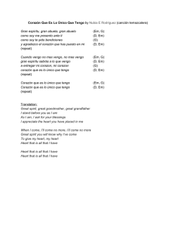
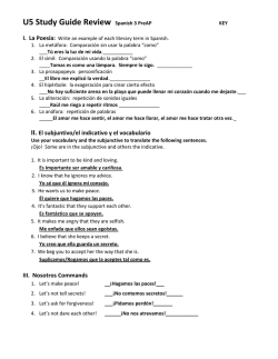
© Copyright 2026